Back to school
Book progress, speaking in Freiburg, and of course a load of typography links.
I made it.
I actually made it.
After nearly a year of writing and illustrating and designing it, my book, Universal Principles of Typography, is now with the publisher for review. I made a quick video last week to celebrate the moment.
However, like I mentioned in the video, it’s not quite done yet. First the publisher does a copyediting pass, then I action change requests, then they send that version to be proofread, then I fix any last finds, and then that is the final version that goes to print. So a couple of months to go, really. But the ‘main’ deliverable is in the bag.
Oh, did you see the news about the foreword being written by Ellen Lupton, by the way? I’ve added her credit to the cover and made a few tweaks to that in the process. Hope to show you soon!
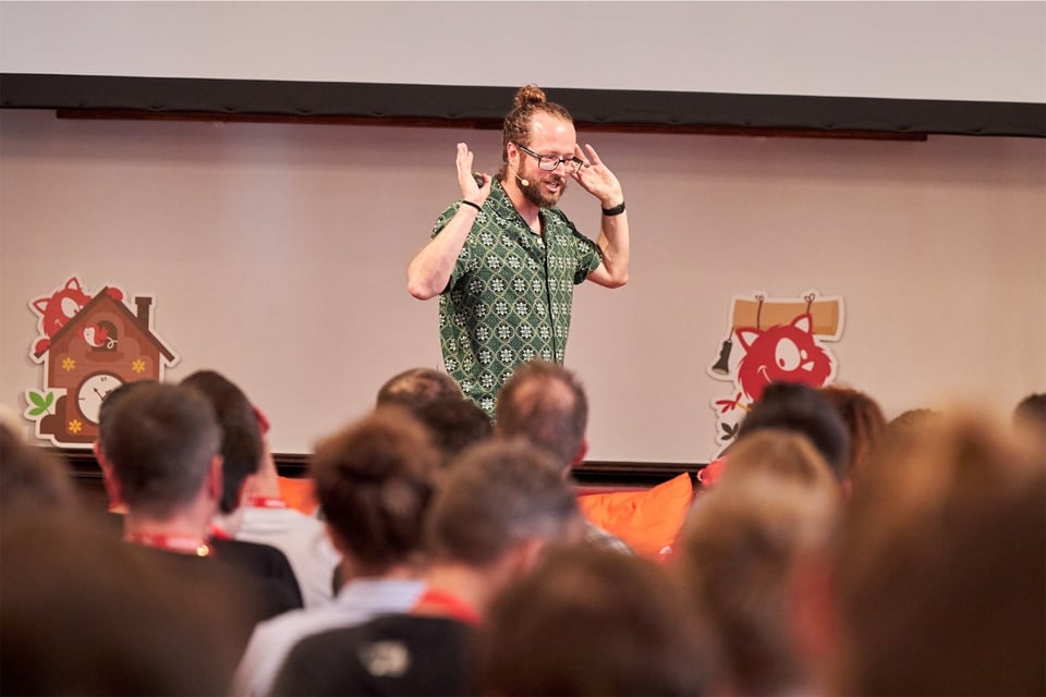
Book stuff aside, I’m recently back home after a wonderful few days in Freiburg, where I was speaking at SmashingConf on the subject of (surprise surprise) web typography. My good friend Marc took some nice photos of me gesticulating wildly on stage. For some reason I look unnaturally serious in almost all of them. I blame CSS. Always gets me riled up.
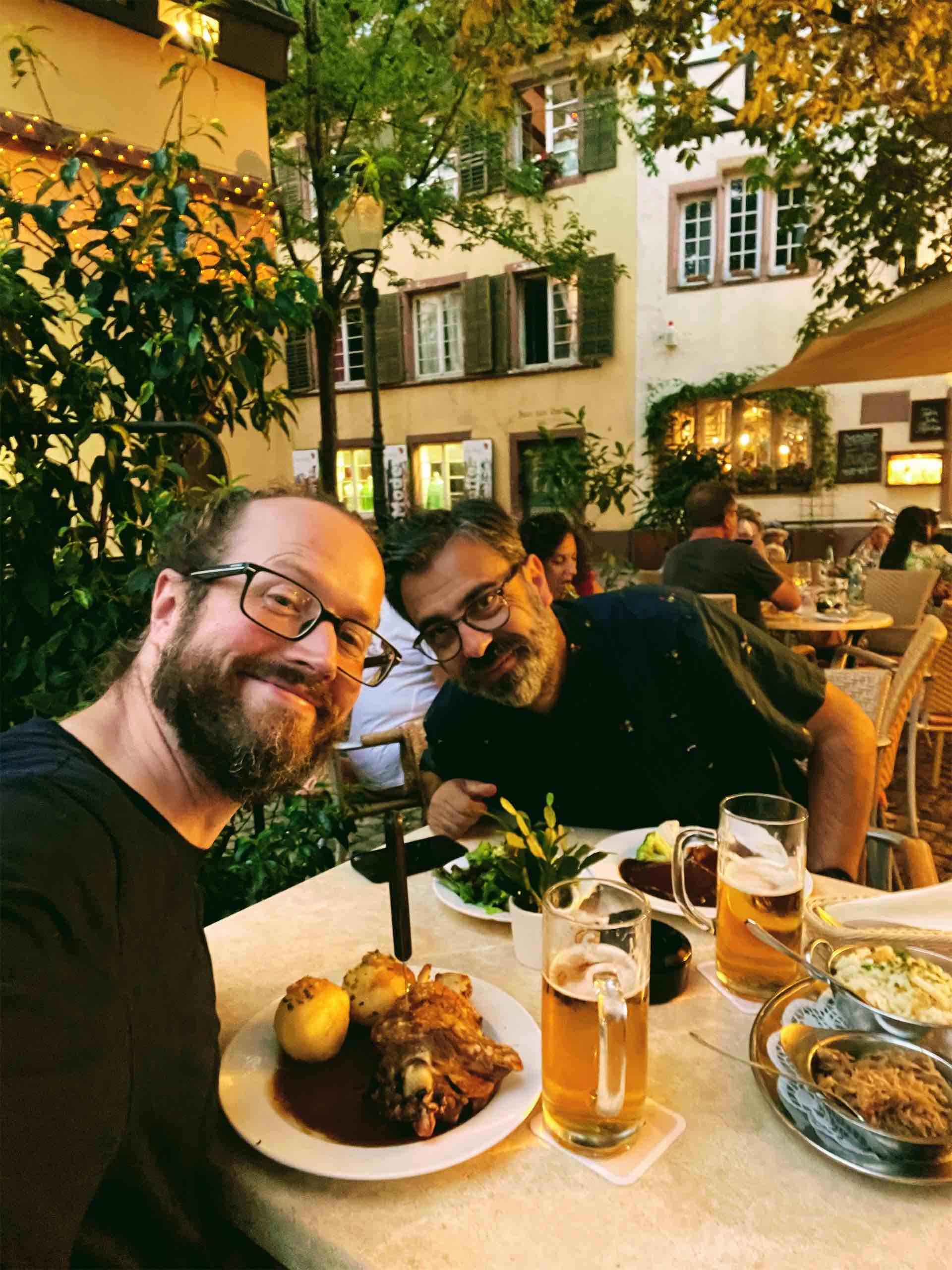
While in Freiburg, I got the chance to have dinner and beers with illustrator, lettering artist, and type designer Francis Chouquet, who popped over from just across the border. (Such a fascinating part of Europe — that triangle where France, Switzerland, and Germany all intersect! Probably not that fascinating for locals, but certainly for me as an island-dweller.) Francis is such a lovely person and a constant source of inspiration for me. You should subscribe to his newsletter, The Typochondriac Weekly.
A combination of the book deadline being hit, SmashingConf being over, the kids being back at school, and the weather taking a distinctly autumnal turn this week has left me feeling ready to get going with the final part of the year. Well, maybe “ready” is over-egging it a bit, but I’m booking in some new client projects, researching a couple of potential side projects, and putting the finishing touches to The Other Big Secret Project that I’ve been teasing. Sorry — I was going to reveal that in this issue, but there’s a bit of ironing-out I need to do first.
You’ll be pleased to know that I do have some typography links for you today, too.
A new article by Typotheque’s Peter Biľak called Originality in Type Design is well worth a read. It addresses the need to reference existing models and the challenges that can present when attempting to come up with something new — an even greater challenge once designers start ‘reviving’ digital-era type. I like this quote: “Claiming complete originality in type design (or any creative discipline) can be seen as either naive ignorance, or historical amnesia, since we learn by absorbing influences in the world around us.” By the way, did you notice that Typotheque have a beautiful new website?
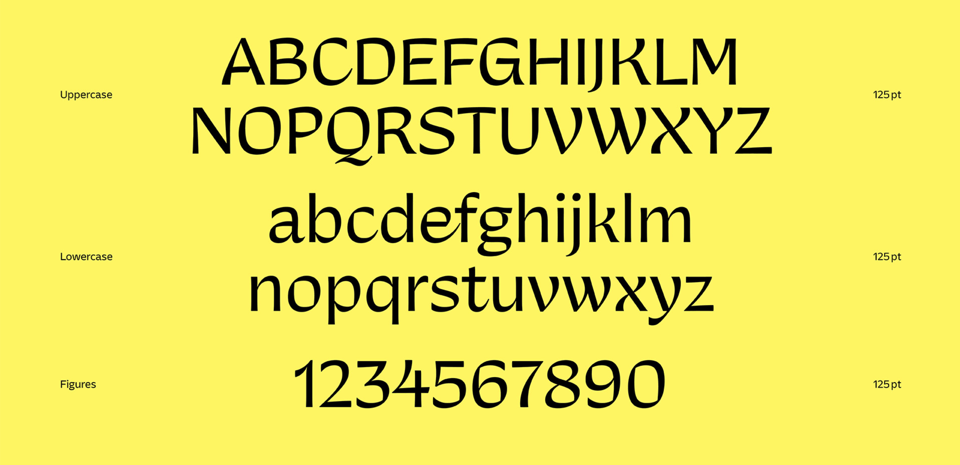
This isn’t new, but I’ve only just come across VZWO VARIANZ, a variable font with axes for “Expression” and “Serifs”, which allow it to “morph between a wide range of stylistic variations, including low-contrast sans, chunky slab serif, high-contrast modern, calligraphic sans, and everything in between.” Sadly the foundry’s site doesn’t have an interactive specimen, but if you play with it on Nick Sherman’s excellent v-fonts.com (where I found it), you’ll see how impressive it is.
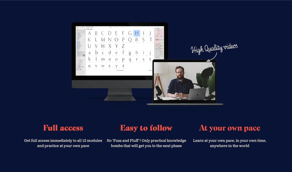
I’ve mentioned before that I’m currently taking a type design course taught by Viktor Baltus. If you’d also like to sign up to the Font Making Course, Viktor has very kindly provided me with an affiliate link so I’ll earn some commission on that. I’m usually suspicious of affiliate links, but please rest assured that this is something I’d already paid my own money for, long before I got to know Viktor. Honestly, I’m happy to make the recommendation, affiliate or not.
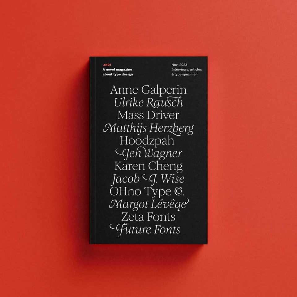
Oh, speaking of Viktor, did you know that he’s about to publish a pocket-book-shaped, type-themed magazine? “Through 11 exclusive interviews with upcoming and renowned type designers, you get to know the faces behind your favourite typefaces, as we look at their creative process, thoughts, and opinions on the current field of type design.” Pre-orders open on Saturday.
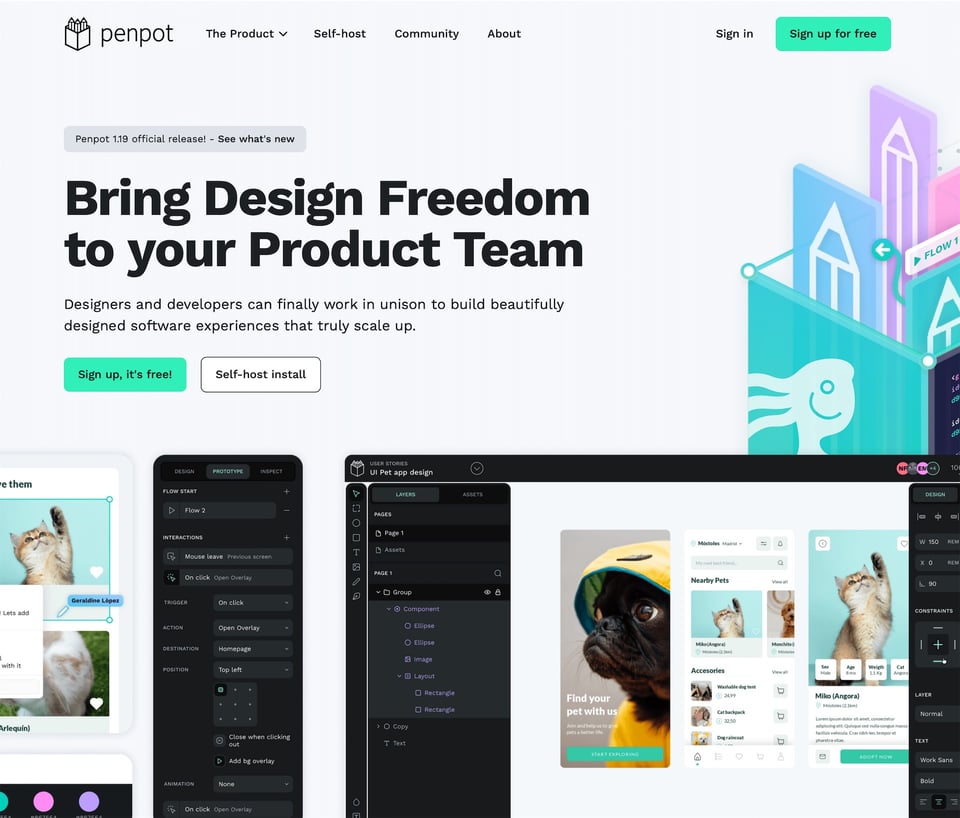
Not type-y, per se, but if you’re into open-source design tools, Penpot might be of interest. I haven’t tried it out yet (and anyway, I love Figma), but it looks impressive. I’d love to know if anyone’s given it a go, and how the typographic controls hold up.
I’ve got two workshops coming up. Please tell your friends and colleagues!
The first one is my Typography Masterclass for SmashingConf, which takes place via 5 × 2-hour sessions (over 3 weeks) and is the same as the one I taught for them in March. They’re offering 15% off with the (rather excellent) promo code “comeandlearnabouttypographywithme”, which should already be applied in that link.
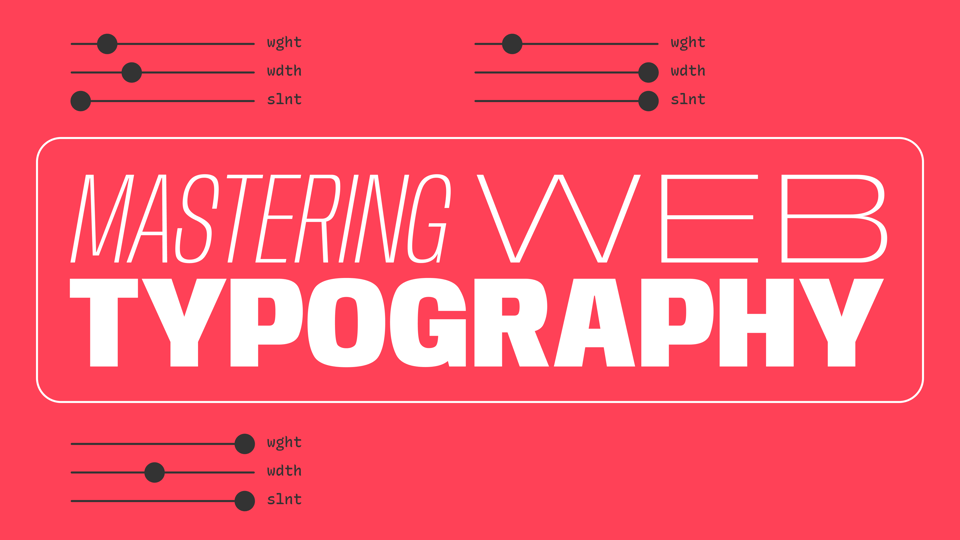
The second workshop is my Mastering Web Typography workshop for ILT Academy. As you might’ve guessed from the title, it focuses on typography for the web, and runs over a weekend (2 × 4-hour sessions).
You just read issue #18 of Typographic & Sporadic. You can also browse the full archives of this newsletter.
