First of all, a huge thank you to all of you who replied to the last issue with such lovely, supportive messages about the book. I can’t tell you how motivational they were. I mean, I’m motivated to finish the book, of course, but in many ways a finished book is a somewhat abstract concept. Someone saying something like “I can’t wait to buy this and read it” suddenly transforms it into something almost tangible.
After the book announcement (which I’ve now also put on my blog), I was going to take a bit of a newsletter breather, but the type world had other plans, with a load of news that just had to be shared.
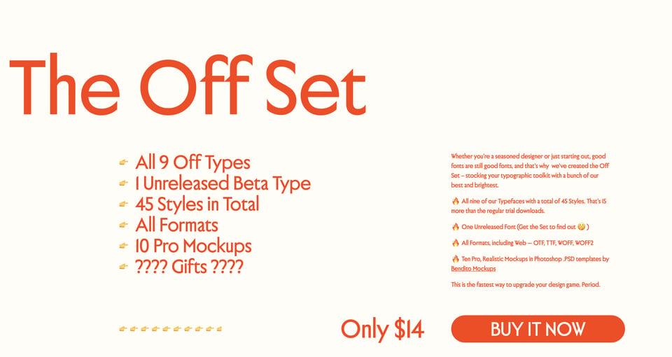
I had to check, double-check, and then triple-check that I hadn’t read something wrong, but no, it appears that this is actually real: Off Type (Pangram Pangram Foundry’s new offshoot, which I linked to not long ago) are offering a bundle called The Off Set, which collects all 9 of their typefaces (a total of 45 fonts) in one package for just… $14. Yes, $14. You can see why I had to check this. I bought The Off Set and can confirm that this is a total bargain. I feel almost guilty linking to it.
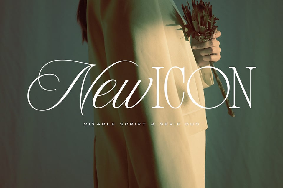
I’ve got another deal for you, and this was discovered via an Instagram ad. (Ah, that algorithm knows me so, so well.) Atipo Foundry sells fonts via a pay-what-you-want model (minimum €15), and they also bundle up a load of font pairs with (or without) templates for film titles, posters, social media posts, etc. This is a really interesting way of selling fonts…
… and brings me to a similar idea by Bristol’s own Set Sail Studios. Sam’s font duos are packages that take all of the guesswork out of type pairing. Cool idea.
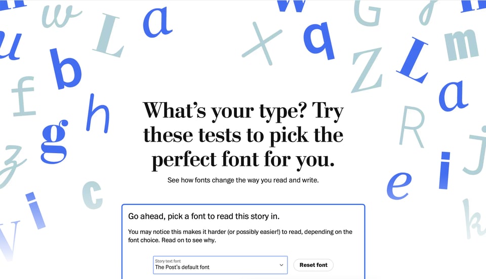
Absolutely everyone’s been linking to this, but it’s not every day that you see type get such a spotlight in mainstream media, so I’m going to link to it, too: The Washington Post recently published a piece on how type choice influences readability. Not everything in there is correct — x-height isn’t “literally the height of a lowercase letter x compared to a capital one” — but it’s a decent intro to type and typography to share with your friends and family. (And, if their interest is piqued, send ’em over to “Introducing Type” on GFK.)
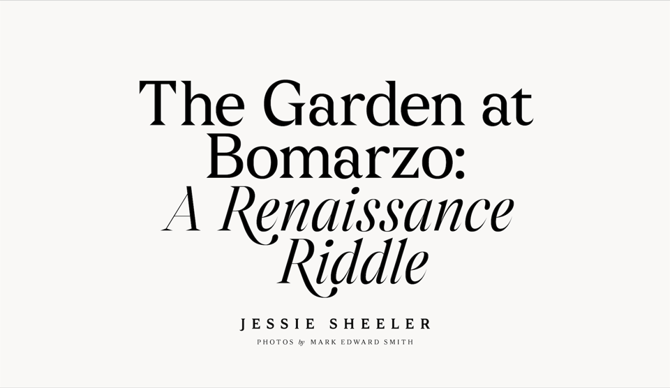
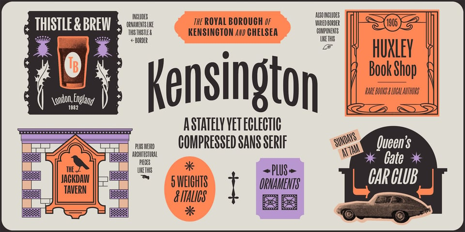
A new foundry discovery for me: Fort Foundry! Their latest release, Kensington, is a collab with Jen Hood of the awesome Hoodzpah.
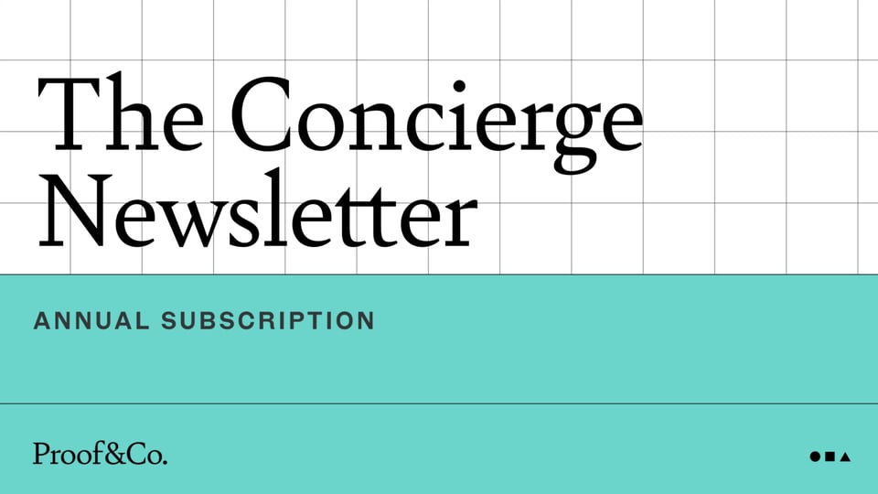
Those super-smart Proof & Co. folks have started a new paid-for newsletter called The Concierge. “Every 10 days, your email inbox will receive a curated, thematic list of typefaces hand-picked from years of research and data — some being groundbreaking new releases, and some being proven stalwarts, but all from independent foundries from around the globe.” Do we need more newsletters? Yes! Do we need more fonts? Yes! Sign me up.
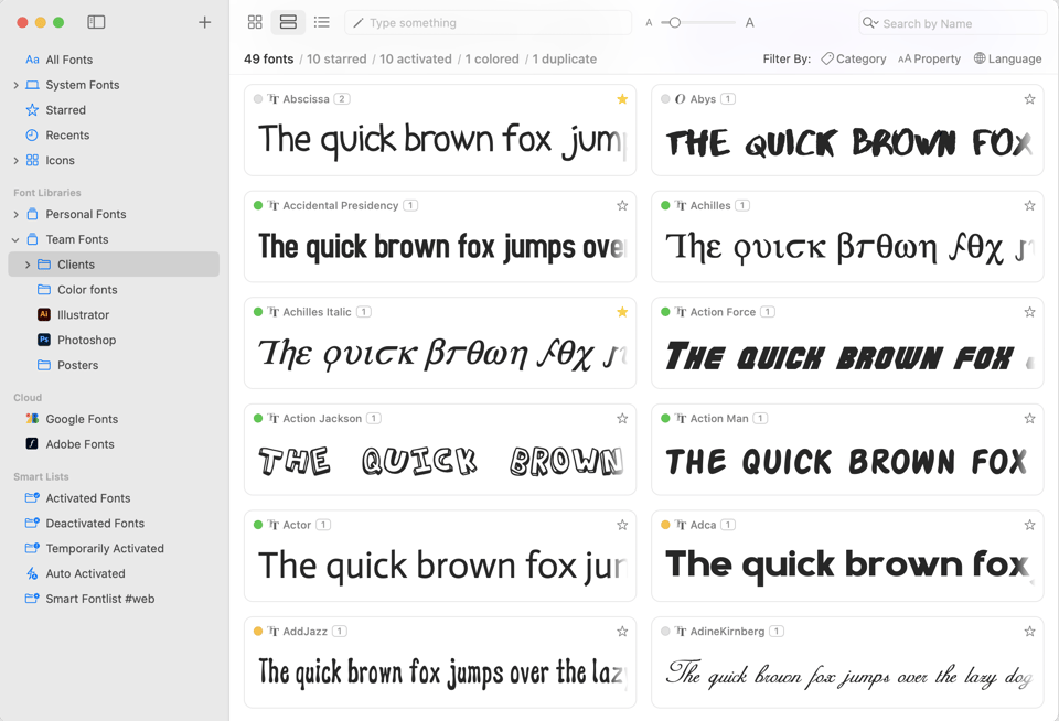
When it comes to font management software, my personal recommendation is Typeface. I’ve tried them all (on macOS), and in my opinion, it’s the best. However, coming in at a very close second is RightFont, which has just hit version 8. This also reminds me that if you ever need to point people towards an all-purpose article on populating the font menu, I wrote one for GFK at about this time last year.
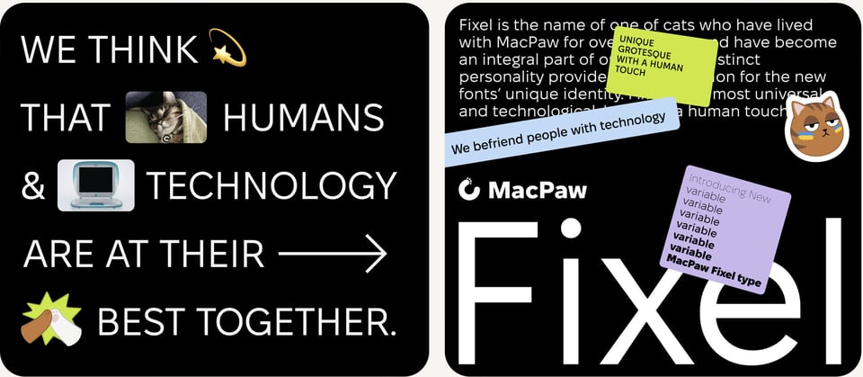
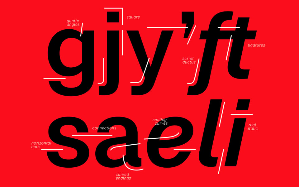
I’ve been a big fan of MacPaw, the Ukrainian company that makes the excellent CleanMyMac, for quite some time. They’ve recently released a typeface, Fixel, which comes in 9 weights, 2 optical sizes, and is fully variable. Nice. Best of all, it’s free! But consider donating to the MacPaw Foundation to “speed up peace in Ukraine and protect the universal values of a free and democratic world.”
Case is the new typeface by from Erik Spiekermann, Anja Meiners, and Ralph du Carrois, released by Fontwerk. Nice to see Erik’s 4-letter naming convention still going strong.
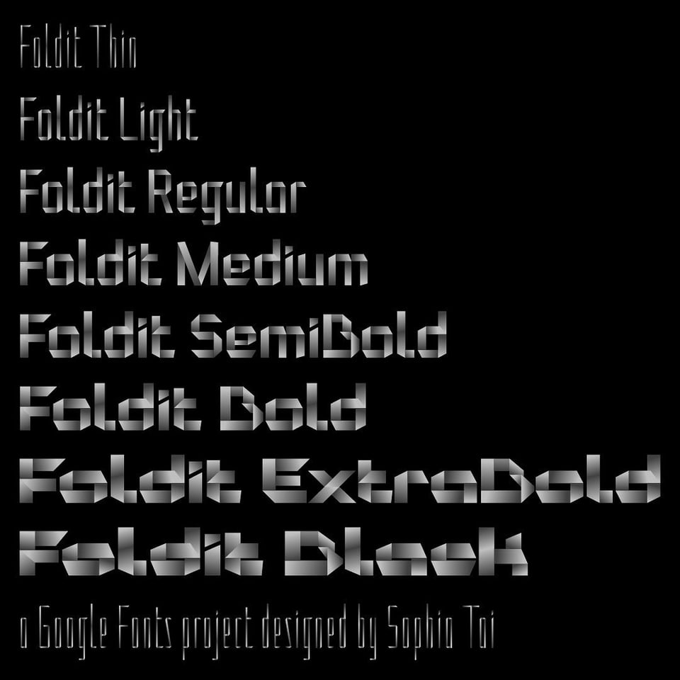
Sophia Tai — who I’ve got to know a little via Letter Luvvers — recently released the seriously impressive colour variable font Foldit, and it’s free. By the way, I’m linking to Sophia’s newsletter here, as that contains a lot of useful information about how to use colour fonts. If you do visit the Foldit specimen on Google Fonts, be sure to do so in a browser that supports colour fonts. (Sadly, no Safari for the moment.)
Lastly, you probably know that the internet is all over Instagram Threads this week. I’ve got mixed feelings, but I’m on there, somewhat predictably, as @elliotjaystocks. See you there, too?
You just read issue #16 of Typographic & Sporadic. You can also browse the full archives of this newsletter.
