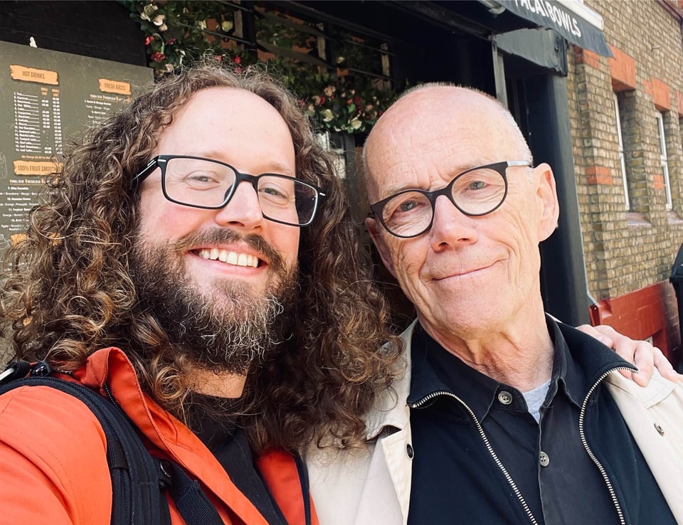
I wrote the majority of this issue on the trains to / from London last Thursday. I was visiting Erik Spiekermann to interview him for… well, I can’t say just yet. But I can tell you that this is one of the big typographic-in-nature projects I’ve been teasing for a while. I promise I’m going to reveal one of them in the next newsletter! Promise promise promise.
Anyway, onto this issue, which is sporting some small-but-important refinements: the text is now set in Ty Finck’s Def Sans (if your email client supports web fonts), and the images now click through to their respective links rather than showing full-size versions (which you prefer, right?). I’m front-loading this one with a load of URLs that have been open on my phone since attending the most recent Letter Luvvers event, prompted by talks I had with the many fine folks there. I figured I’d share them here, as you fine folks might be interested, too (and phew, I can finally close those tabs).
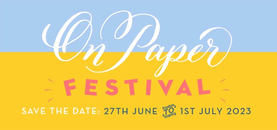
Happening at the end of this month, Meticulous Ink’s On Paper Festival is a whole week of workshops, talks, demonstrations, and opportunities to — as Athena herself says — “drool over our printing presses and expand your mind via the medium of beautiful paper”. There’s even a free wayzgoose on the Saturday! If you’re not near the Bath area, what a great excuse to come and visit our lovely little corner of the world. The festival kicks off on the 27th.
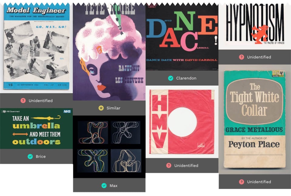
Typereel is “a resource that [makes] it quick and easy to browse a gallery of typographic work” and is somewhat like Fonts In Use, although it tends to focus on older specimens. Simon had some pretty amazing printed specimens with him at the last LL, so it’s nice to see them getting catalogued.
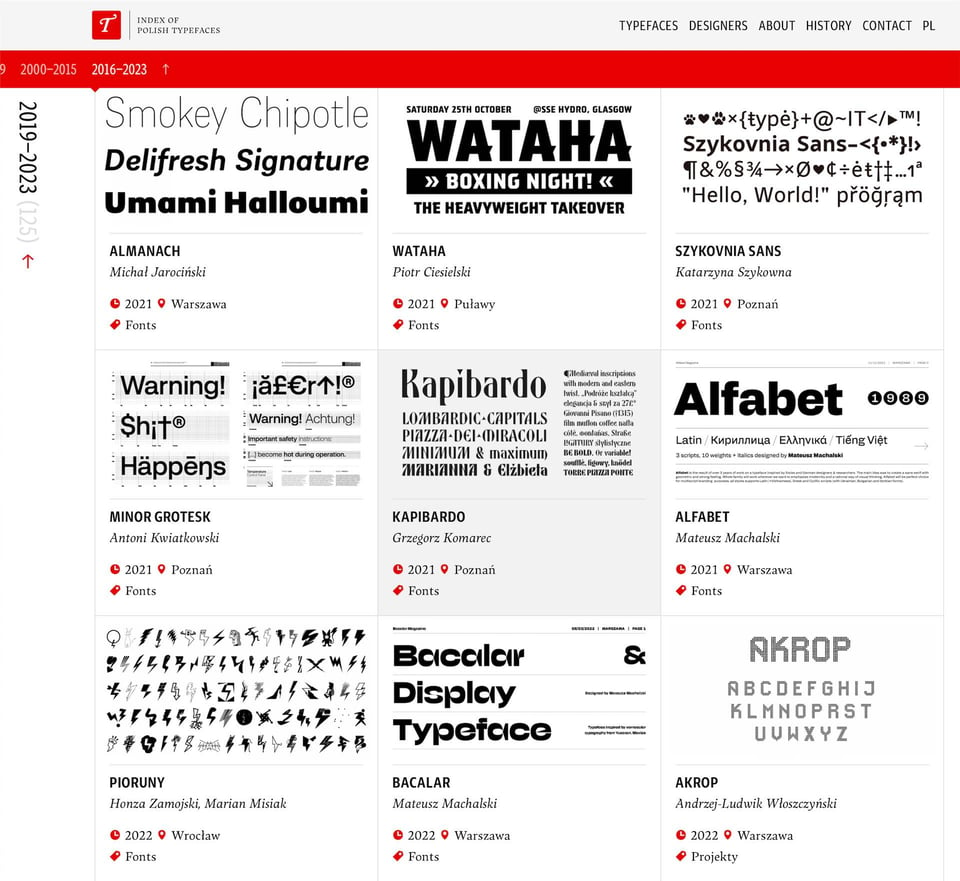
Typoteka is “an index of typefaces created by authors associated with Poland” and LL co-founder Borys Kosmynka is one of the contributors. Some great work here.
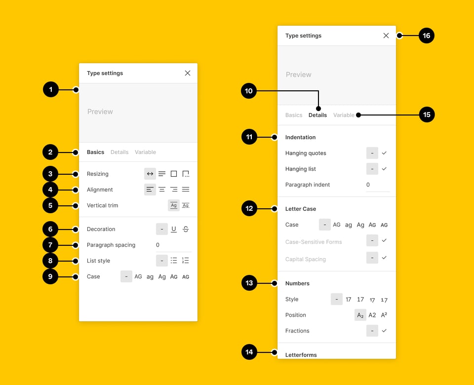
Who here’s a Figma user? I’ve been on it for years, but if I’m being honest with myself, I’ve never really dug that deep — until now. I’m doing a little client project that’s allowed me to spend some proper time to explore Auto Layout and I feel like it’s finally starting to click. As in: just think about it like CSS. Anyway, Auto Layout shenanigans aside, I noticed that Figma has implemented “vertical trim” (based on the “text-box-trim” proposal for CSS) and wow, this makes loads of sense. Whether you care about this being implemented in CSS or not, I urge you to start using it in Figma anyway. It means you can align text elements with so much more accuracy, because it trims all of the whitespace above the cap height and below the baseline. Give it a go and you’ll understand why I’m so enthusiastic about it.
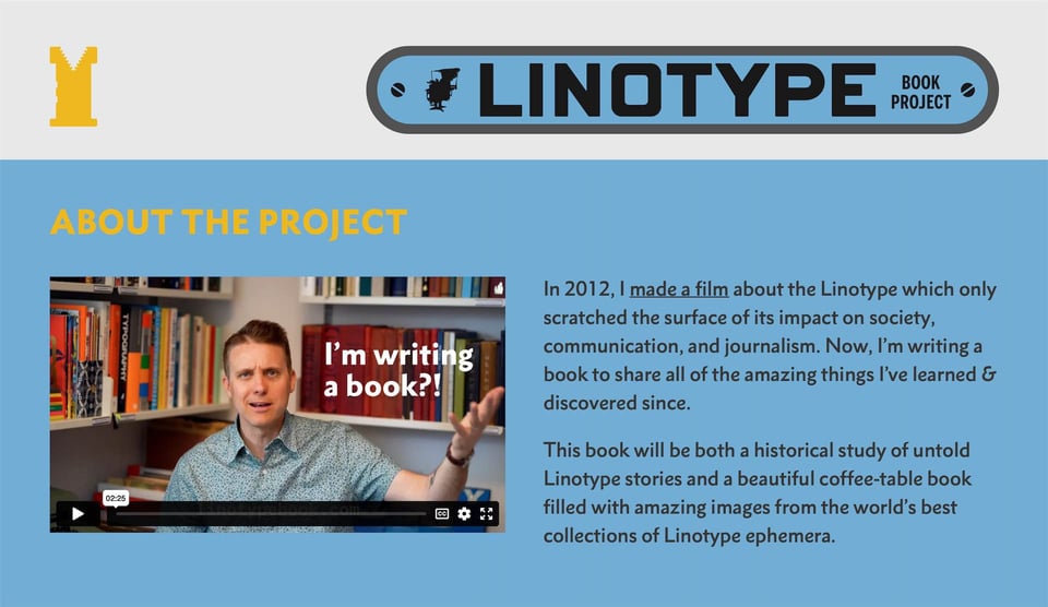
My friend Doug Wilson, who I met when I interviewed him for 8 Faces shortly after he made Linotype: The Film, is now in the process of making the Linotype Book Project. He’s documenting — and funding — the process via a new newsletter. Super interesting approach.
Lastly, a big ol’ stream of indie type foundry links coming at ya! Why? Well, purely because these are some of the beautiful typefaces I’ve been trying out for the aforementioned client project. Thought you might like them, too:
- Pastiche Grotesque by the cleverly named Order Type Foundry
- Jubilee by the similarly named Off Type Foundry (which is itself an offshoot of Pangram Pangram Foundry)
- Marcovaldo (a more condensed, display-centric version of Calvino) by Zeta Fonts
- Multiple typefaces by Type Mates
- Multiple typefaces by Blaze Type
I think I’ve mentioned this before, but just in case you want to spend some / a lot / all of your time browsing indie type foundry websites, type.lol serves as a very big list. Better put the kettle on.
You just read issue #14 of Typographic & Sporadic. You can also browse the full archives of this newsletter.
