
Hi and welcome back to “Trust the Process”. The weekly newsletter where I share my own progress over the week and interesting links I found along the way.
I just realized that this is already issue no. 10 of this newsletter. Which means that I’ve now not only written about my side projects for 10 weeks straight, but also made steady progress on them during this time. Especially on Morgenblau. This week was no exception.
Process
After last week’s big-ish launch of the new landing page and logo, I had a bit of a slower week. But I made some nice quality-of-life improvements that I’d wanted to make for a long time.
One of the bigger ones was finally switching to a premium icon set. Icons are, similar to typography, something that most people pay way too little attention to, but they truly make or break the visual identity of a product. At the moment, one pretty good indicator that someone doesn’t pay too much attention to their design is the infamous combo of the Inter font with Lucide icons. It’s the default configuration of shadcn/ui, the component library that almost everyone building with React uses.
Free icon sets like Lucide aren’t bad per se. On the contrary, they are actually quite good. The problem simply is that they are everywhere. That was the reason why I originally chose the Basicons set. Also a free one, but way less overused.
The only downside of that one was that it only has one style (in the free version) and it’s quite limited when it comes to the number of icons it provides.
That’s why I decided to buy a proper license for probably the best icon set on the market right now: Central Icons.
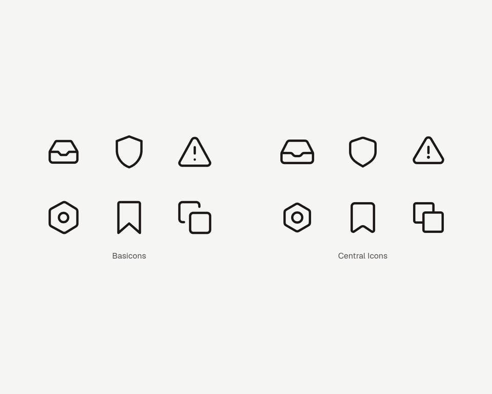
It’s made by the Iconists and has the special property that it’s essentially multiple icon sets in one: you can configure the stroke width and the border radius, which makes the icons feel completely different.
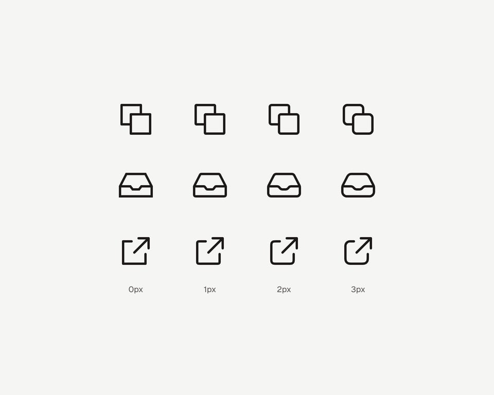
In Morgenblau, I now use the 2px radius version and I like the look it has so far. A great balance between feeling calm and playful, exactly what I want the product to feel like.
I also replaced some labels like the “primary source” or “generated source” ones with icons. This makes the interface less cluttered and cleaner.
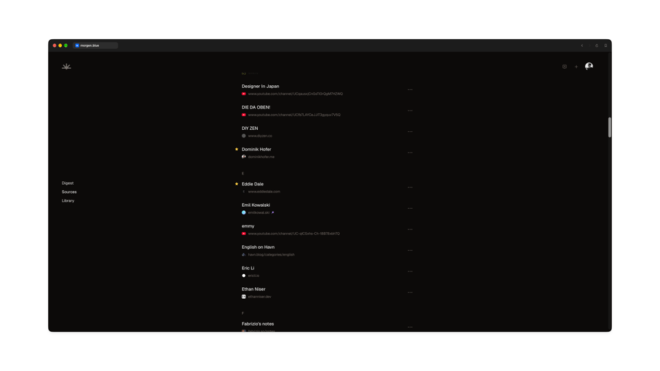
I’m not yet at the point where I can and want to invest in a premium typeface (they are way more expensive than icon sets), but I still want to use high-quality fonts. As of this week, if you’re a fan of mono fonts and/or iA Writer (the app I’m writing these words in, btw), I’ve got you covered: iA Writer Duo is now available for selection as a reader font.
I still have to do a proper type design session and tweak the font sizes, line heights and stuff, but we’re heading in the right direction.
One technical detail that changed concerns the email newsletter feature. Whenever someone subscribed to a newsletter with their custom Morgenblau email address and received an email, it went through an SMTP receiver within my Go app. The problem was that Cloudflare can’t proxy SMTP, which meant the MX record made the server’s IP public. In the current climate with so many security incidents, I don’t want that. That’s something Cloudflare should worry about. Plus it generally felt a bit “icky” to run an email ingest endpoint myself.
That problem is solved now: the whole email setup for Morgenblau uses PostShiba under the hood. I found this service through its creator Jesse’s relentless advertising on my favorite tech podcast Mostly Technical. And I’m a big fan so far: the setup was smooth, I had one support/feature request which was immediately resolved and, the most important thing, their branding is very cool. You can definitely see the Japanese influence in there.
This new part of the stack costs me 5 dollars per month, but it gives me a bit of peace of mind. Same as with the icons: paying for good tools and infrastructure is worth it. For your sanity, but also because people notice these kinds of things (visual polish, reliability). At least subconsciously.
Speaking of reliability, I don’t expect Morgenblau to be bug-free software. Or finished, for that matter. That’s why getting feedback is so crucial for building a good tool.
To make it a bit easier to send me some, there is now a little composer in the app that users can open via a header button. They can write what bugs them or what could be better and even attach screenshots, if needed. All of it lands straight in my inbox and hopefully helps me make Morgenblau a tiny bit better.
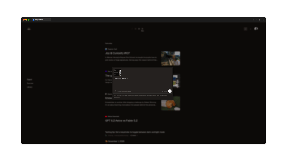
So, if you’re already part of the alpha and find something you want to tell me, please don’t hesitate to use that feedback dialog!
And if you’re asking yourself right now “What alpha?”: I’m still looking for folks who want to test the current version of Morgenblau in exchange for feedback. If you want to be that person, simply reply to this email with your Bluesky handle and I will let you know how you can be part of it.
I also had a nice exchange with one of the alpha testers this week that made it clear how crucial it will be for me to better explain Morgenblau to people outside the ATProto ecosystem. Especially why it’s possible/necessary to log in with the account that they already use for Bluesky.
I keep coming back to this topic: many ATProto apps just assume way too much knowledge about the protocol and its ecosystem. I’m pretty sure that 9/10 apps apart from Bluesky that advertise some sort of ATProto functionality are used by developers or at least people who are deep into the ecosystem itself. What I’m not sure about is how we as a community can solve this. It probably comes down to education, branding and just building good products.
What I’m 100% sure about is that there is still so much work left to do.
Finds
Cool things I discovered this week:
- No AI Slop: A Manifesto: Like the Agile Manifesto but for our era. I especially like the mantra “Better work over easier work”. With current technology, we can be way more ambitious than before.
- Writing as a thinking tool: “If you think without writing, you only think you’re thinking.”
- Dear young writer: As with every craft, in order to get better at it, you just have to do it more often.
- Building an LLM safe design system: While not every finding Polar had is applicable to my work on Morgenblau, I still find case studies like this invaluable in improving my own workflows.
- How the Claude Code team thinks about verification / claude.dev Blog: Speaking of improving workflows, this one right here is a gem. Especially the part about property tests sparked some great ideas for my work on Billow.
- On Drawing Icons: And case study number three, this time about icons and the process behind them.
- Allo, your friendly neighborhood font: Another nice font dropped, essentially a rounded version of Inter.
- Productiv icky: This is exactly the feeling I have when I see another one of these “I automated my whole life” videos.
- The life of a composer: Obviously exaggerated, but it really can feel like this sometimes when you’re designing an interface.
- MEUTE - Reset: Last but not least, my favorite find of the week. Analogue techno, how cool is that?
From the blog
This week I published:
- Knowember 2026: A nice blogging challenge to get to know the people behind your favorite personal blogs a bit better.
That’s it for this issue. Thanks for sticking around! If you have any questions, feedback, or just want to say hi, reply to this email and it will land straight in my inbox.
Until the next one,
Dominik
You just read issue #10 of Trust the Process. You can also browse the full archives of this newsletter.
Add a comment: