Design Matters #9 - What The Font?! In Practice!
Hello!
You are reading (Dataviz) Design Matters - a newsletter series made with 💕 by T. from Data Rocks.
If you’re new here but like what you see, subscribe below and get all upcoming issues straight into your inbox.
First published on 05 October 2023.
Hi Friends!
Welcome to issue #9 of the series Design Matters.
In this series, I’ll share with you how design can help your dashboards go from average to awesome.
The goal of this series is to shed light on how design plays an indispensable role in data analytics - not just in making things look pretty but in affecting understanding, communication, and decision-making.
First, an update:
Life happened, and I missed a beat. I love keeping things consistent, and I have been able to do it since February with this newsletter, the blog, the Medium posts, my client work and some other fun things I’ve been preparing in the background.
But these past couple of months have been quite challenging for me, both professionally and personally, and consistency fell out the window. This issue of Design Matters should have come out a few weeks ago. But here we are. Better late than never!
My life is going through some big changes: I bought my first home!!
We move in late October. So, to make the best out of this life achievement, I’ll take some time off. The next time you get an email from me, it will be in Data Rocks’ new headquarters! 😊
This also means taking a brief pause in social media and content-making. But stay tuned; I’ll be back before the end of the year with lots of great dataviz stuff to share!
- In the meantime, if you have a cool dataviz project and would like to work with me, I’ll be able to help you from late November. You’ll also likely be my last client for the year!
- Rescue Sessions will be back in early 2024. I have some exciting plans on this front, so watch this space!
In the last issue of Design Matters, we talked about Typography. I introduced a few of the basic concepts related to typography and explained how I go about choosing a typeface for dataviz.
As a recap, this is what makes a typeface good for data displays, such as dashboards:
- Sans Serif typefaces are more readable than Serif typefaces for data labels, details and numbers;
- The typeface needs to have a good x-height;
- Clear and distinct counter shapes;
- Regular width (not too narrow, not too wide);
- Numbers should be lining and tabular;
- Contains all the symbols you’ll regularly use.
Below, we’ll explore how these guidelines apply in practice, and I’ll share my step by step to define and apply a good type scale to your dashboards.
1. The scale
The first thing you’ll read in any typography guide is about choosing a typographic scale. This means choosing a sequence of font sizes that works harmonically together. In graphic or web design, this also means taking a series of other considerations into account, such as line height or grid structure.
In BI tools, a lot of these decisions are already made by the software, and we generally have much less control over how a typeface will behave in certain sizes. On one side, this takes away the need for a data analyst to decide the smaller things about their typeface. But on the other, this also means we have to work out a type scale sort of ignoring these other elements.
Type scales define visual rhythm and consistency across your dashboard. They work the same way as your colour palette does. By defining a clear scale of sizes you want to use across your visual displays, you ensure consistency and hierarchy.
So, the first step is to choose the rhythm you want to apply to your dashboard.
Think of this as choosing your base set of colours - we’ll then assign meaning to each of the sizes and variations.
There are different options when it comes to scales. The best approach is to start with tools such as Typescale or the Figma plugin Typescales

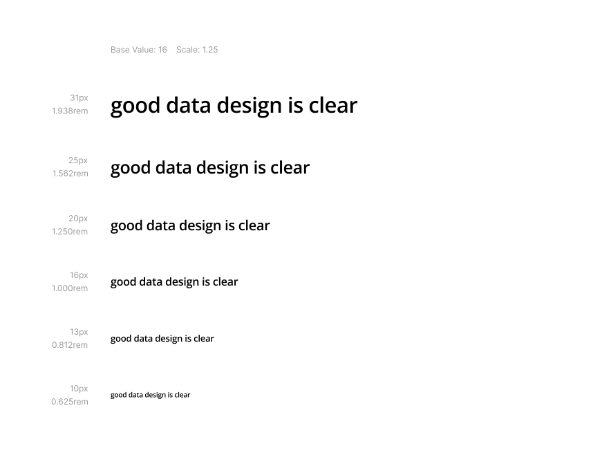
You’ll notice that you have different scale options to choose from. The scale options are a multiplier you use to calculate the size of your next font based on the previous one. So, if you start on a base of 16px as your font size and apply a Major Third scale of 1.250, this means your next size up will be 16px multiplied by 1.250, giving you 20px. The same goes for making smaller sizes, but you divide your font size by the multiplier. The next size down, starting from 16px on a scale of 1.250, would then be 12.8. Notice how this is a decimal number? While in design tools you can have font sizes like this, in BI tools you’ll usually just round them to the next whole number - in this case, 13.
This is how a harmonic type scale is formed.
If all this sounds too complicated, bear in mind that you already use type scales, even if you’re not aware of it. Whenever you decide a title is bigger than a subtitle, you are creating a scale. What this does is add a bit more science and replicability behind those decisions.
You may also be wondering why these are the scales that designers everywhere use. And they come from music! It seems we understand rhythm the same way, be it with our ears or our eyes. You can read more about it here.
There isn’t a clear guideline of which of these scales works best and when. This is where your aesthetic decisions come in. The important thing is to have a scale - whichever it is. Keep in mind that the bigger your scale number is, the more emphasis you give to the different hierarchy levels of your type scale.
I have a personal preference, though:
- For dataviz work that is more creative and heavy on graphic design (infographics, posters), the most basic scale, called Major Third or 1.250, works quite well.
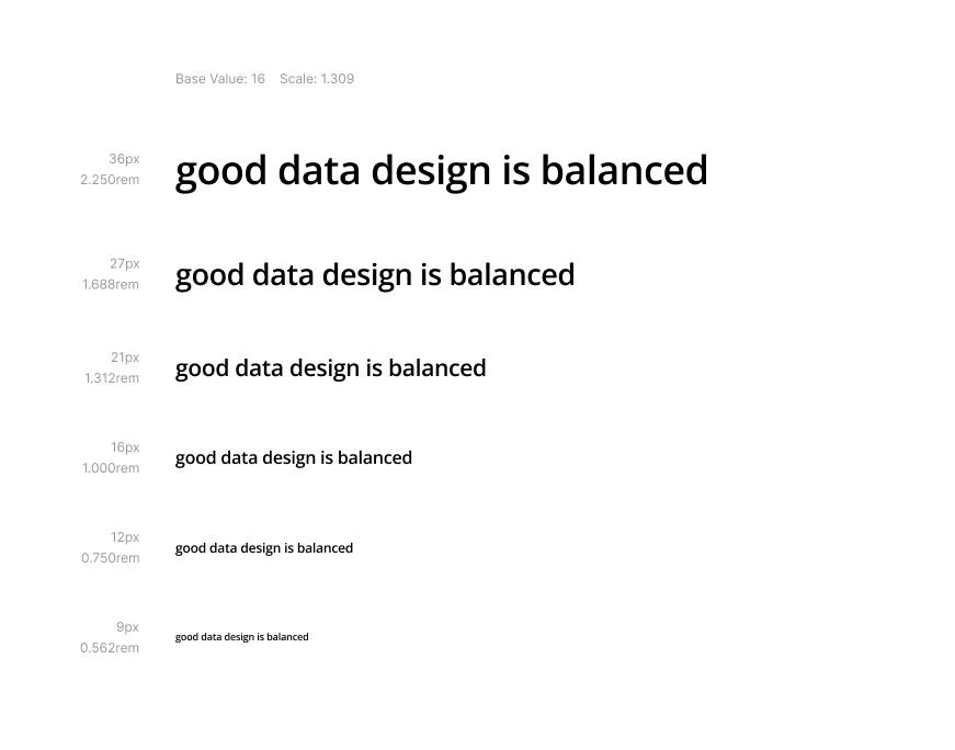
- For dashboards, typography plays a bigger role in enforcing hierarchy within a constrained space - which means that more emphasis is needed. I tend to go with a scale based on a half-golden ratio, or 1.309.
- I also tend to start at 16px and choose 3 sizes above this base and 2 sizes below. This gives me a total of 6 font sizes to choose from and play with. My preferred range using this set-up is between 36px for the largest size and 9px for the smallest size.
From here on, this is the scale I’ll be using. But you’re free to grab the same steps I use and adapt them as you need. Test other scales and see what works best for your use case.
2. Functional Hierarchy
Once you have a scale, the next natural step is to wonder, where do I use each size and where?
The first thing is to acknowledge that you don’t need to use every single step in a comprehensive scale to have hierarchy or harmony. The same way you don’t always need to use all musical notes to compose a song. Sometimes, 2 sizes are enough. Sometimes, 5 sizes are needed. But how do you define that?
This is where defining a semantic hierarchy comes in.
Very much like we did with colours, now we need to lay down what are all the places where we use fonts in a dashboard? Luckily for you, I have already taken note of that and came up with the list below:
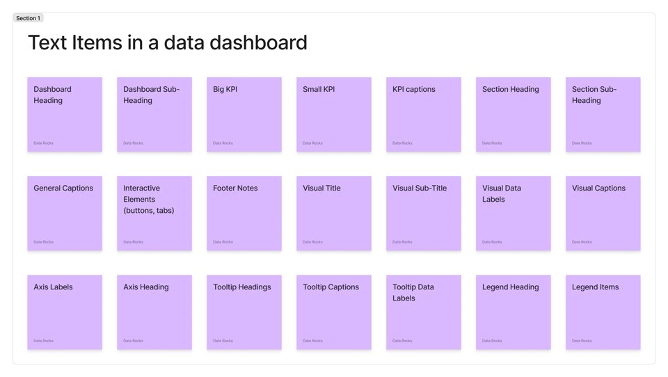
Now comes the fun part - and one that usually generates a bit of discussion.
How would you prioritise these items? Which of these pieces of text do you want your audience to read first? And next? And next?
I usually constrain the exercise in two ways: there are 4 levels of priority to choose from, and you need to think of it strictly from a usability point of view - not thinking about dashboards we normally see everywhere. If your only rule was to prioritise the order of reading, how would you do it?
This is what my hierarchy looks like:
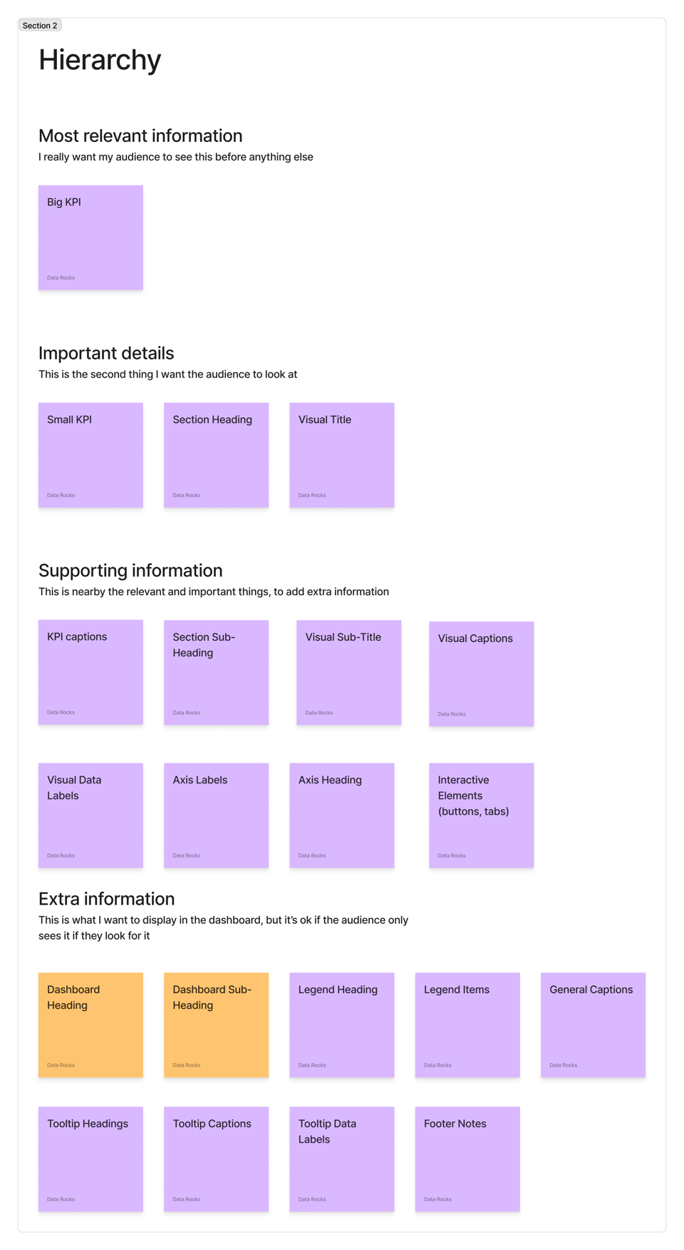
Notice the two orange Post-its? That’s where everyone gets hung up. Dashboard title and subtitle.
If you think of typography as having a function of conveying information, and you look at it strictly from a usefulness lens, the title of a dashboard isn’t the first thing you want your audience to see all the time.
Think of it from a user journey standpoint:
- Your user wants to see a sales dashboard
- They have either a server or a link saved that goes into that sales dashboard
- They know exactly where they’re going and why when they source the information
- When they get there, all they need is a quick confirmation that they’re in the right place.
- They do this periodically - every day, week, month.
Even if they receive it in an email, they have the email subject title telling them what it is before they open and see the dashboard.
If all the title is doing is to confirm where they are and nothing else, why does it take the most premium space on a dashboard with so much emphasis?
I date it back to when we used to print things. Papers go places. In a pile of papers in a dusty folder somewhere, you need to be clear about what the contents are. Newspapers do this quite well. But a dashboard on a screen that takes effort to reach? A quick reference is more than enough. Those titles are a localisation cue, nothing else. They don’t need to be set in 48px.
Give it a try! You’ll see that a title set in 12px will perform the exact same function as one set in 48px, and you’ll instantly gain more working space for the things higher in your information hierarchy.
This is a tiny hill I’m willing to die on.
Once you have set your hierarchy, assigning them a size becomes a much easier task:
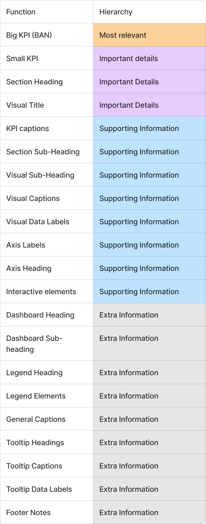
3. Type systems
Now that you’ve defined the typeface you want to use, the scale and the functional hierarchy, you get to decide how you want to apply all of this to your dashboard. And you have multiple options. Typography decisions are some of the most involved design decisions you’ll make. But to help you get a head start on what all that looks like, I’ll show you my 3 go-to options when it comes to applying typography systems to dashboards.
Type System 1: one type size to rule them all
Can you make a dashboard work with only one font size? Yes, you can. This is the simplest possible set of decisions you can make. Of course, having a clear hierarchy is important, but you can do that using other typography attributes, such as line weight and colour.
Example 1 - no variations
- Pick one medium size: 11px to 13px are good, readable sizes in almost any BI tool.
- 16px is the most accessible size across any screen resolution and platform. But your BI tool may make this look a bit too big for labels and annotations if they have responsive options.

Example 2 - use weight to establish hierarchy
- Bold weight options make the same font size look more prominent.
- Light weight options make the same font size look more subdued.
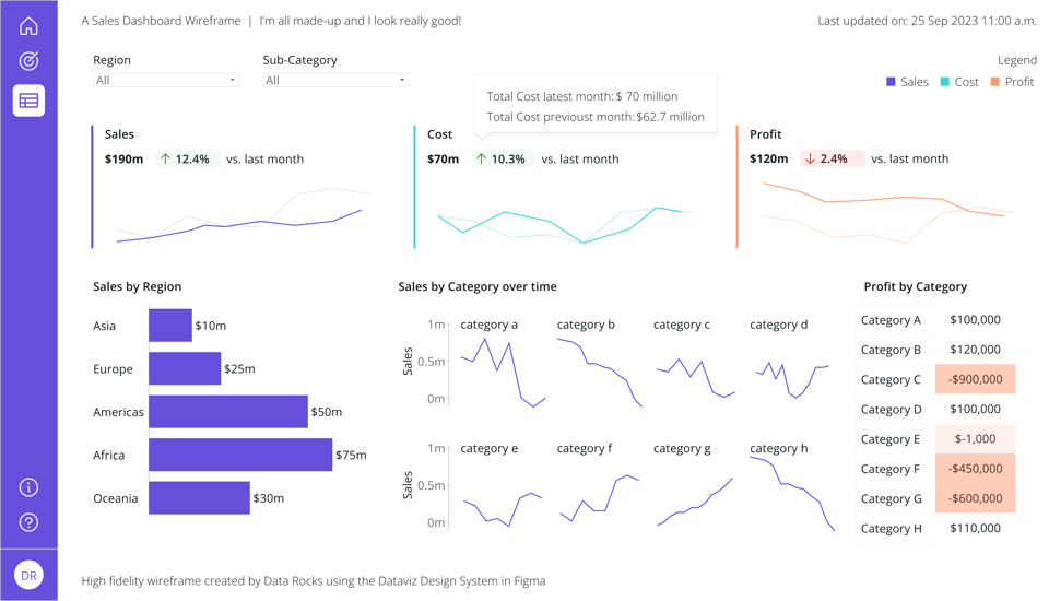
Example 3 - use colour to reinforce hierarchy
- A font with a high-contrast colour against the background is more visible than a medium-contrast colour.
- Colour can be used in combination with font weight to establish a stronger hierarchy when you use only one font size.
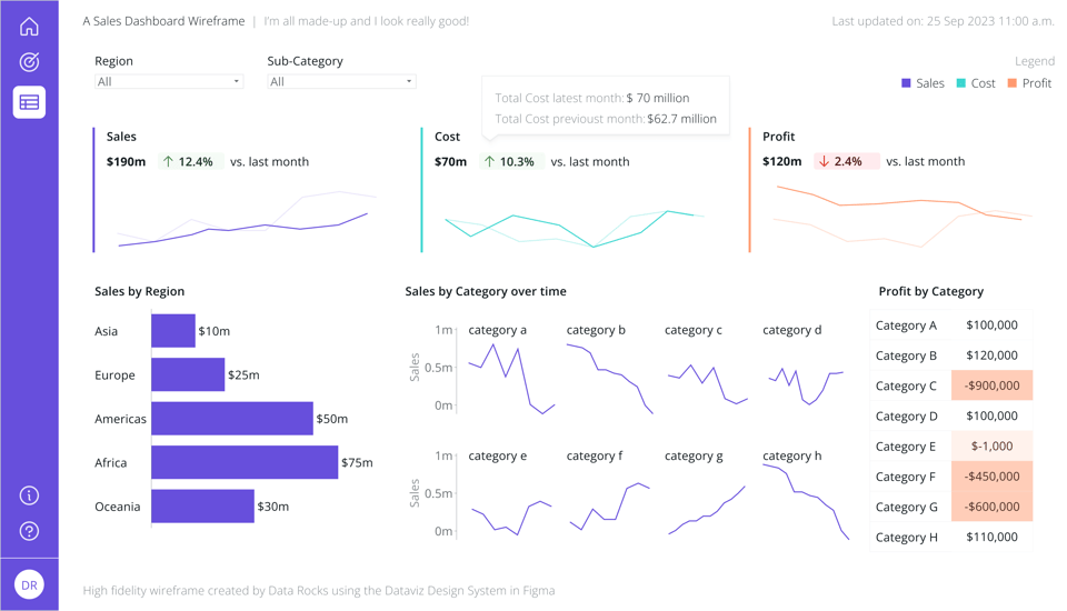
Type System 2: two font sizes; big contrast
If you want some elements to really have prominence while everything else takes a second role in the background, you can use a type system made of only 2 sizes.
Example 1 - size matters
- When picking which two sizes, make sure you choose them as far apart as possible in your scale.
- With the scale of 1.309 I normally use, I pick 36px and 12px.

Example 2 - play with cases to reinforce hierarchy
- You don’t always need to use colour or font weight to help with hierarchy
- Upper case is useful to emphasise short labels or short titles and sub-titles.
- Avoid using Upper case for longer text, as it reduces flow and readability.
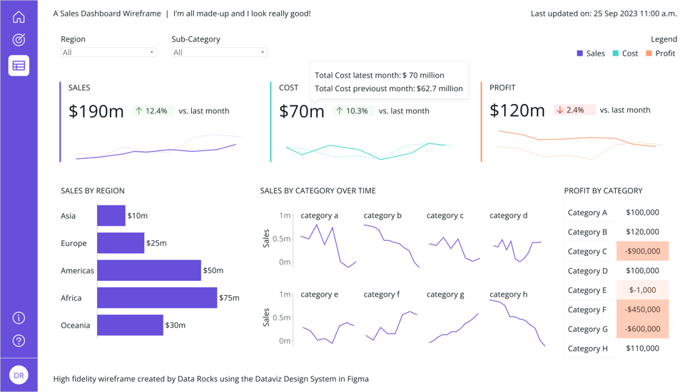
Example 3 - colour helps to direct attention
- The same as with 1 font size, colour can help establish a clear path for your audience’s attention. (have a look at the subtitle, the legend, footer notes, etc.)
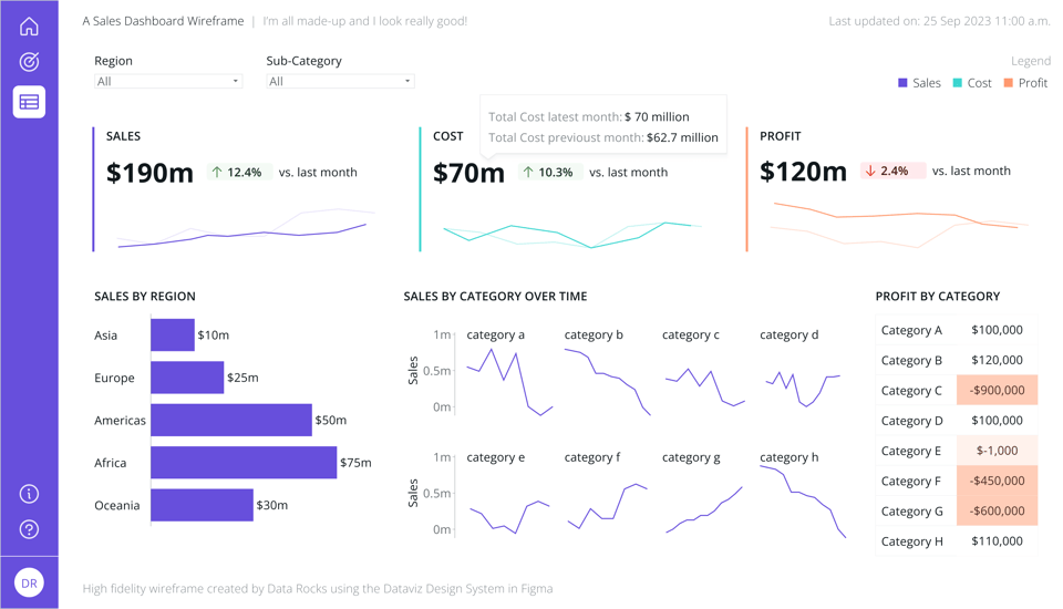
Type system 3: four sizes, a lot of rhythm
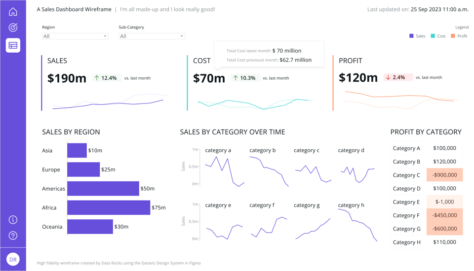
Can you use 3 sizes? Sure. But I often find that while working with 2 sizes is quite straightforward, 4 sizes is the next natural progression for me, mainly because of how I choose to prioritise my functional hierarchy. Remember we split all of this into 4 levels? This is the fine application of that methodology.
This is also my most frequently used approach to typography in dashboards.
Example 1 - font size variation only
- Here, you apply 4 font sizes of your type scale based on your functional hierarchy and don’t apply any other style variation.
- They don’t have to be consecutive sizes as long as they’re all part of the same scale. Being consistent ensures a good rhythm and visual flow.

Example 2 - font size, weight, and colour
- This is the most complex system to implement
- It is also the one with more visual variety. And variety, as long as it’s purposeful and consistent, brings more life and interest to a design.
What about two typefaces?
In general, if you are building something that needs to be easily replicated, scalable and in an environment where people have multiple levels of design skills, sticking to just one typeface is recommended. Can you use more than one? Absolutely. But it brings in different challenges that I haven’t covered here.
But suppose your brand has a typeface they use in their visual identity, and it is a Serif typeface. Can you make it work? Yes, you can.
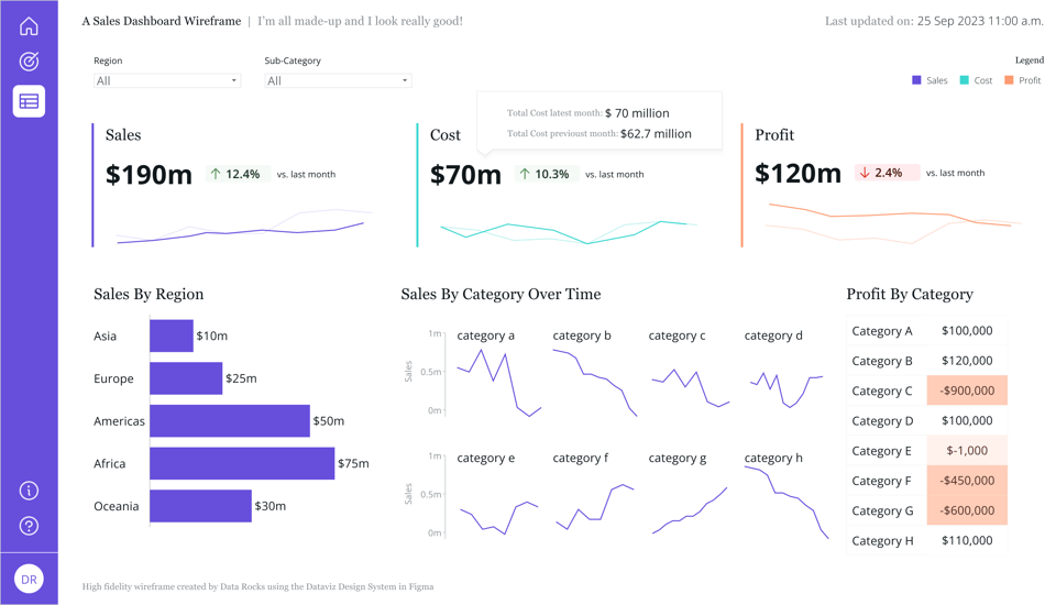
Bonus example: two typefaces.
- Stick with two typefaces only: one Serif and one Sans Serif.
- Use your Serif typeface for all non-data elements such as headings and sub-headings and long annotations like footnotes.
- Stick with a Sans Serif typeface for all data-related stuff, such as numbers and labels, axis, and visual captions.
- Keep your interactive elements (like buttons and clickable tabs, filters, and slicers) in Sans Serif.
- Colour and weight rules apply in this case as well.
- You’ll notice how a small addition of a serif typeface changes the visual identity completely.
4. In your BI tool
This is all good and well, but you may be wondering how this translates into Power BI or Tableau.
Both tools have limited options for typefaces, and while we would all love to be able to use more custom options, they aren’t top on the priority lists of things either of them needs to improve.
Can you make any of these typography systems work with either Tableau or Power BI?
The answer is yes, you can.
The first thing is to establish your typographic system and rules and make it very clear in either a design document, style guide or design system you might use. Mine is in a table, and it looks like this:
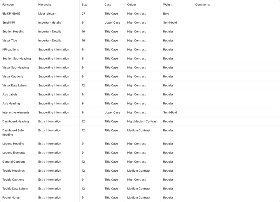
From this, you can create themes or templates that help you or your team to keep things consistent across different dashboards. The name of the game is always consistency.
Power BI
There is one typeface that attends to most requirements of readability, good x-height, good counter shapes, and good options of weight within Power BI itself. Segoe UI, a Microsoft typeface.
The numbers in Segoe UI are lining and tabular, which means they look good on tables and that numbers with the same amount of digits always have the same width - making it easier and quicker to know that while 311 and 896 are both 3 digits long, 1271 is larger than them. This is very useful with things like data labels.
It also has 4 weights, although all weight options only appear available in some visuals and for some settings. But I haven’t faced any major constraints yet - except that the Text Box only shows 3 options (Segoe UI Semibold is missing from the Text Box options).

The dashboard below was created using the 4 sizes type scale with Segoe UI. You can see it in Power BI here.

Tableau
I must make a confession. I have a crush on Tableau Font. It is one of the best-curated data fonts I have ever found. I understand everyone being sort of tired of it by now because it does have a distinct look that screams Tableau defaults. But when you look at it clinically, it is brilliant.
One of the small things that makes it such an awesome font for data displays is the details with the numbers. Yes, they are tabular and lining like Segue UI’s are. But they are also of the rarest kind: *uniwidth. This means that even if your numbers are bold, they are still the same perceptual width as their thin counterparts. This may sound unnecessary, but if you think of using them in a long table where some figures use a thicker weight as emphasis, it makes all the difference - your numbers are always tabular, despite the weight you choose.

Another thing is the number of options of line weights it comes with. While other typefaces may give you 3, maybe 4 weight options (Regular, Bold, Light, sometimes a Black extra thick option), Tableau Font gives you 6 natively.

There are other small details that make it awesome, but I couldn’t find more about its history. If you happen to know where the Tableau Font came from, please send me your sources! I want to know how the perfectly curated data display font came to be.
And to those who made all these brilliant decisions, I send you my most cheerful congratulations. I smile every time I use it.
The dashboard below was created using the 4 sizes type scale with Tableau Font. You can see it in Tableau Public here.

Design Matters has already covered quite a bit about the decisions we have to make as dashboard designers. I hope you enjoyed learning more about typography!
We still have some way to go and lots of themes to cover. If you have suggestions of what you’d like to see next or thoughts about what we have covered so far, just reply to this email.
If you like what I share and would like to support my caffeinated habits, you can buy me a coffee!
You can also buy a copy of my Data Design Manifesto posters here
See you again in late November!
-- T.
