Design Matters #7 - The Ultimate Dashboard Colour Palette in Practice
Hello!
You are reading (Dataviz) Design Matters - a newsletter series made with 💕 by T. from Data Rocks.
If you’re new here but like what you see, subscribe below and get all upcoming issues straight into your inbox.
First published on 26 August 2023.
Hi Friends!
Welcome to issue #7 of the series Design Matters.
In this series, I’ll share with you how design can help your dashboards go from average to awesome.
The goal of this series is to shed light on how design plays an indispensable role in data analytics - not just in making things look pretty but in affecting understanding, communication, and decision-making.
Last week, I talked about how I create my ultimate dashboard colour palette. This is a continuation of that post. If you haven't got the chance to read it, you can check it out in the the archive, along with all previous Design Matters issues.
A dashboard is an ecosystem
If you've ever worked with me before, you probably heard me saying about seven gazillion times a day that a dashboard is like an ecosystem. What I mean by that is this is a data product that relies on multiple moving parts, and if any of them is changed, removed, or broken - at any stage of the process - everything stops working properly. You may not be able to articulate what it is that seems wrong, but you know something doesn't feel right.
The way most of us interact with a dashboard is through the way it looks. If colour isn't quite in the right place, we will feel overwhelmed and lost, and that will impact the way we interact with the tool. It may even impact trust - even if everything else is right.
So, today, I'll walk you through an example of a mock-up dashboard and its journey from poor use of colour to functional use of colour. I hope this helps you expand how you understand and apply colour to your work in the future!
Get it right in black and white
Let's start from the beginning. If you've followed previous issues of the newsletter, by now you'll know how I love using wireframes to get my layout organised before I start building my dashboard in a BI tool.
This is the layout we're going with here:
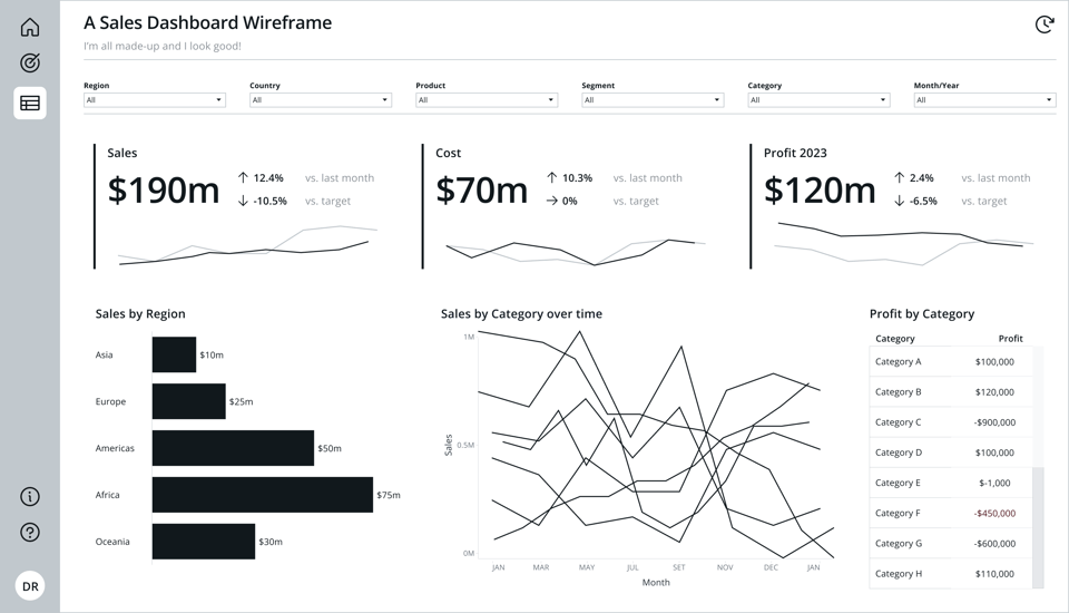
We've got 3 KPIs, 2 charts and a table.
Looking at it with no colour allows us to see that the elements are placed in a logical and hierarchical order, which will help users navigate the information they see:
- We have a filter bar at the very top
- Next, we have 3 KPIs - Sales, Cost and Profit
- Below them, we have a bar chart breaking down Sales by region
- And last, we have two breakdowns by category - a line chart and a table.
When everything is important, nothing is important
Here's another thing I say about seven gazillion times a day. Colour's main purpose in a dashboard should be to help us derive meaning and assign importance to an element. Maybe you want your colour to identify your brand or to mean that a KPI's status is important. Maybe it's to add some flair and make something visually more interesting. But if everything on the screen has a bright, saturated colour assigned to it, your eyes won't know where to focus, and everything will become just a big mush of cognitive load.
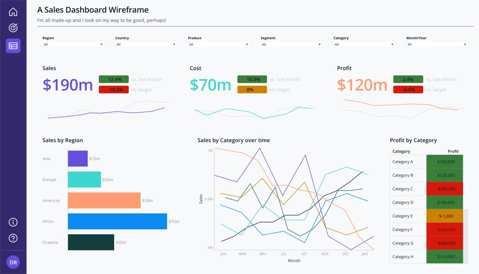
Take our starting point below. Unfortunately, if you Google "dashboard", heaps of examples like this one come up.
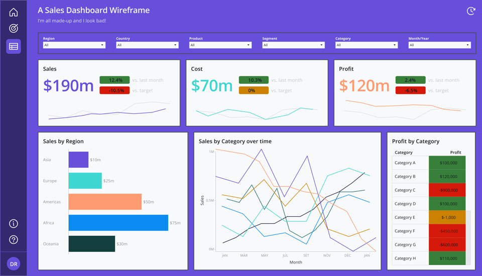
There are many reasons why a dashboard ends up looking like this. But let's unpack it feature by feature and improve it one step at a time.
1. Background
This is the surface where all your elements will live. Think of it as the room where your dashboard will live.
If you painted your entire house with this very bright purple, chances are you'd grow very tired of it very quickly. Your entire decoration would be much more difficult to harmonise, and you'd feel overwhelmed by everything around you.
Apart from feeling quite overwhelming, a bright background is hard to work with. It will necessarily grab all the attention of your eyes and compete with the information you're trying to display.
It is also an accessibility nightmare. Not just for people with colour vision deficiency but for those who have a hard time with contrast, such as neurodivergent people.
White is always a good alternative. As sleek as some dark mode interfaces may look, they require an advanced notion of colour theory to look good and accessible.
Some rules of thumb:
- If you aren't sure of what your background should look like, stick with pure white (#ffffff).
- A very light and neutral grey, like the one we defined when we created our colour palette, is also a good choice, as it's neutral and doesn't compete with other colours.
- If you want to go for a modern look, you can try a very light tint (95% brightness or more) of your main hue. This means that the colour you'll pick is almost white, with 5% of your primary hue there.
2. Borders, Borders everywhere
This is another common problematic use of colour. In an effort to enclose and separate content, you may be tempted to contain it within thick, colourful borders. The same goes for the excessive use of drop shadows.
One question to ask yourself is: What function is the border performing that white space and alignment wouldn't be able to perform?
Enclosure and Proximity can help us highlight and organise content in a dashboard. Borders act as a pause between content elements. But if you have too many pauses, reading the content becomes cumbersome.
Think of it as a normal written sentence, for example:
"good data design is purposeful:
Every decision, every visualisation, and every interaction is crafted intentionally, aiming to promote understanding."
Easy to read, right? Below is the same sentence if we use commas the same way our dashboard is using borders:
"good, data, design, is, purposeful,:
Every, decision, every, visualisation, and, every, interaction, is, crafted, intentionally, aiming, to, promote, understanding."
Use your borders and dividers like you use your commas. Wisely.
3. Status and semantic colours
Our dashboard has a classic problem of traffic lights.
Right beside each of our B.A.Ns (Big A** Numbers), we have little indicators.
There are a few problems here. First, the colours we're using to mark status (positive, negative, warning) are very bright. This causes the same problem we had with the background colour at the start: they're hard to work with. The black fonts on top are barely readable. The contrast is very poor. Even if you use white, in this case, against the yellow warning colour, it would still look quite difficult to read.
When you add elements to a dashboard, think of it as adding layers, one on top of the other. In design, we call the background of anything a surface. Your buttons have a surface, and your icons are on top of a surface. It's the background of every element.
Surface colours need to not only have good contrast against the fonts layered on top of them but also against the other surfaces they're on top of.
When we defined our colour palette, we accounted for this. We defined surface and text colours. That's when defining functions for each colour in a palette comes in handy - to help you with decisions like this.
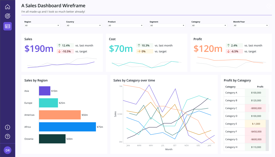
Some helpful tips when working with semantic or status colours:
- Yellow and white don't go well together
- Always try to rely on other encoding methods to send the main message of your data before colour. Notice that I've also added little arrow icons to our KPIs. If you weren't able to distinguish these colours, you'd still be able to read this dashboard and understand the trends.
- Red, Green and Yellow are not the only options for semantic colours. In fact, you could easily use any warm colour for negative meanings and a cold one for positive - like orange and blue, for example.
- Always ask yourself about purpose. If your audience only cares about what you'd paint in red, maybe all you need is to highlight those red items and nothing else - no green or yellow needed!
4. Categories
It is common to see colours used to differentiate categories in a dashboard. This can be a very useful way to encode information. But you have to ask yourself two important questions before you use up all of the colours you have available in your palette for a chart like our Sales by Region one.
- Question 1: Do you need to differentiate those categories by colour? Why?
In our context here, the category is already named in the vertical axis. We know what each bar represents. If we removed the colour entirely, we would still know the exact same information. Colour is adding nothing but clutter and confusion here.
- Question 2: Are our categories and measures encoded consistently across our entire dashboard?
In this case, notice how I used purple, turquoise and coral to represent the KPIs at the top (measures) and also to represent the categories in the bar chart (Asia, Europe and Americas).
This can be very confusing for someone who's not familiar with this dashboard. If the bars represent sales, why some of them are coloured the same as Cost or Profit?
If your use of colour is consistent across the dashboard, you'll likely not even need legends. Someone who sees that everything related to Sales is always purple would instantly know that every time they see purple, it means Sales. Less legends mean more space for more meaningful stuff.
In some instances, you can even use colours in your titles to represent the names of your measures or as small accents around your KPIs or charts to hint at the colour's meanings. Notice the little bars beside each KPI, helping both to frame them a bit better, as well as identifying them by colour.
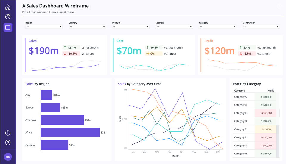
But remember how we talked about bright colours, contrast and accessibility above? Always be mindful of that. If your encoding colours are good for data encoding but not good for text, don't push it. Make sure you consider very carefully if this is the right way to go or not.
5. Mom's Spaghetti
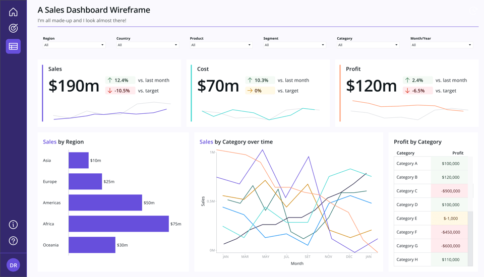
This is what I call that line chart in the middle there.
Usually, a chart like this comes accompanied by a huge legend saying what each one of the colours means. And the more colours you have, the more you risk having to either use colours you have used before for different things like I mentioned above or to use colours that are very hard to tell apart.
Either way, this chart tells us very little. Which category is performing well or not? Is there any category that is trending down or up?
Again here, the question of purpose comes up. Why do we even have this chart there in the first place?
Supposing that someone from your audience wants to know about a specific category, they could use the table right beside to chart to help them identify what they need. Interactivity can be useful in case you really want to keep the spaghetti going.
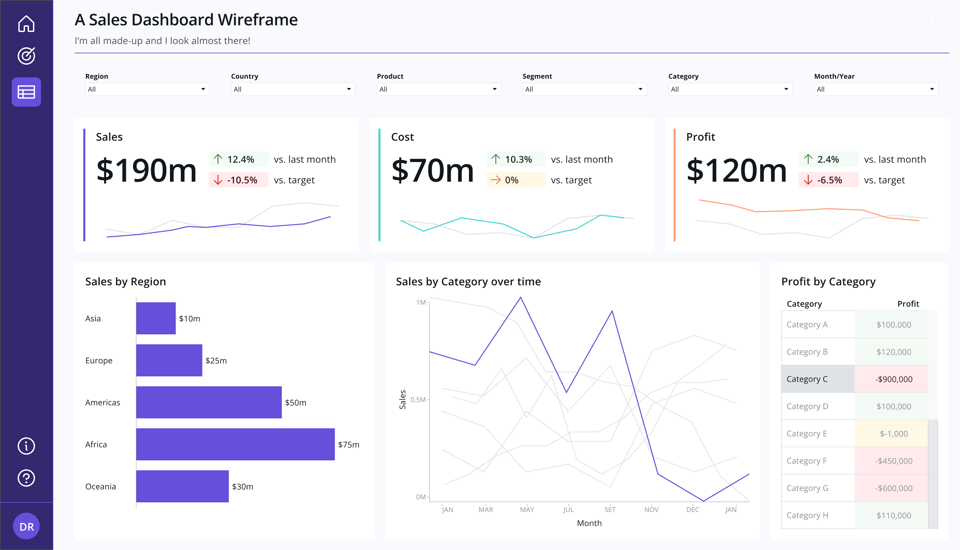
You could also make use of small multiples. This is a technique where you split each category into its own small version of the same chart. Each line would then be very visible, and comparison would be much easier at a glance.
You'd also be able to keep your encodings consistent and paint all the lines purple instead - since all of them refer to sales.
6. Putting it all together
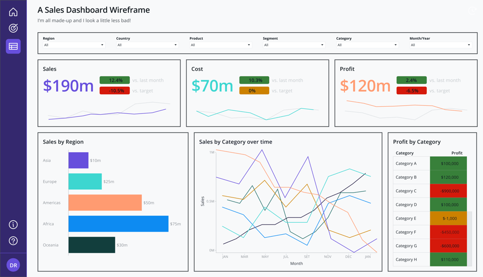
Below is how the final dashboard looks. Notice I did some extra small adjustments here and there. Are you able to see and name them?
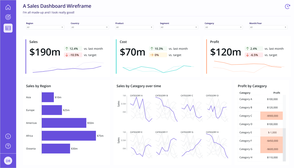
Colour is a complex subject, I could talk about it all day, but I have to draw the line somewhere. There are lots of micro decisions you need to make as a designer to make sure your use is meaningful, purposeful and useful for your audience.
These are just some practical tips you can apply today to your designs, and I hope they'll help you make more conscious choices when it comes to colour in your work. :)
If you'd like to keep the conversation going, just reply to this e-mail. I'd love to hear your thoughts!
If you like what I share and would like to support my caffeinated habits, you can buy me a coffee!
You can also buy a copy of my Data Design Manifesto posters here
See you again next week!
-- T.
