Design Matters #6 - The Ultimate Dashboard Colour Palette
Hello!
You are reading (Dataviz) Design Matters - a newsletter series made with 💕 by T. from Data Rocks.
If you’re new here but like what you see, subscribe below and get all upcoming issues straight into your inbox.

First published on 18 August 2023.
Hi Friends!
Welcome to issue #6 of the series Design Matters.
In this series, I’ll share with you how design can help your dashboards go from average to awesome.
The goal of this series is to shed light on how design plays an indispensable role in data analytics - not just in making things look pretty but in affecting understanding, communication, and decision-making.
The last couple of issues of Design Matters covered the ins and outs of how wireframing can help your design process.
If you haven’t read the previous issues yet, you can check them in the archive
A couple of months ago, I tried my hand at Chat-GPT and wondered if I could use it to help me create the ideal dashboard colour palette. That was the newsletter issue I got the most feedback on ever! Not so much because of Chat-GPT but because it outlines my thought process on establishing a colour palette at the start of a dashboard development process.
Colour has always been an interesting subject in the dataviz field. It is usually the first element in a chart that makes someone go, "I should probably learn a couple of things about design". It is terribly misused and misunderstood as an encoding method most of the time. And although there are excellent resources available on how to use colour and how to create colour palettes for individual visualisations, there's very little in the way of informing how to use all of this knowledge in a display where you have to coordinate multiple visuals together - like in a dashboard. Little is said about what to do with all the other elements that aren't a chart on the screen.
A dashboard is a complex data product, not just because of all the analysis that is involved in creating an informative one, but because it gathers multiple visual elements that we often pay little attention to, even though they're essential to ensuring the charts aren't just thrown on a screen, with no support. I think of them as scaffolding elements - because they're the structure holding all your important things (like your charts) together in place. Think backgrounds, titles, subtitles, tooltips, UI elements like buttons, toggles or icons. Sidebars, filter bars. Pathfinding cues like breadcrumbs. Footer notes. Annotations. They are all part of the whole that makes a dashboard feel polished and professional. Yet, we talk little about them and give them little love.
For the sake of brevity, this issue won't dive into the basic definitions of using colours in individual charts. There are outstanding articles you can read to get a primer on colour in dataviz.
If you find yourself scratching your head about any of the terms I mention below, take your time to read, bookmark, print and forever keep this article and follow Lisa Charlotte Muth on social media, as she's written the best content about colours in dataviz I've ever read. All her articles are a treasure trove of colour knowledge.
The trap of colour
I usually see analysts look at the use of colour in dataviz from a rather narrow perspective: colours differentiate categories or highlight states.
While categorical colour palettes are a valid encoding method and colour can be useful to highlight status (positive, warning, negative), seeing only these two functions of colour as options often results in a dashboard where all categories must be differentiated by the use of colour as a primary encoding method and misguided use of traffic light shades, everywhere.
Apart from the usual talk about accessibility (green and red are quite confusing for people with colour vision deficiency), there's a risk of using too much colour to highlight too many things and falling into a trap where suddenly, there's just too much of it. When everything seems important, then nothing is really important.
Let me illustrate this. Look at the group of shapes below. Count how many red shapes you see. Red is understood to be the attention colour, so it shouldn't be too hard. Time how long you take to count. In the end, think to yourself if counting these shapes was easy or difficult.
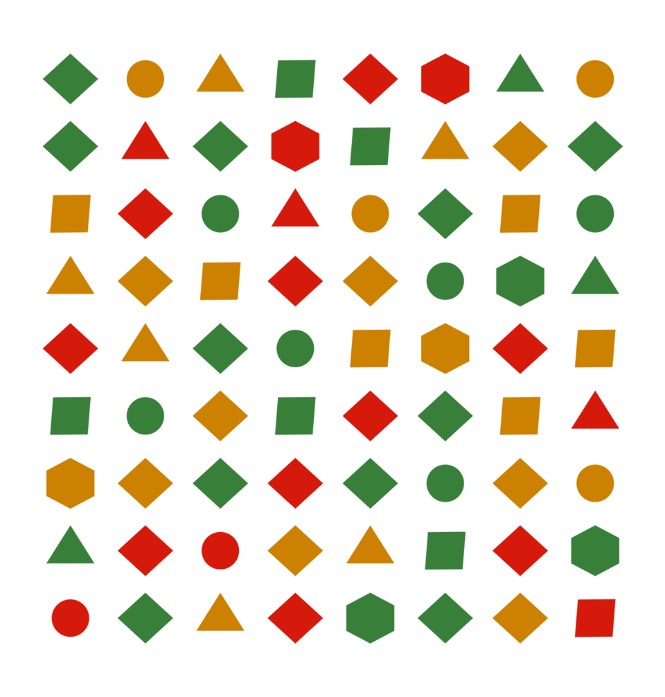
How long did you take? Let's complicate it a bit more. How many of those are triangles? Now you have to overcome the differences in shape alongside the colour. There are 18 red shapes, of which 3 are triangles, by the way.
Think about it for a second. If the purpose of your visual is to know which shapes are red, you could encode your data just by calling attention to those shapes:
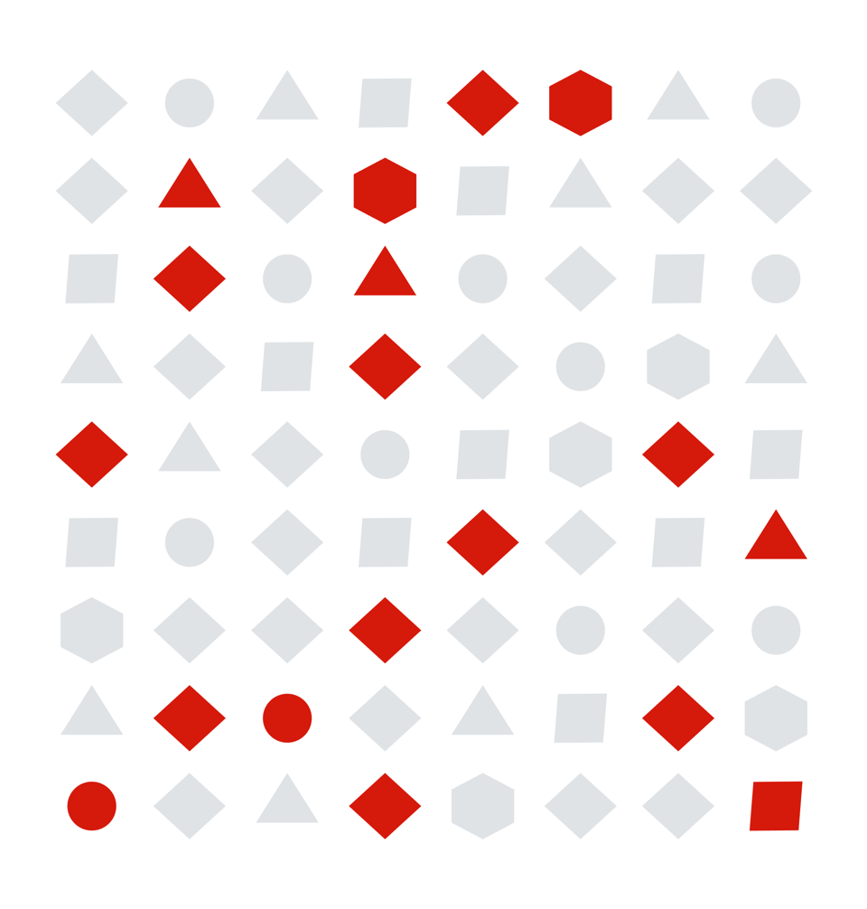
And if your purpose is to be even more specific, you can apply the same technique just to triangles:

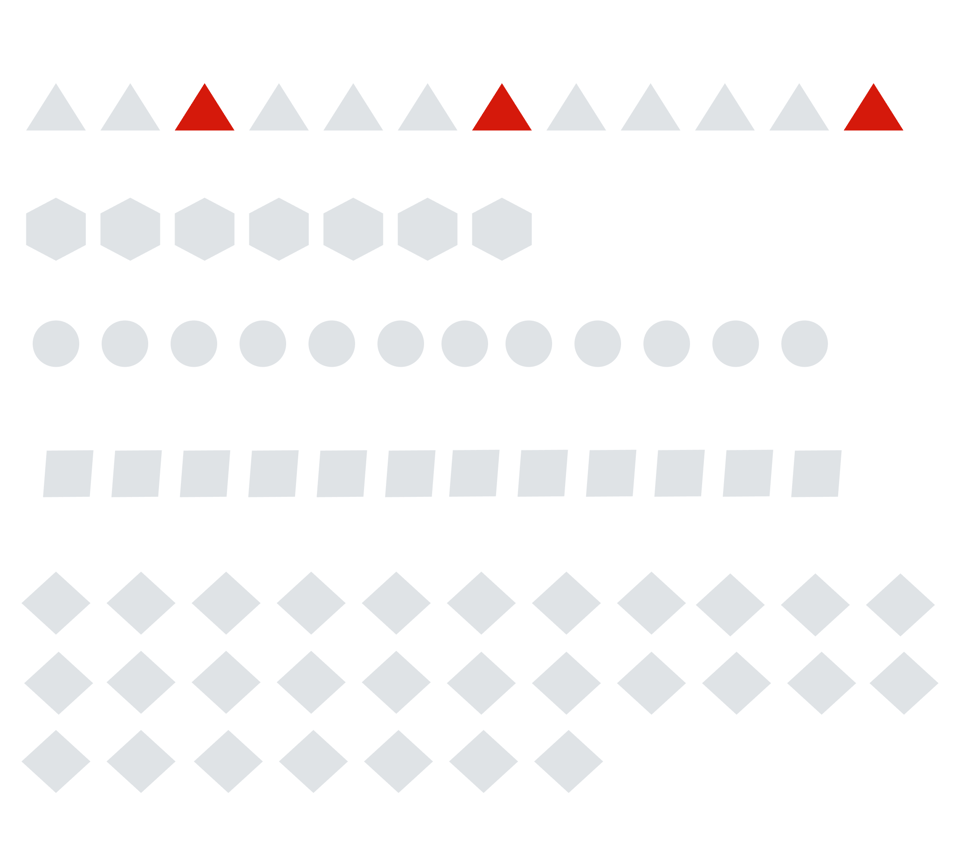
Suppose triangles are always more important than other shapes in this context, and if they're red, they matter even more. You could even sort and organise the shapes differently to get your point across more easily:
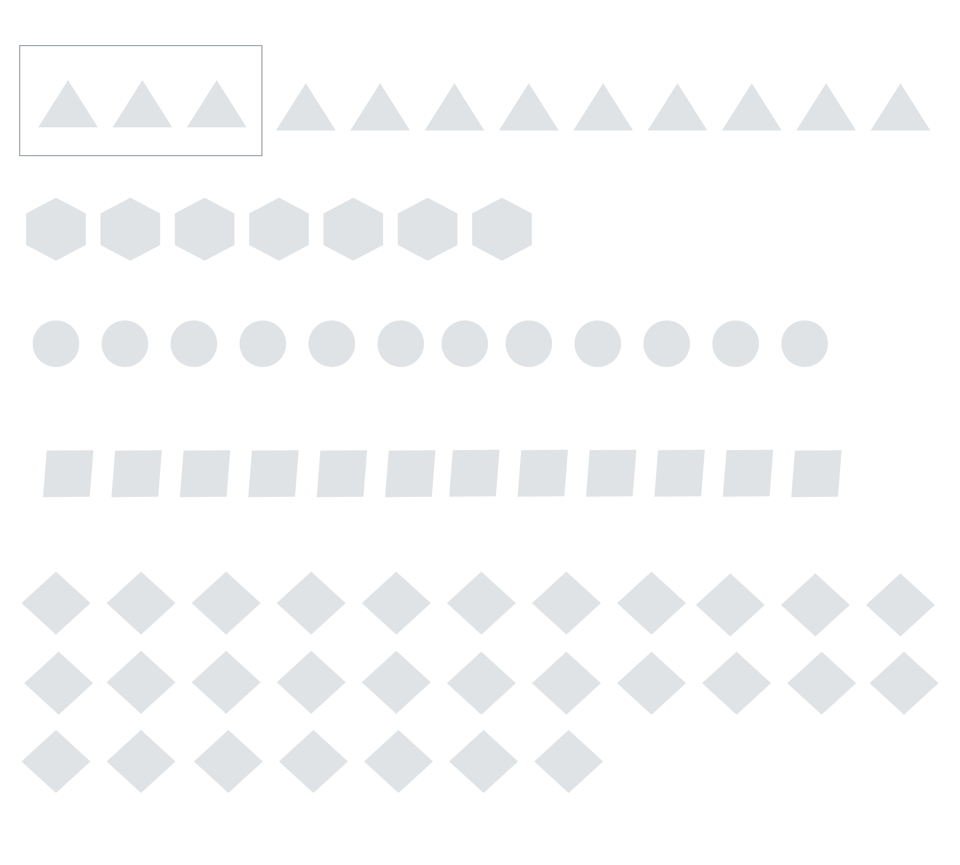
And if you really want to stretch it further, you could even do it with no reliance on a red colour whatsoever:
Now, imagine that around this group of shapes, there are other elements, as there would be in a dashboard. And also, imagine your brand's colour is purple. And you have a brand guide that tells you to use purple as your primary colour. But you still want your audience to have some sort of semantic colour - the ones that mean positive or negative. You'll soon end up with a display full of elements that can't possibly work well together and will be a big strain on your audience.
Functional choices
There is a somewhat simple solution to the dilemma of how to apply colour to dataviz, though. It is the idea that every colour you apply to an interface must perform a named function. If instead of thinking about colour just as categorical encodings or as alerts, we start thinking about it as a resource to enhance specific functions, the choices you'll make while putting together a dashboard will make more sense.
It took me years to realise the power of seeing colour as a functional element instead of just an attention attribute or differentiator of some kind. But it makes all sense if you want your colour palette to have meaning and to help you build a common communication language with your audience.
When brand colours or a pre-determined palette are part of the discussion of which colours to use, keep in mind that the colours chosen by a designer to represent a brand perform a different function in a different context - to raise awareness of the brand, to make it recognisable, to evoke an emotion. And very often, "to represent and encode data meanings" is not one of those functions. So I normally say that brand colours make for a bad dataviz palette. That doesn't mean you can't incorporate them into your designs - just use them consciously.
Usually, when there is a branding guide, analysts end up using the brand's colours for everything - from super bright backgrounds to gradients that make encoding data extra difficult.
Good interfaces have all this figured out, and we don't even think about it. Think about LinkedIn, for example. Big brand. Familiar interface most of us use frequently. What is the colour that comes to mind when you think about them? Blue, of course.
Now, open LinkedIn and evaluate how much of the interface is actually the same bright blue as their logo. No bright blue background. No blue text. In fact, most of it is grey. There's even a sneaky green in some of the secondary buttons. But there's plenty of white space, breathing room and a small logo just to remind you of where you are.
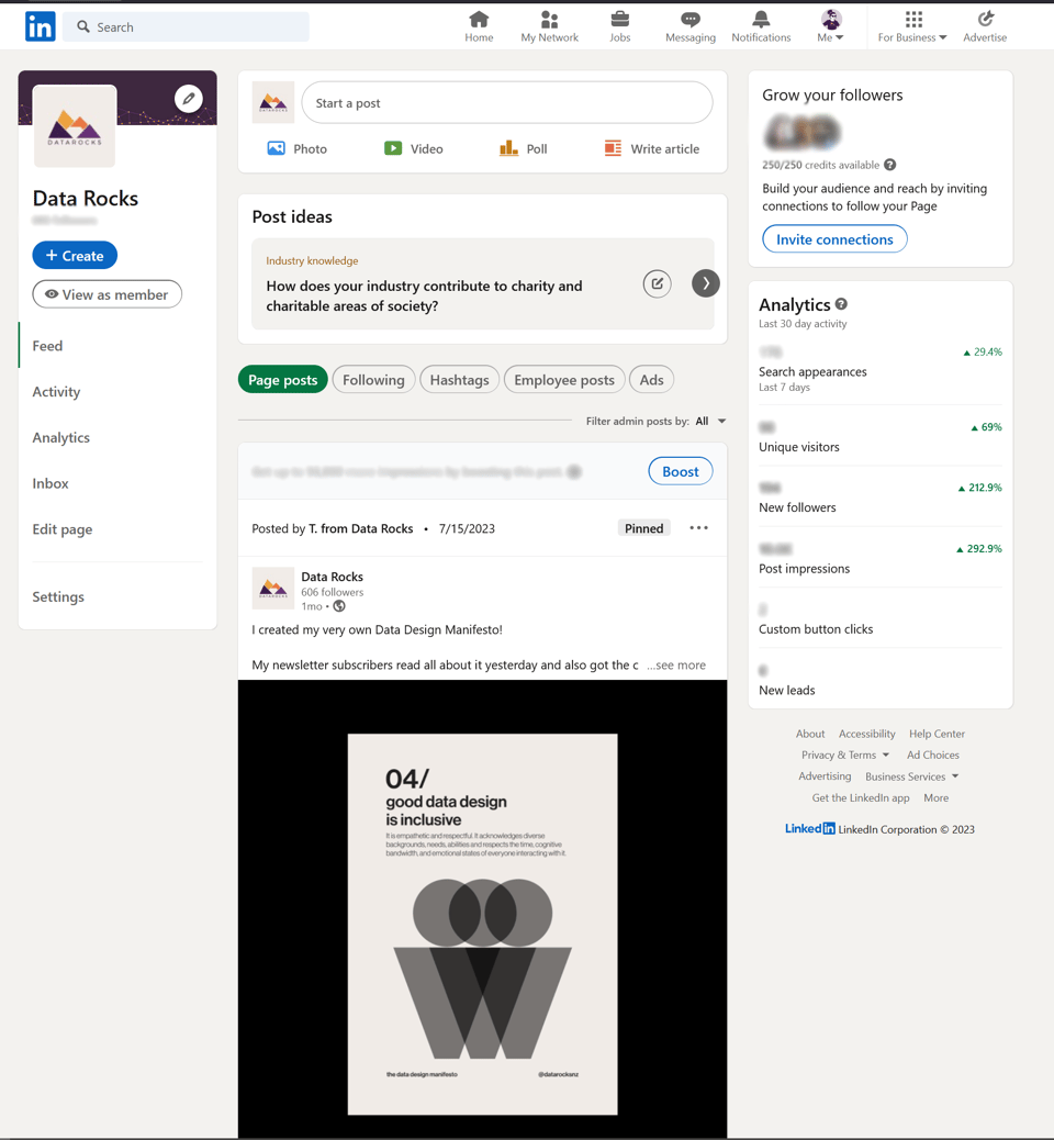

You can, in fact, say that the neutral cream colour and white makeup about 60% of the interface. 30% is reserved for the dark grey used for text - it is a heavy text-based interface with the posts, after all. Only 10% or even less are accent colours - including the brand colour, which only features as either the border of buttons or the main button on the screen. So much for being "on-brand".
There is a tiny hint of green and red indicators on their analytics page as well. Tiny is the keyword here. Instead of giving us a table or colour-coded KPIs with endless shades of green and red, we have a small arrow and a small indicator, double-encoding the information without the need for colour (the arrow is doing the heavy lifting here). Colour is just an accent.

It is quite a revealing exercise to look at the User Interfaces we interact with every day and pick apart the ones we like the most. A lot of them follow the same rules. Try it for yourself! Take a screenshot of an interface, app or website you like. Now, gauge how much colour is used on-screen and where. Chances are, you have less than six different hues, lots of neutral tones, and some bright accent colours here and there.
You'll also notice that the colours in good interfaces are used consistently - the action buttons on LinkedIn are always bright blue. You know that clicking the logo will take you to the home screen (the only other blue element on the screen). These colours have a consistent function assigned to them across the interface, no matter which page you're visiting.
How I create a colour palette
When I get a new client, one of my first requests is if they have a brand guide of any kind or templates they use. I usually hear a long sigh of "yeah, we do, but it doesn't work for dashboards…"
I used to think this way too. But the more I create colour palettes, the more I realise that we can make it work with some clever colour theory.
Here's how I go from brand colours to a comprehensive function-driven colour palette for data dashboards.
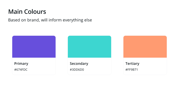
Step 1 - Pick up to 3 brand colours.
No more than that. In theory, you can go up to 5 different colours, but honestly, you don't have to. It just opens more room for more nuance in your design decisions. Less is more in this case.
Select one colour to be your Primary hue. This will likely be your main brand's colour. Let's do it with a violet hue (no particular reason why).
Then, proceed to select a secondary and a tertiary hue. These must be distinct from your primary. If all your brand has are shades of blue, for example, you can use tools like Adobe Colours or Coolors to find harmonic shades to go alongside it.
Pro-tips:
It is really important that you don't fall for the trap of choosing 3 main colours that are very similar at this step - or you'll end up with a very difficult situation where you can't differentiate categories because they're all just slightly different shades and tints of a bright blue. This isn't a good situation. If you're building a palette for dataviz, that has to be a bit distanced from strict branding guidelines. Picking a complementary shade of orange won't cause a brand identity meltdown if you use your secondary and tertiary hues wisely.
<br/ >
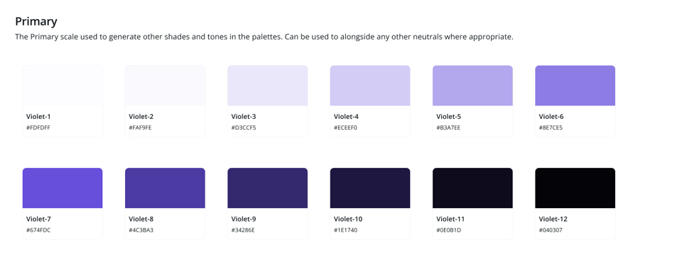
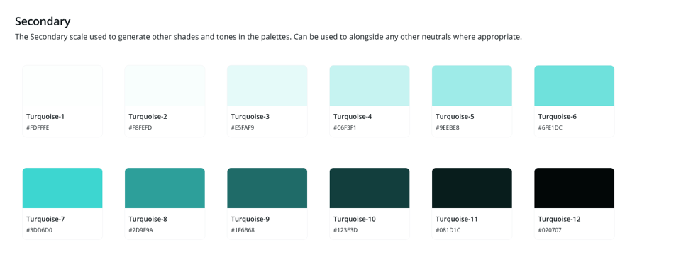
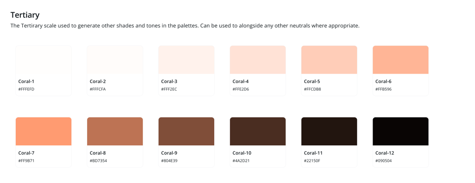
Step 2 - Have a range of 6 to 12 shades and tints of your main colours
Shades are when you add black or remove light from a hue. Tints are when you add white or add light to a hue. From your starting colours, pick a range of at least three variations for each side of the spectrum. I usually create palettes with 12 options. This is very comprehensive, and you'll likely not need all of them. But it's good to start with. You'll see why soon.
You can use tools like The Tints and Shade Generator or Colour Shades Generator to help you. If you use Figma, I recommend the plugin Supa Palette (paid) or the (free) no-frills Colour Designer.
<br/ >
Step 3 - Pick your neutrals
The range of colours you just came up with will inform all colours that will come afterwards.
When we talk about neutrals, we mean greys. You can use a generic grey for your neutrals, but those slick interfaces you see everywhere hold a secret: their greys are slightly biased towards their main primary colour. This means having a grey that is slightly blue and cold if that's the theme you're going for, or slightly orange and warm if your main colours range on earthy tones.
The good news is that I grew somewhat tired of always having to come up with a shade of grey, so I now have a series of go-to standard greys I use based on the primary colours I am working with.
You're welcome.

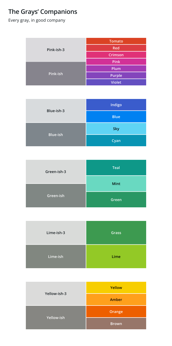
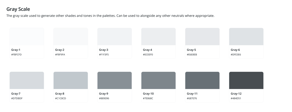
You'll also create a palette of tints and shades for your greys. Bear in mind that here, your lightest tint will be white - pure white is always useful in a palette! #FFFFFF for the win. But on the other end, avoid using pure black - as it is highly contrasting and very unnatural, it can be quite straining to the eyes. The best blacks are almost black but derived from a very dark version of your grey of choice. This will be your grey with a very dark shade - 10% or less brightness. I always call mine Black-ish (see a naming pattern emerging?).

<br/ >
Step 4 - Pick your semantic colours
These are the colours that always mean something - green for positive, yellow for warning and red for negative. I usually also add a 4th colour for information cues, such as information icons, overlays and tips. This 4th colour is usually blue, but if the brand has blue as one of its primary colours, I change it to purple.


You'll also create a gradient for these, but for the sake of ensuring they aren't abused in traffic light nightmares, I only allow the main shade of each category, one tint and one shade. This means you have a very light red and a very dark red, which serves for text and surface colours (in case you want to create a pill, like the example below):

You'll rarely need more than three variations of each semantic colour. They should be used sparingly.
<br/ >
Step 5 - define your colour's functional roles.
Now that you have a comprehensive colour palette, you're probably overwhelmed by options. What do you do with all this? This is when you start defining functional roles for your colours.
Every role I mention below will be occupied by one of the colours you selected in the previous steps. You may not end up using all variations, and that's ok. You don't need to. But it's good to start with good, solid options to then be able to pick what works best.
There are a few rules to keep in mind and a few functions you'll always have to pick a colour to fulfil.
Rule of thumb:
60% of the colours you'll use will be neutrals - that's why picking a good grey matters so much. You'll use it everywhere that's not encoding data directly - and sometimes even when you're encoding data in a chart!
30% of the colours you'll use will be your base colours - made up of your primary, secondary and tertiary colour scales. They also can inform your UI elements if you're looking for a way to bring in brand colours without overwhelming the interface. They also give your interface its overall identity - since everything else is grey, any pop of purple will be memorable.
10% of the colours you'll use will be your semantic colours - your alerts and indicators. This ensures we aren't creating Christmas tree-inspired dashboards and that whenever your audience sees red or green, they know it matters.
The functional roles:
I organise my colours in 3 groups based on their roles and frequency of use. These are:
<br/ >
Group 1- 60% - Scaffolding colours
These colours represent 60% of your interface.
They give a neutral structure in which your encoding colours can shine without competing for attention.
They are made of :
Background Colours - the base on top of which everything else lives;
User Interface Elements Colours - the elements that are not visuals but help navigation, like buttons, toggles, tabs and sidebars;
Chart Elements Colours - the ones that are not encoding colours but make the rest of the chart, like gridlines, titles, and labels.
Here's how I usually define their roles:
Background colours:
Background - usually Pure White
Surface-Light - useful for elements like tiles or highlighted sections that need some shading to differentiate them. It's still very light to enable Contrast with most text colours. It can be your lightest tint of grey or of your Primary colour.
Text-High Contrast - usually your Black-ish, as it must have a good contrast ratio against your background and surface colours.
Text-Medium Contrast - it must still be easily distinguishable and accessible against your surface colours, but a little lighter. Usually used sparingly in the text you don't want to call attention to, like footer notes.
Separator - I often have a light and dark variation of separators, but you can start with just one. These are the lines that split your dashboard into sections. Usually, a light-medium tint of grey.

User Interface Elements:
Surface - Go for a light shade that you can use to differentiate the elements (like the background of a button, for example) based on your primary colour. If you want to be extra, you can have 3 variations: light, bright and dark, to mix and match different options.
Text - With a Dark and Light variation. Make sure you give great levels of Contrast when using light text on top of dark surfaces and dark text on top of light surfaces.
Icons - You can also have variations, but if you have to pick one, make it either be similar to your Dark Text option or your main primary hue.
Borders - some elements can benefit from having a border around them, like tabs. You can have variations of Light, Dark and Bright here, too; make sure they're easily distinguishable.
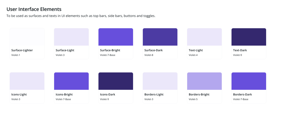
Chart Elements
I usually define 3 main shades of grey - light, medium and dark, to mix and match across multiple functions of charts. If I have 12 variations of grey, they're usually grey-5 for Light, grey-9 for medium and grey-11 for dark. This ensures that even at the lightest option, the audience is still able to see the elements.
Two text variations: High and Medium Contrast, often the same ones I use for background text. Both must ensure good Contrast against surface colours.

<br/ >
Group 2 - 30% - Encoding Colours
These will be your main colours - the ones you'll use in the charts and visualisations you create.
They give the general look and feel of your final dashboard and are often based on brand colours and guidelines.
They should be used on about 30% of your page.
Too many of them will cause colour overload. Use them with purpose and meaning in your visuals.
For each of your encoding colours (your Primary, Secondary and Tertiary), you'll define 5 functional roles.
Surface - a very light tint
Light - a medium-light tint, lighter than your base colour, but still easily distinguishable against your background surfaces
Base - this is your main colour
Dark - a darker shade of your main colour
Text - almost black, works well to add a little bit of colour to text elements you wish to represent using one of your encoding colours.
This is what it looks like:


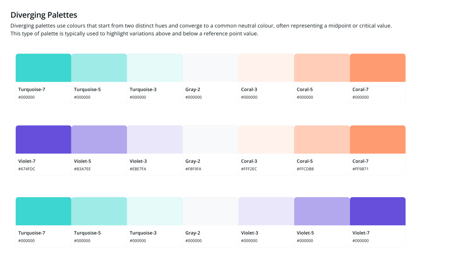
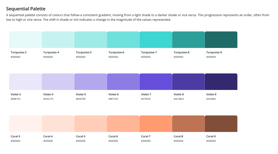
Encoding colours are a bit special since they're the ones that will inform how you'll represent your data in your dashboard. For this reason, I often create a side group of palettes as a reference, which can be used to feed out dataviz tools (Power BI, Tableau or others).
This is what the encoding colours look like organised as Categorical, Diverging and Sequential Palettes:

<br/ >
Group 3 - 10% - Semantic Colours
These colours represent alerts and indicators in your interface. Warning signs, error messages. Information boxes.
Use them at most 10% of the time on a given screen.
Here you only have 3 functions for each colour. No more than that.
Surface, Base and Text.
I organise them into Positive, Warning, Negative and Information colours.


This takes a bit of practice and some time to define, but in most teams, you only define this once. You may want to review periodically what works and what doesn't, but assigning functional roles to your colour palettes makes it easier to justify your design decisions and combine them in a way that's thoughtful. The end result will be much more polished and professional, and the burden of all these micro-decisions is much lighter once all is in place.
Next week, I'll walk you through some examples of how this palette looks like in a dashboard.
If you'd like to keep the conversation going, just reply to this e-mail. I'd love to hear your thoughts!
If you like what I share and would like to support my caffeinated habits, you can buy me a coffee!
You can also buy a copy of my Data Design Manifesto posters here
See you again next week!
-- T.
