Design Matters #2 - The Loop and The Squiggle
Hello!
You are reading (Dataviz) Design Matters - a newsletter series made with 💕 by T. from Data Rocks.
If you’re new here but like what you see, subscribe below and get all upcoming issues straight into your inbox.

First published on 20 July 2023.
Hi Friends!
Welcome to issue #2 of the series Design Matters.
In this series, I’ll share with you how design can help your dashboards go from average to awesome.
You might be a seasoned Business Intelligence developer, an enthusiastic manager, or an analyst dipping your toes into the field for the first time. Regardless of where you find yourself in your data journey, the goal of this series is to shed light on how design plays an indispensable role in data analytics - not just in making things look pretty but in affecting understanding, communication, and decision-making.
Last issue of Design Matters, I covered why design is important in your analytics process and how good data design can help you build better data products. If you missed it, you can read it here.
I’m so happy and humbled by all the responses to The Data Design Manifesto! I’m glad it has resonated so well with so many people! Thank you to everyone who supported my work by buying a copy. If you’d like to get yours too, you can do so here.
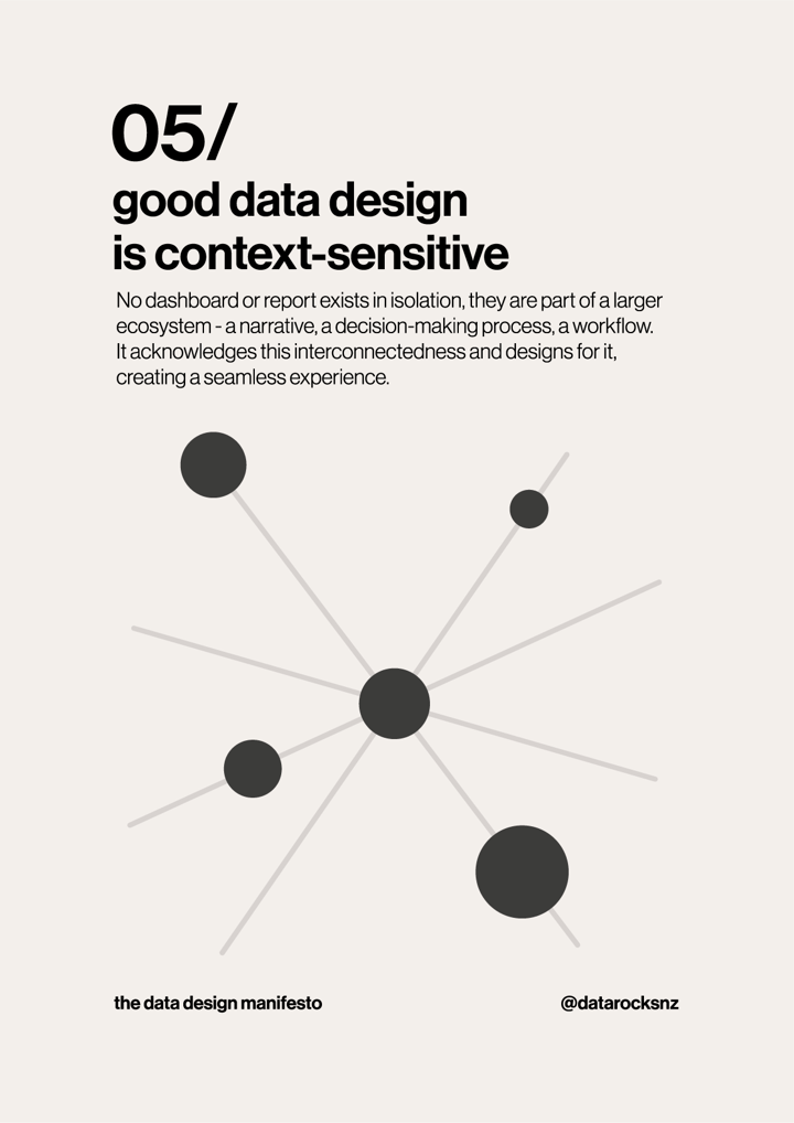
Good Data Design is Context-Sensitive

No dashboard or report exists in isolation; they are part of a larger ecosystem - a narrative, a decision-making process, a workflow. It acknowledges this interconnectedness and designs for it, creating a seamless experience.
When someone needs to see and do something using data, they usually have that need in a context. A need for data communication or insight never exists in a vacuum. A person asks you for a report because they have a need to satisfy. It can be because they need to go to a meeting and report on performance, or they have to investigate the root causes of an issue with a process, or they need to track performance against a target and report it to their manager. There’s always a why within a place or situation.
This is one of the most elusive concepts when it comes to developing a data product of any kind - be it a dashboard, a report, a presentation or a data repository - data communication doesn’t stand by itself. It demands a clear audience within a clear context to be effective in its purpose.
Once you realise how context matters as much as the audience, you’ll also start noticing how narrow-scoped and inflexible dashboards can be. Which begs the question - does it even have to be a dashboard?
It depends
What even is a dashboard?
Ah, what a big question.
Stephen Few defines a dashboard as *“a visual display of the most important information needed to achieve one or more objectives; consolidated and arranged on a single screen so the information can be monitored at a glance”.*
While The Big Book of Dashboards (Wexler, Cotgreave and Shaffer) offers a wider definition, saying, “a dashboard is a visual display of data used to monitor conditions and/or facilitate understanding.”
But if you go around your business or team and ask 20 people their definition of a dashboard, you’ll likely get 20 different answers. This is because “dashboard” sort of became a blanket name for anything that shows data, in any form, for any particular reason. And this is a problem.
If you want to go deeper into the definition debate, Nick Desbarats discussed it in this brilliant talk at Tableau Conference 2019. I highly recommend you watch it! It even touches on a few things I’ll cover in upcoming weeks 😉
For this issue of *Design Matters* though, I’ll go with the other blanket statement that drives anyone trying to get better at this dashboard thing up the walls: *it depends.*
>*It depends.*
>*- Every consultant ever.*
And since I am a person who likes to define things clearly, this got me thinking: when an expert answers, *it depends* on a data visualisation context; what *does it depend on?*
Well, I’m glad I assumed you asked it too. As annoying as the answer may be, every decision you make on how to display information for someone else to consume, in a given context, for a particular reason, does depend. It depends on up to three things:
Context
Audience
Purpose
Next time you’re browsing your social feeds, and someone asks a question about an ideal chart, a best practice of any kind, and you see the words *it depends,* take a deep breath, count to 10 and read what comes afterwards: It does depend - *on context and/or audience and/or purpose.* Unless these 3 factors are well-defined and clear, you can’t even decide if what you are about to build needs to be a dashboard at all - for whatever definition you may choose.
Be like an architect.
Let’s suppose you want to build a house. You may have a vague idea of what you want your house to look and feel like. What do you do? Do you go straight into your piece of land and start laying the foundations, bricks, and walls without assessing what goes where or why? Do you even know what sort of house you want to build? Is it a beach house? A farmhouse? An urban townhouse? How many rooms?
More often than not, this is exactly what happens to data products - as analysts, we tend to have a bias towards action and the technology we’re comfortable with. So we think to ourselves, “if I assess all of this before I jump into the final tool where the build will live, I’m wasting precious time! Gotta build right away!”
And so, we end up with a dashboard that looks like a house built without project or planning. It won’t be a solid house. As we change our mind on the go, it will likely be plagued by all sorts of structural problems. And it will probably end up looking a bit confusing and messy. No one will want to live there.
The solution is to embrace an architect’s mindset. An architect will look around, assess the land, and check the environment in which the house will be. They’ll ask multiple rounds of questions before finalising a plan. They’ll understand who will be living in the house, their lifestyle, and what they value. The architect will define the context where the house will be (the place), who will live there (the audience) and why the house will be built (the purpose). And only then they’ll lay all of those findings into the shape of a house, in a blueprint, way before any bricks come into the picture.
We can and should approach the development of our data displays similarly. It not only saves time as our build grows in size and complexity, but it also builds trust and gives a common vision to everyone involved in the project.
A loop and a squiggle
When working with the development of data displays (namely, dashboards, in the broader sense), there are many common processes that most developers follow. They usually drink from common sources like Scrum or Design Thinking-inspired methodologies. While having a process helps to give a high-level idea of what to expect in terms of phases of development, the reality is much messier than that. That’s why, in my own practice, I adopt two frames of reference to explain how things will progress in a development job: The loop and the squiggle.
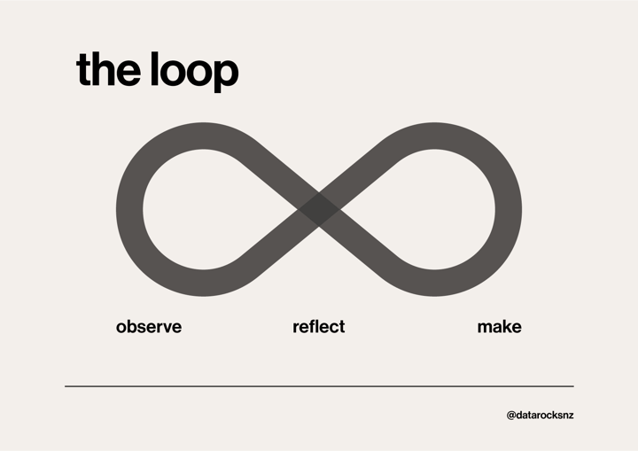
**The loop**

It is borrowed from [IBM’s methodology](https://www.ibm.com/design/thinking/page/framework), and it is a simplified depiction of the design thinking double-diamond methodology. I like that it is more organic, less prescriptive and *infinite*. It doesn’t end with delivery. Although you will get a deliverable at the inflection of the *Make* stage, I recognise that my work is akin to that of a gardener - my plants may be established, but they’ll still need care, nurture and pruning if I want them to keep healthy, flourishing and alive.
This is important to acknowledge - data is usually a mix of service and product delivery, and the work involved is never really quite finished - as much as human curiosity and capacity for inquiry is never over. The loop depicts it perfectly.
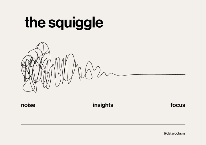
**The Squiggle**
The problem with a neat depiction like this is that it rarely captures what really happens in terms of people’s perceptions of what the process feels like.
For that, there’s Newman’s Squiggle:

Together, the loop and the squiggle are the best ways I found to depict how I work through a data display’s design & development, with some poetic license where needed.
We’re now entering the Observe-Noise stage.
Next week, I’ll dive a bit deeper into Context, Audience and Purpose and share methods and resources I use to map each of them.
If you'd like to keep the conversation going, just reply to this e-mail. I'd love to hear your thoughts!
If you like what I share and would like to support my caffeinated habits, you can buy me a coffee!
See you again next week!
-- T.
