Design Matters #10 - Visual Analogies in Data Displays - Part I
Hello!
You are reading (Dataviz) Design Matters - a newsletter series made with 💕 by T. from Data Rocks.
If you’re new here but like what you see, subscribe below and get all upcoming issues straight into your inbox.
First published on 01 February 2024.
Hi Friends!
Welcome to issue #10 of the series Design Matters.
The goal of this series is to shed light on how Design plays an indispensable role in data analytics - not just in making things look pretty but in affecting understanding, communication, and decision-making.
Design Matters is back!
The last time I sent out a Design Matters issue of my newsletter was in October last year. Life threw me a few curveballs and some dramatic changes in the meantime, and all the plans I had ended up on the back burner. It is good to be back.
If you’ve been here since then, thank you so much!
And if you’re new to the party, welcome!
You might want to get a refresher on what the series is about by reading issue #1 first or by revisiting some favourites, like part I and part II of my ultimate dashboard colour palette.
Some Housekeeping:
This year, I plan to send out new posts to your inbox once a month. I’ll move on with the Design Matters series, bringing more about how to apply UX design techniques and UI design improvements to your data display projects.
I’ll also republish the older posts on both my personal Blog and on Medium. This is because the series seems to have resonated with a lot of people, and it has been, by far, the best feedback I have ever received. Republishing on different platforms allows others to discover the content without having to dig through my newsletter archives.
But this also means that if you’re here - because I do value you all as subscribers - you’ll get to read things first! I also plan to share exclusive free materials and discount codes for upcoming launches as a thank-you for allowing me into your inbox.
And now, to the reason everyone is here: let’s talk about Design Matters.
Me, talking about audience, purpose and context again.
I had initially planned for issue #10 to be about the use of effects in data displays. That is, borders, drop shadows, glow, blur, transparency. It seems like a lot of people I talk to equate the use of these with a modern Graphic User Interface (GUI). Social media is full of fancy dashboard examples that employ these techniques with varying degrees of success.
But after I started writing it, I realised I was missing the most important element - and the reason why I started writing my own stuff to begin with: CONTEXT.
So, this will be a step back in preparation for what comes next, to add some much-needed context as to why we perceive certain interfaces as more awe-inspiring than others and when or why we first decided that any of these elements might be a good idea (or not) when it comes to communicating data.
You might be a fan of the ultra-minimalism idea that a data display can’t contain anything at all that is not strictly representing data. And you might be wondering if effects like drop shadows, blurs, etc. should ever be used next to any chart.
The truth is, audiences of data displays have spent the past 40-odd-years being conditioned by other Graphic User Interfaces on what good looks and feels like, and they now require not only accurate data displayed in a clean and direct approach but also a good experience while accessing and using it. We’ve already reached the era where User Experience is what makes or breaks your dashboard’s adoption. And this is what this newsletter series is about. :)
There are a few good reasons why effects might be helping your audiences navigate your data displays. But if we want to understand why certain things seem to work and look good while others seem to look dated and cluttered, we have to look a bit into where these ideas come from.
User Interfaces emulate our interactions with real-world objects.
In the early 1970’s, computers looked like this:
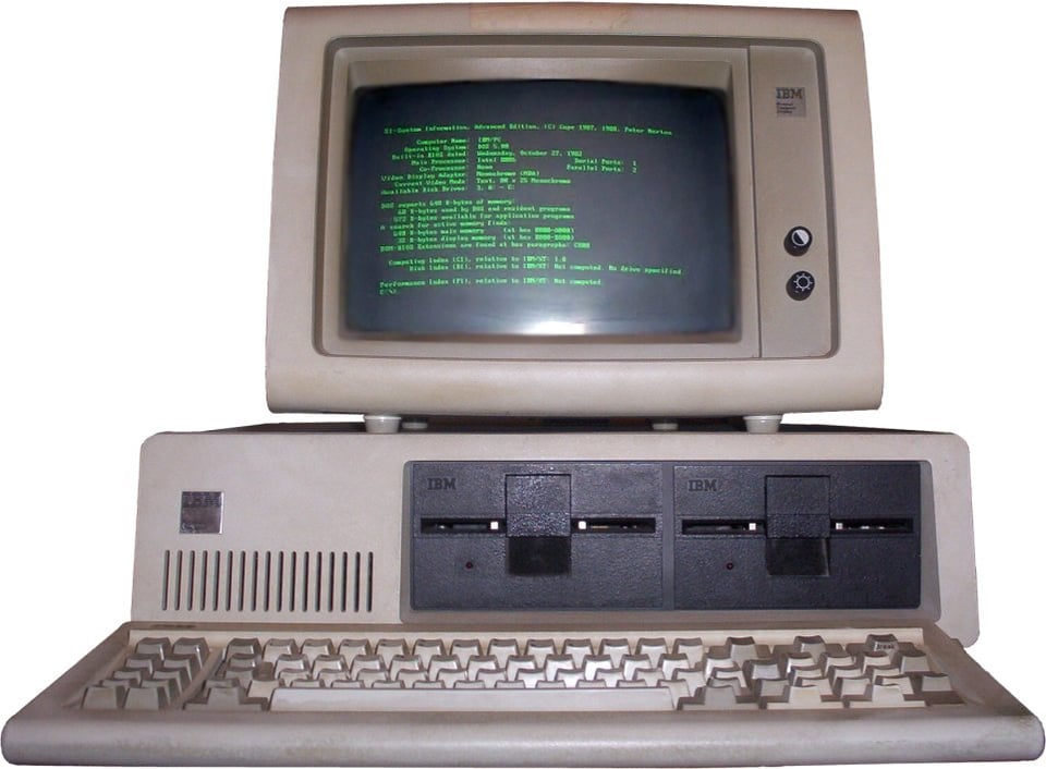
The screens were black, with either green or orange text. Interactions were text only. You’d use a keyboard and have to recall a bunch of commands to perform tasks. Needless to say, interacting with this was not everyone’s cup of tea. This meant that, apart from the odd game here and there, or if you had to compute information as part of your job, you wouldn’t want to spend much time dealing with this machine. This meant that computers were a niche thing, and only a few people were interested in them.
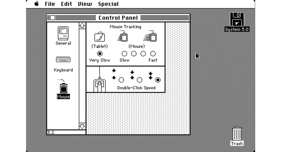
Come Xerox (yes, the photocopying machines’ company) and their R&D laboratory, the Palo Alto Research Center (PARC). In 1973, they unveiled a project called Xerox Alto, and the rest is history. Everything you know about user interfaces nowadays had just been born, right there: desktops, rubbish bins, windows, copy, cut, paste, and the brilliant use of a mouse pointer to interact with all of it.
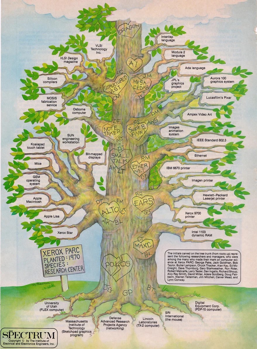
This awesome tree illustration by the IEEE team shows the influence that the PARC researchers and engineers had on how we interact with our virtual world. Each branch represents the technologies that stem from their research. Little hearts with the name of the projects and the initials of the developers are in the tree’s trunk. I really like it:
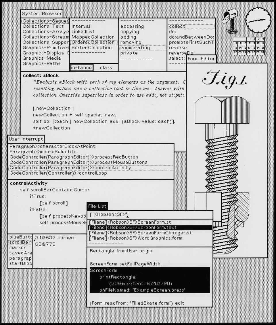
Alto was so revolutionary that everyone who came close to it became absolutely enthralled by the novelty of using real-world analogies to simulate tasks on a screen. It captured the imagination and action of none other than Steve Jobs, who ‘borrowed’ lots of these concepts to release his Apple Lisa prototype in 1983.
Here’s Jobs himself, fawning over the brilliance of the Alto’s interface:
He also goes into other stuff about monopolies and product development (which is a bit prescient, isn’t it?) But that’s a bit of a tangent to our point here.
The fact is that anyone and everyone who came to see and experience the Alto got the same impression back in the day: this was the way how computers would evolve from then on - relying on a user interface that emulated common real-world concepts so that people could perform tasks more easily.
The early concepts of User Interfaces were built with the idea of using common real-world analogies to facilitate non-programmers in using machines to complete their tasks. Do you want people in the office to understand what to do on-screen? Call it a desk-top. Emulate items they normally see on top of their desks: papers become windows. They can overlap because so can paper documents. Oh, and let’s call this instance of a program a document while we’re at it. And let’s keep them in folders, like we do in real life. Let’s label those folders and archive them. Let’s add a calculator and a notepad. Do you need to check your mail? You probably have a little box on your desk to keep it all neat and tidy for when you receive it. And if you no longer need something, let’s throw it out in a bin. You can still retrieve something from the bin, though, like in real life. Unless you’ve emptied it, cause that now means it’s gone forever - like when they empty the bins in the office.
It’s easy to see why this caught on and spread so seamlessly into all spheres of our lives.
An Intro to Skeuomorphism
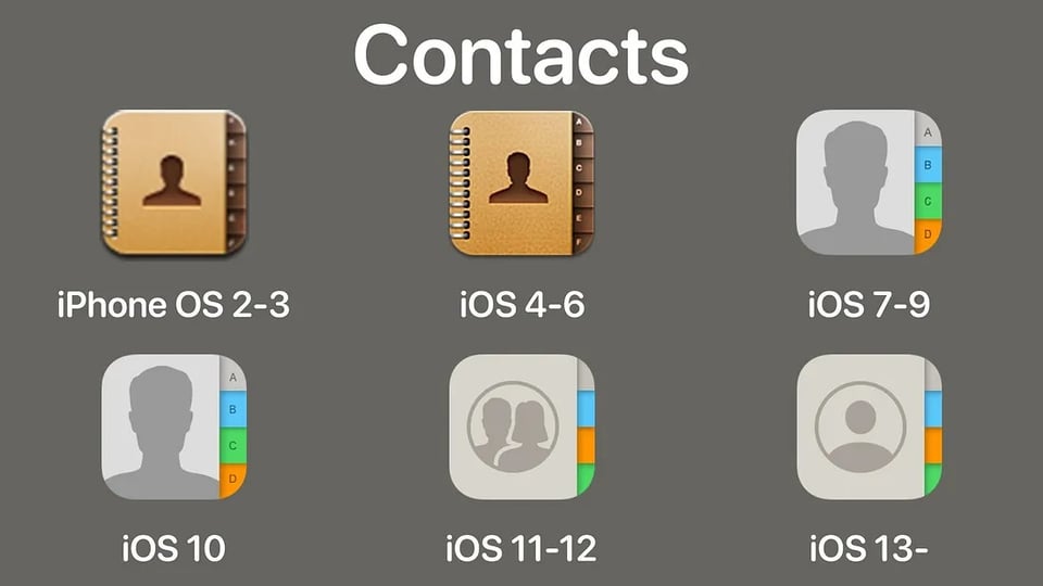
Apple got this concept early on and doubled down on it in all its subsequent products. If you remember the first iPhone, you’ll surely remember what the icons looked like. They looked like real-life objects. The idea here was that the product was so novel that if you wanted people to adopt using it, you had to make it familiar somehow.
Do you want someone to know that this app is an agenda? Or a map? Or a calculator? Make it look like one!
Skeuomorphism, as defined by the Interaction Design Foundation, is:
…a term most often used in graphical user interface design to describe interface objects that mimic their real-world counterparts in how they appear and/or how the user can interact with them.
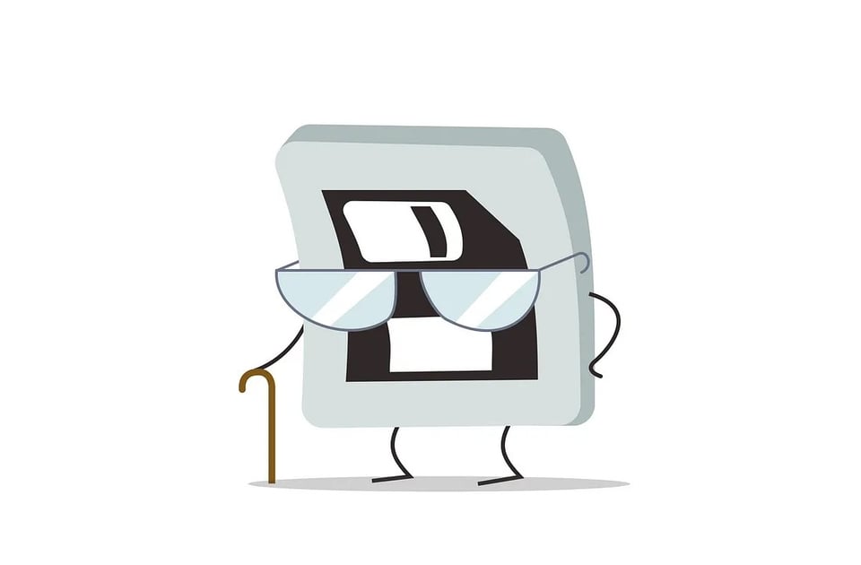
But this is not just applied to how things look. Skeuomorphism in design also helps us understand the function of a particular visual element by associating it with a real-life task. The fact that we still use the image of a floppy disk to ‘save’ is a good example of this.
By mimicking real-world objects, skeuomorphic designs tap into users’ existing experiences, making digital interfaces more understandable and easier to navigate. This is particularly vital for first-time users or those less familiar with digital technology.
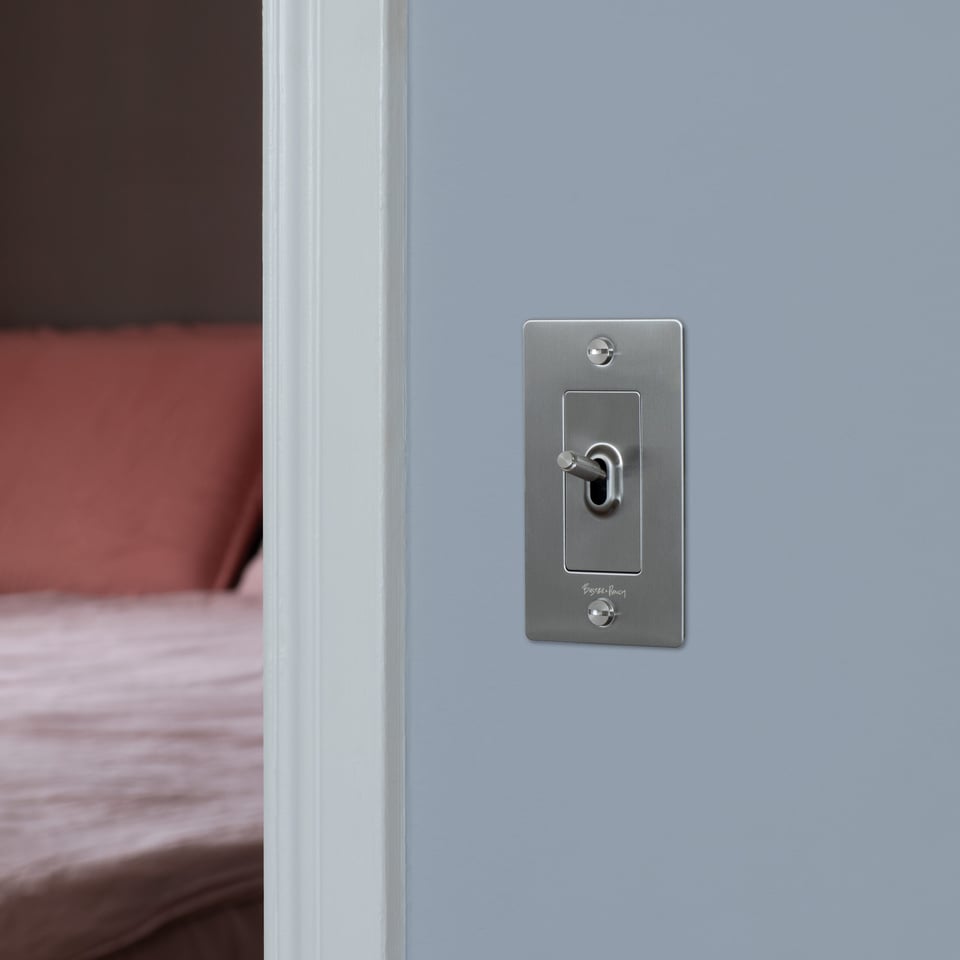
Skeuomorphic elements also provide cues on how to interact with them. A button that looks like it can be pressed or a slider resembling a physical control offers intuitive clues about their functionality.
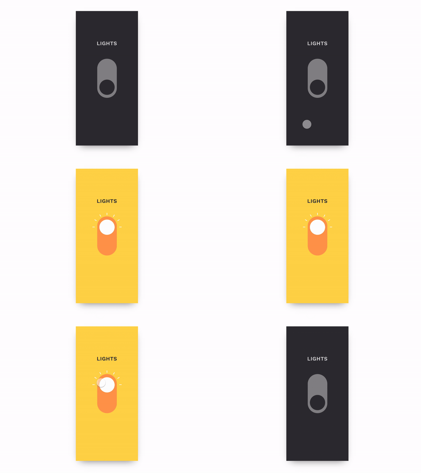
“But we’ve moved past that kind of look! It looks dated! We have flat design!” I hear someone yelling from the back.
And while the popularity of skeuomorphic designs has fluctuated after the rise of Google’s flat design, I’ll make the case that flat design is still skeuomorphic in a lot of ways and therefore, understanding where these elements come from is essential to know why and when they should be used.
Your home icon still looks like a little house, the e-mail is still shaped like an envelope, elevation or depth (represented through drop shadows) still represents elements that are on top of one another, and toggles and buttons change state when pressed. These are still analogies to real-world objects. They’re just stripped down to a little less detail and more essential forms because we’ve become digital natives and already know what functions we’re expected to perform on a User Interface. But the basic analogies are all still there.
Skeuomorphism in dataviz design
When we’re talking about data visualisation, this is particularly true. We are trying to represent movements or perform comparisons and represent real events using visual metaphors.
To begin with, we call them dashboards. That is straight up an analogy with cars, planes and industrial machinery.

Charts that look like thermometers, gauges, traffic lights, date pickers that look like calendars, maps, and pies all allude to real life in some way. So, we’re knees deep in skeuomorphic design, even if we think we’re being fancy by trying to make everything minimal and flat.
This also means that when we present data, adding visual cues that might help them interpret the abstract analogies we’re trying to create is usually welcome - as long as these cues aid understanding and improve their experience. If someone feels good using something, they’ll want to use it again. If someone struggles to understand what is expected of them, they won’t come back.
When used wisely, effects can greatly enhance the end user’s experience. Shadows can indicate that an element is elevated and can be pressed - like a button; borders can help delineate a perimeter where similar objects interact with one another; blurs can be added to a background to enhance text visibility on layering elements. Before dismissing every non-chart element on a screen as ‘noise’, ensure you’re also not stripping your dashboard away of invaluable navigation cues. And before you start adding every single effect you encounter on your tools because they seem to look cool, make sure you’re not confusing everyone by having misguiding signs everywhere.
So, when and how should we use effects and other non-chart elements like icons and bars in dashboard design?
This is what we’ll be exploring in the upcoming issues of Design Matters. :)
Notes:
I left a lot of the history of Graphic User Interfaces out for brevity, but if you want a more complete deep dive, check out this website.
If you want to read more about the Xerox Alto and its influence on modern UI Design, check this article out.
If you have any questions or would just like to keep the conversation going, just reply to this e-mail!
If you like what I share, you can support my caffeinated habits.
You can also visit my shop.
-- T.

