Design Matters #1 - The Good Data Design Manifesto
Design matters #1 - The Good Data Design Manifesto
Hello!
You are reading (Dataviz) Design Matters - a newsletter series made with 💕 by T. from Data Rocks.
If you’re new here but like what you see, subscribe below and get all upcoming issues straight into your inbox.
Hi Friends!
Welcome to the first issue of the series Design Matters.
In this series, I’ll share with you how design can help your dashboards go from average to awesome.
You might be a seasoned Business Intelligence developer, an enthusiastic manager, or an analyst just starting out. Regardless of where you find yourself in your data journey, the goal of this series is to shed light on how design plays an indispensable role in data analytics - not just in making things look pretty but in affecting understanding, communication, and decision-making.

First published on 14 July 2023.
Why Design Matters
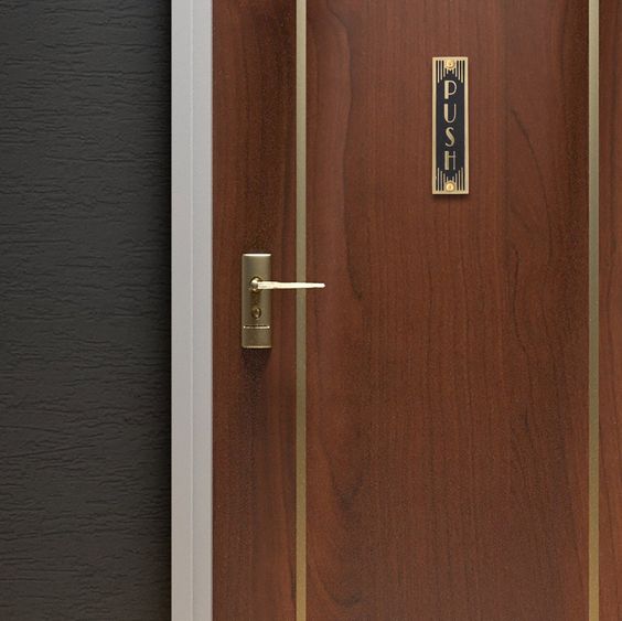
Look at the door below.

Where did you look first? If you encountered this door in real life, I bet the sequence of actions you’d take would be along the lines of:
try to pull it with the handle
get annoyed that you should’ve pushed it instead
look at the sign at the top saying “Push” and feel stupid because it was right there, and yet you still pulled first.
let an annoyed grunt out.
You may lack the words to explain what annoys you about the door above, but you know it could be better. Even if you’re not sure why.
You also know that if the door was thoughtfully designed, it would have a handle on the side you pull and a smooth tile on the side you push - affording you to perform both actions without needing any sign telling you what to do.
And here are your first two lessons about design:
You feel bad design everywhere around you, and every time you know it is bad.
Good design is seamless. Invisible. And as long as you can achieve your purpose without struggle, you won’t even notice it.
This is an ungrateful truth for most designers. Good design is meant to go unnoticed. It lets you do your thing (whatever your thing might be) while being unobtrusive.
Bad design, on the other hand, makes us very vocal. We feel big feelings about it, and we want the designer to know how bad it is.
There’s even a whole VOX video about this! (featuring Don Norman, the author of the outstanding Design of Everyday Things).
My goal here is to help you translate all of these concepts into your dashboard design process. That’s why I started this series.
An appropriate investment of time
One of the main objections I get when advocating for the importance of adopting more design into a techie-focused development team is that it is a waste of time.
Perhaps this comes from the myth that design is the same as making things pretty. While a product that looks polished and professionally made certainly matters, design is a much broader concept, with the principal goal of making people’s lives easier, better, brighter.
Think of how much time and frustration people would save every day if someone had invested time in creating context-appropriate doors?
Time is not wasted if you choose to invest it in the right things from the get-go.
Next time you catch yourself saying design doesn’t matter because of time, think that someone, somewhere, designed a door with a gigantic pull handle on a push-only side - and afterwards had to design a little sign to put on top saying “push”.
Measures of success
One of the biggest challenges in creating a successful dashboard is defining what success looks like.
What makes a good dashboard?
This is a deceivingly simple question that carries very complex answers. At least two good handfuls of books have been written on the subject.
A common approach is to ask people what their requirements are, take note of them and then turn these requirements into features.
Some teams even have feature checklists and follow strict user acceptance criteria checklists, where each feature gets a little checkmark once they’ve been developed - a common practice that business intelligence and analytics borrowed from software development.
After some or all features are implemented, you ask the people to test your dashboard and let you know if it works as they intended.
Very often at this step, to the developer’s dismay, people get back saying that actually, no - this is not what they wanted.
You're often left thinking: *What went wrong?*
If we think about it using examples from the real world’s design again, what makes a product good? And how do you even begin to evaluate it?
Is it because it has all the features we deemed necessary? Is it because it solves a need or problem you may have?
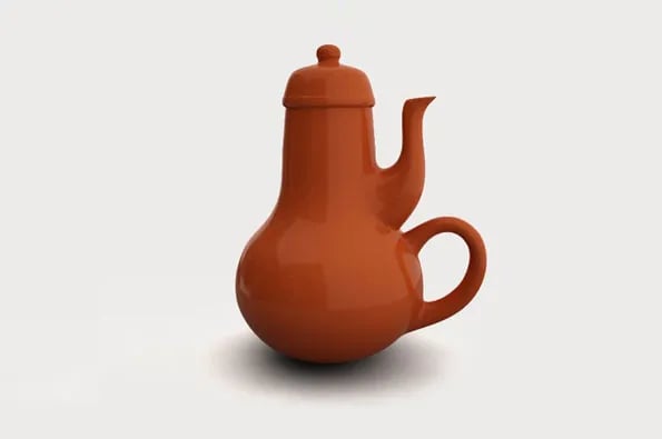
Let’s take a look at a teapot, for example.
If someone is tasked with solving the problem of developing a way for people to heat up water for tea, they may list the requirements below:
needs to have a receptacle for the water;
ideally, a lid so the water doesn’t evaporate away while heating up;
it has a handle, so I don’t burn my hands when picking up the hot teapot up;
a spout to pour the water into a teacup;
an appropriate material for heating up (let’s say this is a stovetop teapot);
make it look nice to go with the kitchen decoration.
You go item by item, making sure all of the requirements are met. Here’s the teapot you came up with:

You can put water in it
It has a lid
It has a handle
It has a spout to pour water
It is made of porcelain and can be heated up
It goes with the kitchen decoration!
And yet, it is 100% useless.
What went wrong?
Less is more
Dieter Rams is another designer who has influenced a lot of the world in countless ways. He’s the creator behind the Braun aesthetics of the 70s, which heavily inspired no other than Steve Jobs.
Rams' design influence is directly referenced in Apple’s products to this day.
Legend says that back in the late 1970s, Dieter Rams was becoming increasingly frustrated by the state of the world around him: “An impenetrable confusion of forms, colours and noises.”, he describes.
He then posed himself a familiar question: were his designs good design? How could he even know what good design is beyond the specifics of a single product?
His answer came in the form of one of the most influential pieces of design history. A list of 10 governing principles of good design.
*According to Dieter Rams, good design*:
Is innovative
Makes a product useful
Is aesthetic
Makes a product understandable
Is unobtrusive
Is honest
Is long-lasting
Is thorough down to the last detail
Is environmentally friendly
Involves as little design as possible
This seemingly simple list has had a profound impact on the design world, serving as a fundamental blueprint for contemporary product design. It challenged the role of industrial design at the time and championed simplicity, functionality, and longevity, turning its back on the prevailing trend of obsolescence and disposable culture.
Rams called for products that were innovative, useful, aesthetically pleasing, and understandable, demanding that every design detail had a purpose and contributed to the product's functionality.
The timeless nature of Rams' principles continues to influence modern design, reminding us that good design isn't about ornamentation but about creating products that make life easier and better. His principles remain a testament to the idea that less, when designed with consideration and intent, can indeed be more.
The Data Design Manifesto
But back to business dashboards. How does it all tie together with developing a good dashboard?
We've talked about doors that confuse and teapots that fail in their essential task. Now, let's bring it all back to my world - dataviz.
I've seen and built quite a few dashboards. I've felt the frustration when users don't understand them and the triumph when they do. I like to think I got better at it over time, but it doesn’t come automatically. I still look for guidance from time to time to make sure I’m not getting lost in all the details, missing the mark of what 'good' feels and looks like.
Inspired by the practice and theory of great designers, while navigating the chaos of poorly collected requirements, disappointed users, beautiful dashboards that lead nowhere, and confusing reports that proliferate like weeds, came the idea of crafting something that could serve as a good set of universal guidelines, that I could rely on, to make sure I’m on track - even when all feels like a bit too much.
And so, The Data Manifesto was born.

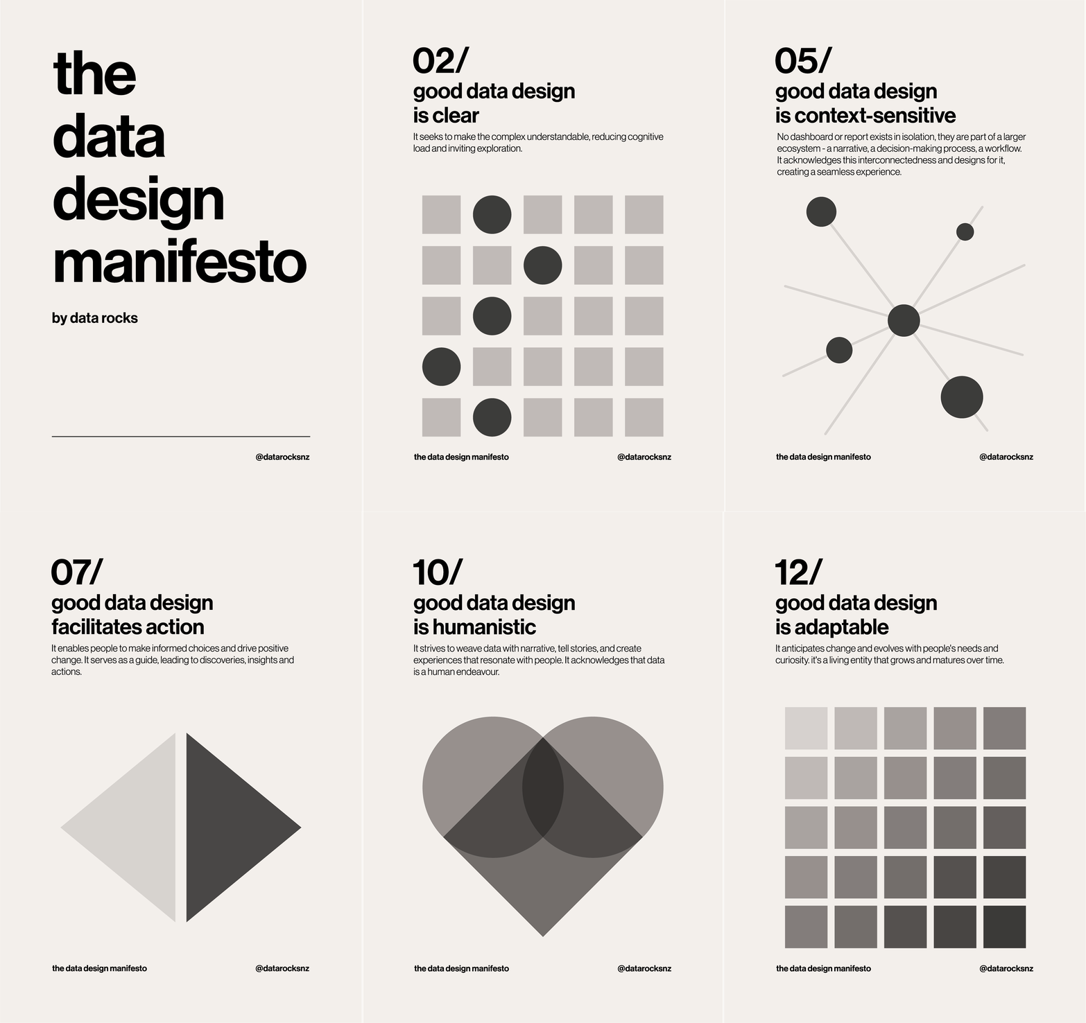
It is a set of 12 principles I use to inform my decisions when developing any dataviz piece, based on everything I believe makes data design not just good but great.
And as the visual person I am, I turned them into a poster to have them around to inspire me on this journey - and also because I want to share them with you. 🙂
The poster is inspired by the Swiss Design movement of the 50s-60s - clean, readable, and functional, complementing the essence of my Manifesto’s goals.
Readers of my newsletter got the A1 large poster PDF for free. If you're reading this on the archive now, you can buy them here.
_**And now to you:**_
What are your guiding principles? What do you believe makes good data design?
If you'd like to keep the conversation going, just reply to this e-mail. I'd love to hear your thoughts!
If you like what I share and would like to support my caffeinated habits, now you can buy me a coffee!
See you again next week!
-- T.
