What makes a letter recognizable?
An exploration of negative space, where the shapes inside and around letters become just as expressive as the letters themselves. Meet Make Make, a playful display typeface built around counterforms, silhouettes, and color.
What makes a letter recognizable?
Sometimes, it only takes a small detail.
A notch
A gap
An apperture
A counter
We usually notice the outer silhouette of a letter first. But look closer and you'll find that some of its most distinctive features happen inside and that changes how we see the whole shape.
The small opening in an e
The counter of an a
The spaces where the strokes of an m or w meet makes a letter recognizable?
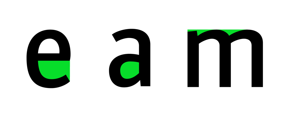
Sometimes, it’s the smallest details: the opening in an e, the counter of an a, or the tiny spaces where the strokes of an m or w meet.
What happens when we give those details more room to play?
Meet MakeMake. A display typeface that explores the relationship between inner forms and outer silhouettes. Its letters are built from rounded, compact shapes, with small internal appertures and interruptions that become an essential part of each character.
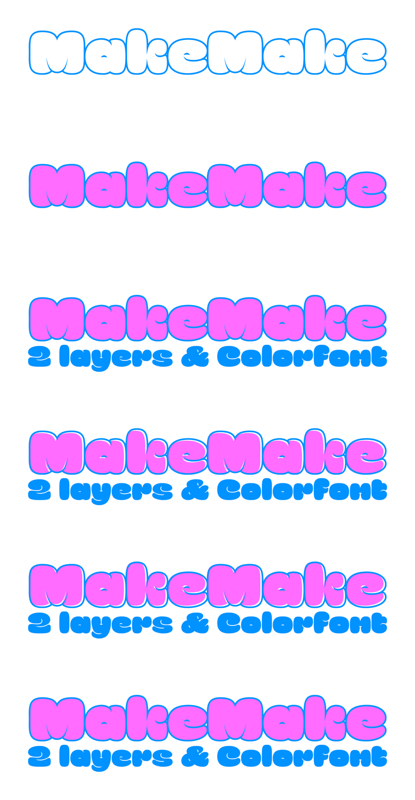
Rather than treating the counters as leftover space, MakeMake brings them to the foreground giving a distinctive character to the typeface; and then, there’s color.
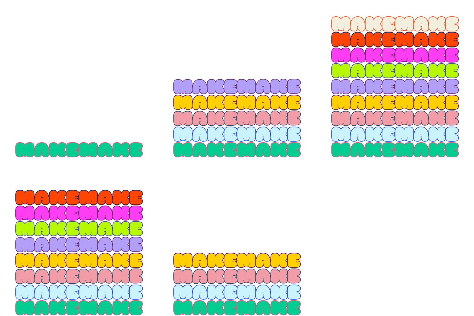
MakeMake comes with two layers that can interact to create different visual relationships within each letter. Fancy a logo? just mix the two layers, add some nice color and boom!
Moreover, with 10 predefined color palettes, the same shapes can take on completely different personalities.
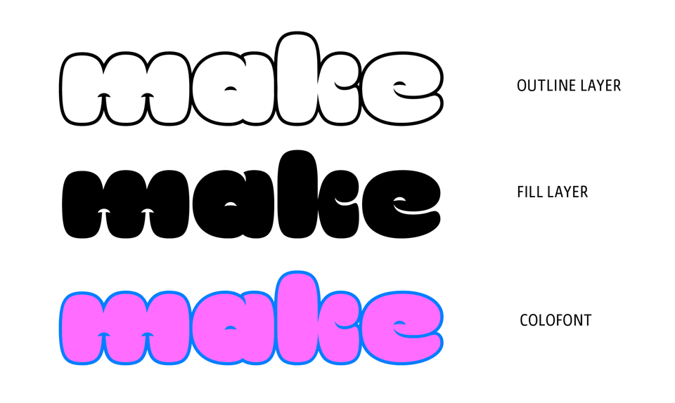
One typeface
Two layers
Ten palettes
Something inside
Explore MakeMake. Enjoy 30% off for a limited time.


