Linkfest #4: Infinite AI Seinfeld, "Highway Gothic", and Coding With Joey Ramone
Welcome to the latest edition of the Linkfest! Thank you for being a subscriber; if you’re enjoying it, spread the word – it’s a pay-what-you can signup here; the folks who can afford to contribute help keep it free for everyone else, too. Forward this email to anyone you want.
Let's get to it! Here's the best stuff I found online this week ...
1) 📺 An AI-generated infinite Seinfeld episode

Nothing Forever is a fascinating experiment: An endless episode of an animated show, generated on the fly by ChatGPT and a bunch of AI heuristics.
You can watch it on Twitch here. It's done in emulation of Seinfeld: Four low-fi-pixelated friends hang out in the apartment of "Larry", the main character, chitchatting about the same sort of quotidien nothing that Seinfeld made famous. According to this story in Vice ...
Skyler Hartle, the co-creator of “Nothing, Forever,” told Motherboard that the show was created as a parody to Seinfeld. “The actual impetus for this was it originally started its life as this weird, very, off-center kind of nonsensical, surreal art project,” Hartle said. “But then we kind of worked over the years to bring it to this new place. And then, of course, generative media and generative AI just kind of took off in a crazy way over the past couple of years.”
It's quite mesmerizing to watch. The dialogue makes sense most of the time; it's definitely mundane. Occasionally the AI comes up with some reasonably sharp lines -- like this conversation I saw between Yvonne (the Elaine character) and Fred (the George) character:
Yvonne: What's up with those new shoes you got? [laugh track]
Fred: I'm trying to make a fashion statement.
Yvonne: Oh come on, they look like clown shoes!
Fred: No, they're cool.
Yvonne: I think they make you look like a clown clown, not a cool clown.
Fred: What's the difference?
Yvonne: Well, a cool clown would wear something that disrupts the norm in a stylish way. A clown clown would just wear something goofy.
Larry: That's Fred in a nutshell.
The creators really leaned into a glitchy aesthetic: The animated friends lope around the apartment using the awkwardly alien physical moves of late-90s Playstation characters, and the voices feel like the free tier of a text-to-speech API, where you're not paying enough dough to get full emotions. The laugh track often surges at the wrong moment. All together, it neatly matches the sometimes-meaningless output of GPT3.
The creators predict this is the beginning of a trend -- endless, autogenerated culture:
“As generative media gets better, we have this notion that at any point, you're gonna be able to turn on the future equivalent of Netflix and watch a show perpetually, nonstop as much as you want. You don't just have seven seasons of a show, you have seven hundred, or infinite seasons of a show that has fresh content whenever you want it. And so that became one of our grounding pillars,” Hartle said. “Our grounding principle was, can we create a show that can generate entertaining content forever? Because that's truly where we see the future emerging towards. Our goal with the next iterations or next shows that we release is to actually trade a show that is like Netflix-level quality.”
2) 📸 "Chronophoto"

Chronophoto is an online game that gives you five photos and challenges you to pick what year each was taken. The closer you get to the correct year, the more points you get.
It's curiously compelling. That photo above? Based on the dresses and hairstyles -- plus the fact that it was color -- I guessed 1954. I wasn't too far off: In reality, it was 1948.
The more photos you do (and some of them go right up to the present day) you begin to figure out what are the major "tells". Fashion is a big one; technology can also be a useful one (cordless phones with antennas will help carbon-date an image to within about 15 years). Hovering above it all are the intangible shifts in imaging technology -- the way that the clarity and color-palette of a photo suggests its age. It puts me in mind of the recent hipster trend for buying digital cameras from the late 90s and early 00s, since they have a bitcrunched retro style that looks intriguingly different from that produced by today's AI-adjusted, three-eyed cameraphones.
3) 🧮 Emulations of historic digital calculators

Today I learned that the Internet Archive has a collection of emulators of digital handheld calculators.
It's got a bunch of classics -- like the Texas Instruments TI86, the TI89, and the Hewlett Packard 48GP -- as well as a fun one (the Vtech children's "Electronic Number Muncher").
Obviously, it's cool to preserve the feel and style of these classic devices. But to me, the truly interesting dimension of this project is that these emulations were done using "MAME".
MAME, as you may know, is software originally designed for emulating the hardware of arcade cabinets. It was first launched in 1996 by the programmer Nicola Salmoria, because he was worried that all the genre-defining video games of the 1980s were vanishing; as arcade cabinets became older and broke down, there weren't any easy ways to play these games.
He initially wrote an emulator for the machine that ran Pac-Man. You'd boot up his emulator, load the Pac-Man code, and presto -- the game played, looking exactly as it looked in the arcades. But it turns out that in the 80s and 90s there were several different types of arcade cabinets, running different types of hardware. If you wanted to play other games (like Space Invaders or Asteroids or Dig-Dug) you'd need to emulate their unique pieces of hardware, too. So Salmoria and other coders worldwide began writing emulations of other arcade boards, and eventually this grew into the "Multiple Arcade Machine Emulator", or MAME.
MAME is now a globally significant cultural project -- a core way that old games are preserved. Niftier yet, it's an archival project that arose entirely at the street level: Hundreds of open-source coders and hardware phreaks, working hard to make sure old code never dies.
It might seem weird that an arcade emulator is useful for emulating pocket-calculator hardware, but, hey, emulation is emulation. Eventually all our old machines will need to be similarly transubstantiated into the empyrean, if we want to keep old software alive.
(Side note: This MAME-calculator connection also reminds me that those early pocket calculators had ... game-like aspects to them! Back in the 70s, kids played with them -- they spelled words by flipping the 7-segment numbers upside down, and some calculators actually shipped with simple built-in games like hi-low or blackjack.)
4) 🗯️ Sony patent would require TV viewers to shout a brand name aloud
This one went around the Internet a few weeks ago, so my apologies if you've already seen it, but: Sony has acquired a patent for a technology that can require TV viewers to shout aloud a brand name during a commercial.
There is no profound new technology here, I think; it seems like they're just glomming together bog-standard voice-transcription software and metadata on the video stream. The innovation appears to be purely in the realm of creepy corporate behavior.
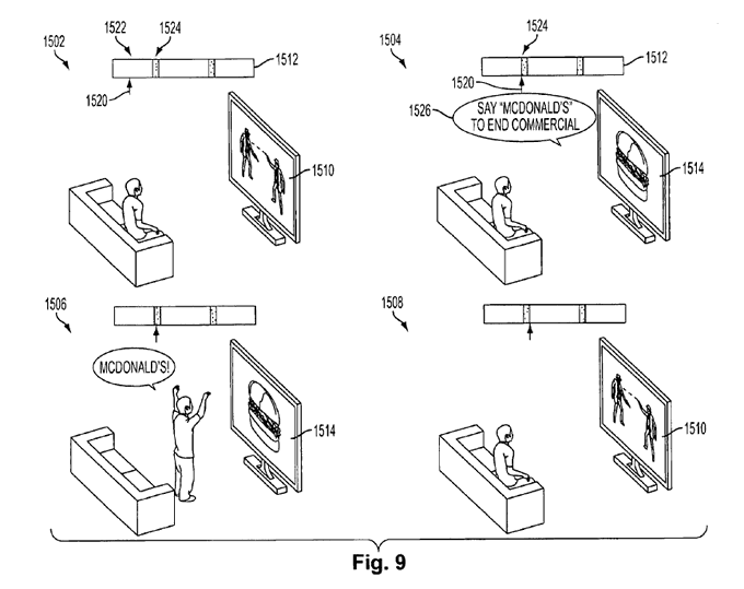
In the patent filing, Sony's legal eagles describe the image you see above:
FIG. 9 illustrates a user interacting verbally with a commercial, according to one embodiment. In first capture 1502 of the sequence, a user is watching movie 1510. Progress pointer 1520 in progress bar 1512 shows that content 1522 display corresponds to a movie and that break 1524 is approaching. On second capture 1504, progress pointer 1520 shows that the movie has progressed to break 1524 for placing IC 1514. IC 1514 is interactive and instructions 1526 from the display ask the user to ‘Say “McDonalds” to end commercial.’ On third capture 1506, the user is saying “McDonalds!” The client device includes a microphone that captures the user's words and voice recognition on the device determines that the user has responded. The system then proceeds to skip the rest of the commercial, as shown on fourth capture 1508, where the user goes back to watch the movie. In one embodiment, the user gets rewarded with some points or a coupon from the sponsor. The rewards can be collected by the user in a variety of ways, such as receiving a coupon on the mail or via email, getting a text message in a mobile phone with the coupon, collecting points toward collecting prices in a web site, etc.
That image has, as one might imagine, already spawned an entire Linnean category of memes.
5) 🛣️ "Highway Gothic"

Highway signs look pretty similar no matter where you drive in the US, right? It turns out that's because the Federal Highway Authority has a set of design principles that mandate everything from the type of font you can use to the reflectivity of the signs and where they ought to be placed, and even the roundness of the sign corners. That picture above shows some of the guidelines for the precise placement and size of text on a highway roundabout-entry sign.
One example of the rules, from the mammoth 900-page style guide:
“The only acceptable alternative background colors for Street Name (D3-1 or D3-1a) signs shall be blue, brown, or white. Regardless of whether green, blue, or brown is used as the background color for Street Name (D3-1 or D3-1a) signs, the legend (and border, if used) shall be white. For Street Name signs that use a white background, the legend (and border, if used) shall be black.” Section 2D.43 Street Name Signs (D3-1 or D3-1a) #18 (Standard)
Jon Keegan has written a terrific essay on the guidelines here. My favorite detail is that the font mandated for highway signs is colloquially known as "Highway Gothic" ...

... and an attempt to replace it turned into a huge debacle: The replacement font was slightly wider than Highway Gothic, so it required signs to be bigger -- totally screwing up a complex design and production ecosystem that, for decades, had evolved to crank out standardized sign-sizes. After twelve years of chaotic arguments, the FHWA withdrew the proposed new font and it never went into production. It's a terrific tale of how complex a system like this can be.
Oh, Jon also found a Facebook group of people who snarkily photograph and lambaste signs that violate the design guidelines, too.
6) 🎸 A 1984 BASIC program to play the Ramones' "Slug"

On Mastodon, Jesse Jarnow has posted a fascinating blast from the past: A 1984 article from K-Power, Scholastic's programming magazine, showing off a BASIC program that plays an 8-bit version of the Ramones' song "Slug".
The glitchy music is fun enough -- you can see and hear it execute on this YouTube video -- but what's even better is the article introducing this program includes an interview with Joey Ramone, discussing his thoughts on computers.
I think it's interesting and exciting -- I just hate to see it get out of hand. I like the basic things. I can appreciate computers, but I'd like to see kids take chances. Kids are so conservative today. I think the computer age is a big part of it. Computers can become too much like a crutch. I think kids need to experience more stuff that's real.
In one sense, Joey was both correct and ahead of his time. Back in 1984 computers hadn't yet changed much of the experience of being young. There were video games, sure, but the social life of youth had not yet been phagocytosed by a tiny handful of planet-spanning technology giants. It would take another 25 years for the stuff Joey was worried about to come true, and yowsa, he nailed it.
In another way, he was totally off base. Joey was criticizing computers for being "conservative" at the precise moment -- the early 80s -- when they were arguably pretty punk-rock and DIY. Back in the early 80s, computers generally shipped with no software, so the only way to get them to do anything useful was to roll up your sleeves and learn how to program them yourself. Plus, the home computers of the early 80s weren't powerful enough to do particularly practical things, so teens mostly used them for culture and art: Making games, electronic zines and music, and setting up personal BBSes for randos to dial into.
It wasn't a very widely-shared landscape; computers being expensive and tech being mostly siloed as a boys' club, the scene (as I experienced it back then, anyway) was pretty homogenous. But it had a 140-proof spirit of DIY that was completely in step with punk rock.
7) ⌨️ Mario Bellini's 1966 keyboard-screen
Mario Bellini is a fantastic industrial designer; he spent years working for Olivetti, and produced some truly gorgeous and playful office devices. Consider this 1975 Electric Accounting Machine ...

As Alexandra Alexa wrote several years ago ...
Whether he was designing typewriters, TV's, calculators or audio devices, he was uniquely adept at translating the functions of technology into forms that were approachable and surprisingly joyful. [snip] His projects stand out because they are all so carefully considered, almost as if you could feel each typewriter have a distinctive personality.
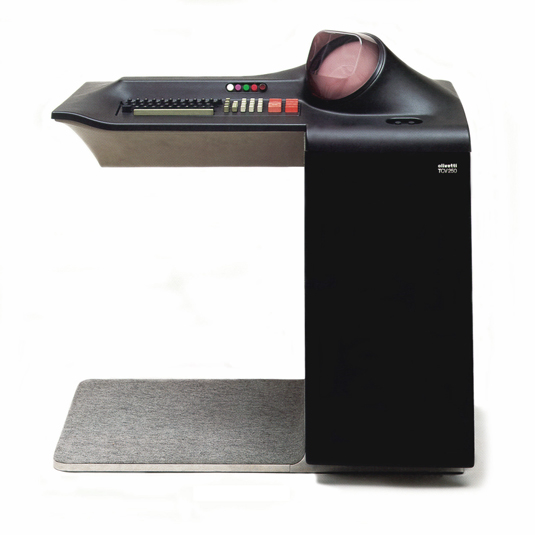
Recently, Rain Noe wrote a short post about an even more remarkable piece of Bellini's design -- his 1966 TCV 250 for Olivetti. It was a desk that had an embedded keyboard and screen; the cowl around the small screen curves up organically out of the desk's surface.

Noe makes a fascinating observation about this computer ...
Starkly futuristic for the time, the screen was so secondary (to the task of facing the human being sitting across from the desk) that it's placed off-center to the side, enabling the user to glance at it briefly to glean the required information needed to inform the human face-to-face conversation.
It's a terrific point! Today's screens are nearly always between us and other people we speak to. This design, in contrast, assumed that face-to-face interaction was crucial, and the digital information was peripheral. It's interesting to think: What would other of today's digital-communication devices look like if they were redesigned to be peripheral to our interactions with other F2F folks?
8) 🗺️ "Barely Maps"

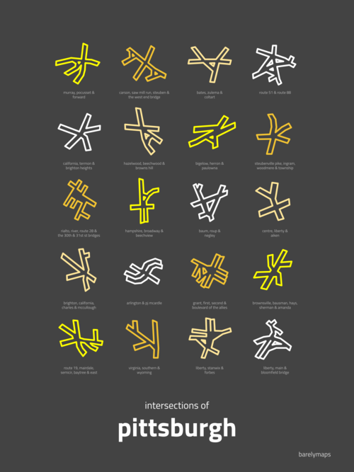
Peter Gorman makes minimalist maps where he picks one element of geography or a city -- the bridges that cross the river in Portland, say, or the streets of San Francisco's Chinatown -- and creates a lovely abstraction.
You can see a whole bunch at his site (he's done a book of them), and the one above is a collection of Pittsburgh's famously-angled intersections. He did a similar map for Seattle, and as Jessica Lee wrote for the Seattle Times ...
The design has generated a heavy response and parodies online, reflecting its universal appeal. Anyone who has traveled the city’s streets knows some intersections can require special navigation skills.
Now, Gorman is fielding hundreds of requests for the print from paying fans.
“So Seattle was designed by a fan of the Blair Witch Project,” one Reddit post said. “The intersections of Seattle look like Chinese lettering,” someone tweeted. Gorman said he heard one person compare the icons to yoga poses.
9) 🔔 A final, sudden-death round of reading material
Maybe oxytocin isn't the "cuddle drug". 🔔 CSS for making your web site look like it's on a Playstation 1. 🔔 A $309 antique-store chandelier turns out to be an art piece worth millions. 🔔 Reverse RSS reader. 🔔 Face-recognition technology suggests Raphael painted a previously "anonymous" work. 🔔 Artist writes fake obits of Dolly Parton, Greta Thunberg, and Bill Clinton. 🔔 ChatGPT writes a layoff memo. NASA's new "rotating detonation engine". 🔔 The 1941 Chrysler Thunderbolt was a lovely concept car. 🔔 A black bear took hundreds of selfies using a night-vision camera. 🔔 How ebikes are used by postal services. 🔔 The ordnance that made the attack on Pearl Harbor so destructive. 🔔 Tiny flying "fairy" robots proposed as possible pollinators. 🔔 Jewelry made from the shapes of chaos theory. 🔔 Wait: Venus Flytraps can count? 🔔 A deep dive into the fractal patterns inside music. 🔔 Calculating the monetary value of a medieval stick of eels in today's currency. 🔔 The average mileage of a used electric scooter is 113. 🔔 A soft robot that can swim in the Mariana Trench. 🔔 Rice-based 3D printing filament. 🔔 The value not of critical thinking, but "critical ignoring". 🔔 Air pollution causes chess grandmasters to make mistakes. 🔔 Firefighting goats.
