Linkfest #37: "Wind Theft", an HTML Bomb, and the Rice Theory of Culture
Hello folks!
It’s time for "the opposite of doomscrolling” — my next Linkfest, in which I comb through the endless branching shelves of the Internet in search of the finest items of science, culture and technology, just for you.
If you’re a subscriber, thank you! If not, you can sign up here — it’s a Guardian-style, pay-whatevs-you-want affair; the folks who kick in help keep the Linkfest free for everyone else.
And: Please share this email with anyone who'd enjoy it.
Let’s begin ...
1) 🏠 Frank Lloyd Wright’s unrealized buildings, digitally recreated

Frank Lloyd Wright was a pioneering architect who built some of the world’s most famous buildings, like “Fallingwater”.
But — like many architects — he had far more ideas than he could build. When he died in 1959, he left behind dozens of sketches and plans for unrealized buildings.
Now David Romero is creating them, virtually. Romero is an architect himself, and also a 3D designer — so he’s been going through Wright’s unfinished plans and doing note-perfect digital versions of them.
As Kate Mothes writes in Colossal …
Romero typically initializes his workflow by building a model in AutoCAD, which he then exports to 3ds Max modeling software. Using a plugin called V-Ray, he refines the visual quality of the scene by adding realistic textures, lighting effects, vegetation, and terrain.
“This is the stage where the project truly starts to come alive, moving beyond a technical model to something with atmosphere and emotional resonance,” he says. From there, he finishes with a few post-production tweaks in Photoshop to make the entire image as cohesive as possible.
Go check out the full gallery at that Colossal piece — it includes an image of Wright’s “The Illinois”, a skyscraper that would have been fully a mile high. Wright claimed it would have been possible to build, even using late 1950s technology — but holy crap, I’m not sure I’d want to go to the top!
Romero has tons more images at his Flickr account.
2) 🥁 Drum machine based on literary style
A few Linkfests ago, I highlighted Maxwell Neely-Cohen’s project to create and/or curate 10,000 quirky drum machines (item #5 in Linkfest 35).
He just produced another one so clever that I am required, by Linkfest law, to bring it your attention.
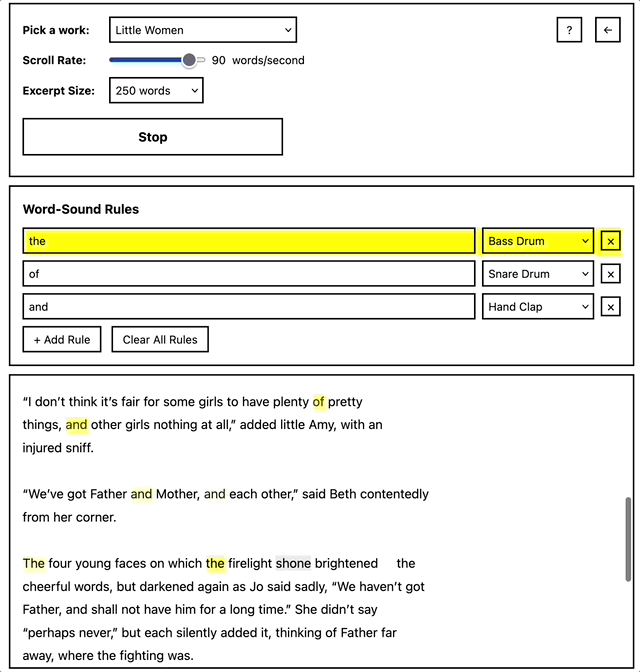
Above is a screenshot of his “Word Search Drum Machine”. It gives you 10 different famous novels as options, and then you can assign different drum sounds — the kick, the snare, clap, etc. — to different words.
The drum machine loops through the text of the novel and triggers the sound every time it encounters the word.
I love the idea of turning literary text into an inadvertent MIDI file! It makes you meditate, in a fresh way, on word-occurrence and how this forms an invisible facet of literary style. It also puts me in mind of stylometry — i.e. how statistical analysis of word-use can reveal the author of an anonymous text.
Maybe a really subtle musical scholar could do a stylometric analysis via the drum-machine patterns produced by a text? “Oh yeah, that’s gotta be Jane Austen, her beats always sound like that.”
3) 🍳 Data crunch of “statistically improbable” restaurants

Ethan Zuckerman has recently been interested in what he calls the “statistically improbable” restaurant, or …
… the restaurant you wouldn’t expect to find in a small American city: the excellent Nepali food in Erie, PA and Akron, OH; a gem of a Gambian restaurant in Springfield, IL.
He first wrote about this last summer, but recently he used the Google Places API to create a dataset of 340 American cities that tracks their demographics and their restaurant mix.
This allowed Ethan to crudely calculate what type of dining the statistically “average” American city would possess. His fictional average town, “New Springfield, CA”, contains 305 restaurants, 20% of which are fast food (i.e. “6 McDonalds, 3 Burger Kings and 3 Wendy’s”) — then 55 which are restaurants selling “American” food, and “122 restaurants offer[ing] some sort of “international” cuisine.”
Okay, cool enough. Now the fun begins: He compared all the other cities to this fictional average, so he could tell you which real-world US cities have statistically higher concentrations of particular cuisines!
For example, here are the US towns with unexpectedly higher proportions of Lebanese cuisine …
Dearborn, Michigan 4.73%
Sterling Heights, MI 2.08%
Miramarm Florida 1.44%
Toledo, Ohio 1.29%
Paterson, New Jersey 1.28%
Richardson, Texas 1.19%
Downey, California 1.07%
Anaheim, California 1.03%
Peoria, Illinois 0.95%
Lafayette, Louisiana 0.91%
Here’s the highest concentrations of Turkish cuisine …
Paterson, New Jersey 2.77%
Plantation, Florida 1.65%
El Cajon, California 1.26%
Richardson, Texas 1.19%
Waterbury, Connecticut 0.99%
Daly City, California 0.96%
West Jordan, Utah 0.95%
Dearborn, Michigan 0.95%
Kent, Washington 0.82%
Bridgeport, Connecticut 0
(I’m guessing Bridgeport’s percentage is existent but so low that Ethan’s data-analysis tool rounded it to zero.)
4) 🌞 Agrivoltaics make solar panels more productive

I’ve blogged a lot about “agrivoltaics” — or, growing crops underneath solar panels.
What I love about the trend is how it addresses some reasonable objections to industrial-scale solar: i.e. “We can’t replace so much cropland with panels!” No, we can’t, but with agrivoltaics you get the best of both worlds — electricity and crops. Farmers get extra income from their fields, and surveys show the public is far more supportive of solar fields when they’re agrivoltaic. What’s more, many crops grow better when shielded by solar panels, because the panels cool them down and help trap water vapor.
Like I’ve written, agrivoltaics are win-win-win.
Whoops: Let’s add another “win”! It turns out that solar panels themselves perform better when they’re in a field with crops.
Why? Because the crops also help cool down the panels to their optimum temperature. As Tina Deines notes, solar panels aren’t as efficient when they heat up too much …
An optimal functioning temperature for panels is around 75° Fahrenheit, he explained. Beyond that, any temperature increase reduces the photovoltaic cells’ efficiency. [snip]
However, planting vegetation under solar panels—as opposed to the more traditional method of siting solar arrays on somewhat barren land—can help cool them. In one set of experiments, Barron-Gafford’s team found that planting cilantro, tomatoes and peppers under solar arrays reduced the panels’ surface temperature by around 18 degrees Fahrenheit. That’s because plants release moisture into the air during their respiration process, in which they exchange oxygen for carbon dioxide.
“This invisible power of water coming out of plants was actually cooling down the solar panels,” Barron-Gafford said.
The crops reduced the heat of the panels by an average 18 degrees F? That’s huge.
Here’s the chart from the academic paper that studied this effect — the dark blue jagged line is the temperature of the panels in the cropland, and the light grey is a normal panel on normal ground …
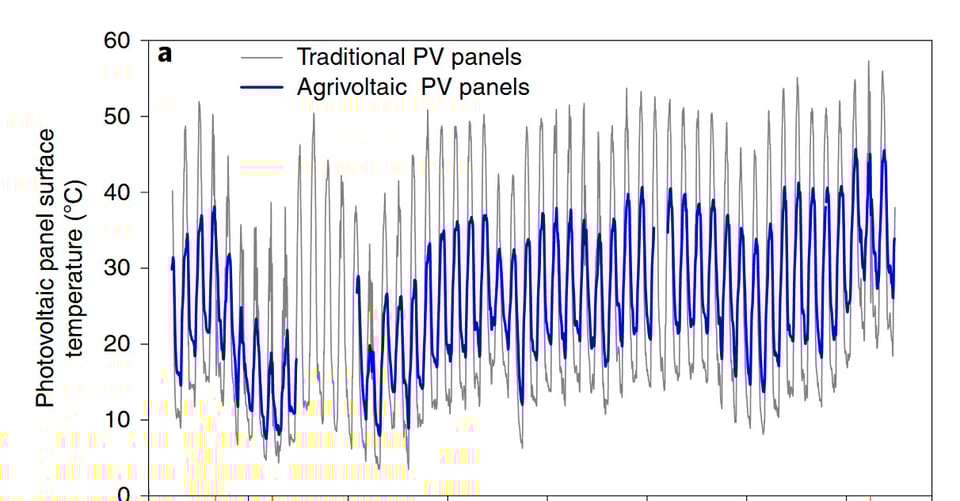
The difference is remarkable. Go check out that free paper, and read Deines’ piece — which also describes the bountiful crops you get from plants shielded by solar panels: “Basil leaves the size of your palm” and Swiss chard “the size of your torso.”
5) 🎨 Vending machine that produces robot-drawn art

Niklas Roy is known for making “fine art with technology”, and his latest project is a lovely one: A vending machine that draws randomly-generated pieces of robot art.
The machine has a screen that shows a piece of line-art being constantly generated via a random seed. Here’s a sample gif of it in action (full video here) …
Roy didn’t need to use some Olympic-pool-boiling LLM to generate this art — it’s just a good-old fashioned hand-crafted algorithm, as Elliot Williams notes in Hackaday …
You’d be forgiven if you expected some AI to be behind the scenes these days, but the algorithm is custom designed by [Niklas] himself, ironically adding to the sense of humanity behind it all. It takes the Unix epoch timestamp as the seed to generate a whole bunch of points, then it connects them together. Each piece is unique, but of course it’s also reproducible, given the timestamp. We’re not sure where this all lies in the current debates about authenticity and ownership of art, but that’s for the comment section.
Anyway, you watch the screen, see the art evolve, and if it’s currently showing something you think is cool, you slip in a 1-euro coin and the machine leaps into action. It freezes the algorithm and, using a pen-plotter on paper, draws precisely that moment in time — then cuts the paper, stamps it, and the art drops out the bottom of the machine.
Go watch the full video — it’s short but quite beautiful.
6) 💣 An “HTML bomb” for AI crawlers

As you may have read, AI firms are wreaking havoc with web sites, by crawling and recrawling their pages. Sometimes they do it so often that it causes server problems. The AI firms are also ignoring the historic “robots.txt” files — i.e. a file you put on your web site saying “hey, please don’t crawl these pages”. Back in the old days, search engines like Google would obey your robots.txt file, and wouldn’t crawl or index any page you asked to be left out. AI firms don’t do that: They crawl everything.
As a result, webmasters are fighting back by using tech that fights against AI-sponsored site-crawling. Cloudflare, for example, released a tool this spring called “Labyrinth”, which — when it detects an AI crawler has arrived at the site to copy every single page — it begins spawning endless fake pages filled with nonsense.
But now the programmer known as “ache” has created an even more fascinating piece of defensive tech: The “HTML bomb”.
It’s a tiny HTML file that lives on your site. It’s encrypted, so any browser or AI crawler that tries to load it does not, at first, know what it does. The instant the your browser (or an AI crawler) loads the file, though, the HTML bomb triggers: Your browser / the crawler decrypts the file, and inside is a little script that — on the fly and instantly — fills the HTML page with the letter H, written ten billion times.
The page quickly balloons to over 10 gigs in size! Which means it crashes anything that tries to load it. Any AI crawler that reaches that page would collapse and need to be rebooted. So would your browser.
The creator checked their work by trying to load the page with Firefox, and …
Firefox struggles a lot and ends up crashing cleanly with an
NS_ERROR_OUT_OF_MEMORYerror, visible only in the developer tools. If I put the body tag before the malicious comment, I would certainly have a correctly displayed page.Chrome is much faster to crash! It offers a happy screen signaling that an error occurred via
SIGKILL.In both cases, we notice that the page is partially loaded; however, the title is correct. Therefore, we are certain that a Selenium-type web crawler will crash on this HTML file.
Very devious!
7) 🦅 A hawk that used traffic signals in its hunt
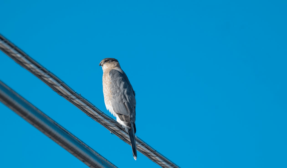
The zoologist Vladimir Dinets has discovered something wild: Apparently a hawk in New Jersey has been using the timing-pattern of traffic lights to help it hunt prey.
It works like this: In Dinets’s hometown there’s a block of houses, and one of the households often leaves food in the front yard. This food attracts doves, sparrows and starlings.
A nearby hawk got interested in this nice little collection of prey. Tasty! The problem was, every time the hawk tried to approach the yard, the birds would see it and flee before the hawk could get close enough.
So the hawk did something ingenious.
At the intersection near the house, there’s a pedestrian cross-walk button. Whenever someone presses the button, it starts beeping — and soon the light changes red so the pedestrian can cross.
Now, the pedestrian-triggered red is a long one, lasting fully 90 seconds instead of the usual 30 seconds. That’s such a substantial amount of time that a long line-up of cars becomes backed up along the street.
The hawk apparently learned to associate the sound of the beeping with the imminent appearance of a long line of cars. So whenever it heard the beeping, it would position itself to use the line of cars as a visual shield, so it could fly up close to the front year without the other bird seeing it.
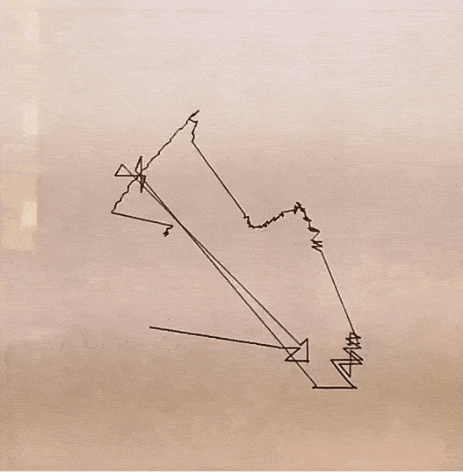
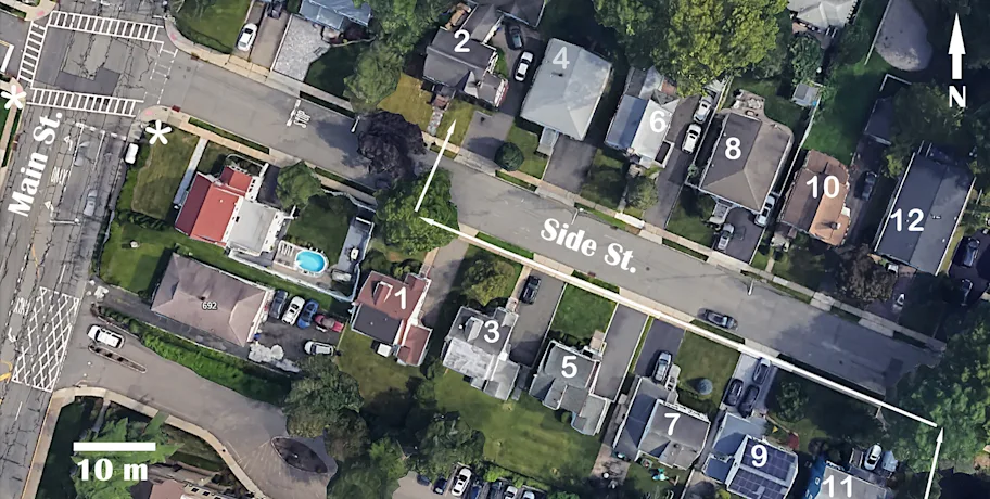
Here’s a map of the street, to help you visualize it. The hawk starts out near house 11, and would zoom up along the sidewalk — hidden by cars — until it was right next to house 2, where the birds would be …
This is an astoundingly complicated intellectual feat for a hawk, as Dinets notes:
Dinets argues that the hawk had formed a mental map of the neighborhood. It couldn’t see its prey from the tree, blocked by cars and buildings, so it had to memorize the layout and calculate its approach. It also had to understand cause and effect — recognizing that a specific sound led to a predictable change in the urban environment.
That’s not basic conditioning. “The observed behavior required having a mental map of the area and understanding the connection between the sound signals and the change in traffic pattern — a remarkable intellectual feat for a young bird,” the study concludes.
There’s a good story on the hawk here, and you can read Dinets’ original paper describing the behavior here, free: “Street smarts: a remarkable adaptation in a city-wintering raptor".
8) 💰 Sculptural piggy banks
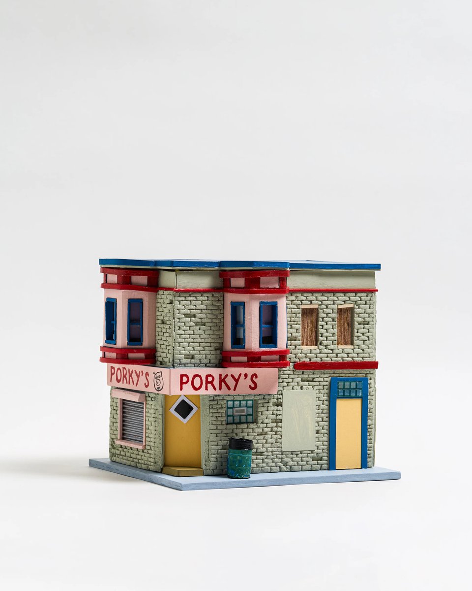
Yowie is a hotel, shop and cafe in Philadelphia that runs occasional art shows. Their latest is the Piggy Bank Show, which showcases 99 artists creating artsy riffs on piggy banks — like the little tenement you see above, by Veronica Hansens.
As Ellis Tree writes in Its Nice That, the works include …
… blocks of wood, crushed beer cans, croc pots and a miniature couch. In sum, very few of these vessels had a straight forward take. Like the egg cup, “most people don't use these in their everyday lives”, shares Shannon. She continues: “The Piggy Bank Show felt like a natural progression with the added timeliness of talk of saving and the appeal of something that instinctively has a sense of humour.”
You can see more of them at that post; one of my favorites is this piece by Palmer Purcell …
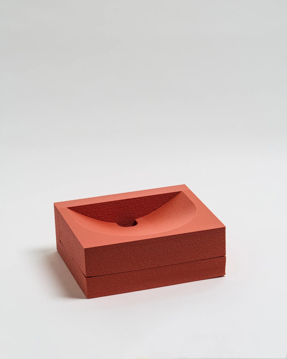
Dig those clean, modernist lines! Coins would swoop down that bowl-shaped ridge in such a satisfying way.
You can order a zine with photos of all the piggy banks.
9) 🍚 The rice theory of culture

Farming wheat doesn’t require a lot of labor per acre, and it’s comparatively easy to automate with machinery. That means an individual farmer can work with a high degree of autonomy.
Farming rice, on the other hand, is hard to automate and requires tons of manual labor — including precisely timed labor. The upshot is that rice farmers were, historically, pretty tightly bound to one another: They’d help each other perform big sudden bursts of planting and harvesting. They worked, in other words, collectively.
As Tomas Pueyo notes, this might explain the different styles of government that emerged in wheat-planting regions versus rice-planting ones …
Maybe this made cultures more or less individualistic? Westerners are famously more individualistic than East Asians. Christianity emphasizes the value of every life and every soul, which leads to more individualistic societies that guarantee individual rights of property and life. Meanwhile, Confucianism, developed in China, emphasizes social duties, puts the interests of society at the forefront, and created societies that are much more sensitive to losing face. Could these differences be linked to crops? When your life depends on your relationship with your neighbors, you better develop a culture of group harmony, family loyalty, and consensus decision-making.
This is the Rice Theory of Culture.
The theory was first proposed in 2022 — you can read the original paper here. The scholars did some tests of people in rice- and wheat-farming regions and, as Pueyo notes, they found …
In psychological tests, people coming from rice-farmed areas (“rice people”) were more culturally interdependent than wheat people (e.g., rice people self-inflate less).
Wheat people reason by focusing on individual elements, while rice people think more holistically.
Rice regions have tighter social norms than wheat regions.7
This comes with stronger social order, less crime, and less drug abuse in rice regions.
But also with less individual freedoms and less acceptance of immigrants. Rice regions are more likely to support authoritarian governments.
As Pueyo notes, this could just be correlation and not causation. But another paper from 2024 discovered some even better evidence: After WWII, the Chinese government designated two adjacent regions to be wheat-growing vs. rice-growing.
When scientists compared those two regions, they found …
The rice farmers show less individualism, more loyalty/nepotism toward a friend over a stranger, and more relational thought style. These results rule out confounds in tests of the rice theory, such as temperature, latitude, and historical events. The differences suggest rice-wheat cultural differences can form in a single generation.
I’m always fascinated by how geography propels culture. It’s the first time I’ve heard of this theory, but I’d love to read more.
10) 🏊 She became a free-diving champion at age 40
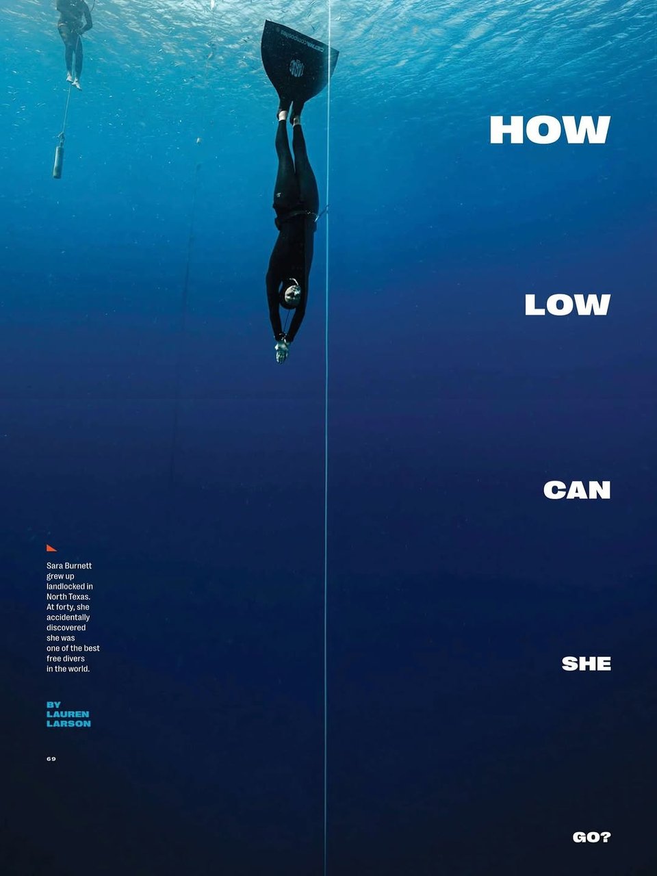
In Texas Monthly, Lauren Larson writes a terrific profile of Sara Burnett — a woman who discovered, almost by happenstance at age 40, that she had a profound talent for “free diving”: Going as deep as you can without an oxygen tank.
Not long after her first free dive she was qualifying for America’s world team, and these days she goes as deep as 55 meters, staying down for minutes at a time.
I was intrigued by the biomechanics of deep diving:
There are small “sensors” under our eyes, Burnett explains, and submerging them activates the mammalian dive response, the mechanism that helps humans conserve oxygen while underwater: The response causes our heart rates to slow, our breathing to stop, and our blood vessels to narrow. Burnett and Greubel then take turns doing “hangs,” descending fifteen meters down the rope and lingering there for minutes at a time.
In slowly building up to longer breath holds—when Burnett does static dives in a pool, she can hold hers for almost five minutes—free divers must overcome the uncomfortable, urgent pangs humans get in our torsos when we’re holding our breath, which are called contractions. These indicate not that the body is running out of oxygen but that carbon dioxide is building up. (Burnett started to feel contractions only recently, and she mostly experiences a burning sensation during dives.) “You can train yourself to get used to that feeling, to where it kind of starts going away. And if you just sit with it for a while, you enter a second phase where you don’t feel it,” she says. “And then, of course, when you’re free diving deeper underwater, you don’t feel it at all, because your lungs are so compressed. You feel like you can stay down there for a week.” She compares the feeling to being wrapped in a weighted blanket.
Check out the whole piece!
11) 📸 A 1912 law prohibiting deepfakes
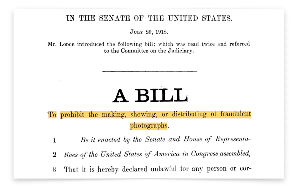
In the late 1800s and early 1900s, photography was still a relatively new art — but people were already wreaking havoc with faked pictures.
That included criminals making fake nudes to try and humiliate or extort women — a problem that seems decidedly of-the-moment today, but was a real issue even back then …
In 1905, a gang was using the threat of “the circulation of indecent trick photographs for the purposes of blackmail.” A 1891 report out of Chicago noted the arrest of a “gang of scamps” selling fake nude images of high society women, and 1936 would see a blackmail plot against opera stars.
Congress wasn’t moved to act, though, until criminals started producing fake photos of then-President William Taft.
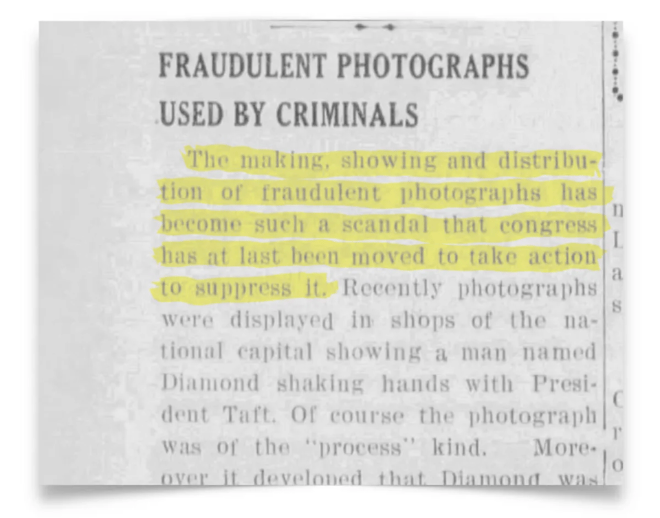
… a fugitive wanted for people trafficking was found in possession of a fake photo posing with President Taft. It was reported he’d used it to buy the trust of his victims.
According to this piece by Louis Anslow, the Senate introduced a bill “to prohibit the making, showing, or distributing of fraudulent photographs”. If found guilty, you’d get up to six months in jail or a fine of up to $1,000, roughly $31,800 in today’s dollars.
Apparently photographers rebelled: The law was so vaguely worded that a lot of legitimate photomanipulation was in danger of being criminalized. As a result, the bill died in the Senate.
12) 🐻 Dataviz of the gender of animals in children’s books
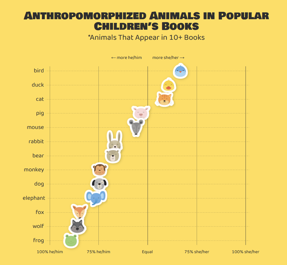
Historically, most children’s books that have an animal as its main character tend to give it a gender — male or female.
But if you consider any given animal, is there any commonality about which gender authors tend to settle on?
The folks at The Pudding wondered, so they gathered 300 of the children’s books published since 1950 that had the highest ratings on Goodreads. Then they read them and noted the gender of the animals.
The result:
After filtering the data to focus on animals who were explicitly gendered (she/her or he/him) and appeared in at least 10 different books, only a few animals were more consistently gendered female: birds, ducks, and cats.
The rest—frog, wolf, fox, elephant, dog, monkey, bear, rabbit, mouse, and pig—skew male.
They explore a bunch of reasons why the gender of animals would skew so heavily male, with those few exceptions. It’s interesting to chew over — a potpourri of cultural, historic and market drivers.
They also have a cool dataviz that shows an animal icon for each of the main characters, which you can click on to see which book it appeared in.
13) 🛼 A final, sudden-death round of reading material
Wind theft. 🛼 Medieval murder maps. 🛼 The Montana Mini-Computer. 🛼 The kitchen recipes of Georgia O’Keeffe. 🛼 On “the evolutionary appeal of ant-eating”. 🛼 ProtoWeb. 🛼 VHS cassette with an embedded screen that displays a video. 🛼 Tetris in a single line of code. 🛼 3D-printable card shuffler. 🛼 Why Hyugens hid his scientific discoveries in a cipher. 🛼 Lovecraft considered as “an American William Blake”. 🛼 Turning a guitar into a hurdy-gurdy. 🛼 Cable bacteria. 🛼 How the return of wolves to Yellowstone also means more aspen trees. 🛼 Restaurant in a creek. 🛼 They reinstated Oscar Wilde’s library card. 🛼 A triple monogram. 🛼 Why coffee stains are darker at the edges. 🛼 Choir of singing beechwood dolls. 🛼 DIY NASA-style solar generator. 🛼 Pokemon cards are increasing in value faster than Nvidia. 🛼 Air Lab. 🛼 Using “cognitive shuffling” to get to sleep. 🛼 Calling cards of Parisian sex workers, circa 1930. 🛼 Parrot.live. 🛼 Robot draws 3D art inside cups of liquid. 🛼 “cuss” is a library of “profane words in several languages”. 🛼 A crop circle from 1678. 🛼 Could 100 men beat 1 gorilla? 🛼 List of eponymous laws. 🛼 SoCal hobbit home. 🛼 4,000-year-old Babylonian math homework. 🛼 Infraordinary FM. 🛼 Sheep tree.
CODA ON SOURCING: I read a ton of blogs and sites every day to find this material. A few I relied on this week include Strange Company, Hackaday, Messy Nessy, Numlock News, the Awesomer, the Morning News, and Mathew Ingram’s “When The Going Gets Weird”; check ‘em out!