Linkfest #31: Tactile Graphics, "Alexinomnia", and a To-Do App Controlled By Dice
Hello folks!
It’s time for "the opposite of doomscrolling” — my latest “Linkfest”, a collection of the finest nuggets of science, culture and technology that I could excavate from the fractally-branching mineshafts of cyberspace.
If you’re a subscriber, thank you! If not, you can sign up here — it’s a Guardian-style, pay-whatevs-you-want affair; the folks who kick in help keep it free for everyone else. And also — forward this email to anyone you know who’d like it!
Let’s begin ...
1) 🎨 Trippy paintings inspired by the artist’s twin sister
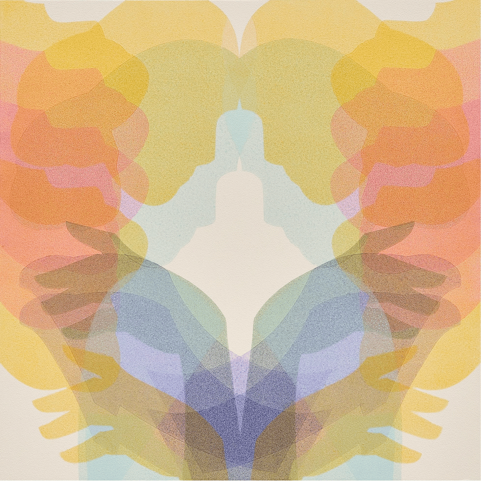
Marina Kappos has an identical twin sister, a fact that inspires her latest series of paintings — in which she layers together transparent mirror-images of women’s bodies, to produce gorgeous and hypnotic images.
Kappos applies acrylic paint in semi-transparent layers of color, which overlap to create a resonating or vibrating visual quality. She is interested in portraying human connections, especially women, often emphasizing profiles or hands because they hint at the body but may not be the first detail one notices when seeing reverberating, optical color effects. Many works have light and dark counterparts, like “Sister 1” and “Sister 2.”
“Like echoes, the repeated motifs almost have a Doppler effect, where there is an increase or decrease in frequency of light depending on where you stand,” Kappos says. “The ethereal, transparent layers of paint eventually become profiles of faces, sometimes melding into landscape, at times appearing out of focus, simply buzzing or humming along.”
More of her stuff at that Colossal piece or at Kappos’ web site.
2) 👉 Tactile graphics for visually-impaired students in 1900
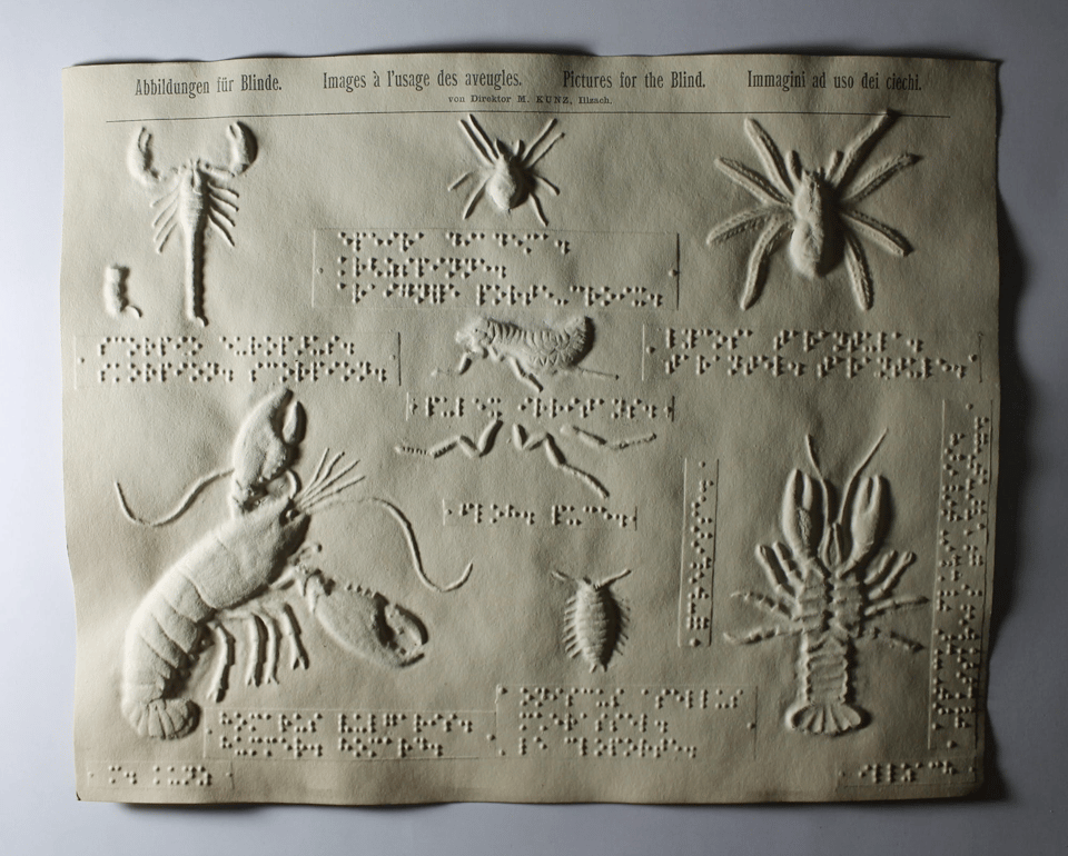
Back during the turn of the 20th century, the educator Martin Kunz ran a school for visually-impaired kids. To give them a sense of the shape of various animals and plants, he created these remarkable embossed images accompanied by braille descriptions.
To create each page, he hand-carved two wood pieces that formed a mold, into which he sandwiched paper to produce raised illustrations.
The material was typically thick, and Kunz soaked it in water before placing it between the blocks so that the natural fibers would soften and stretch into shape. Leaves, fish, herons, crocodiles, crustaceans, and more comprise a wide array of designs that he mass-produced and made available to blind students all over the world.
More here at their Flickr account. The maps are particularly gorgeous, as with Italy here …
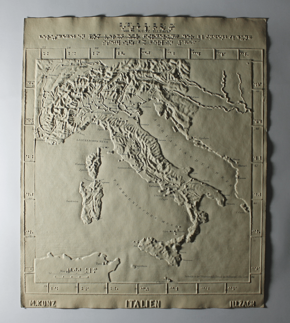
The craft that went into this is pretty astonishing.
3) 📇 “Alexinomia”, or, the phobia of calling loved ones by their names
I had never heard of alexinomia before, but apparently it’s the condition where it feels so awkward to call a loved one by their name that you can’t bring yourself to do it.
I was unaware this was a thing? But apparently so, according to this fascinating piece by Shayla Love, who suffers from it …
For years, Thomas Ditye, a psychologist at Sigmund Freud Private University, in Vienna, and his colleague Lisa Welleschik listened as their clients described their struggles to say others’ names. In the 2023 study that coined the term alexinomia, Ditye and his colleagues interviewed 13 German-speaking women who found the phenomenon relatable. One woman told him that she couldn’t say her classmates’ names when she was younger, and after she met her husband, the issue became more pronounced. “Even to this day, it’s still difficult for me to address him by name; I always say ‘you’ or ‘hey,’ things like that,” she said. In a study published last year, Ditye and his colleagues searched online English-language discussion forums and found hundreds of posts in which men and women from around the world described how saying names made them feel weird. The team has also created an alexinomia questionnaire, with prompts that include “Saying the name of someone I like makes me feel exposed” and “I prefer using nicknames with my friends and family in order to avoid using names.”
The psychology here is really intriguing. Sometimes alexinomia happens because using a loved one’s name feels too formal, too alarming, too impersonal, or too hostile. Or too fakey, as when a salesperson learns your name and keeps using it (“well, Clive, that’s a good question!”) in a fashion that is instantly intolerable.
4) ✈️ The Department of Defense’s “boneyard”

Today I learned about the “boneyard”, an air-force base in Tucson where the Department of Defence stores surplus aircraft. When you look at it using Google Map’s satellite view (or Apple Maps), it’s extraordinary — there are hundreds of bombers, fighter jets and helicopters, all neatly lined up in several huge fields.
As this piece in the Economist notes …
AMARG is a temporary storage site, a source for spare parts and a “regeneration” facility, where stored planes are made fit to fly again. “Nothing that you see out here is junk,” says Robert Raine, AMARG’s spokesman. Even what is obviously junk—a bunch of decaying B-52 bombers with their wings and tails chopped off—is there for a reason. They are kept in that state so that Russian spy satellites can verify America’s compliance with the Strategic Arms Reduction Treaty.
Apparently the air force strips them for parts quite frequently …
… for use on serving fighters, bombers, transport carriers and others. The parts could be anything from engine components to entire horizontal stabilisers (those are fins at the back of a plane, jutting out sideways underneath the tailfin). Mechanics—whom AMARG calls “artisans”—go out into the desert, locate the part, extract it, and bring it to a warehouse where it is cleaned, checked, packaged and shipped. The reservoir can process up to 30 such requests every day.
Here’s a link to view the location on Google Maps in satellite mode, and here it is in Apple Maps. Slide the map up and to the right to see the rest of the field, it’s wild.
5) 📱 WikiTok
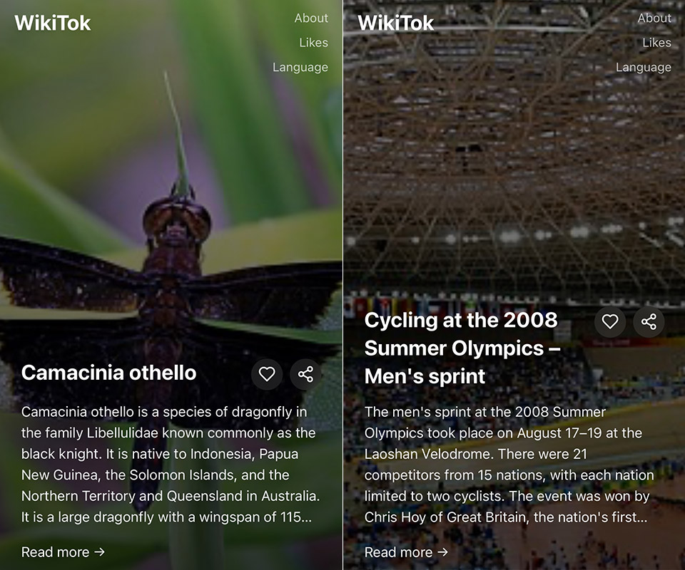
On Feb 3, the software developer Tyler Angert tweeted: "insane project idea: all of wikipedia on a single, scrollable page." Others chimed in, vamping on the concept, and Angert coined the name "WikiTok" for the idea.
Isaac Gemal, a coder based in NYC, saw the whole thing and jumped into action. So now we all can enjoy the delights of …
… WikiTok, a web app that displays an endless feed of randomly-picked Wikipedia articles.
When I just checked WikiTok now, it showed me the pages for the Cyrillic letter Dhe, Stephanie Strom, “business failure”, and Boradigah.
It works fine on a laptop but is far more TikTok-like on a phone!
Apparently early users have been pinging Gemal asking if he can add an algorithm that detects what they’re clicking on and serves up more, similar articles. He’s adamantly opposed — the whole point of the project, as he tells Benj Edwards at Ars Technica, is to critique the addictive “for you” sorting of social-media feeds:
… so far, he is sticking to his vision of a free way to enjoy Wikipedia without being tracked and targeted. "I have no grand plans for some sort of insane monetized hyper-calculating TikTok algorithm," Gemal told us. "It is anti-algorithmic, if anything."
6) 💖 Romance is vanishing from movies
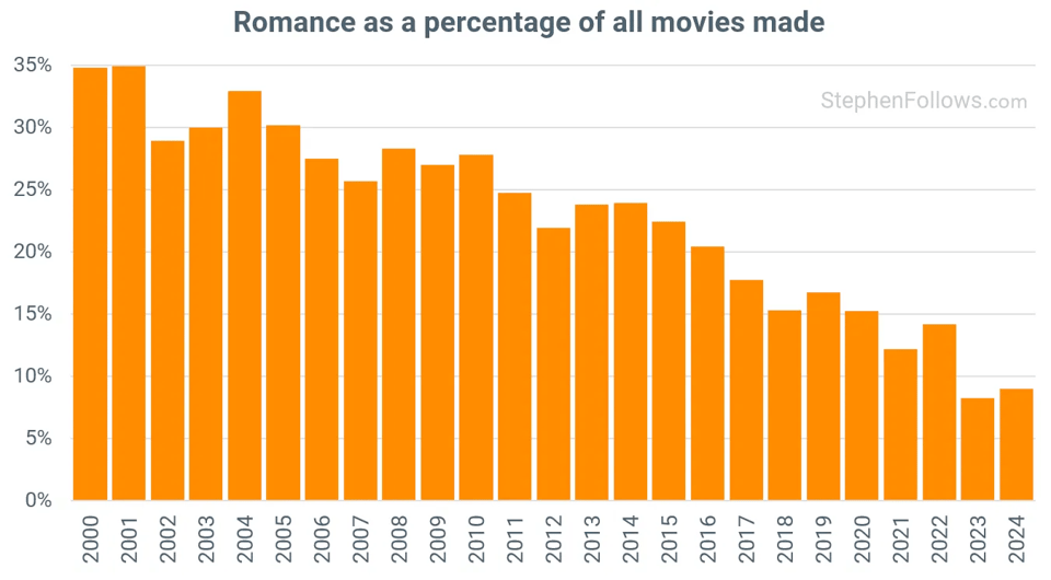
Stephen Follows is a data guy who specializes in doing number-crunches of the film industry. He’d recently published a study showing that on-screen sex had declined by almost 40% over the last 25 years …
… which made him wonder: Huh, what’s been the fate of on-screen romance?
He gathered IMDB data, found that the percentage of movies classified as “romance” has absolutely plummeted — from 34.8% in 2000 to 8.6% in 2024.
He did another interesting analysis, looking at 17,430 movies that were not themselves romance (i.e. action flicks, sci fi, etc) and examined whether a subplot contained romance. Which is to say, even if the movie isn’t itself a “romance”, to what extent does the plot use romance?
Even there, the trend was downwards. Fewer movies contain romance as a subplot …
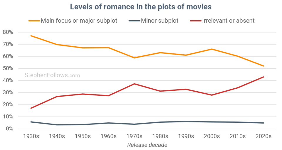
The one exception was action movies: They bounced around a bunch, but over decades the proportion that include a romantic subplot have gone up.
What does this all mean? Follows doesn’t draw any firm conclusions, so we can talk amongst ourselves about it. He does wonder if romance has moved from the big screen to the smaller one — i.e. streaming services …
Rather than concluding that ‘romance is dead’, it feels more plausible to suggest that audiences may be engaging with it differently.
Watching an emotionally intense romance can be a vulnerable experience - one perhaps better suited to the intimacy of home viewing rather than the big screen. This might explain why streaming services continue to produce romance-heavy content while feature filmmakers are leaning away from it.
I’d buy this. It reminds me of the analysis of love songs that I described in Linkfest #27, which found that the overall amount of love songs had stayed the same — but historic tropes like the “serenade” and the “heartache” had eroded, replaced by “love song for the self” and “sexual confidence” anthems. Or to put it another way: Genres likely never vanish — they just evolve in ways that can make them seem unrecognizable to previous generations.
7) ⛏️ The dream-state weirdness of AI-generated Minecraft
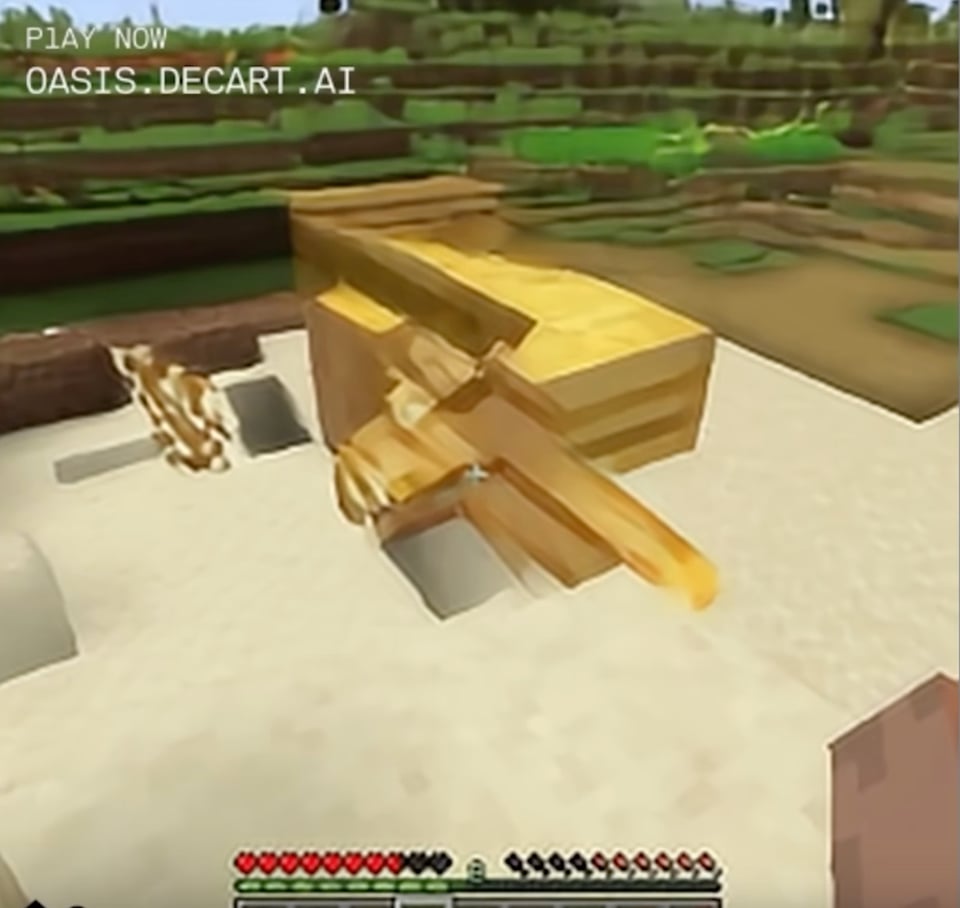
Oasis is a clone of Minecraft where the world is generated entirely by AI. When you play it, the game takes your input — move forward, turn left, jump, etc. — and the AI model generates the next frame based on its best probabilistic guess of what ought to happen.
This produces an incredibly weird experience. As you can see in the video above, the objects in Oasis are fuzzy and strange and sometimes randomly morph into something new. (That screenshot above is from a YouTube video showing what it looks like.)
Janelle Shane — a longtime experimenter with oddball AI — wrote a fun essay on how dreamlike and trippy it is to experience Minecraft via Oasis …
There's no object permanence. Look at a mountain, look away, and look back at it, and the mountain's completely gone …
… if you stare fixedly at ordinary blocks and approach them, they tend to get weird. Noise in a generative algorithm usually comes in the form of strong striped patterns, so by continually staring in the same direction you force the "Minecraft" algorithm to keep generating new frames based on accumulating noise. A somewhat ordinary stone cliff face gradually loses what definition it has, becoming blocky and flat as it seems to panic. [snip]
I've made it a goal to see how completely I can get the generated landscape to freak out. One time I was swimming across a lake and noticed that the reflections at the water's edge were looking weirdly spiky.
Swimming closer to them, they started to get even more strongly striped. Was this still supposed to be the horizon? Why did the rest of the water turn featureless?
Why did the snowy mountain turn into trees? Was I even above water any more?
I swam closer and the water's edge became a weird static wall that engulfed the sun.
8) 👽 Could an extraterrestrial race metabolize something other than oxygen?
This very question was posed to the Worldbuilding Stack Exchange (which I didn’t know existed; cool!) and it prompted an engrossing answer from the user Samuel Owen.
As he notes, if we wanted to envision a lifeform that breathed something other than oxygen, we’d need “the oxidizer (an electron recipient) and the reducer (an electron donor)”. For the oxidizer on this alien planet, the most obvious candidates are the halogens fluorine, chlorine, bromine, and iodine.
The life cycle of "plant" life in your world would involve ripping the carbon out of Halomethanes or silicon out of Halosilanes to use it for assorted purposes (storing energy, growing, etc), and emitting the resulting halogen as a byproduct. The substances that are abundant on your world will be massively different from the ones on ours - most things we're used to will react with halogens to produce compounds that are quite rare on Earth. As such, the tissues of your organisms will be strange to us - perhaps there's Teflon fibers in their skin, or their blood is Freon-based.
For the reducer component in the atmosphere, Owen suggests …
… perhaps elemental sulfur or peroxide, which is produced by some photosynthetic organism, to serve as the basic "fuel" for your world (akin to glucose for us). The atmosphere (at least the breathable part) would consist of something like hydrogen, methane, or another gas that we think of as "flammable". (Because that means it's readily oxidizable).
This would produce some pretty wild lifeforms …
It's worth noting that lots of things around this environment will be "flammable" to us, because the normal, stable forms of matter here will be ones that are thoroughly reduced - and therefore primed to oxidize if you give them an oxidizer. You might even see the sweat or blood of these aliens catch fire just from entering an Earth atmosphere!
Go check out the whole thread, it’s a blast. I’m gonna add Worldbuilding to my RSS feeds — it looks like a hotbed of fascinating conversations.
9) 🎲 To-do app controlled by dice
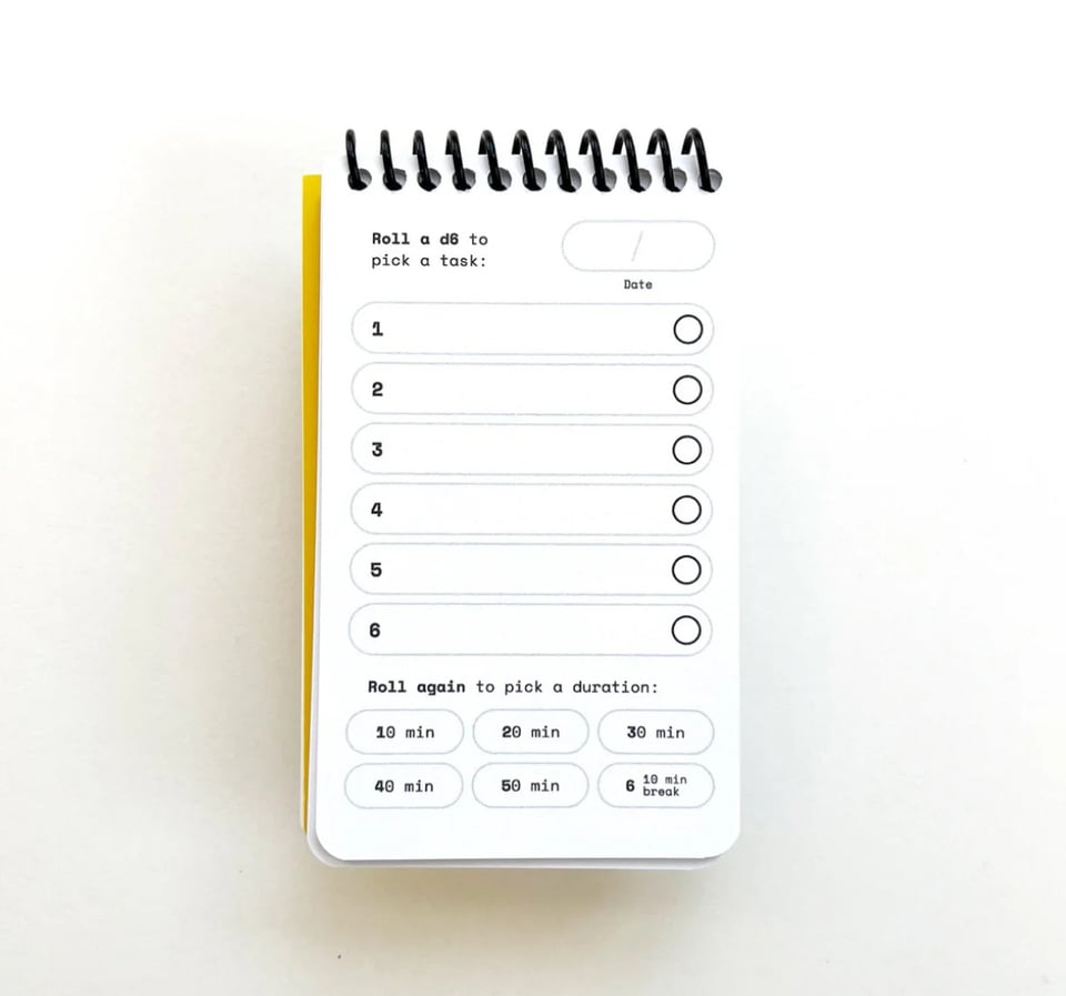
Tom and Sarah Briden are designers who make exceptionally cool “paper apps”.
I first heard of them when they launched a Kickstarter campaign for “Paper Dungeon”, a single-player D&D style game you play using one of their custom-designed pads. They followed it up with “Galaxy”, a similarly-styled one-pad space shooter.
I just happened upon their “To Do Notebook”, which is a really witty conceit:
Fill out the tasks you want to accomplish, then roll a d6 to determine which one to work on. Roll again to determine how long to work on it. With any luck, you'll roll a 6 and get a break!
Love it, gonna order some.
10) 😜 Did two-word insults give birth to modern syntax?
The linguist Ljiljana Progovac has a fascinating theory: Two-word insults — like “butt-head” or “no-brain” — might have given rise to our modern, complex human syntax.
What’s her argument? It begins with the observation that two-word clauses are very old, and are likely the first sentences early humans ever spoke. As the New Scientist quotes Progovac …
Take the sentence “Elena will grow wheat”. It contains a short clause – grow wheat – that makes sense on its own. The remaining words expand this clause by telling us who is growing the wheat and anchoring the activity in time. For Progovac, this means our ancestors came up with phrases like “grow wheat” first and the expansions came later as language became more sophisticated. Analyse this syntactical hierarchy across modern languages, says Progovac, and you will find a curious class of two-word clauses right at its bottom. “They have very little structure,” she says. “They are proxies of the earliest grammars.”
Of course, these days our modern grammars are complex, so we less often employ sentence/clauses in that only-two-words style, i.e. “grow wheat”.
There’s one common exception, as Progovac notes: Insults. A curiously large proportion of insults — in nearly every language she’s examined — consist of two-word clauses …
Intriguingly, many of these phrases are combinations that have their origins in a noun and a verb, juxtaposed to produce a creative put-down: think kill-joy, busy-body, scatter-brain and arse-licker. And this is also the case in non-English languages. For example, Serbian versions include poj-kurić (sing-dick, meaning womaniser) and jebi-vetar (fuck-wind, meaning charlatan).
And so this leads to her big idea …
Because of this, Progovac suspects that prehistoric humans first began combining words into short sentences at least partly to insult one another.
There’s a lot more to her argument, so go read the whole piece! It is, as Progovac notes, only a hypothesis, and since we have no audio records of very early human language there’s no way to prove or disprove it. But other linguists agree it’s an interesting concept.
11) 🎀 The rise of pink in medieval and renaissance fashion
There’s a new book Pink: The History of a Color — by Michel Pastoureau — and this review pulls out some fun historic details about the rise of pink in art and fashion.
As they tell it, the use of pink in Europe first took off in the 14th century, when artisans crushed up oak-tree insects to make the pigment. Another source was brazilwood, and …
… so popular was pink that when the Portuguese discovered tropical trees in the New World whose wood possessed the same properties as brazilwood, they named the country they colonised after it.
Did not know that!
Then pink really explodes in late-18th-century Europe:
In textiles, the fashion for pink reached its height between 1750 and 1780, especially in France. Strong pinks were available to middle-class buyers, leading elites to pursue the more expensive pastel shades. Charles Joseph de Ligne, marshal of the army of the Holy Roman Empire, was nicknamed ‘the pink prince’, a term that referred not only to his taste for pink in furnishings and clothing but also to his optimism and good humour. Symbolically, pink had come to indicate joie de vivre. Madame de Pompadour loved to combine new pinks with blues and greys, often striped, and at Sèvres, a delicate pale shade of pink with a hint of orange was perfected for porcelain. From the 1770s ‘pink seemed to invade everything’, Pastoureau says. Painters, decorators, dyers, tailors and milliners all strove to produce varied hues and combinations. Goethe’s bestselling The Sorrows of Young Werther (1774) launched a fashion for white dresses trimmed with pink ribbons (and among men, for blue morning coats with yellow breeches). Werther says that he wants to be buried with Lotte’s pink ribbons in his pocket.
I really want to read this book now — I love microhistories of this sort!
12) 🔎 How the Google Vision API sees you
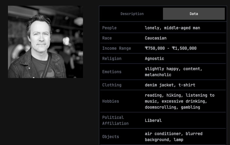
The photo-app company Ente has created a fun tool — TheySeeYourPhotos, which shows you what the Google Vision API detects in a photo of you.
I fed my standard headshot into the tool, and it gave me that summary you see above. A longer version of the Google Vision API output …
The image features a man in what appears to be a cafe in Mumbai, India. The subject, seemingly in his late 40s, stands in the foreground, with blurred objects and surfaces behind him. An air conditioner is visible mounted on the wall, and general cafe lighting can be seen in the background.
The man, of Caucasian descent, appears slightly happy and content, though there may be a hint of underlying melancholy. He is wearing a denim jacket over a t-shirt. One can imagine him enjoying hobbies such as reading, hiking, and listening to music. On the darker side, he might also engage in excessive drinking, doomscrolling, and gambling. Considering his location and clothing, his income range might fall between ₹750,000 and ₹1,500,000. He is likely agnostic and leans towards liberal political views.
The man seems to harbor a certain melancholic disposition, hence we can target them with luxury goods and mental health services, such as antique globes (Replogle), vintage fountain pens (Montblanc), mindfulness apps (Headspace), therapy subscriptions (BetterHelp), single-origin coffee beans (Starbucks Reserve), noise-cancelling headphones (Sony), online language courses (Duolingo), streaming services (Netflix).
LOL. Some of this stuff is obviously correct: I was about 50 when this photo was taken, I’m wearing a denim jacket and tshirt, and I’m liberal. I definitely enjoy cocktails, but “excessive drinking” is a stretch, and I don’t gamble at all, nor do I hike. (Cycling across the entire continental US, though: Yeah, that, I’ve done!) Doomscrolling, sure, but who doesn’t? As for “lonely”, maybe it knows something I don’t, but I certainly don’t feel that way.
I pity the poor advertisers who try to sell me stuff based on Google’s digital phrenology, because holy crap, nearly every single one of these marketing recommendations is howlingly off-target.
No, I am not going buy antique globes (what?), online therapy subscriptions (F2F for me all the way), noise-cancelling headphones (I use the cheapest possible $25 earbuds, do not really care about music quality, go figure), nor streaming services (I watch essentially zero TV). My idea of a mindfulness app is playing Robotron 2084 on a MAME emulator. I do admire fountain pens, I guess? Wouldn’t buy one, though.
Oh and the photo was taken in downtown Manhattan, not Mumbai 😂
That said, this is kind of hilarious exercise, so give it a whirl.
(Caveat: Obviously, some of the interpretations above are authored by Ente based on data from the Google Vision API, so some of the off-based-ness may be from their end.)
13) 📟 The ten strangest mobile-phone designs Nokia never launched
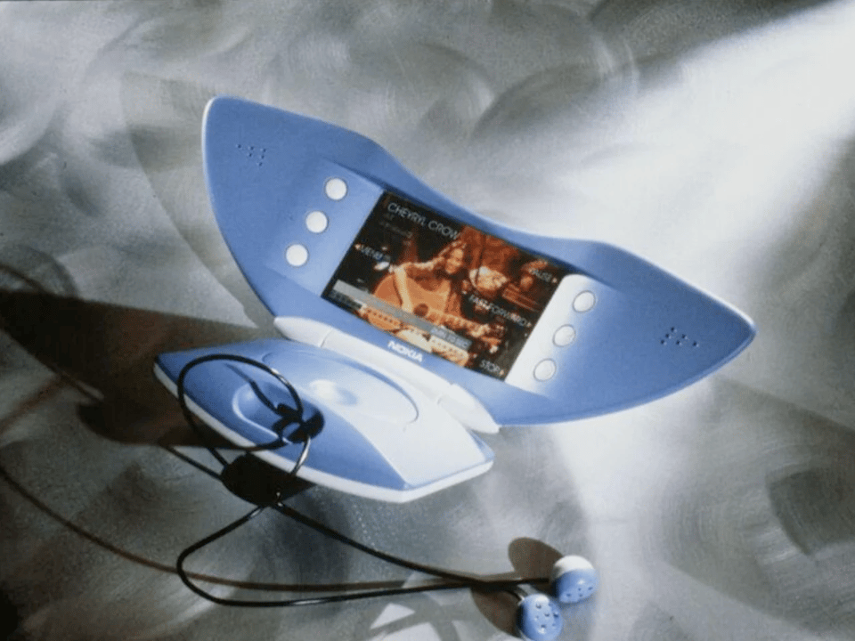
When the Iphone launched in 2007, it quickly oriented all mobile-phone design around that form-factor. Within a couple of years, most smartphones became a brick of glass with a virtual keyboard.
But in the years leading up to the Iphone, mobile-phone design was pretty weird. You could buy clamshell-style phones that flipped open — revealing QWERTY keyboards split around a tiny LCD screen in the middle — or Lovecraftian horrors like the NGage, which was both a phone and a game console, vivisectioned together in a fashion that prevented it from performing either function correctly.
Nokia had a lot of nutty ideas during this time frame! Over at Yanko Design, JC Torres dove into the newly-launched Nokia Design archive to find ten of the weirdest.
That manta-ray thing above? I think it’s a music player, or maybe even a video player. Check out the whole gallery, it’s pretty wild.
14) 🛫 A final, sudden-death round of reading material
Fog harvesting. 🛫 Steganographic emoji. 🛫 Flying a drone through a rolling tire. 🛫 Subpixel “Snake”. 🛫 Rat populations boom as cities heat up. 🛫 NotepadJS. 🛫 Michelangelo depicted a women with breast cancer in the Sistine Chapel. 🛫 Robot barista for self-driving cars. 🛫 Should the dead have human rights? 🛫 Why you can’t store light. 🛫 The mystery of a 200-year-old bottle of urine. 🛫 Using Internet cables to detect earthquakes. 🛫 “Gambling frog” playing cards. 🛫 Chimps do better at hard tasks when they have an audience. 🛫 The Messinian Salinity Crisis. 🛫 How medieval Europe regarded crowds. 🛫 Want to sound like Tom Scholz in Boston? 🛫 Wilson Bentley, pioneer of snowflake photography. 🛫 Portraits drawn by pen-plotter scribble art. 🛫 TabBoo. 🛫 A single human can control up to 100 drones simultaneously. 🛫 The Net-Zero Dad. 🛫 The largest structure in the universe. 🛫 The Author’s Guild creates a “human authored” certification. 🛫 A list of dog names from 1697. 🛫 Solar backpacks. 🛫 Robotic cat head-bunting. 🛫 Bennu’s asteroid samples offer new clues about the origin of life. 🛫 Here lies Charlotte Temple, who never existed. 🛫 Tinybase, superfast storage for local apps. 🛫 Jane Austen used pins to edit her manuscript for The Watsons. 🛫 John Milton coined more than 630 words." 🛫 Why dead weight is so heavy. 🛫 Solving a quantum Rubik’s Cube. 🛫 66-million-year-old fish vomit. 🛫 Little red dots of the early universe. 🛫 “Plumber’s nightmare.” 🛫 Viviparity.
CODA ON SOURCING: I read a ton of blogs and sites every week to find this material. A few I relied on this week include Andrew Drucker’s Interesting Links, Numlock News, the Awesomer, Strange Company, and “When The Going Get Weird”; check ‘em out!