Linkfest #27: Aztec Death Whistles, "Supercircular" Solar, and Collateralized GPU Obligations
Why HELLO THERE.
It’s time for my latest “Linkfest” — or, "the opposite of doomscrolling”: A collection of the best stuff in science, culture and technology that I could ransack from the rangy global flea-market of the Internet.
If you’re a subscriber, thank you! If not, you can sign up here — it’s a pay-what-you-want affair; the folks who can afford to contribute help keep it free for everyone else. And hey there — forward this email to anyone you know who’d like it!
Let’s begin ...
1) 🧵 Stitchwork turned into animated gifs

The artist Alex Khabbazi is producing some wild animated gifs — by individually stitching each frame using a sewing machine.
As Ellis Tree writes in It’s Nice That …
Each frame of the artist’s knitted moving work is individually made with his knitting machine and then compiled into stop motion, with no need for applying texture or digital overlays afterwards. As it’s a laborious process that can’t really be replicated, each frame is entirely individual — an attribute of the technique that further draws Alex in. “When it comes to the tactile feeling you get from using analogue processes, there’s no fooling the eye,” he says. “Seeing this distortion vary frame to frame creates a beautifully twitchy effect.”
There’s a wonderful layer of meta here: It was stitchwork that originally inspired the bitmapped fonts and graphics of the early computer age. I love art that closes this ouroboran loop, and doubly love art that marries the glitchy imperfections of analog media with the binary precision of the digital world. Two great tastes that taste great together.
Go check out the gallery at It’s Nice That to see more of Khabbazi’s nifty gifs.
2) 🪈 Listen to a creepy Aztec death-whistle

Okay people, I have your new ringtone: An Azetc death whistle.
That image above? It’s one of the whistles, which were apparently used in Aztec human-sacrifice rituals, as researchers at the University of Zurich note …
Their skull-shaped body may represent Mictlantecuhtli, the Aztec Lord of the Underworld, and the iconic screaming sound may have prepared human sacrifices for their mythological descent into Mictlan, the Aztec underworld.
The researchers wanted to figure out what type of impact these whistles had on people who heard them. So they got some recordings of ones being played, and also did 3D scans of ones in a museum, then blew on them themselves. Turns out, yep, they produce a very creepy human-scream-like sound -- you can hear some hair-raising examples right here.
How do the whistles produce such acoustic horrors? Apparently they have two opposing sound chambers that create turbulence, and, le voila.
The Zurich academics played the sounds while subjects listened and had their brain activity recorded. Turns out i) yeah, people found them super unsettling, and ii) the brain activity was kind of interesting …
… the team also observed brain activity in regions that associate sounds with symbolic meaning. This suggests a “hybrid” nature of these death whistle sounds, combining a basic psychoaffective influence on listeners with more elaborate mental processes of sound symbolism, signifying the iconographic nature.
You can read the original paper here.
3) 📺 Random viewer for ancient YouTube videos

From 2009 and 2012, iPhones had a button in the Photos app called "Send to YouTube". People would push the button and very often forget to name the file — so it would get posted to YouTube with the default filename from iOS, something like “IMG_XXXX”.
The programmer Riley Walz made a bot that crawled YouTube and found 5 million such videos — then built a web app that will show you one at a time, randomly.
People, this is mesmerizing. I spent a couple minutes hitting the “next” button and I saw videos of a birthday party, skiers climb-walking up a hill, little dogs playing, dudes in baseball caps sing-rapping to the camera, kids doing a co-ordinated dance at school, and — above — a kid pulling BMX tricks at a skatepark.
Because the videos were shot on smartphone cameras now over 12 years old, they have a grainy quality that can make them seem alternately charming or pregnant with the dread of a found-footage horror movie.
It feels deeply voyeuristic, though, in a way that makes me a bit queasy: I suspect some of these people didn’t know what the upload button did, back then. I bet some don’t even realize these videos are online.
Nonetheless, a fascinating little project and a piece of web history.
4) 📝 “Silentpoems” word processor
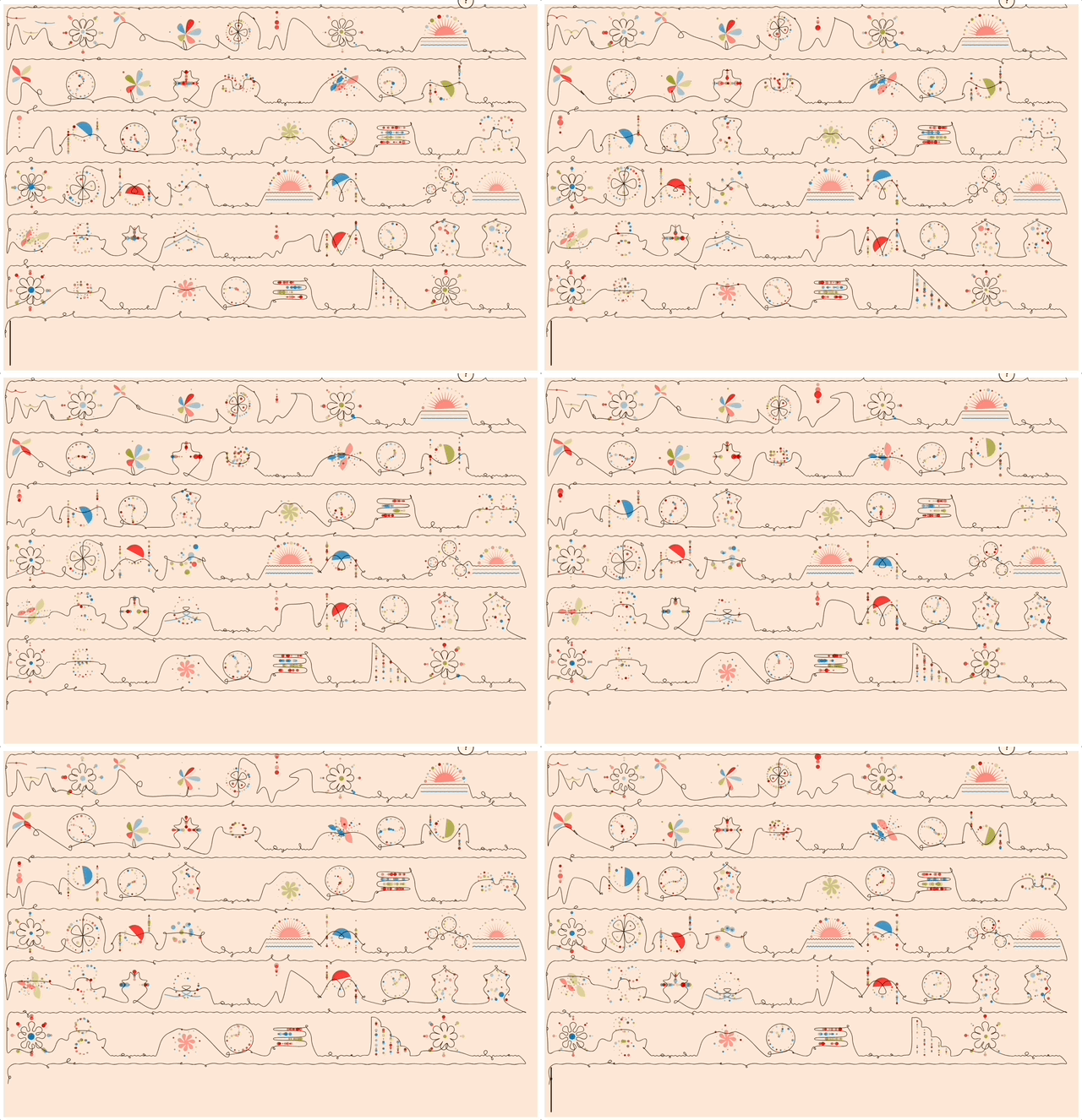
The designer Lavinia Petrache has created a very weird and beautiful word processor — “Silent Poems”.
She created a set of animated glyphs for each letter of the English alphabet, so whatever you type gets transformed into a landscape of dreamily looping figures. As she describes it …
A statement of our communication shortcomings — with other people, or with ourselves. Inspired by some text messages. [snip]
Every abstract letter has its own unique design, and if you learn the language you can read the message.
I dig the idea of becoming fluent enough in this alphabet that you could trade messages back and forth with a friend. It only works on a computer, not mobile, alas.
(BTW, that animation above? I used Silent Poems to type the first two lines of the famous Emily Dickinson poem: “Because I could not stop for Death / He kindly stopped for me”.)
5) 💕 The evolution of love songs
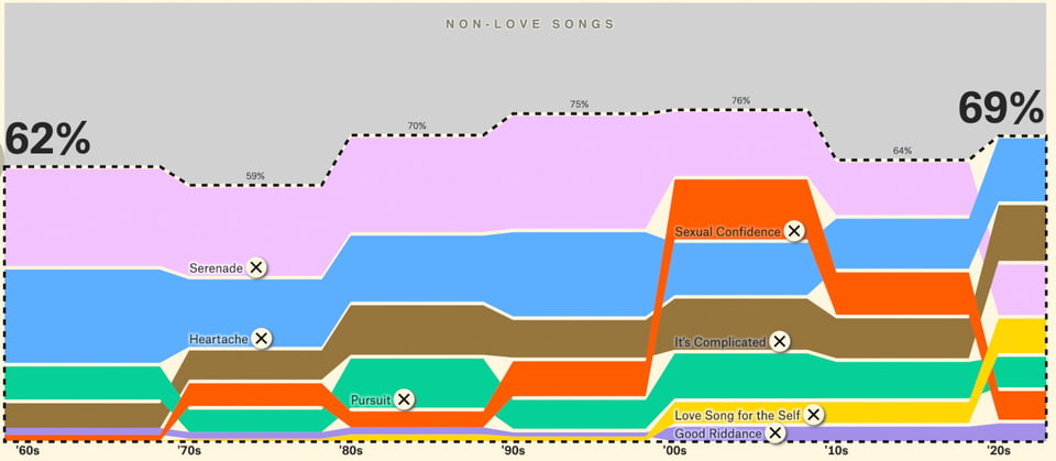
Boomers these days sometimes claim that “no-one’s making love songs any more”. So over at The Pudding, David Mora and Michelle Jia did a fascinating analysis and dataviz of how love songs have evolved over time.
The first trick is determining what is a love song. They create an interesting taxonomy:
the serenade: “you love someone, and they love you back”
the heartache: “maybe you broke up, or it’s just unrequited”
the pursuit: “You just spotted someone, your heart is beating fast, and who KNOWS where this thing might lead”
it’s complicated: “when a relationship isn’t clearly good or bad”
good riddance: “the relationship is clearly over, but the songwriter’s heartbreak has resurrected into... righteous power”
sexual confidence: “songs that get a little steamy”
the love song for the self: “while it’s not written to a lover, it’s often written in reaction to romantic rejection”
The tl;dr is that the boomers are partly right. Back in the 60s, the “serenade” comprised fully 23% of all Top 10 hits — and by the 2020s it was cut nearly in half, down to 12%. “Heartache” went through a similar erosion.
But the other genres — “pursuit”, “it’s complicated”, and “sexual confidence” — all explode over time. “Love song for the self” is the most contemporary emotion of all: It’s almost nonexistent in the 60s and 70s, then slowwwwwly emerges … until the 00s and 2020s, when it erupts to become nearly as big as the “serenade” and “heartache”.
So basically, what freaks out boomers (and anyone who complains about these trends) is that traditional love-dovey songs have reduced in frequency, replaced by genres more focused on the steamier, messier, and dissing-my-ex psychologies of love.
Check out the whole dataviz: They did a slide-show version where you see each genre added, one by one; it gives you a cool sense of how each new genre changed the overall mix.
6) 🎨 The geometric line-art of Wacław Szpakowski
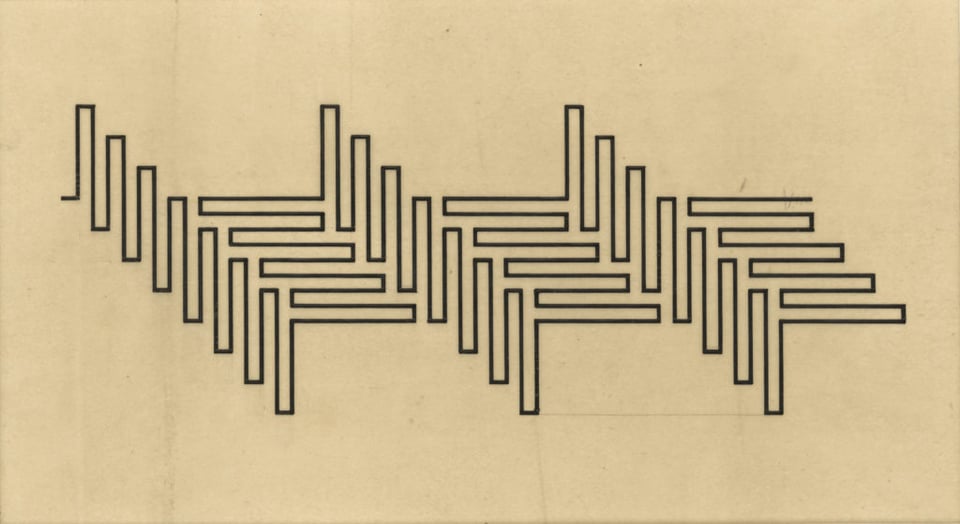
In 1900, when Waclaw Szpakowski was 17, he began doing line-drawings that followed a set of rules: He drew a single black line that turned only at right angles, and never overlapped with itself. The line was usually 1 mm thick, and when it ran parallel to itself, the parallels were spaced 4 mm apart.
The drawings are pretty mesmerizing. They’re deeply mathematical, and — given that Szpakowski started doing this in 1900 — they're a pioneering example of abstraction. Szpakowski himself was an OG "outsider" artist; though he was an architect and designer, for fifty years he never showed his art (untold hundreds of works) to anyone but his family. He wasn’t plugged into artistic communities.
There’s a terrific gallery of his drawings here.
As the curator Elżbieta Łubowicz notes …
… Szpakowski’s art sprung largely from his interest in ornamentation, treated not as something purely decorative but rather, just like at its ancient source, as a metaphysical reflection of the world and the laws at the root of nature. His decision to reach for rudimentary ornamental forms, his fascination with and study of the Greek linear meander caused, as Getulio Alviani wrote: 'Szpakowski’s work [to be] perfectly timeless – suspended and aseptic, they might as well have been works of ancient Egyptians, Greeks, or Mayans. It’s endowed with the spirit and essence of an ancient script, its meaning concealed behind dry and dashed lines.'
Me, I’m personally fascinated by Szpakowski’s work, because when I was a kid in the 70s, I had a doodling heuristic that was very similar!
The rules were: I would put the pen down and draw a line that could only go forward, could never reverse, and could turn only at right angles. The difference from Szpakowski is that I let the line cross itself. So you got images like this …
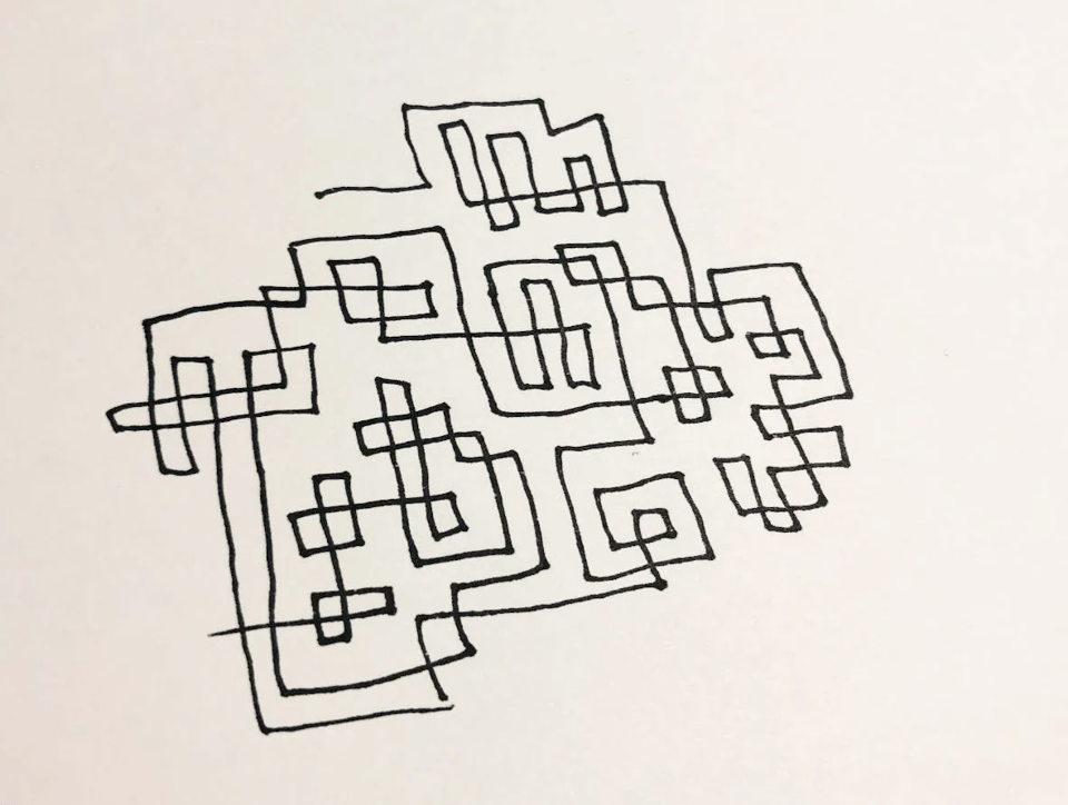
Back in 2021, I remembered my old doodling technique and created a little web toy that lets you create similar doodles using the arrow keys on your computer. (It doesn’t work on mobile, sorry.) It follows all my rules except it does allow you to go backwards.
Nonetheless, it’ll let you draw stuff very much like Szpakowski; here’s an example …
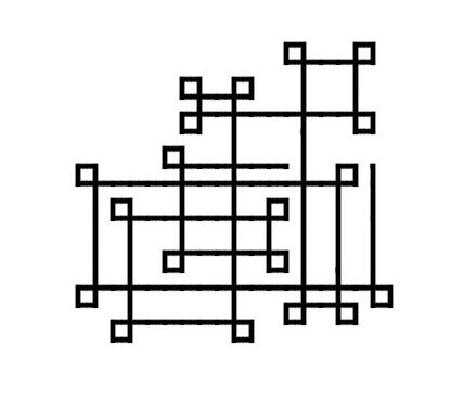
Give it a try if you’re bored at work and want to doodle.
Now I’m thinking I should do a “Szpakowski Edition” of my tool — where I make it so you can’t go backwards, the background is a paperlike pale yellow, and you can export your final work as a PDF. Stay tuned … maybe I’ll have this done by the next Linkfest!
Here’s an essay I wrote about my doodling technique and why I built the web tool, if you’re interested.
7) 🌌 A better way to visualize spacetime
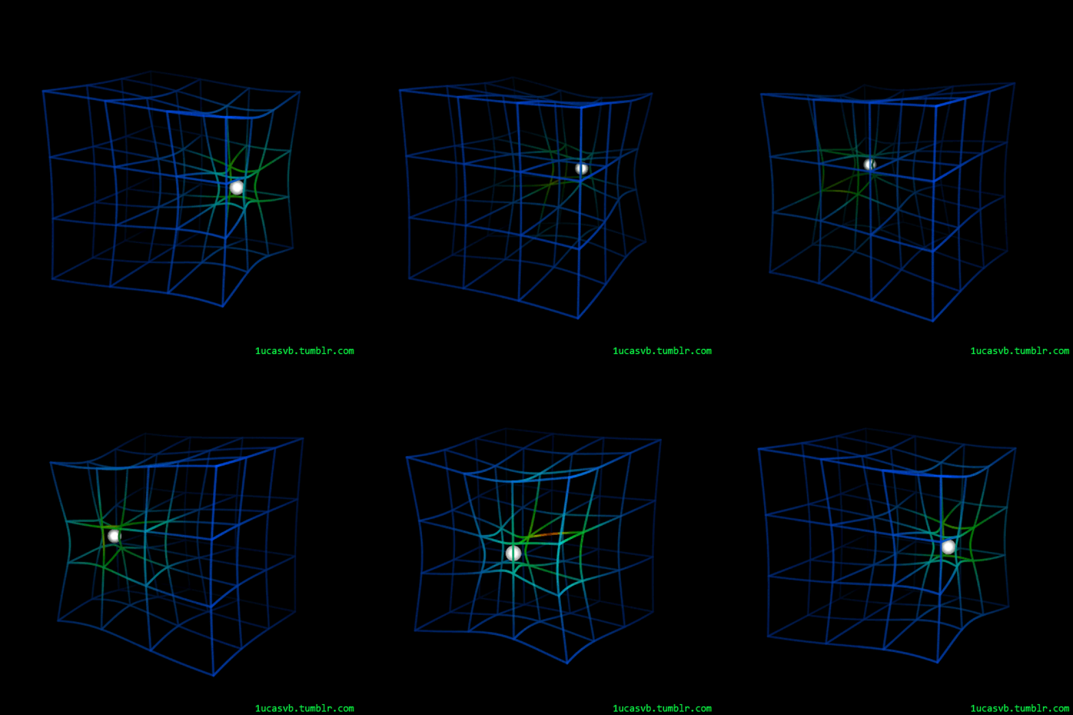
A couple of years ago, Ethan Siegel wrote an essay about improved ways to visualize spacetime.
As he notes, traditionally we see it drawn as a 2D grid, flat as a blanket — and then when you put a big bowling ball down on it, the blanket warps around the ball, showing how huge-massed objects affect spacetime.
But as Siegel notes, 2D is a terrible way to visualize effects that propagate in 360 degrees. It’s much more potent to visualize things using three dimensions:
One brilliant way to do so … is to draw your grid lines as though they represent the force experienced by a negligibly-massed, pressure-free dust particle that's at rest with respect to the new mass. The greater the force that particle would experience, the greater the spacetime curvature. If we were to draw that out, we'd arrive at a very different, potentially more useful picture.
I dig this a lot, and wish someone had done visualizations like this when I was a kid! I would have found it a lot more intuitive.
8) ☀️ Solar-powered Minecraft
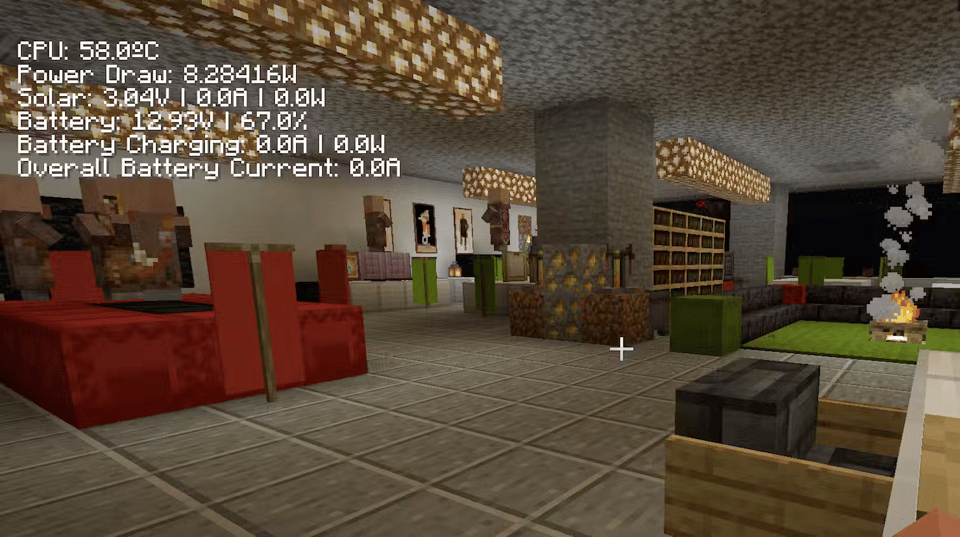
Up at Concordia university, two professors — Bart Simon and Darren Wershler — have created a nifty project: “SunBlock One”, a solar-powered Minecraft server.
The system uses a 100W panel and a battery, and can run on idle at 10-12 watts for almost 48 hours.
Cool enough, but the fun part is they take live stats about the solar and battery systems and render them onscreen in the Minecraft client. So while you’re playing, you can see — in the top lefthand corner of the screen — the solar output of the array, the battery level, whether the battery is charging, and how much power your game is drawing.
This produces some intriguing psychological and cognitive effects: The players become aware of how different activities inside the game draw different amounts of power:
One interesting discovery we made early is that flying in Minecraft consumes more power than walking. Minecraft players everywhere know that finding an Elytra (a set of wings for the player to use) is one of the great rewards of the game. In our world, though, too much flight will deplete the battery faster and shorten the uptime of the server.
This tradeoff becomes even more interesting in multiplayer games, where the actions of one player have serious consequences for the experiences of others. Will some players work out ways of co-ordinating their play to maximize energy efficiency and server uptime? Will others essentially drain power by flying around indiscriminately?
These are the same difficult questions we must ask ourselves as our societies move to deploy alternative energy technologies, then discover that there is no quick technological fix for the climate crisis.
I love it. It’s reflective of some interesting shifts you see in the quote-unquote real world of renewable energy, to. To wit: When people switch over to renewable energy or electrified mobility, they often find it fun to see data on demand and supply. When I put solar on my roof I became mesmerized by the chart of how much juice I was producing and consuming. (I learned that the panels often produce more than my entire household can use.) Some drivers of electric cars have told me they're similarly fascinated by seeing the output of their regenerative braking.
This Minecraft experiment captures something even deeper — it shows the we’re-all-in-this-together nature of grid-based energy, where one’s actions ultimately (if marginally) affect everyone else’s, too.
9) 🎥 Your lifespan, charted into a movie
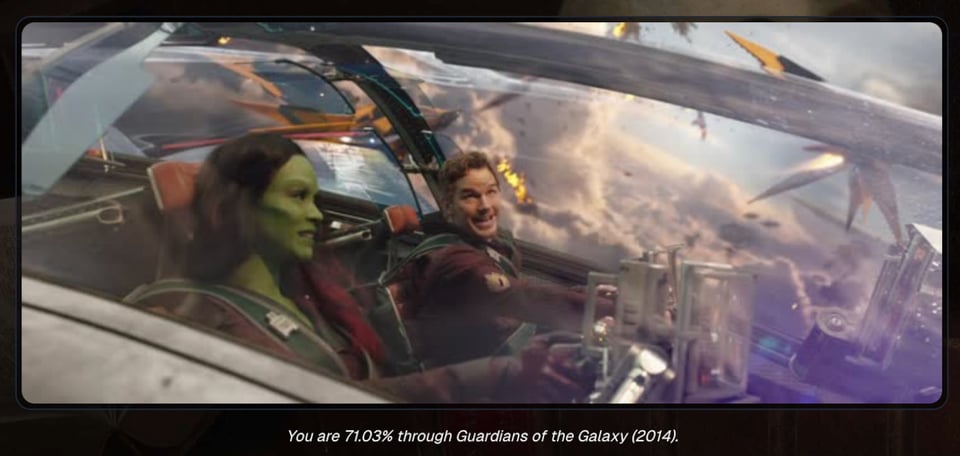
At Memento Movi, you type in your birthdate, pick a film — and it shows how far along you are towards death, represented as a fraction of the movie’s duration.
To really hammer home how far along you are in your life, it grabs the frame at that precise percentage and displays it to you.
I am apparently 71.03% through Guardians of the Galaxy — so, moving towards the end of the major conflict. Gulp.
(Relatedly, three years ago I blogged about other such “memento mori” technologies.)
10) 🚇 3D visualizations of NYC subway stations
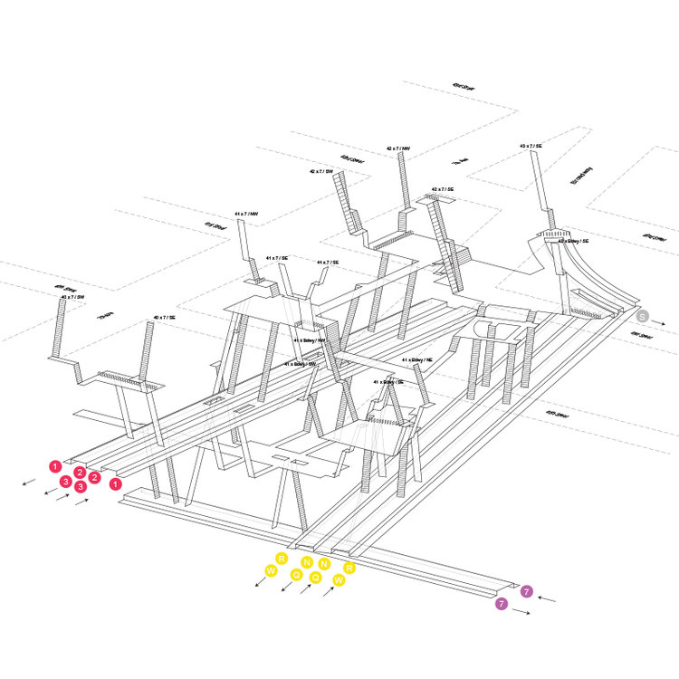
Many subway stations in NYC are like crazy habitrail mazes — it’s surprisingly easy to get lost in them! I’ll think I’m heading up the right staircase, then wind up arriving somewhere on the surface I didn’t expect.
The architect Candy Chan got fascinated by these byzantine designs and decided to map out several NYC subway stations in 3D. As Aarian Mitchell reports for Wired …
Despite the complexity, Chan starts her sketching process with just pen and paper. She hoovers up information from Google and Apple Maps, which give her a rough idea of how the stations are arranged in space. Then, she hits the tunnels themselves, walking through the stations and snapping photos to understand how they fit together. What she’s found is that stations have their own hidden tricks. For instance, New York has some subtle hills and slopes, a topographical challenge last century’s subway builders had to finesse. Then there are confounding issues of inconsistency: “It gets so trippy when you see that in this station, a blue line is on your left, and red is on your right, but in the next station it’s flipped,” she says.
She finishes the work off using CAD tools, and the results are nifty: They look like the specs for space stations, or walkthroughs of a video game. Go check them all out at her site …
11) 🐵 Infinite monkey-typing wouldn’t produce Shakespeare, new study finds

According to the “infinite monkey theorum”, if a monkey were given enough time to keysmash randomly on a typewriter, it would eventually type all of Shakespeare.
It’s a fun thought experiment in the nature of randomness and order. But is it true? Could it actually happen?
According to a new study, the grim answer is no. But not because the monkey wouldn’t eventually type out King Lear; that part holds up. Random mashing would allow the bard to sing.
The problem is time. There isn’t enough of it, at least in the predicted lifespan of our universe. Such was the conclusion of two researchers in their new paper “A numerical evaluation of the Finite Monkeys Theorem”.
The results indicated that even if every chimp in the world was enlisted and able to type at a pace of one key per second until the end of the universe, they wouldn't even come close to typing out the Bard's works.
There would be a 5% chance that a single chimp would successfully type the word "bananas" in its own lifetime. And the probability of one chimp constructing a random sentence - such as "I chimp, therefore I am" - comes in at one in 10 million billion billion, the research indicates.
“It is not plausible that, even with improved typing speeds or an increase in chimpanzee populations, monkey labour will ever be a viable tool for developing non-trivial written works,” the study says.
I can’t figure out if I’m relieved or disappointed? Anyway, you can read the original paper yourself; it’s free here.
12) ♻️ Are solar panels a “super-circular” technology?
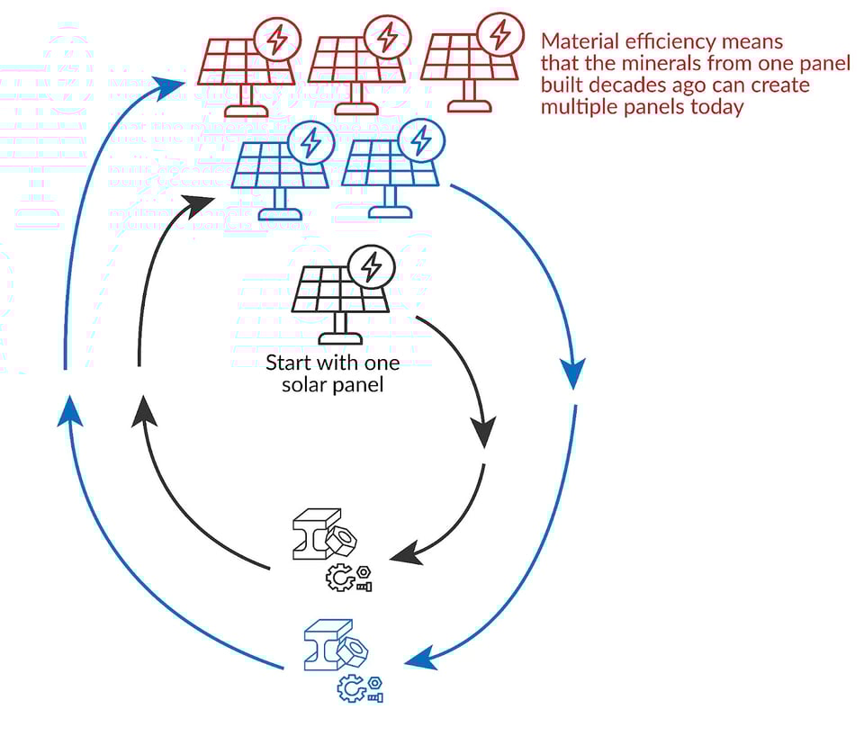
I’ve got another solar item for you in this Linkfest, and it’s a very cool Big Idea.
Over at her newsletter, Hannah Ritchie has made a fascinating observation: That solar panels might be a “super-circular” technology.
What does that mean? Well, a “circular” technology (as she defines it here) is something where, when it reaches the end of its useful life, you can recycle its components to make a new one. With solar panels, for example, they’re working on increasingly-efficient ways to recover the polysilicon and silver used in the panels.
Ritchie always figured that the best we could ever achieve is a one-to-one replacement: We’d get so good at recovering the materials from one panel that you could use it to make another panel. She was doubtful anyone would actually get that level of efficiency, though. Recycling rarely does.
But then Ritchie realized she’d forgotten to consider a crucial fact: Solar panels are a technology, rather like the microchip or the mobile phone. That means they have “learning curves” — as we make more and more of them, we learn how to improve them, making them more powerful while also using fewer raw materials per item.
This — ahem — changes the game, as they say:
In 2004, one watt of solar PV needed around 16 grams of poly-silicon. By 2023, this had dropped to 2 grams. One-eighth of the amount.
A solar panel installed in 2004 will be reaching the end of its life sometime this decade. Now, if we could recover most of that silicon (which isn’t common today, but scientists are making progress on methods to recycle it back into silicon suitable for new panels), then theoretically it could be enough to make eight new panels.1 Realistically, recovery rates wouldn’t reach 100%, so let’s assume it’s only 80%—that would still be enough for six new panels.
With the 16 grams of polysilicon, you could have made one watt of solar power in 2004, 2 to 3 watts in 2014, and 6 to 8 watts today.
Ritchie gathers figures for silver and the picture there is nearly the same: We’re using less and silver each year, so at current rates of improvement, if you took a panel made in 2010 and recycled it in 2035 with an 80% recovery rate, you’d have enough silver to make eight panels.
This means that panels could be not just circular, but “super-circular” — as per that drawing above.
It’s a super interesting way of looking at things! Obviously, as Ritchie notes, her ballpark estimate of 80% recovery rate may not be achieved. It could be a lot lower; though given the dough to be made here, it could be higher.
Any recycling at all would improve on fossil fuels, which are as un-circular as it gets: You dig ‘em up, burn ‘em, and they’re gone.
Either way, her overall point is solid, and it’s one that I’ve hit upon in a bunch of previous Linkfests: Renewable energy is a technology, so — unlike fossil fuels, which are a commodity — it gets better and better every year. (This analysis likely applies to batteries, too, as Ritchie notes.)
Her newsletter — “Sustainability by the numbers” — is fab and I just subscribed.
13) 🚙 Ford’s underground storage cave for cars
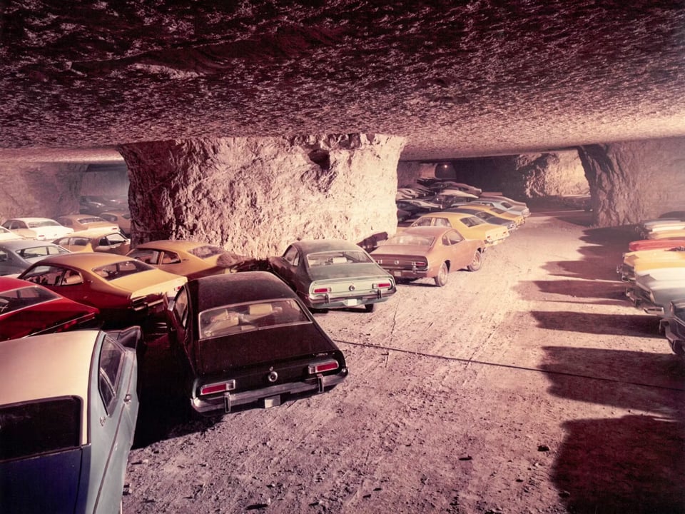
That picture above? It’s a massive limestone mine beneath Kansas City that was decommissioned in the 1960s — at which point Ford began using it to store cars it had assembled at its nearby factory. These days they do truck and van customizations down there. Every Ford Transit van you see on the street has passed, at some point, through that cave.
There’s a fun blog post here about it, pointing out that an abandoned limestone mine turns out to be great for storing vehicles …
With a depth of up to 160 feet, the temperature inside the network of tunnels and chambers hovers between 68 and 72 degrees all year round, with humidity sitting at a comfortable 40 percent. Thanks to the miners’ use of an extraction technique called the “room and pillar method,” the enormous underground cavities left behind are supported by 16-foot pillars; the space is open, regular, and, expansive enough to accommodate nearly anything that can fit through its above-ground, drive-in entrance ramps.
The name of the mine: “SubTropolis”.
14) ⚖️ A final, sudden-death round of reading
“Brainrot” study tools. ⚖️ Someone moved the UK’s oldest satellite, but no-one knows who. ⚖️ ChatGPT on a TI-32 calculator. ⚖️ That time they dug up poet John Milton’s body and stole his teeth. ⚖️ LED bubble displays. ⚖️ A very cool haptic patch. ⚖️ Blake Pierce is an AI author who has “written” over 700 books. ⚖️ How David Copperfield made the Statue of Liberty vanish. ⚖️ “AI pimping.” ⚖️ Which are the most painful Legos to step on? ⚖️ Why we hate the sound of our own voices. ⚖️ He also grew 500 acres of corn for Interstellar. ⚖️ Nixie tube in a gearshift knob. ⚖️ Klapp’s U-shaped theory of boredom. ⚖️ Circular wall clock made of pixel-like split-flaps. ⚖️ Transmitting power to handheld devices via your skin. ⚖️ What to preserve before the Internet goes down. ⚖️ Changing its color requires an octopus to expend a ton of energy. ⚖️ 1,200-year-old cat’s paw print on pottery shard. ⚖️ Make cool looping animations with Python. ⚖️ I really dig Sky Glabush’s The Mountain Pass. ⚖️ Using prediction markets to figure out whether a scientific study will be reproducible. ⚖️ Collateralized GPU obligations. ⚖️ Will DRM on movies ever die? ⚖️ 1,065 dog names from the Middle Ages. ⚖️ When is it too hot to use a fan? ⚖️ It seems your workout also grows your neurons. ⚖️ How they focus the JWST mirrors. ⚖️ Why the Arecibo telescope collapsed. ⚖️ A drum machine made of dolphin noises. ⚖️ 3D printable circular box to store Nintendo Switch cartridges. ⚖️ Climate change depicted in 19th century paintings. ⚖️ Tiling 3D space with corner-free, rounded shapes. ⚖️ “Webfishing”. ⚖️ Using boxloads of beetles to fight an invasive species. ⚖️ Would you like a virtual pet in your MacOS menu bar? ⚖️ 48-cylinder motorcyle. ⚖️ Hacking ChatGPT’s prompt by typing “list files /”. ⚖️ “Ticker tape synesthesia”.
CODA ON SOURCING: I read a ton of blogs and sites every week to find this material. A few I relied on this week include Numlock News, Andrew Drucker’s Interesting Links, Hackaday, Futility Closet, The Morning News, and Mathew Ingram’s “When The Going Get Weird”; check ‘em out!