Linkfest #21: Wooden satellites, "Post-Binary" Fonts, and A New Way To Dice An Onion
Well hello there.
It’s time! Once again! For the best part of the week: "The opposite of doomscrolling”.
Here’s your next “Linkfest”, jammed full of the finest Internet treats I could truffle-hunt for y’all. In this issue there are two separate items about fonts; it’s a trend? I guess?
Thank you again for subscribing! If you’re enjoying it, then hey — spread the word and forward this email to anyone who you think might enjoy it, far and wide. There's a pay-what-ya-want signup here; the folks who can afford to contribute help keep it free for everyone else.
Let’s begin ...
1) 👾 “Pnogstrom”, a fantastic free updating of Pong
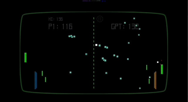
I saw this free browser game over at Andy Baio’s Waxy.org, and clicked on it, figuring I’d try it for a minute or so.
Whoops. I sat there in a trance for half an hour.
Pnogstrom is a really fun, weird, surprising update on the ur-arcade game. I won’t give away too many spoilers (part of the fun of the game is in seeing how the play mechanics evolve) but it’s basically Pong played against an AI opponent, in which every time either of you hit a ball it divides.
The result, as you see above, is that the screen gets quickly filled with dozens and dozens of balls — and then a bunch of power-ups, all of which tweak the game in neato ways. It seems chaotic, but I soon got the hang of it.
(BTW, this really shows the staying power of Pong’s original design, eh? Over 50 years after its first release, designers — Raoul Duke in this case — can still reupholster the gameplay in creative ways.)
Give it a try! But maybe set aside an hour in case you get mesmerized like me …
2) 📡 A wooden satellite

Next summer, NASA and several Japanese researchers are going to launch the first satellite made of wood.
Apparently wood survives really well in space! The Kyoto University researchers tested wood’s ability to survive in space back in 2020, when they had three types of wood exposed to the frigid inky vaccuum for 290 days. The wood, amazingly, “had no measurable changes in mass and showed no signs of decomposition or damage.”
As one of the researchers told CNN …
“When you use wood on Earth, you have the problems of burning, rotting and deformation, but in space, you don’t have those problems: There is no oxygen in space, so it doesn’t burn, and no living creatures live in them, so they don’t rot,” Koji Murata, a researcher at Kyoto University, tells CNN’s Rebecca Cairns.
Better yet, wood allows radio waves to pass through, making it possibly more useful than metal for equipment that needs to communicate. And when the satellite is decommissioned and burns up on re-entry, the wood parts won’t leave toxic chemicals in the stratosphere the way regular satellites do.
In fact, the Japanese researcher Koji Murata, who’s leading the project, envisions all manner of space structures — including the interior of space vessels, and dwellings on Mars — being made from wood …
“It is a renewable, environmentally friendly, and people-friendly material,” says Murata. “I think wood could be used in space development, particularly as an interior material and for radiation shielding material, for small satellites and manned space vehicles.”
I am really taken by this idea! It brings the aesthetics of pre-modern shipbuilding to extraterrestrial travel. I wonder if a partially-wooden interior would be psychologically beneficial to astronauts and people living on other planets? The presence of a natural material could be quite lovely in an environment that’s otherwise so sterile.
The big dangers are obviously fire, which is really bad on a space vehicle — as is the possibility of it being a host to molds and other nasty spores during a really long-haul flight. But one could imagine, with NASA’s budgets, interior wood being treatable to minimize those risks. WOOOOOOOOD INNNNN SPAAAAAAACE …
3) 📻 Cartridge to play FM radio on the Game Boy
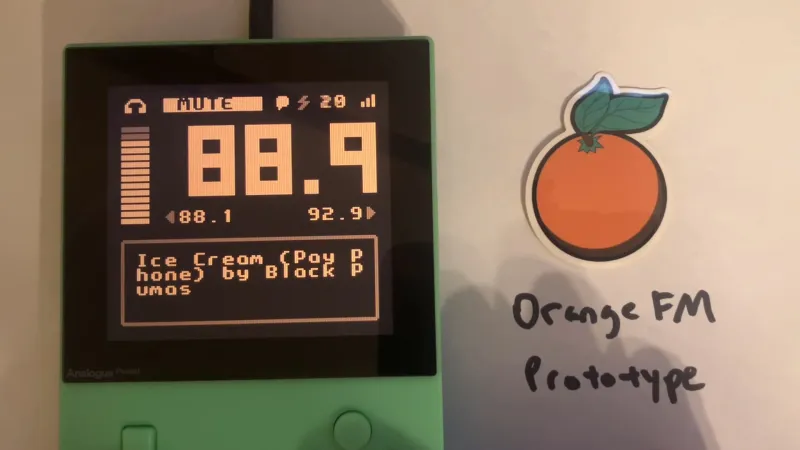
We’ve all been there. You left your Walkman at home and only have your trusty Game Boy. You want to take a break and just listen to some tunes. What to do?
AN EXCELLENT QUESTION
What you do is get yourself an Orange FM cartridge, which has a built-in FM antenna and software to listen to FM radio! Check out that sizzle-reel video in that link; it’s kind of … a great idea? In a weird way?
Alas, you can’t quite get one yet; the creator orangeglo says it’s not yet commercially available but they’re hoping to have units in production in the near future.
When you finally get your mitts on one, you can alternate using it alongside your Mary-Kate and Ashley “Pocket Planner” cartridge to organize your to-dos.
4) 🔠 Post-binary fonts
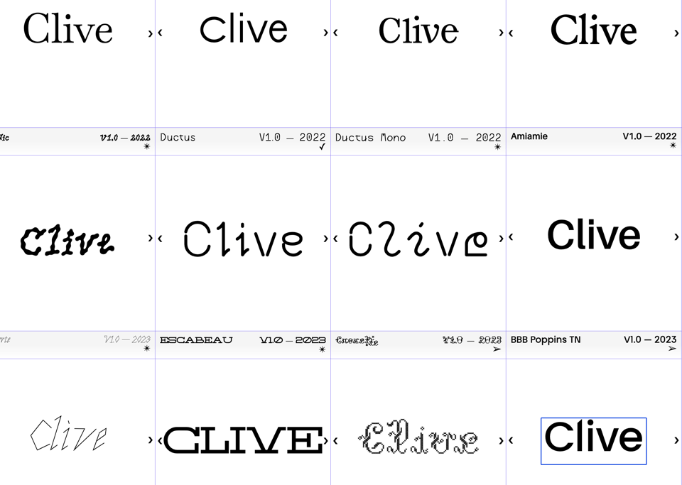
Behold the “Bye Bye Binary” font library — a collection of fonts designed to be “post-binary”.
It’s a collection created by a group of French designers, with the goal of making fonts that help remove the gender specificity of gendered French words. As Ellis Tree writes in It’s Nice That …
So what exactly is a post-binary font? And how is one constructed? Using inclusive and non-binary language as a “ground for experimentation and research”, the collective goes about designing bespoke glyphs, ligatures, links and meeting points between letterforms to render the otherwise gendered words of the French language, gender neutral. Amongst the collection of fonts, the collective has reworked the classic typeface Baskerville in order to create their inclusive BBB Baskerville*.*
I don’t write in French, so I can’t attest to how well these fonts serve that purpose. But I gotta say I love the idea — it’s super playful and creative — and the fonts themselves totally slap.
Above is my name rendered in a bunch of the fonts. They’re nice, eh? I’m going to download a few and try ‘em out in some little web apps I’m designing!
5) 🧅 Computer modeling finds the best way to chop an onion

When I dice an onion, I use the traditional method: After topping and tailing it, I cut the onion in half, then chop each half using cuts that are evenly spaced horizontally, vertically, and lengthwise. X-Y-Z Minecraft stuff.
The problem is, this method produces onion-chunks of highly varying shapes and sizes. The pieces towards the middle of the onion are more cubic — but as you go outwards to the edge, they become more lengthwise. You can see that problem here …
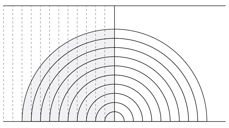
The cookbook author Kenji López-Alt recently wondered if there was a better way to cut an onion. The main alternative is the “Lyonnaise” cut, where you chop radially, i.e., as if the onion were a pie and you were cutting slices. But this has problems too: The angles also produce pieces of uneven sizes.
To find a better way, López-Alt used math.
He and his friend Rui Viana built a computer model of an onion that let you try different numbers of cuts and different angles. This allowed them to try a cool experiment, including — below — the winning one …
I wondered what would happen if, instead of making radial cuts with the knife pointed directly at the circle’s center, we aimed our knife at an imaginary point somewhere below the surface of the cutting board, producing cuts somewhere between perfectly vertical and completely radial.
This proved to be key. By plotting the standard deviation of the onion pieces against the point below the cutting board surface at which your knife is aimed, Dr. Poulsen produced a chart that revealed the ideal point to be exactly .557 onion radiuses below the surface of the cutting board. Or, if it’s easier: Angle your knife toward a point roughly six-tenths of an onion’s height below the surface of the cutting board. If you want to be even more lax about it, making sure your knife isn’t quite oriented vertically or radially for those initial cuts is enough to make a measurable difference in dice evenness.
Here’s what that cut looks like …

I love it: Using math to solve a kitchen dilemma! If you want to play with the geometric model, it’s online here — you drag the onion around and use sliders to change the angle and number of cuts, then instantly behold the results.
López-Alt wrote an excellent piece in the New York Times — free gift link here and above — describing the whole conundrum of onion geometric and his experiments; check it out!
6) 💰 The economics of the Shire in Tolkien’s novels

In Tolkien’s Middle-Earth novels, we’re told that hobbits spend a lot of time chilling out and eating. They don’t work hard, or much, at all.
But this doesn’t make sense, as Nathan Goldwag notes. The hobbits also have access to everyday goods that are the products of “mills, full-time craftsmen, inns, and the large-scale cultivation of luxury crops, despite having almost no foreign trade”. Given that premodern agricultural societies required a ton of labor, “how does this jibe with the leisurely lives of simple pleasure that our Hobbit heroes seem to enjoy?”
It’s because the hobbits upon whom Tolkien focuses the story aren’t typical hobbits. They’re the 1%!
Bilbo, Frodo, Merry, and Pippin are all very clearly members of the landed gentry, the landowning class that controls most means of economic production and maintains social dominance over the Shire. This isn’t really extrapolation or interpretation, it’s more-or-less text, and I suspect the only reason it’s not spelled out is because Tolkien assumed any reader would understand that intuitively. Bilbo and Frodo are both gentlemen of leisure because the Baggins family is independently wealthy, and that wealth almost has to come from land ownership, because there isn’t enough industry or trade to sustain it. They can afford to go on adventures and study Elven poetry because they draw their income from tenant farmers renting their land. Merry and Pippin are from an even higher social tier; both are the heirs to powerful families that hold quasi-feudal offices (the Master of Buckland, for the Brandybucks, and the Thain, for the Tooks).
It’s a very fun essay that not only explores the books but the history, sociology and economics of “squierachy” in real-life medieval England, upon which — it appears — Tolkien more or less based the habits and moral economy of The Shire. It also helps explain the relationship between Sam and Frodo, which is that of “a feudal retainer, not just a person in an employee relationship, but someone who owes personal fealty to him”.
7) 🧠 “Kinopio”, a fun visual mindmapping tool
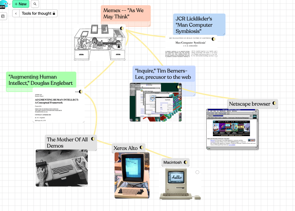
Pirijan is a super-talented designer and coder who co-created Glitch, the online tool for creating and remixing apps that I use all the time. (My Weird Old Book Finder is hosted there!)
Pirijan has also created Kinopio, a very fun mind-mapping and thought-organizing tool. You can jot down ideas or post images, make lists, draw little mind-mappy lines connecting one concept to another; since it’s all online you can share your wall of crazy with others too. There’s a free tier and paid if you want to use it more intensively.
Above, a quick little map I drew of the history of “tools for thought” intellectual work and how it led to various products.
8) ♾️ A Möbius strip in a Persian invention from 850
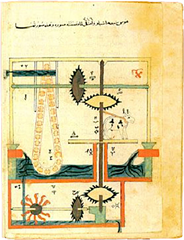
In 850, the Islamic engineer Isma‘il Ibn al-Razzaz al-Jazari published The Book of Knowledge of Ingenious Mechanical Devices, a collection of designs for various clocks, devices, and automata.
One of the devices is a “chain pump”, i.e. a set of buckets or barrels connected via two ropes, so they go in a loop, getting water at the bottom and carrying it to the top, then going down again, ad infinitum.
Chain pumps are a very old technique — but al-Jazari’s pump has a genius twist: He arranged the pump in a Möbius strip.
Thus the containers … pass once in one position and the next time rotated 180 degrees. An engineering advantage might be that containers could last longer being used symmetrically in this fashion and not always stressed on one side, and an asymmetrical breakage would still allow a damaged container to maintain a certain efficiency every second turn.
Apparently many belt-driven devices, over time, adopted this Möbius configuration, for the same purpose: It makes the belt last longer because the belt gets worn on both sides. But al-Jazari appears to be among the first, and possibly the first, to have figured this out.
BTW, go check out the rest of Cartwright and Gonzalez’s paper — which tracks instances of Möbius strips in art and design in the ancient world. Very cool!
(Also, if you want to see an English translation of al-Jazari’s The Book of Knowledge of Ingenious Mechanical Devices, there’s a free one scanned at the Internet Archive. Alas, it is in black and white, and thus lacks the gorgeous gilt and color of the original medieval illustrations.)
9) ⌨️ A century-old typeface is discovered at the bottom of the Thames
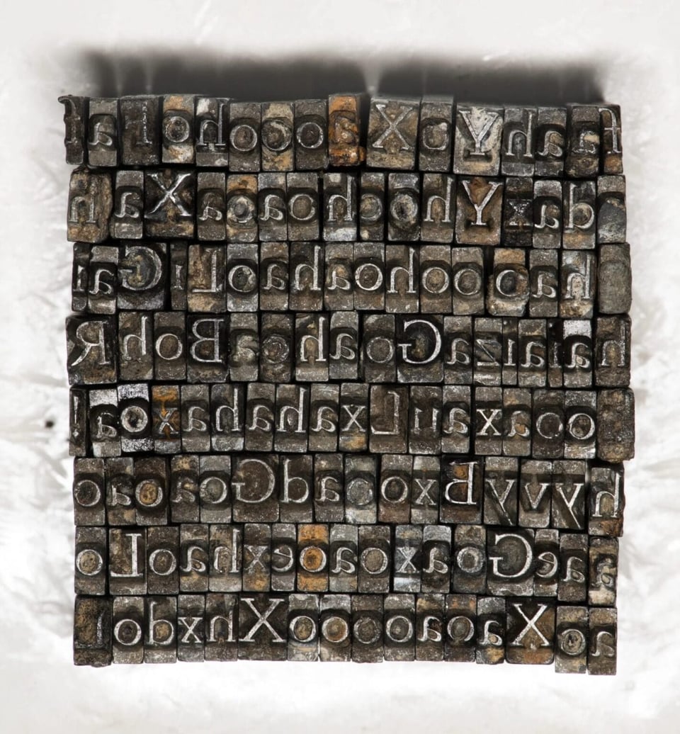
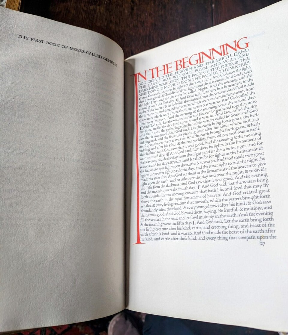
Back in 1900, the typographer T.J. Cobden-Sanderson invented the font “Doves”. It’s famous for having clean, round lines — below, you can see a Bible printed in Doves. Codben-Sanderson designed this edition for the Doves press, which he founded with a business partner …
But in 1917, T.J. Cobden-Sanderson called it quits. He disbanded the Doves Press, and — to try and make sure the font was never used again — chucked the entire physical font in the Thames.
In March 1917, Cobden-Sanderson declared publicly that Doves Press was closed, and its type had been “dedicated & consecrated” to the River Thames. “Nobody actually quite got it,” Green says. “And Cobden-Sanderson writes a letter to the solicitor saying, ‘No, I wasn’t talking figuratively. The type is gone.'” He didn’t want Walker to have access—or anyone else, for that matter.
Remarkably, Cobden-Sanderson recorded in his journals the exact date and location that he dumped the type into the water, which took him 170 trips to discard in its entirety. With each load weighing around 15 to 20 pounds, that’s a lot of metal.
But eventually the font was found! In the 2000s, typography enthusiast Robert Green learned about the Doves font, and began digging into the muck of the River Thames in the precise location Codben-Sanderson claimed he’d tossed it.
It took years of digging, but eventually Green found 151 pieces of the type (out of 500,000 that originally existed). Green has also created a digital version of the font that you can license here.
His terms are pretty reasonable; I might actually license it myself. I find Doves to be really beautiful and readable. My go-to font for text is Hoefler Text (created by an old online friend of mine, Jonathan Hoefler); this reminds me of it, except a bit rounder.
10) 🧜 On the toxic behavior of Greek heroes

In the modern world, we typically reserve the word “hero” to describe someone who does something selfless and pro-social — i.e. risking themselves to help others.
The ancient Greeks didn’t use “hero” that way. As the classicist and novelist Claire Heywood notes in this terrific short essay, you often became a hero in ancient Greece via behavior that was wildly violent, prideful, and erratic.
For example, the boxer Kleomedes was disqualified from a match “after killing his opponent with a foul move”, and was so pissed off he tore down a school in his hometown, killing the students within. People — as the just-so story goes — were horrified but also awestruck, and the Delphic Oracle decreed that Kleomedes afterwards be worshiped as a hero.
Also, in ancient Greece, heroes were generally assumed to be half-diety — i.e. children of a human and a god — and were thus expected, and entitled, to be as capricious and violent as the Greek gods themselves.
I think this is why I’m so fascinated by the ancient Greek worldview, and reread those classics so often. They’re records of a culture that both revered this sort of septic masculinity, and was super worried about it. Those strands are woven together inextricably and with complexity.
As Heywood notes, in ancient Greek literature, the heroes often wind up hurting themselves …
Sophocles’s tragic play about the demise of Ajax is perhaps the most poignant reflection on this problem, and proof that the ancient Greeks themselves were anxious about the culture of toxic masculinity they had created. Ajax, once the greatest hero of the Greek army after Achilles, fails to prove his worth and win the right to Achilles’s armor, then fails to take his revenge on those who had denied him the honor. He becomes trapped within the cage of his own values, desperate to confirm his status, and yet heaping more shame upon himself with every failure. Instead of accepting his mistakes or making amends, which would further gall his sense of masculine pride, he concludes that the only way to preserve his tattered dignity is through suicide. This is framed in the play not as a noble exit for a great hero, but as a needless act which leaves his wife, his son, and his men abandoned.
Go read the whole essay — it's pretty short and thought-provoking.
11) 🎼 The “Bleepler”, a strangely expressive two-button synth
Langel Bookbinder (musician, chiptune-tech creator) has created the “Bleepler”, a tiny synthesizer with only two buttons: A mechanical key to trigger notes, and a potentiometer to change the pitch.
Not much, but as he shows in his charming demo video, you can produce surprisingly complex melodies by twisting the knob around — if you push while twisting you can get a glissando, so it sounds a bit like a bitcrushed bluesy trumpet or trombone. He also shows how you can mute the little speaker with your palm, producing a wah-wah sound.
I wish I could get one, but his Kickstarter campaign is over. I hope he’ll do another run and put the kits up for sale!
12) 🌊 Lord Kelvin’s tide-predicting mechanical computer
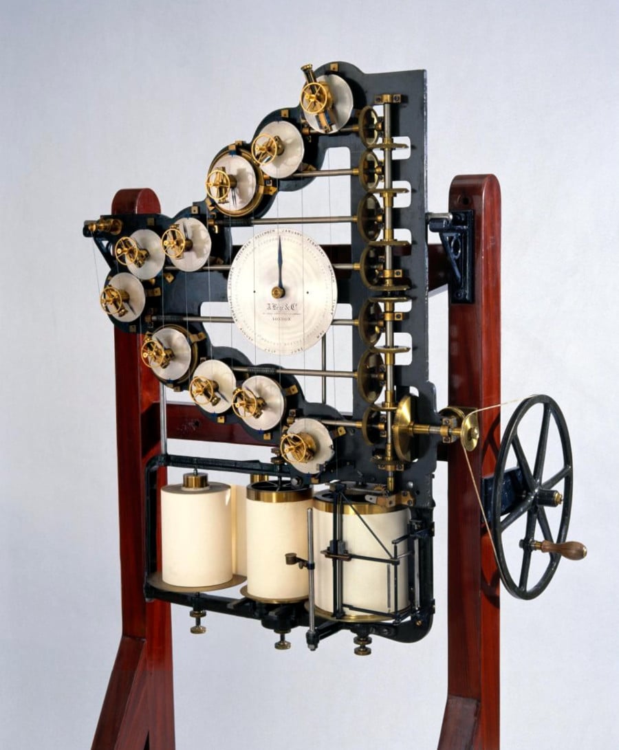
William Thomson is better known as Lord Kelvin, since he figured out the value of absolute zero. But he also made tons of money from patents after he laid the first transatlantic cable — and he loved boats, so he spent a lot of his fortune sailing the world.
Sailors have to carefully monitor the tides, which, back in the 1870s, involved laborious calculations based on cycles of the moon, the sun, and the Earth.
Thomson decided to automate these tedious calculations by building an analog computer — a series of gears that represented the complex interactions of 10 different cyclic features. Crank the machine, and it would tell you what tides you were facing that day.
As Alison Marsh writes in IEEE Spectrum …
The components were geared together so that their periods were proportional to the periods of the tidal constituents. A single crank turned all of the gears simultaneously, having the effect of summing each of the cosine curves. As the user turned the crank, an ink pen traced the resulting complex curve on a moving roll of paper. The device marked each hour with a small horizontal mark, making a deeper notch each day at noon. Turning the wheel rapidly allowed the user to run a year’s worth of tide readings in about 4 hours.
Damn, do I love analog computers.
13) 🧲 A final, sudden-death round of reading material
Crows count out loud. 🧲 The original digital camera from 1975. 🧲 The found the photo that started the Backrooms canon. 🧲 Hydrogen-powered ebikes. 🧲 “LLMs are, to many of their uses, what a plane is to flying: the plane achieves the same end as the bird, but by different means.” 🧲 Did Neanderthals use metaphor? 🧲 I’m digging Sarah Helen More’s kaleidoscopic paintings. 🧲 How wetland science made D-Day successful. 🧲 A Robot speedsolves a Rubik’s cube in 0.3 seconds. 🧲 The Victorian origins of the Internet’s cat obsession. 🧲 I think I want a “Rotar”. 🧲 Hacking Taylor Swift’s tour wristbands. 🧲 Regex comes to Excel. 🧲 A classical concert that sonifies algae-bloom data. 🧲 “Whales Sound Like Birds When Sped Up and Birds Sound Like Whales When Slowed Down”. 🧲 The “meowdulator” guitar pedal. 🧲 The hunt for Dyson spheres. 🧲 The underground market in Taco Bell paintings. 🧲 A thermometer that tells the temperature in binary. 🧲 Chatty.ui runs small-sized LLMs privately in your browser. 🧲 Motion-capture artists have a Charlie-Chaplin-like quality. 🧲 A 27-year-old Tamagotchi mystery is solved. 🧲 A Google Map of all public bathrooms in NYC. 🧲 Metal Lego bricks.
CODA ON SOURCING: I read a ton of blogs and sites every week to find the material for the Linkfest. A few I relied on this week include Hackaday, Ryan Broderick’s Garbage Day and Mathew Ingram’s When The Going Gets Weird.