Linkfest #17: Medieval Fighting Snails, "Loud Budgeting", and How To Power A Car With Plastic Garbage
Welcome to the latest edition of the Linkfest! "The opposite of doomscrolling", as I call it 😅 ...
Thanks so much for subscribing! And if you’re enjoying it, spread the word -- forward away this to anyone who you think might enjoy it. There's a pay-what-you-want signup here; the folks who can afford to contribute help keep it free for everyone else.
All righty, let's begin ...
1) 🐌 Medieval fighting snails
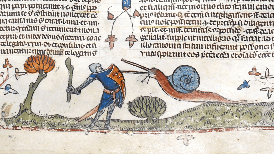
Apparently medieval manuscripts contain a surprisingly large number of illustrations of huge, menacing snails.
As Zaria Gorvett at the BBC reports ...
Sometimes the creatures appear to be hovering, attacking knights in mid-air. Occasionally there is more than one. [snip]
The specific scenarios that warring snails found themselves in varied, but broadly followed the same format of a snail-assailant standing off against a knight. Often, the molluscs have their antenna – technically their upper tentacles, or ommatophores – pointed aggressively forwards, as though they were swords. In one, a snail is shown fighting a nude woman. In a few they're not depicted as regular molluscs at all, but hybrids between snails and men – who are being ridden by rabbits, naturally.
Eventually, the warring snail meme even started to spill over into other places in the medieval world, such as cathedrals, where they were carved into facades or, in one case, hidden behind a kind of folding seat.
The best part about this story is historians have really no idea why medieval artists kept painting massive killer snails. Possibly they were allegories for cowardice? (The knight can't even beat a snail!) Maybe they represented the struggle between the upper and lower classes?
My personal fave theory is that of Marian Bleeke, a professor of medieval art at the University of Chicago. The snails, rather like memes today, were intended to make people laugh:
"The basic idea is the overturning of existing or expected hierarchies. It is supposed to be surprising and even funny – I think we get that implicitly today," she says.
2) 🔥 Volumetric spinning display
You really have to watch this video to get a sense of how cool this thing is.
The hardware/software hacker Tim Alex Jacobs created a customized grid of LEDs that spins rapidly on its base, such that it can generate cool, 3D-seeming images in the air.
He wrote an exhaustive build diary of how he did it -- and it is not for the weak of heart. Not only is my hat off, but my hat's hat is off.
3) 😳 Old ads promoting wildly dangerous products
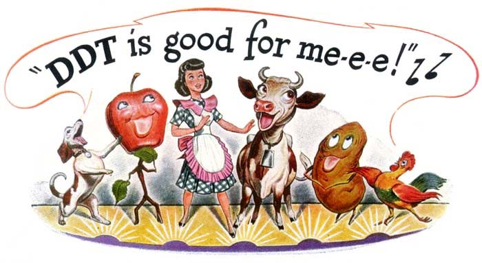
Over at Collectors Weekly, Hunter Oatman-Stanford has assembled some of the looniest ads from days of yore.
His focus? Advertisements cheerily promoting products that were incredibly dangerous to your health.
There's that little ode to the salutary qualities of DDT, above. Or consider this one ...
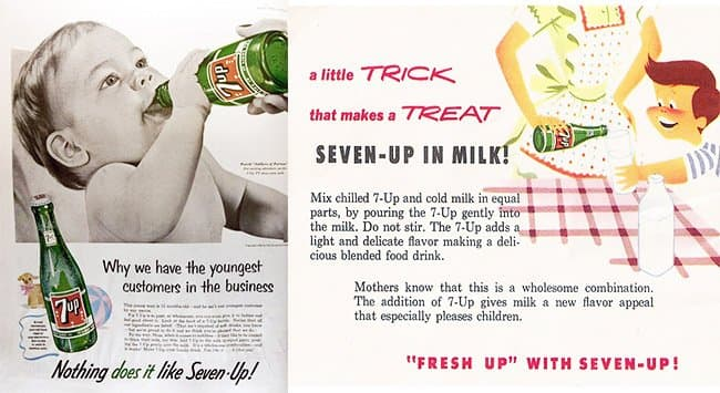
Seven-Up in milk for the baby!
Quite apart from the dubious nutritional qualities of this eldritch concoction -- my god, can you imagine how utterly vile it must have tasted?
Don't sleep on the ads for lead-based paints, DIY shock treatments, and babies wrapped in cellophane.
4) 🛫 The "ugliest airplane"
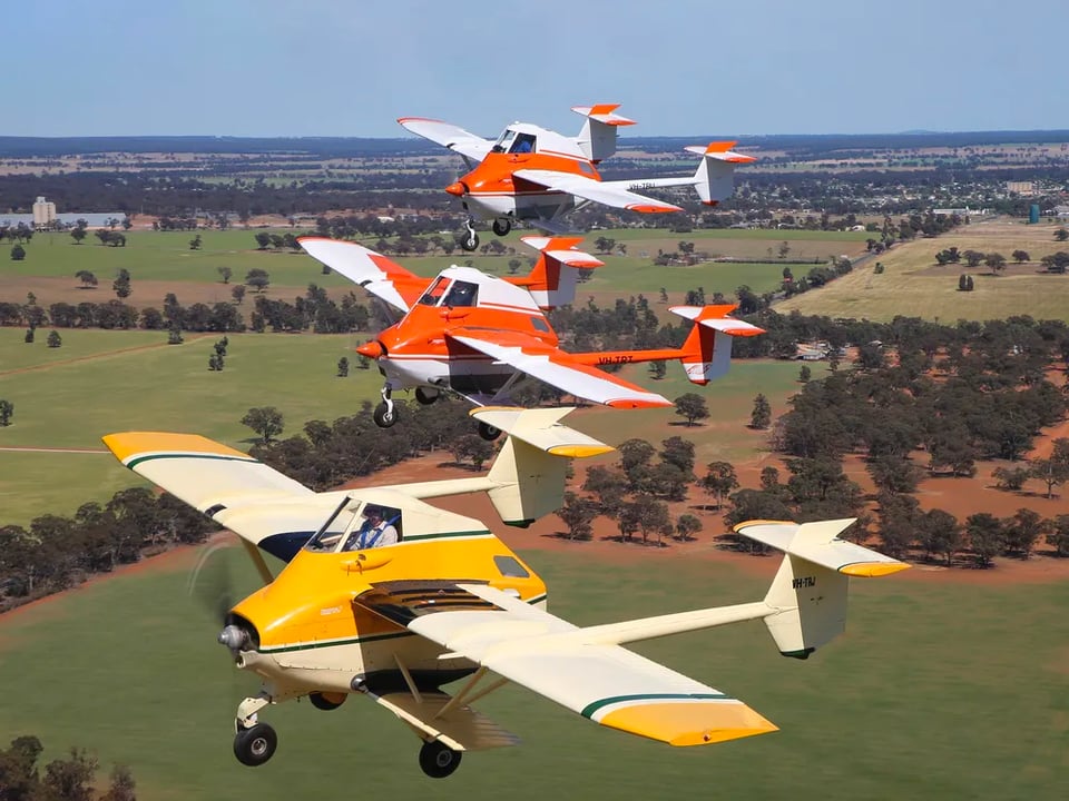
Over at Smithsonian, Ken Scott has an excellent appreciation of the "AirTruk" -- the world's "ugliest airplane".
It's got a big, fat, tall body, with the pilot jacked up at the very top; two weird stubby little secondary bi-plane secondary wings; and two long tails jutting out to the sides.
Whyever does it look like that? Because it was designed for a specific purpose: Cropdusting (or "topdressing", as they called it down under). New Zealand needed a cropduster plane, and the Italian designer Luigi Pellarini organized the structure of the plane around the dictates of its job ...
Pellarini reasoned that a topdressing aircraft—a cropduster—should carry as much payload as possible and still operate out of any patch of ground close to the worksite. He started with a large, steel, barrel-shaped tank and began adding. Attach points for a set of biplane wings and a tricycle landing gear were welded on. He figured that the rear fuselage—often corroded by chemicals in cropdusters—was there only to provide an attachment for the tail, so he dispensed with it altogether and hung two sets of tail surfaces on narrow booms projecting aft from the wings. This had the added benefit of allowing space for a loading truck to be backed between the tails where it could fill the hopper while the engine was running, keeping turnaround time to a minimum (agricultural airplanes don’t make money when they are on the ground). The pilot was perched on top of the aft end of the tank, giving him a clear view of the ground behind the lower wing. Racks beneath the lower wings could be used for additional payload, fuel, or to airdrop supplies without landing—a useful feature in a rough country where just delivering a bundle of fence posts could take a mounted man with a pack animal a full day.
I really dig how every part of this ugly little plane is so totally functional!
Bonus: The AirTruk appeared in Mad Max Beyond Thunderdome.
5) 🏀 Basketball court painted like the gardens of Versailles
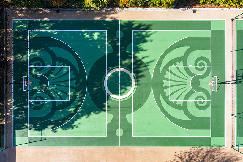
I love this new basketball court in Versailles, the French town that's home to the famous kingly palace.
As Design Boom notes, the court was painted in the style of Versailles' famous gardens, and outfit with various urban-cooling elements ...
The space reflects the historic vision of André Le Nôtre, the landscape architect behind the gardens of Château de Versailles, and the essence of the city. The design team merges the practical aspects of a basketball court with the aesthetic charm drawn from the iconic gardens, including its hues of green, symmetrical lines, and regal emblems. In an additional effort to combat urban heat islands, a light-colored surface encompasses the 300 square meters of pedestrian pathways made of exposed aggregate concrete, as well as the surrounding areas of the courts featuring beige asphalt.
6) 🚮 Powering a car with plastic waste
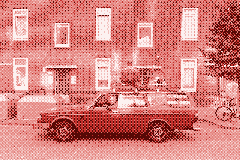
Behold the Volvo 240 that Dutch designer Gijs Schalkx retrofitted to run on discarded plastic waste.
That apparatus on the roof? It's a "de-refinery":
The “de-refinery” converts plastic waste back into fuel and is installed on the luggage carrier of the car, making the vehicle independent of the fossil fuel infrastructure. The plastic waste is heated in a boiler to about 700 degrees Celsius, after which it evaporates. The gas is then cooled down and turns into a diesel-like liquid one hour later. Gijs collects it in plastic bottles – themselves the raw material for the diesel they contain. The fuel looks like Coca-Cola – one of the largest producers of plastic waste.
How far could one drive by turning the world's plastic into fuel?
Considering the case of Norway, the author of this piece -- Low Tech editor Chris de Decker -- calculates that the country's 1,650 kilotons of annual plastic waste would power 10% of the 114.3 billion kilometers driven annually by Norwegians.
Cool experiment! Some downsides: The process of liquifying all that plastic produces more CO2 per mile than a comparable gasoline car.
What's more, the car smells terrible. Though as de Decker notes, philosophically that's kind of interesting: Whereas most vehicles externalize their malign side-effects -- CO2, noise, lethality -- on the world around it, this car internalizes one of its worst features; the person who suffers most from the smell is the driver.
7) 🔮 The gorgeous, bonkers 1905 Theosophist book "Thought Forms"
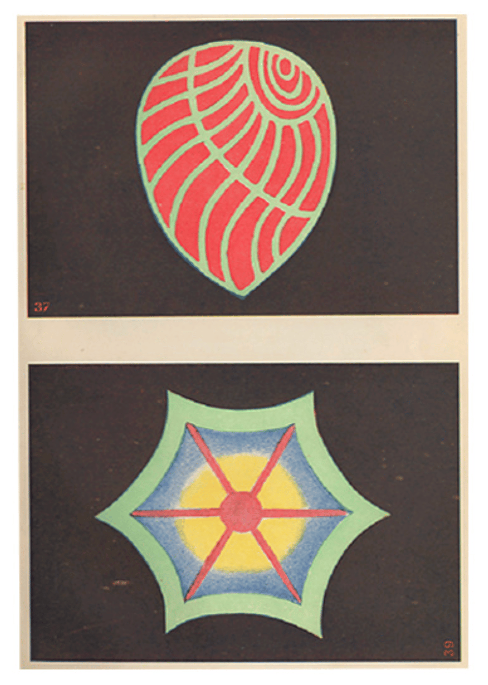
During some truly epic procrastination-surfing this afternoon I ran across ...
... a mention of the famous 1905 Theosophic book Thought Forms, in which the authors argue that thoughts are tangible things that have shapes and colors and sizes. They furthermore describe their theory of how different types of thoughts give rise to different forms. Classic Theosophic nuttiness!
Whatever one thinks of these untethered speculations -- back when they wrote this stuff, opium was basically sold in corner stores -- the book's worth checking out, because it has some truly sumptuous illustrations! Above are their drawings of the thought-forms "Sympathy And Love For All" and "An Aspiration To Enfold All". You can see an entire color scan of the book here.
It's worth reading the text, too; a finer example of stoned dorm-room susurrations cannot be found. For example, here are the drawings of the thought-forms called "The Upward Rush of Devotion" (right) and the "Response To Devotion" (left) ...
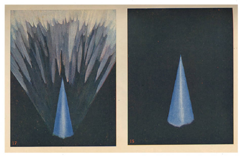
... and here's their textual explanation of "Upward Rush of Devotion":
We could hardly have a more marked contrast than that between the inchoate flaccidity of the nebulosity in Fig. 14 and the virile vigour of the splendid spire of highly developed devotion which leaps into being before us in Fig. 15. This is no uncertain half-formed sentiment; it is the outrush into manifestation of a grand emotion rooted deep in the knowledge of fact. The man who feels such devotion as this is one who knows in whom he has believed; the man who makes such a thought-form as this is one who has taught himself how to think. The determination of the upward rush points to courage as well as conviction, while the sharpness of its outline shows the clarity of its creator's conception, and the peerless purity of its colour bears witness to his utter unselfishness.
Damn.
These images are all in the public domain, BTW! So if you want to use 'em for stationary, blog posts, or for your very own Theosophist t-shirt, go wild. (The Project Gutenberg version of the book has the images chopped out into jpegs.)
I'm now idly pondering a side project where I train an LLM on the text of Thought Forms, then bungee-cord its output to an AI image-generator, so I can generate an infinite supply of new ones ...
8) 🧭 Map of a river made for a thermal receipt-printer
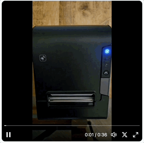
Aaron Koelker decided to create a map of the Wakulla River formatted such that it could be printed on a long skinny piece of thermal receipt-paper.
Impractical, but fun! Along the way, he discovered some interesting limitations of thermal receipt-printers for rendering complex designs ...
They don’t even do true grayscale. The coating either turns black, or stays transparent, so all the shades of gray it prints in between are mimicked using different dot and hatching patterns. Some of these patterns are pretty intricate if you look up close, but ultimately it means you can’t get too detailed with your design. The edges between different shades that are too close to one another end up looking fuzzy and unclear because of the patterning, so not only are you limited to grayscale, but high-contrast greyscale.
Another fun thing I learned is that these printers can overheat. The first draft I printed got so hot that this weird, dark gradient bled down into the white section at the bottom of the map. This was caused by radiant heat coming off of the printhead as it struggled to print all the solid black water near the river mouth.
I actually have a thermal printer kicking around here, which I bought years ago thinking I'd create a poetry bot that randomly spits out a poem. This is making me want to unearth it and finish that project!
9) 🕵 Breaking the "silk dress cryptogram"
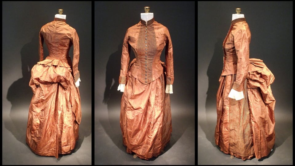
In 2013, Sara Rivers-Cofield -- an archaeologist who also collects vintage dresses -- bought a Victorian-era silk bustle dress from a local mall. When she examined it she found a mystery: An hidden internal pocket that contained two pieces of paper, each with several lines of what appeared to be a secret code, with lines like "Bismark Omit leafage buck bank".
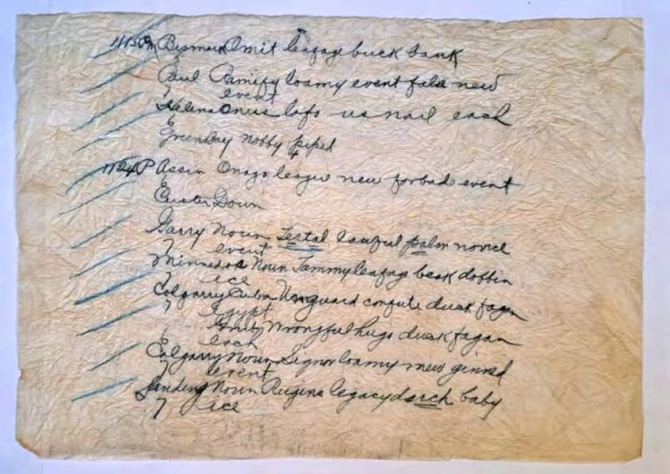
Her reaction, as she wrote on her blog back then, was "What the...?" What was this? A writing exercise? A spy message? Given that it was carried in a hidden pocket, this seemed like cloak-and-dagger stuff.
Once Rivers-Cofield put the mystery out in public online, though, amateur sleuths began frantically trying to solve it. It was quickly proclaimed one of the "World's top 50 unsolved encrypted messages" on the cryptology blog Cipherbrain.
Many people suspected it was a telegraph code, which were popular back in the 19th century; to compress a message you'd use a codebook where a single word stood for a whole phrase. The problem is, there were thousands of codebooks in use back then. No-one knew which one it could be.
This year, finally, someone cracked the mystery!
Wayne Chan, a computer analyst at the University of Winnipeg, figured out that the stitching on the dress dated it to the 1880s. That narrowed things down, and he scoured through 170 codebooks from the period.
Finally he had a breakthrough. As he wrote in a paper describing his breakthrough ...
I came across an old book called Telegraphic Tales and Telegraphic History (Johnston, 1880). In one section, the role of the U.S. Army Signal Service in weather reporting was discussed (Johnston, 1880, 168–178), and an example of the telegraph code was provided: “YORK, MONDAY, DEAD, FIRE, GRIND, HIMSELF, ILL, OVATION, VIEW”. The style of the code and the fact that it began with a place name suggested a close match to the Silk Dress codetext. This was the key that led to the decoding of the cryptogram.
What he realized was the codes were weather reports. The first word in each line refers to an actual city. The other words refer to weather conditions.
Turns out "Bismark Omit leafage buck bank" was a weather observation for May 27, 1888, in what is today Bismarck, N.D. [snip]
The second word, Omit, corresponded to an air temperature of 56 F and a barometric pressure of 0.08 hg.
"Leafage" meant the dew point was 32 F at 10 p.m. "Buck" described clear skies, no precipitation and a north wind. "Bank" meant wind velocity of 12 mph.
Chan even figured out that the woman who originally wore the dress probably lived in Washington. Why? Because back then, weather codes were sent by telegraph from city to city, each one adding another line of info; given the collection of cities in those codes, the most likely final city was Washington, DC.
He's not sure if the dress-owner was herself a telegraph operator or just adjacent to them.
Anyway, this is a fabulous tale! If you want to read more, here's a CBC story on Rivers-Cofield and Chan. To go deeper, read his entire academic paper describing his process. And here's one of Rivers-Cofield's original blog posts about the mystery.
10) 💵 The most expensive Big Mac in America

The cheapest Big Mac that you can buy in the US costs $3.49 in Stigler, OK. The most expensive? That's apparently a hefty $8.09, in Lee, MA.
This information comes to use courtesy of "How much does your Big Mac cost?", a data-map assembled by Pantry & Larder, a food web site that also does info-analysis of food trends.
I've no idea how accurate this info is! But assuming it's correct, it's fascinating to zoom in around the map to look at where prices get highest ...
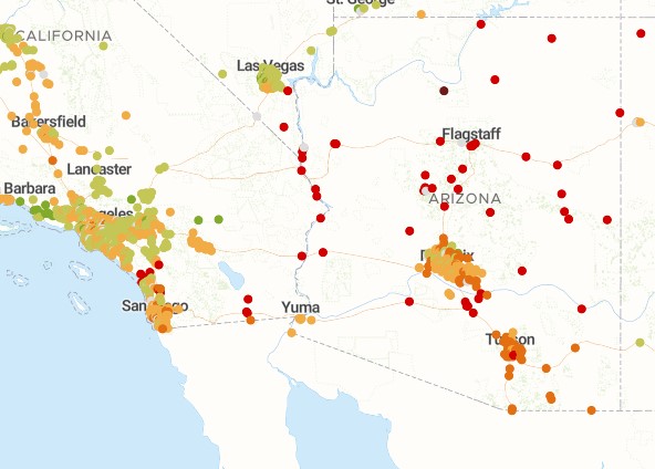
Arizona, what the heck is going on down there? Y'all have to use Bitcoin to pay for a Big Mac, apparently.
11) Recharge yourself, recharge your phone
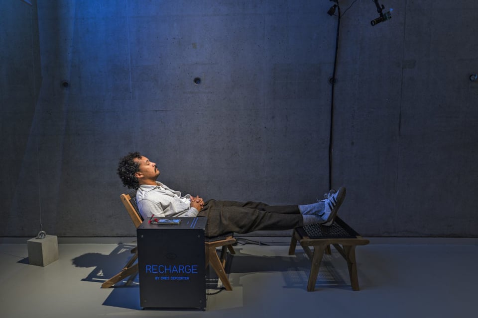
Dries Depoorter is an artist who builds thought-provoking digital-art installations -- one of my faves from recent years was a vending machine that sold scratch tickets, where the prize was 25,000 fake social-media followers.
His new one is "Recharge". In this installation, you plug in your phone to recharge while you lie down -- but the phone only recharges if your eyes are closed.
Charge your phone while recharging yourself
Bonus points for using AI eye-gaze detection software for weird artsy purposes!
12) 🏢 The rebirth of the "Nagakin Capsule Tower"
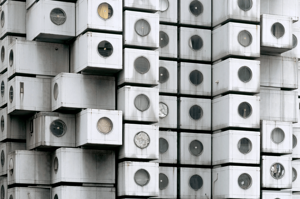
The Nagakin Capsule Tower was erected in Toyko in 1972, and back then it seemed like a glimpse of the future: It was composed of 140 detachable box-like capsule apartments, each one eight by thirteen feet, with a circular window. They were the original tiny houses, really.
By making the building modular, it would also, the theory goes, be renewable and upgradeable. As Tim Hornyak writes in the New York Times (free link) ...
... the architect Kisho Kurokawa, who designed the tower, envisioned cities and buildings with modular parts that could be attached and detached as needed, just as some organisms grow new appendages.
“If you replace the capsules every 25 years, it could last 200 years,” Kurokawa said in an interview in 2007, the year he died. “It’s recyclable. I designed it as sustainable architecture.”
Alas, the building did die. People left the apartments; nobody new moved in; and in 2022 it was dismantled. Only 23 of the little pod-like apartments remain, scattered around the world, used as everything from museum exhibits to holiday locations.
Go check out that Times piece -- in addition to a wealth of detail about this experiment, it has some amazing photos. Here's what the inside of one capsule looked like ...
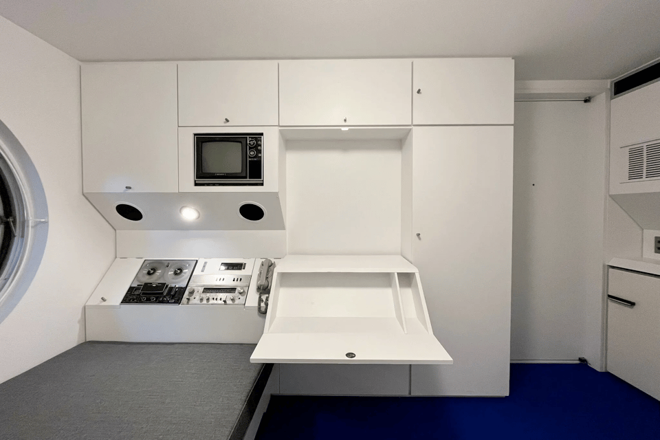
Dig that built-in reel-to-reel tape recorder! And the fold-out desk!
13) ☎️ A final, sudden-death round of reading material
"Why is my LG Washing Machine using 3.6GB of data/day?" ☎️ The New York Times gets its old Flash animations working again. ☎️ Love the color commentary during the 2023 Excel World Championship. ☎️ The "most WTF products" at CES this year. ☎️ Would you trust a manicure robot? ☎️ Jet fuel made from human poo. ☎️ Maybe orcs are kind of smart. ☎️ "Loud budgeting." ☎️ The 10,000-hour rule, debunked again. ☎️ An appreciation of Brutalist architecture. ☎️ Visiting the CIA's creative-writing group. ☎️ A tic-tac-toe machine-learning device made of 304 matchboxes. ☎️ The "sugar-free" web. ☎️ T9 text input for your TV. ☎️ US map showing how much it costs to charge your EV. ☎️ The text of Romeo and Juliet converted to a greyscale PNG. ☎️ The "beaver drop" of 1948. ☎️ Lab-grown eyeballs. ☎️ Haptic device that lets blind sports fans spatially follow a football game. ☎️ Pokemon, with guns. ☎️ A computer mouse for your tongue. ☎️ 3D emulation of how a flat earth would render the heavens. ☎️ The "three cups problem". ☎️ The remarkable Arctic survival of Ada Blackjack. ☎️ The "denomination effect".
CODA: I read hundreds of sites to find this stuff, but there are a few sites that yield consistently great stuff. A few I relied on for entries in this Linkfest include Flowing Data; and Tim Ross' Futility Closet; go check 'em out!