Linkfest #14: Indoor Clouds, a Ferrofluid Synthesizer, and Why Left-Handed Badminton Players Have an Edge
Welcome to the latest edition of the Linkfest! "The opposite of doomscrolling", as I call it 😅
Thank you for subscribing -- and if you’re enjoying it, spread the word! Forward this newsletter far and wide to anyone who you think might enjoy it. There's a pay-what-you-want signup here; the folks who can afford to contribute help keep it free for everyone else.
But enough throat-clearing: Let's get to it. Here are the finest fruits of the Internet I've selected, just for you ...
1) 🌥 Artificial, indoor clouds

In the Berndnaut Smilde art project Nimbus, he takes photos and slow-motion video of clouds he creates indoors.
The result is eerie and beautiful with a slight tinge of menace; it's as if the earth's atmosphere had decided to visit us, in our houses and workplaces.
How does he make the clouds?
It is a task that requires elaborate planning and preparation and consists of taking control of the temperature and weather elements of the space he wants to create his work. The humidity of the space has to be controlled while constantly increasing the moisture content of the air in the space. The lighting is then adjusted to create a realistic and dramatic effect. With the right conditions, the fog machine releases a heavy and damp, dense mist, which looks just like a real-life cloud in the sky. [snip]
Not many people have seen Smilde’s work live as the clouds only last as much as ten seconds ...
Plenty more photos of his work over at Colossal and on Smilde's web site.
2) 🏸 Why left-handed badminton players have an advantage
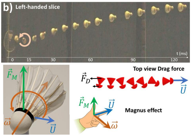
Observers of badminton have long noticed that left-handed players seem to possess a more wicked "slice": When they hit the shuttlecock, it heads earthward at a steeper angle than when a rightie smacks it.
Nobody could quite figure out why, though.
Recently, Eric Collet at the University of Rennes in France decided to investigate this with some science. He recorded and analyzed video of six players -- three righties, three lefties.
It turns out the secret is in the rotation of the shuttlecock. Pro badminton players use shuttlecocks made of feathers, and the orientation of the feathers has an asymmetry that makes the shuttlecocks spin counterclockwise in flight.
Collet discovered that when righties hit the shuttlecock, it spins faster in that direction. But when lefties hit it, they reverse its spin -- and that makes all the difference.
“The shuttlecock is rotating the opposite direction, then stops spinning and starts rotating around its natural rotation axis again,” says Collet. “This process means the shuttlecock is slowed down rapidly by the air.”
This loss of speed means that the shuttlecock falls much quicker and therefore follows a path that is around 15 degrees steeper than the same shot from a right-handed player. The faster drop and slightly more vertical route of the shuttlecock means that it lands closer to the net, so the opposing player needs to travel a bit further and stoop lower to defend the shot, giving left-handers an advantage, says Collet.
“People knew that left-handed players have a good slice,” he says. “Now we know why.
There's a free, unpaywalled copy of Chollet's paper here if you want to go deeper into badminton physics.
3) 🚢 How to read the weird markings on the sides of container ships
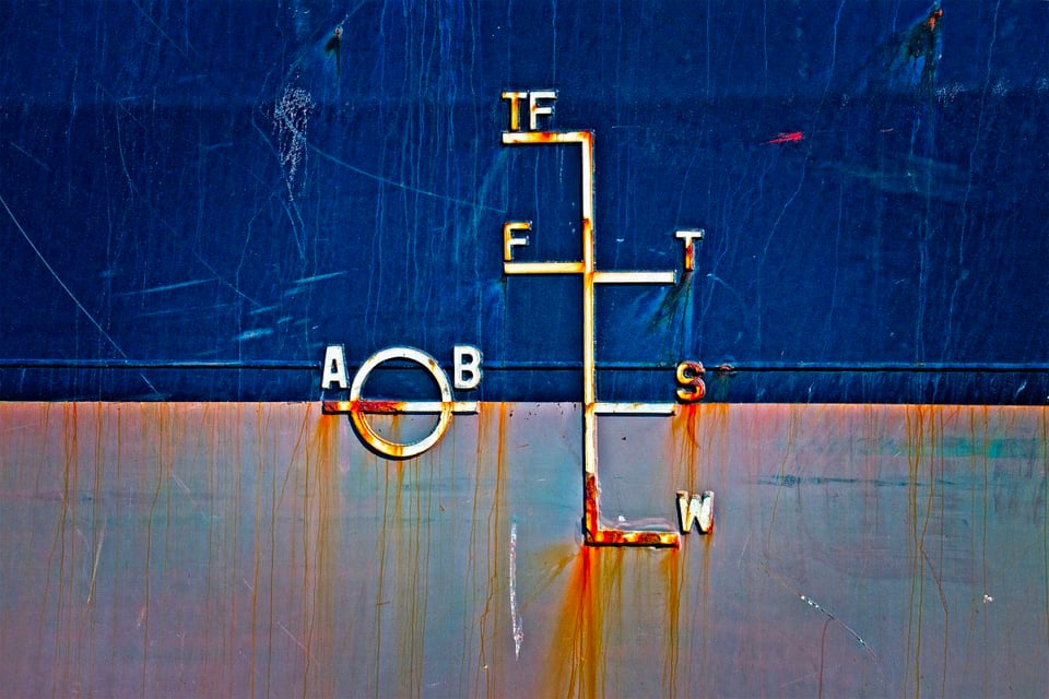
Container ships have all sorts of strange markings on their sides: Glyphs, line patterns, numerical markings going from the water-line up to the deck. During some of my long-distance cycling trips I've ridden alongside shipping canals and wondered what was up with those markings.
Over at Hakai Magazine, there's a great story by Erin Van Rheenen explaining what some of them mean. It's illustrated with spectacular photos by David Webster Smith.
That marking above? They're "load lines", showing the maximum load a ship can carry ...
The letters on either side of the circle stand for the ship’s registration authority. AB is the American Bureau of Shipping, one of 12 members of the International Association of Classification Societies, which sets and maintains safety standards for more than 90 percent of the world’s cargo ships.
The marks and letters to the right of the circle indicate maximum loads under different climatic conditions. Salt water is denser than fresh, cold water denser than warm. Since water density affects ship buoyancy, different conditions call for different load lines.
W marks the maximum load in winter temperate seawater, S in summer temperate seawater, T in tropical seawater, F in fresh water, and TF in tropical fresh water, like that of the Amazon River.
Check out the rest of that piece -- Webster's other photos are stunning, and the explanations are super cool.
4) 🐦 When to use a pigeon for data-transfer
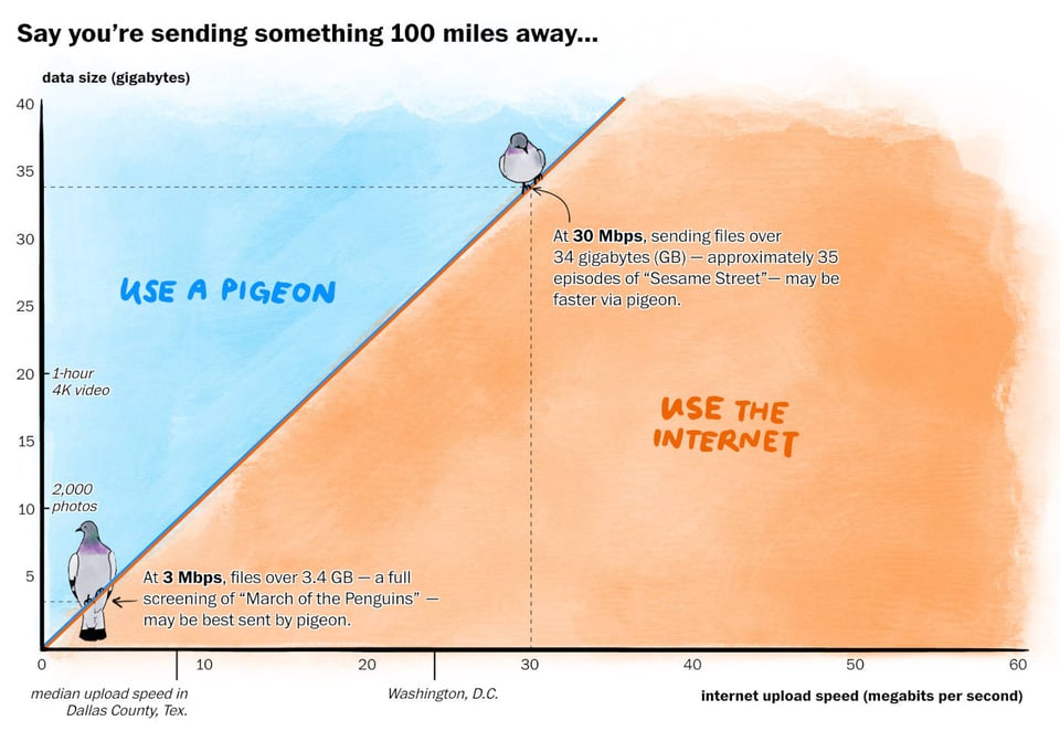
What's faster -- using the Internet to send data, or strapping flash drives to a carrier pigeon?
Various folks have experimented with this over the years, often finding that if you're sending a file of several gigs over a shorter distance, the pigeon handily wins. It's only when the distances start getting bigger -- or the files are small -- that the Internet is faster. Over at the Washington Post, Janice Kai Chen wrote a fun story about this with some great dataviz.
This analysis has interesting implications for America's rural areas, where folks often have terrible, low-speed Internet. If a rural town has several companies that regularly need to trade large files, maybe they should set up a PigeonNet?
(Or more practically, the states and federal governments could fight the monopolistic rural telcos, and roll out publicly-owned civic broadband ... but that's a rant for another day.)
5) 🪢 Which of these is knotted?
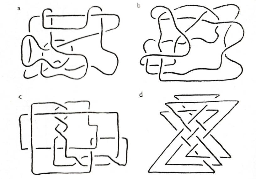
I recently stumbled across a free archive of scanned copies of Eureka, a historic magazine of "recreational mathematics" published by the Cambridge Mathematical Society.
It is a blast! I opened an issue at random -- issue 23, from October 1960 -- and found that awesome puzzle shown above. There are dozens more great puzzles in that issue, like this one ...

There's also a fun short essay on the problems (circa 1960) of typesetting mathematical formulae -- illustrated with this rad drawing of the "four line" mathematical typographic system ...
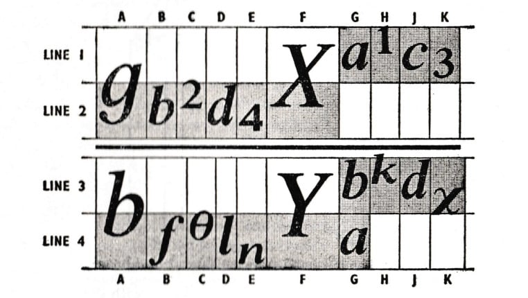
I'm gonna make a tshirt with that illustration on it.
That free Eureka archive includes issues from 1940 to 2018. More recent issues are still being published today online, and still for free!
6) 😱 The uncanny valley of Brooklyn in Spider-Man 2

Chris Person played the latest Spider-Man video game and noticed two things: 1) This is the first video game to depict Brooklyn in depth, which is pretty cool; but 2) the version of Brooklyn is very weird.
It's not that things are inaccurate. Sometimes the buildings are extremely accurate! It's just that they're often wildly incomplete or built to a strange scale.
The upshot is a version of the city that falls into an architectural Uncanny Valley. As he writes ...
It also makes the game feel like it was made by people who came to New York for a week or two and then tried to summarize their trip from memory. It’s not that parts of the game are inaccurate; it’s that parts of the game are shockingly accurate next to really basic stuff that isn’t ...
The Brooklyn Botanic Garden greenhouses are rendered with shocking accuracy, as is the Brooklyn Museum nearby and zoo nearby, but Prospect Park accounts for at most 3 blocks, significantly smaller than the 525 acres that it takes up in real life. It’s not that they got it wrong, it’s that they got a small bit very right and that gives me whiplash. The bridges look great in profile but are completely wrong up close, and none of them have trains, which is something that even GTA IV got right even with fictionalized bridges. There are abandoned freight lines that seem to reference lines that run through Maspeth, but they run through apartment buildings in a way that I have never seen freight lines do in my life.
Very fun read! I love seeing how games honor, or mangle, the design of famous cities.
7) 🎼 Long-lost, sole copy of a haunting 1990 album found at a Goodwill

Back in 1990, Carola Baer was a young songwriter living in San Francisco. An immigrant from the UK, she was feeling lonely and isolated, but she had access to an inexpensive four-track Portastudio recorder -- which recorded directly onto Walkman-style cassette tapes. Over several months, she recorded an entire album, The Story of Valerie.
The thing is, she never released the album. So that cassette? It was the only copy. She made a little photocopied cover for it (seen above). Almost no-one heard it, except maybe a few friends.
Worst of all, at some point she lost it.
It was missing for 26 years, until ..
... in 2017, the music collector Jed Bindemann was scavenging for albums in his local Goodwill in Portland, Oregon, and he found it. He brought it home and was absolutely gobsmacked: Baer's singing is by turns raw, ethereal and haunting, as it floats above echoey keyboards, a drum machine and the occasional bass. It sounds a bit like Kate Bush, except even weirder (which, if you know Kate Bush's work, is saying something, lol). As Monorail music describes it ...
Many of the tracks feel like musical exorcisms ... Like finding a stranger’s diary, the listener is granted access to music that is emotionally raw and deeply personal.
Bindemann, thankfully, rescued Baer's work. He tracked her down and signed a deal to release the album; you can go hear it yourself over at Bandcamp. He did a run of 500 vinyl albums that are, alas, sold out. I would buy one in a second.
So many cool tech-culture lessons here! I recently blogged about how the age of cassettes was "permissionless", and thus much like the early Internet; artists could make and distribute music without needing lots of money or access to a studio ...
You didn’t need anyone to permit you to make a cassette, a mixtape, a live recording of a band, a rambling voice message. Your audience didn’t need permission to listen to it. That permissionless quality is — as Masters documents — what allowed so many indie musicmakers to create and distribute their music.
Go listen to the album; it's truly wild, and made even moreso by this amazing backstory. Baer's still making music, too; her personal site is here. There's a story here with quotes from Baer reminiscing about when she was making the album.
8) 🪄 When AI photo-stitching goes wrong

As Tessa Coates writes on her Instagram photo here, "I went wedding dress shopping and the fabric of reality crumbled."
At first glance, the photo might seem fine -- until you realize her hands are in different positions in the two mirrors, neither of which match what her hands are doing in reality.
This isn't a photoshop; it's how the Iphone took the picture. What went wrong?
She consulted with an Apple Genius bar employee who said it's a wild example of the Iphone's photo software, which often uses several takes of a picture to stitch one final image together.
... mobile phones are essentially miniature computers with camera functions, and even when the live photo setting isn’t enabled, they automatically capture a sequence of images from left to right.
Furthermore, he elaborated that at the precise moment when the camera moved behind Tessa’s back, she must have inadvertently raised her hands, resulting in an “artificial intelligence decision” creating a completely distinct set of images on the other side.
Given that Iphones are in such common use -- as well as Pixel phones, which ship with similar software -- I wonder what implication this will have for the forensic use of everyday Iphone photos in court.
9) 🔥 A final, sudden-death round of reading material
The joy of weak ties. 🔥 Apparently, our nostrils work independently. 🔥 Mobius tank treads. 🔥 The Earth contains chunks of another planet. 🔥 Tic-tac-toe made purely using HTML. 🔥 The "Tremulous Hand Of Worcester." 🔥 An addictive game to name all of London's 416 subway stops. 🔥 A reboot of webrings. 🔥 A web-scraping project to find unused three-letter acronyms, the first of which is "CQK". 🔥 The 16th-century's reluctant levitator. 🔥 Historical trends in romance-novel covers. 🔥 Using friendship-bracelet beads to visualize Taylor Swift tour earnings. 🔥 "Community fridges." 🔥 A reinvented coat hanger. 🔥 The world's largest gravity hole. 🔥 A programming language with physical dimensions as types. 🔥 When can a human beat a chess AI? 🔥 Lord Byron's vinegar diet. 🔥 How Galapagos' giant turtles terraform the landscape. 🔥 A guitar pedal to make your guitar sound like a crappy MP3. 🔥 A two-neuron network that can steer a bicycle. 🔥 People no longer treat desktop computers as if they were human. 🔥 3D-printed "Triaxial Numechron Clock". 🔥 Study finds ethicists are more likely to steal books from libraries. 🔥 Map of how to cross the US while staying at a 70-degrees F daytime temperature. 🔥 In praise of vocal fry. 🔥 A deck of playing cards with wilderness-survival tips. 🔥 The world's largest waterfall is underwater. 🔥 What quantity of microplastics comes off of sex toys? 🔥 A social network of chatbots talking to one another. 🔥 The "Comedy Wildlife Photography Awards". 🔥 Real-world experiments with money that expires. 🔥 Ferrofluid synthesizer.
Endnotes: A few of the excellent blogs and publications I used to find material for this issue includes Neatorama and The Overspill; go check 'em out!