016: The hardest panel to letter
Well, that was March! Highlights for me included my niece’s first birthday, my nephew’s first delousing, my first theater movie of the year (Project Hail Mary, which is very long and very good), my first Albert Brooks movie ever (Real Life, which is very short and very good), buying way too many Bills Evans albums on vinyl, having way too many migraines, and attending a blisteringly cold No Kings rally. It was windy. Very windy. Ten-degree-windchill windy.

Oh, and the cats got a clean bill of health at their biannual senior wellness exam. Their fur was declared clinically soft by the vet and the tech.
I did manage to work less, which is good. I averaged out 4ish books a week instead of the typical 7 or 8, and I was also able to work ahead on a few things to keep future months nice and manageable. I’m still tiring out pretty easily, but according to my sweetie, I’m noticeably less stressed. It has been nice to have more time to read and watch films without distraction, and gardening season is just around the corner.
There was another meme post going around Bluesky the other day: “Post a non-religious picture you think of as holy.” A piece by Kamome Shirahama immediately came to mind, which I thought I’d share here:
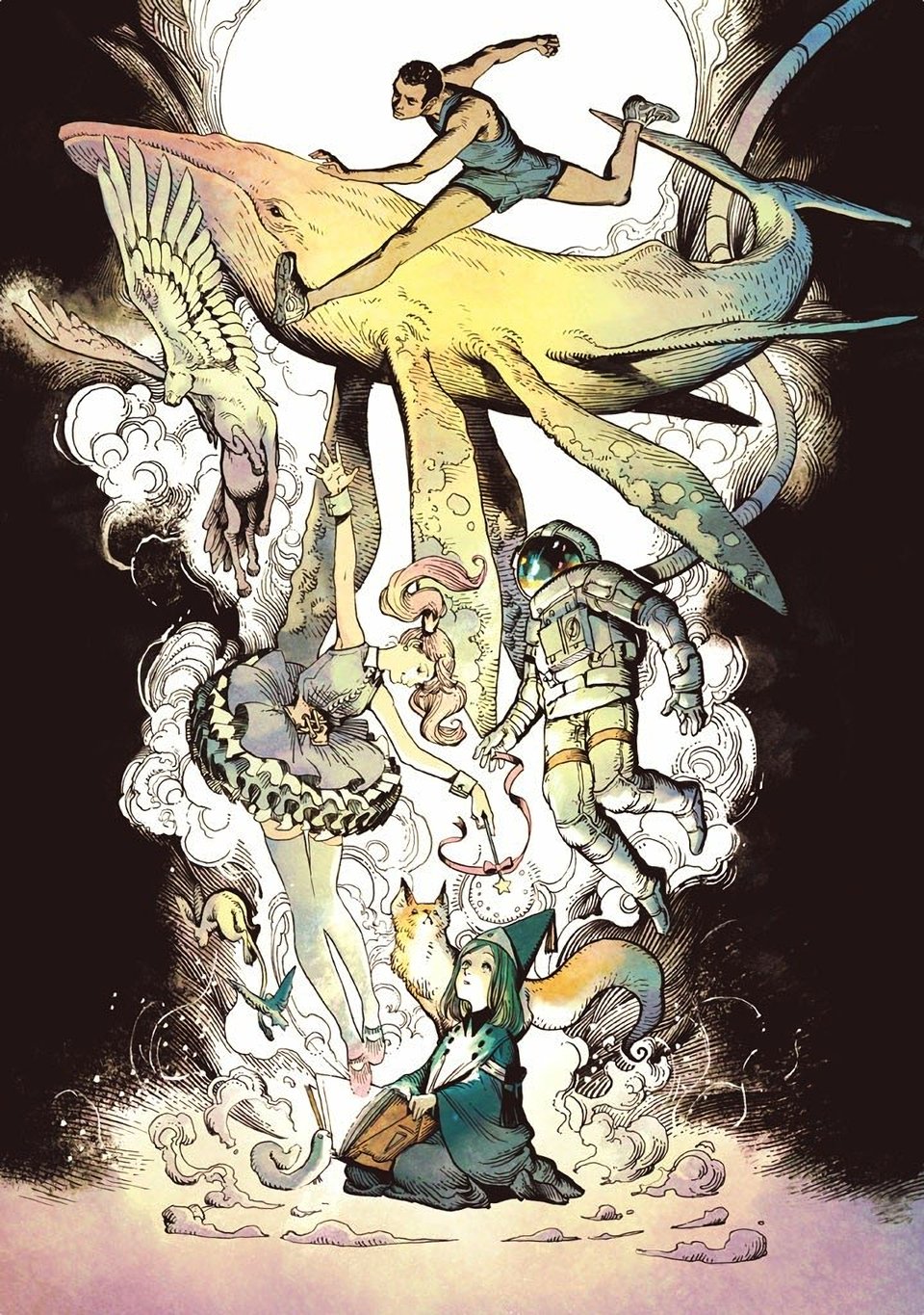
Somehow it’s linked to Witch Hat Atelier (which had a new volume released last month, hell yeah), and I was reminded of it when I found an Art of Witch Hat Atelier hardcover at a local Barnes & Noble. Recency bias aside, I am surprised that I thought of this first instead of something by Alphonse Mucha or J.M.W. Turner or any of my other favorite “fine” artists, but hey, maybe that means I’m keeping it real.
Anyway, on to some content.
Charity Auction: Star Wars
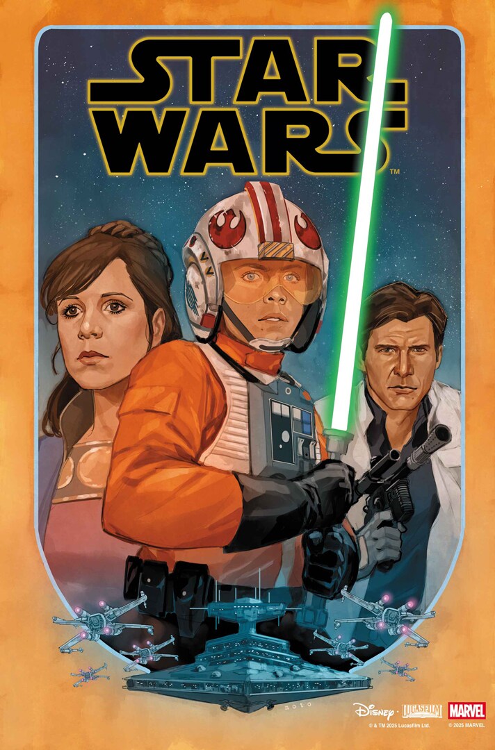
Last month’s Young Avengers charity auction went great—those 15 issues sold for $222.50! Still, I need to make more space, so why not do it again? This month, I’m auctioning off the most recent volume of Star Wars, written by Alex Segura and illustrated by Phil Noto and Pete Woods! Once again, all the money will go directly to Trans Continental Pipeline, as will the profits from anything else in my store that’s purchased alongside it. Auction ends on the 4th—bid strong!
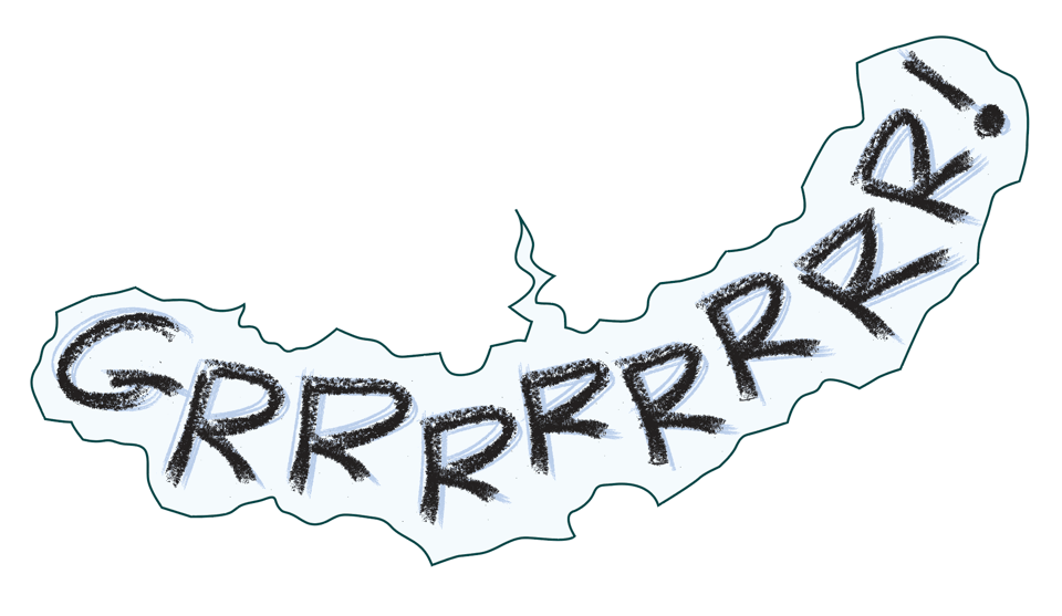
Sound Effect of the Month:
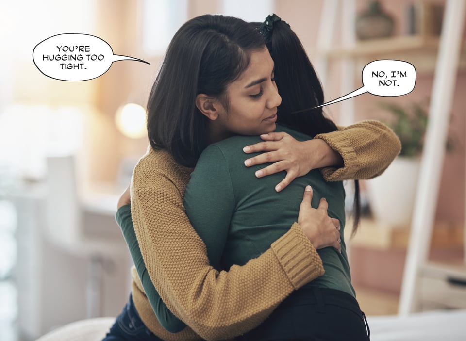
Tip/Rant: The Hardest Panel to Letter
Do you, the artist, remember when you learned that the hardest thing to draw is a horse? Then you laughed it off, tried to draw a horse, realized your folly, knocked over the drawing table, swore revenge against the one who warned you, put on the iron mask while it was still hot, and became the allegedly-deformed tyrant of a small country in Eastern Europe? Well, this is the lettering version of that. My face is fine. Thanks for asking.
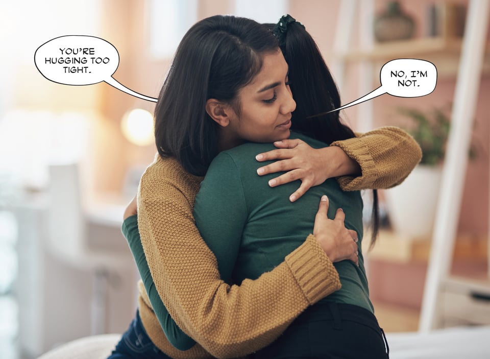
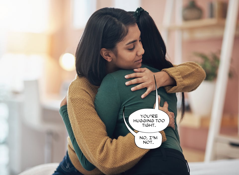
Behold, the comic-book-lettering-version of the horse—the hug-in-profile:

Like the common horse, on first glance, there is nothing wrong with this composition. It’s a simple but strong composition that tells the story. But look what happens when we add lettering:

This is how I letter most panels. I try to place the word balloons within the negative space, so the positive space isn’t obfuscated (if you don’t know about positive/negative space, here’s a helpful primer). But with a hug-in-profile, it really doesn’t work. Why? Because the reader can’t tell who’s supposed to be saying what. Both balloon tails are pointing at a speaker’s mouth, but because one mouth is hidden (not to mention fairly close to the other’s mouth), it’s completely unclear. Does balloon one go to the person in front or the person whose face is hidden? Even if only one character was speaking, this would still be a problem.
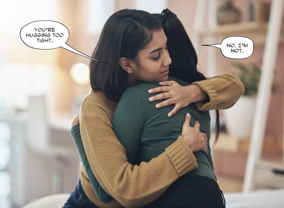
Let’s try a few other balloon placements/break a few rules and see how they go.
Here’s one I’ve seen done before. It’s clear who the second balloon goes to, but not so much the first one. The reader could surmise that the first balloon goes to the person whose face is hidden, but that they have to stop to figure that out wrecks the flow of the story.
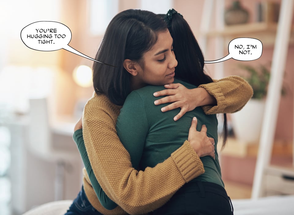
This is slightly better. It’s certainly more clear which balloon belongs to which speaker, but here’s why this bugs me. If the hidden speaker’s mouth was visible, the tail that’s pointing to it would be very, very long—so long that if it weren’t obscured, it would be going all the way into her mouth. That makes me gag, both as a designer and reader. Also, if you really want to get nit-picky, you could also make the case that the first balloon is spoken by a third person who’s behind the two huggers. Like Jiminy Cricket, I guess. Or Jiminy Glick.
Let’s also consider—what if the speakers are reversed?
The visible speaker still clear. I’ve moved the tail on the second balloon so it’s not pointing at the first speaker’s mouth, but still, it isn’t great. This still makes the reader do some math.
We could also try this, but again, we have the same problem as before. In fact, I think this is worse. Balloon tails don’t typically wrap around someone’s head to reach the mouth, and that’s what this tail would be doing.
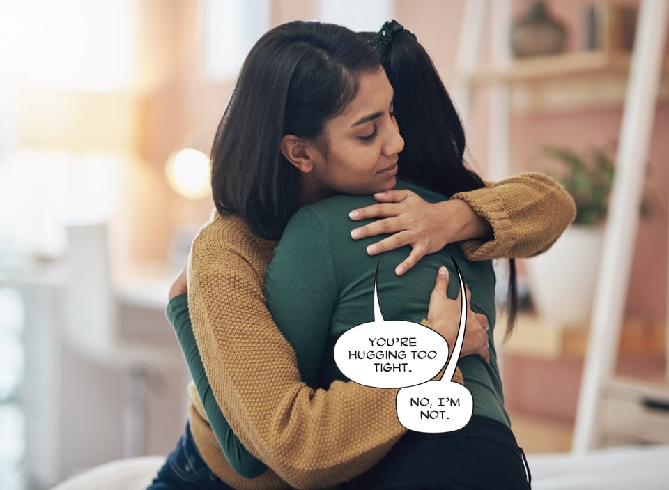
So let’s try moving the balloons onto the figures. Honestly, this is probably the best way to go. The speakers are clear, and the balloons read in the correct order, but I still don’t like it. For one thing, the balloons are covering positive space, and there’s a bunch of lovely negative space being left unused. We’re also forced to use long, curvy tails to make the speakers clear, which are generally frowned upon within the craft (not to mention by artists—I’ve worked with a few old-schoolers who hate, HATE long, curvy tails). Plus, I’ll often get notes from editors telling me to keep balloon tails off of hands, so while they’d probably go along with this, it’s not all that satisfying.
Also, again, what if the speakers are reversed?
This way is also clear, but it still isn’t great. We’re still covering positive space—and hands, no less. We could lower the balloons a bit, but then the tails would have to be even longer and curvier (they’re already pretty long and curvy here). Also, I’m sure someone would think the first balloon still looks like it’s going to the visible speaker, which could be resolved with an even, even longer and curvier tail.
If it sounds like I’m being pedantic…I guess I am. But that’s lettering for you—a bunch of small “rules” that you have to break sometimes. I don’t think I’ve ever lettered a book without breaking at least one “rule,” and the covering-positive-space rule gets broken a lot. I guess I’m frustrated that, after seventeen years of lettering comic books every day, I still don’t know how to letter this panel in a way that feels right. Also, the version of the hug-in-profile I’ve shown above is the easiest possible composition. Sometimes the panels are so wide or narrow that I have to resort to even more desperate measures, like straddling word balloons across panel gutters, or running leashes behind heads.
Just for the record, this post isn’t meant to blasts artists who’ve drawn the hug-in-profile. I wouldn’t dare tell a comic artist how to do their job. If anything, this is meant to be a heads-up. A story that is otherwise flowing smoothly can really be bumped by the hug-in-profile.
But hey, if the panel is silent, then go ahead and draw the hug-in-profile.
Community:
The great Sara Linsley just released a new comic book dialogue font—and as always, it’s free!
You’ve probably backed this already, but just in case, Matteo Scalera has launched a Kickstarter for his newest graphic novel! Naturally, it looks incredible.
Recommendations:
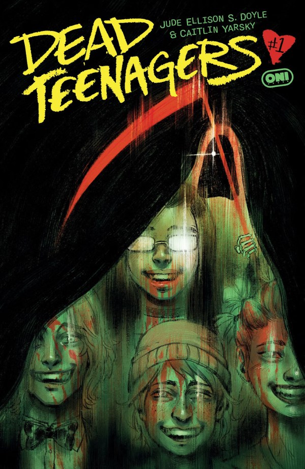
Comic: Dead Teenagers. If you watched Groundhog Day and thought it needed more death, gore, and hormones, then boy do I have a comic book for you! Stuck in a time loop taking place on a ‘90s prom night, this one has a full class of juniors repeatedly dying in just about every way imaginable, and trying to find a way out of it (with quite a twist at the end of issue #1 that I won’t give way). There are MONSTERS. And a VIRUS. And DRUNK DRIVING! Written by Jude Ellison S. Doyle, illustrated by Caitlin “Clayton’s Buddy” Yarsky, and lettered by Becca “The Skree Queen” Carey. Becca’s work is infuriatingly great here.
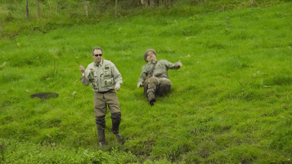
Non-comic: Mortimer & Whitehouse: Gone Fishing. My sweetie has described this show as such: “It’s like a public service announcement for men” and “It’s like watching Winnie the Pooh and Rabbit go fishing.” In each episode, elder British comics Paul “The Rabbit” Whitehouse and Bob “Pooh Bear” Mortimer travel to a different British Isle fishing spot and discuss the meaning of life after their respective cardiac events—peppered with beautiful drone shots, heart healthy meals, heart healthy guests, heart healthy Airbnbs, and a small elderly dog named Ted rolling around in something pungent (Ted’s heart healthy status is not yet known). Also, Bob falls over a lot, but in a way that’s mostly harmless.
Stuff with my name in it (March 2026):
4/1:
Alien: King Killer #1
Batman #8
Magic: The Gathering: Untold Stories - Jace #1
Venom #256
X-Men #28
X-Men: Age of Krakoa - Dawn of X Omnibus
4/6:
X-Men Infinity #12
4/8:
DIE: Loaded #6
Moonstar #2
Star Trek: Lower Decks #18
Uncanny X-Men #26
Uncanny X-Men Annual (2026) #1
Web of Venom #1
4/13:
X-Men Infinity #13
4/15:
Birds of Prey vol. 4: On the Run TP
Star Trek: Lower Decks vol. 2 - Mixed Signals TP
Star Wars: Jedi Knights vol. 2 - A Higher Path TP
Supergirl: Woman of Tomorrow - The Deluxe Edition HC (Superman Day 2026 Edition)
Venom #257
Wonder Woman #32
4/20:
X-Men Infinity #14
4/22:
Marvel/DC: Spider-Man/Superman #1 (A-story)
4/27:
X-Men Infinity #15
4/29:
Absolute Batman vol. 1: The Zoo HC (Jim Lee FCBD 2026 Edition)
Batman by Chip Zdarsky Omnibus vol. 1 HC
Predator Kills The Marvel Universe TP
Predator: Bloodshed #3
Uncanny X-Men #27
And, finally, the cat photo:

He smelled horrible when this picture was taken. See you all in 30!
Got a question you’d like me to answer in a future newsletter? Ask away in the comments section!
-
Not a lettering question, but I love the Bill Evans deep dive. As a fellow jazz-on-vinyl admirer, I’m partial to Django Reinhardt and Charles Mingus. What might you recommend I check out?
-
↳ In reply to Lodro Rinzler

Brother, I do not feel qualified to answer, but here I go anyway. Sunday at the Village Vanguard is my favorite of Evans' so far, with Portrait in Jazz coming in second. I've also been enjoying The Oscar Peterson Trio's Night Train, and Miles Davis' In A Silent Way and Dig (ft. Sonny Rollins).
What would you recommend by Reinhardt and Mingus?
-
↳ In reply to Clayton Cowles
Sunday at the Village Vanguard is winging its way to me now, thank you. I'd say Mingus Ah Um is a classic for a reason and a fan favorite around the Rinzler household. While you can't go wrong with anything Django, Modern Jazz Quartet is the vinyl I repeatedly come back to...but really anything there is good. Looking forward to nerding out about this topic in the future with you
Add a comment: