013E: Q&A Extra! Guest-starring Hector Negrete
I received a reader question a few weeks ago, but unfortunately, it was an area that I don’t know well at all—lettering in non-English languages! So I asked Hector Negrete of Grapheck Lettering to answer in my place. Take it away, Hector.
Q: Is there much overlap between letterers who work on English language comics, such as yourself, and letterers who re-letter non-English comics in translation? Does lettering from comics in translation operate under different norms? I’ve noticed in some translated comics such as Shubeik Lubeik and Miyazaki’s Nausicaä, the letter ‘i’ will have horizontal bars across the top and bottom even when the ‘I’ isn't used as a pronoun. It’s my understanding the standard for lettering in English language comics is that an ‘i’ when not in use as a pronoun is rendered as just a vertical stroke (Although this is treated less as an ironclad rule in more recent hand-lettered indie comics I've noticed).

Hector: Lettering licensed comics outside the US is different than doing the original lettering process by many reasons, but usually it comes to a single fact: re-lettering is not necessarily worked by actual letterers.
In most of the cases, comics outside the US are done by licensees, this means a different company with gets the permission to publish any given book abroad. Usually this licenses are acquired by publishers which are not necessarily comic book driven, and might fall more on the field of traditional editorial design. So must of the people working on the lettering are actually graphic designers and not proper letterers, who may or may not know how to actually letter a comic book (I actually started as a graphic designer who eventually turned into a letterer).
As licensees doesn’t gets a manual on how to put together a comic book, they recur to the tools they understand: the classic editorial process. So, the texts are translate, the graphic designer fill the balloons with the translated texts—replacing most of the original lettering—and adjusting (or not) the ballon size and shape when needed, the proof readers check the text, and editors (with or without the designer) do the final edits. With this being said: it’s pretty common to find that international licensees of comics and mangas work lettering over on in a single InDesign file instead of editing single pages lettering in vectorial files as is traditionally done.
So…enter the “I” with horizontal bars dilemma.
Yes, indeed. The “I” lettering rule only applies to English, as I believe it’s the only language that uses “I” as pronoun. But any experienced letterer will have problems to spotting capital “I” with bars all over places, especially the ones who have worked doing original lettering in English. So what to do about this? Simple: create your own rule(s). I usually just work with the “I” with bars at the beginning of a sentence, except when it’s a name. I prefer this to keep names as Iron Man, Illyana or S.H.I.E.L.D. looking exactly like they do in English, and with this we keep the use of the “I” with bars in a minimum (I prefer not to loose horizontal space due with the bars when adapting the lettering, this space saved usually gets in hand when placing the translated text).
The thing is, there’s no actual convention about how to work this, others may opt to use the “I” with bars in different bars. But I have been sure to pass along this rule to my close co-workers, or people under my wing.
The “I” with bars appearing in international books is way too common. The reason can be several, which bring us to the very first topic I wrote about earlier: editorial design process and no actual letterers involved in the comic book translation. So you may choose why an “I” with bars may show up from the following: To any translator, comic books may look all written in capital letters; so, he/she translates the text book all in upper-case letters. The graphic designer may use a lower-case font and force the upper-case lettering. The designer may no be using a pro comic book font; etc. But all come to one single issue: not knowing the “I” with bars rule.
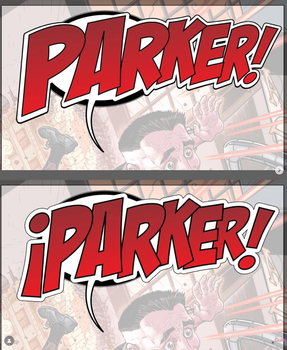
In Spanish, the bread and butter (as I call it) it to add the “¿” and “¡” to the onomatopoeias when needed (and the the art makes available). This may look picky, but traditionally is done here. Both marks are exclusively used in Spanish, so this from time to time, is one hell consuming task. Sometimes SFX are left without the “opening mark,” but this usually is necessary when in comes to a dialogue or a shout.

In my 10+ years working adapting comics to Spanish, I have always tried to keep the book look closest to whatever the original letterer did, and use the closest or the same font they used for the original book. For Marvel books, all lettering is done by VC (Virtual Calligraphy) and they use exclusive fonts not commercially available, so it’s imperative to look for similar fonts and tweak this fonts with paragraph styles to fit the best need.
But then again, there’s not actual any convention when it comes to translating comic books and re-lettering, as this varies from licensee to licensee. I’ve been lucky enough to work so far with two different licensees and have tried to pass along my knowledge, opinions and craft to my co-workers and colleagues not only as letterer but also as a graphic designer looking for the best practices in the comic book adaptation.
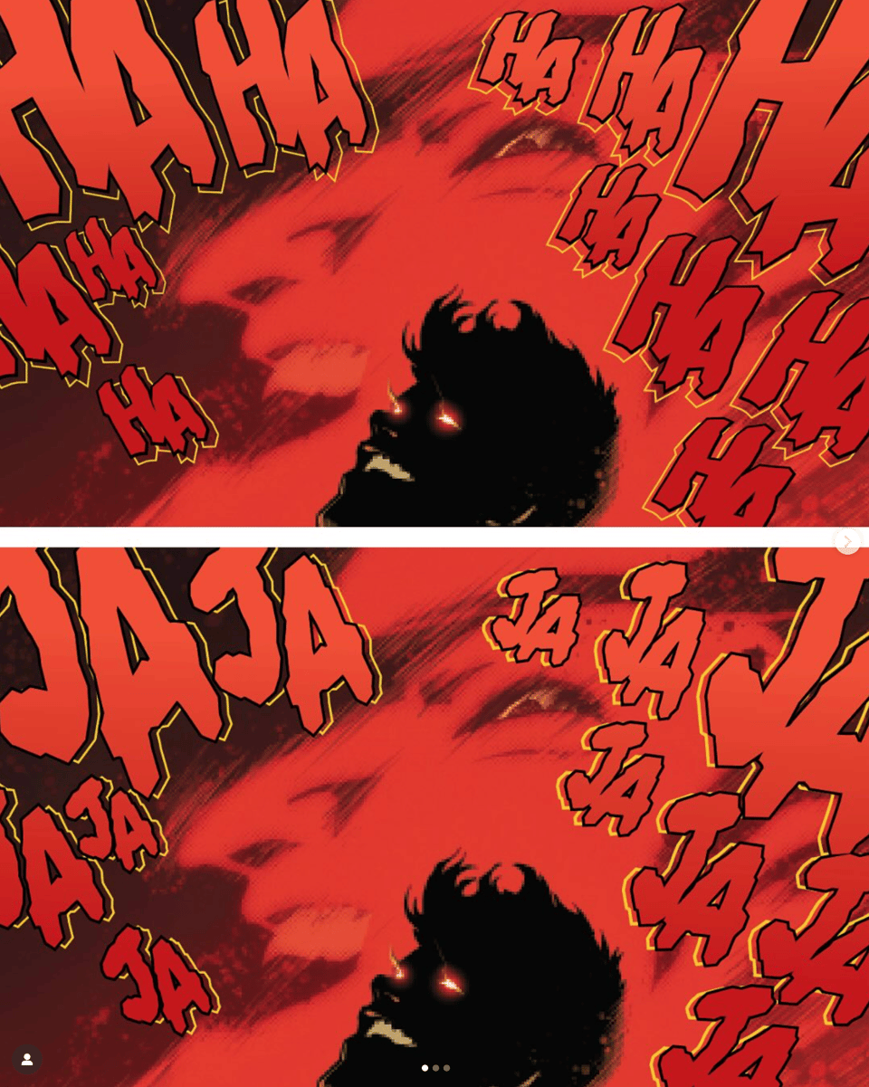
Now, if you ask, are there many letterers who work their stuff in other languages, the blunt answer is: No. Usually letterers have commitments on their own with US publishers, and they would hardly have time to letter their work to overseas editions, and hardly international licensees will contact the original letterers to rework their jobs. In all my years working as a letterer I have only reworked my own job twice: a short story comic book which was translated to English and French—the original was done in Spanish—(it can be downloaded for free here) and the Mexico’s story for Joker: The World. The first, called ANA, was planed to be translated to those different languages from the very beginning, so we tried to keep many of the sound effects as neutral as possible, although we had a few exceptions. For Joker: The World, since the team working on the Mexican edition knew me very well, they contacted me for help to adapt this to Spanish. This short story in particular needed rework many of the laughing SFX—HAHA is JAJA in Spanish. This usually is a hard work when it shows up in any license book, as basically you have to rebuild the original SFX without knowing the actual process the original letterer did. For J:TW, the task was way more simple as I already knew which assets I needed to redo the Spanish version. At the end, both experiences were very satisfying, as I knew not much letterers have the chance to redo their own lettering for other languages.

Thanks a ton, Hector! My assessment about crossbar-”I”s in translated comics is pretty much the same as his—the work is done by designers and editors who don’t know the rule. Honestly, I can’t blame them—it’s a very obscure rule that only comic book letterers seem to follow.
Still, go read Shubeik Lubeik and Nausicäa anyway. They’re both great.
-
Oh, how wonderful to receive such a detailed response to my question. Thank you, Hector, and thank you, Clayton! I'll heartily concur Shubeik Lubeik and Nausicäa are both phenomenal. Hear, hear!
-
Some lovely fiddly details here! The closest thing I have done to these complex language scenarios is edit audio in languages I'm unfamiliar with.
Unfortunately the ANA book is unavailable in any translation via that link.
Add a comment: