Show Your Work
In this issue:
Let's wrap up my foray into using PowerShell as a presentation tool by coming back one more time to my water management functions. A great thing about PowerShell is that you can apply the same techniques and concepts to anything. You most likely don't need to use today's code to display water consumption. But maybe you want to show mailbox utilization or Hyper-V memory consumption. In PowerShell, the objects are mostly interchangeable, or maybe even irrelevant. It doesn't matter what they are, it matters what you do with them.
Bar Charts
If you recall, I have functions that will analyze the raw water consumption data stored in a JSON file.
PS C:\> Measure-Water -days 7

Date                  Count Average          TotalOz
----                  ----- -------          -------
3/31/2026 12:00:00 AM   5   11.2                  56
4/1/2026 12:00:00 AM    5   12.8                  64
4/2/2026 12:00:00 AM    5   11.2                  56
4/3/2026 12:00:00 AM    6   10.6666666666667      64
4/4/2026 12:00:00 AM    5   11.2                  56
4/5/2026 12:00:00 AM    6   9.33333333333333      56
4/6/2026 12:00:00 AM    6   10.6666666666667      64
What I'd like to see is the daily total as a chart. Fortunately, creating a chart in a PowerShell console is very easy using the pwshSpectreConsole module and the Format-SpectreBarChart command. Let me give you a quick lesson on how to use it.
I will need to create a series of chart items using New-SpectreChartItem. Let me graph the working set size of my running PowerShell sessions.
$data = @()
$ps = Get-Process pwsh
I need to create a chart item for each process. This will require me to define a label, a value that will be represented by the bar and a color. The color I'll draw from a random array of SpectreConsole colors.
$color = 'Wheat4','LightGoldenrod2','Yellow4','DarkCyan','Cornsilk1','LightPink1','Magenta2_1','SandyBrown','MediumOrchid3','SpringGreen3_1'
To keep things simple, I'll cycle through this list with a counter.
$i = 0
Now to go through the processes and create my chart items.
foreach ($p in $ps) {
    [int]$value = (($p.ws)/1mb)
    #highlight the current PowerShell process
    $label = ($p.id -eq $pid) ? "[Chartreuse2]PID $($p.ID)[/]" : "PID $($p.ID)"
    $data+= New-SpectreChartItem -label $label -value $value -color $color[$i]
    $i++
}
I'm using the working set value as MB for the value. The data looks like this:
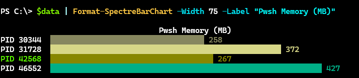
PS C:\> $data

Label                      Value Color
-----                      ----- -----
PID 30344                 258.00 wheat4
PID 31728                 372.00 lightgoldenrod2
[Chartreuse2]PID 42568[/] 267.00 yellow4
PID 46552                 427.00 darkcyan
I can use this data to create the bar chart.
$data | Format-SpectreBarChart -Width 75 -Label "Pwsh Memory (MB)"
The width controls how much of the console to use and the label serves as a title.
Charting Water
Here's how I translate this for my report. First, I want to group each day's consumption.
$days = 7
$get = Measure-Water -Path $Path -Days $days |
Group-Object {$_.Date.ToShortDateString()} | Sort-Object {$_.Name -as[datetime]}
I'm grouping on a custom property. I also need to ensure my data will be order so I'll sort on another custom property. This leaves me with raw data that looks like this.
PS C:\> $get

Count Name                      Group
----- ----                      -----
    1 3/31/2026                 {@{Date=3/31/2026 12:00:00 AM; Count=5; Average=11.2; Amount=56; ...
    1 4/1/2026                  {@{Date=4/1/2026 12:00:00 AM; Count=5; Average=12.8; Amount=64; D...
    1 4/2/2026                  {@{Date=4/2/2026 12:00:00 AM; Count=5; Average=11.2; Amount=56; D...
    1 4/3/2026                  {@{Date=4/3/2026 12:00:00 AM; Count=6; Average=10.6666666666667; ...
    1 4/4/2026                  {@{Date=4/4/2026 12:00:00 AM; Count=5; Average=11.2; Amount=56; D...
    1 4/5/2026                  {@{Date=4/5/2026 12:00:00 AM; Count=6; Average=9.33333333333333; ...
    1 4/6/2026                  {@{Date=4/6/2026 12:00:00 AM; Count=6; Average=10.6666666666667; ...
I know for my report I want to show a grand total.
$data = @()
$grandTotal = 0
Now, I need to process the raw data and create the chart items. For colors, I'm going to get all possible colors and filter out those that don't display well in my console session. I'll use a regular expression for the filtering.
$colors = [Spectre.Console.Color].GetProperties().Name |
Where-Object {$_.length -gt 1 -And $_ -notMatch 'Black|Gr[ae]y|Olive|DeepSkyBlue4|Blue(Violet)?|DarkGreen|(Dark|Navy)Blue|Blue\d+'}