Artefact 257
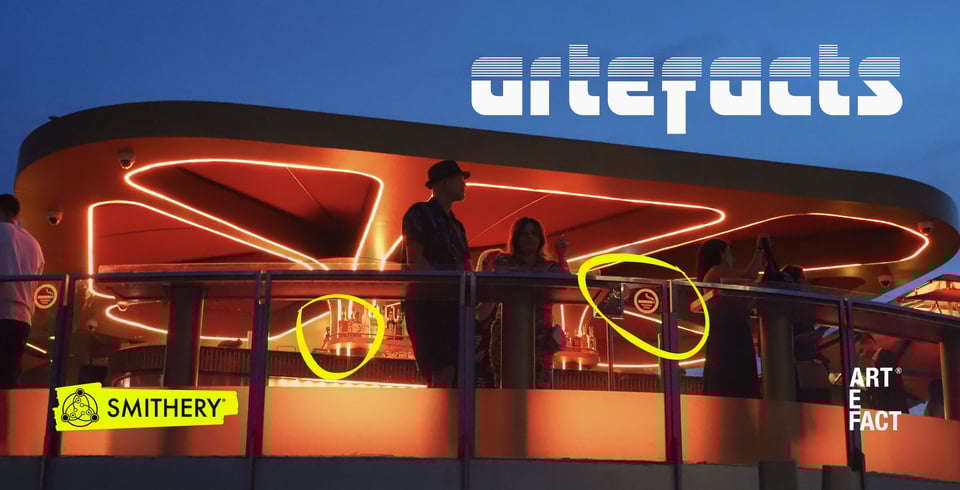
The future/present/past of design
It has been a wonderful start to the year, but as I said on the first STEPS Collective of the year on Friday, I can’t believe that January has disappeared already.
Now, I’ve been doing that thing again where I save up editions of the newsletter to talk about particular things, and therefore don’t send out anything for a while.
This time, that has been the rumination on the Double Diamond which I promised back in November. Finally it’s here, and it’s growing areas and legs at the bottom of this email.
But first, a few announcement things.
Futures Through Design - 2026
You may remember last year that Dr Robert Phillips (to give him his Sunday name) and I announced that we were launching a new three-day open course at the Royal College of Art in London called Futures Through Design. We were lucky enough to have the brilliant Gem Barton join us as a guest for it too.
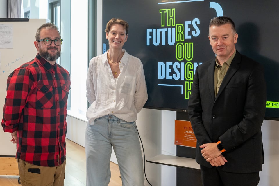
After it ran, we found out that it was the most successful new course that the Executive Education team at the RCA had ever had (i.e. it sold out), and it scored 4.6 out of 5 in the course feedback afterwards.
The great news is that it’s back - 25th-27th March in London, just before the Easter Holidays.
Just go and remind your boss that the training budget needs spending before the end of the financial year.
Yeah, but what even is Futures Through Design?
That is a good question.
Rob and I were invited by the RCA to do an ‘IN SESSION’ about this online this Tuesday, and wanted to bring two of our favourite brains from the worlds of Design and Futures together for a chat about it.
We’ll be joined by the awesome Charlie Warwick, Associate Director of Foresight at Arup, and nicest design legend you will ever meet Alexandra Deschamps-Sonsino.
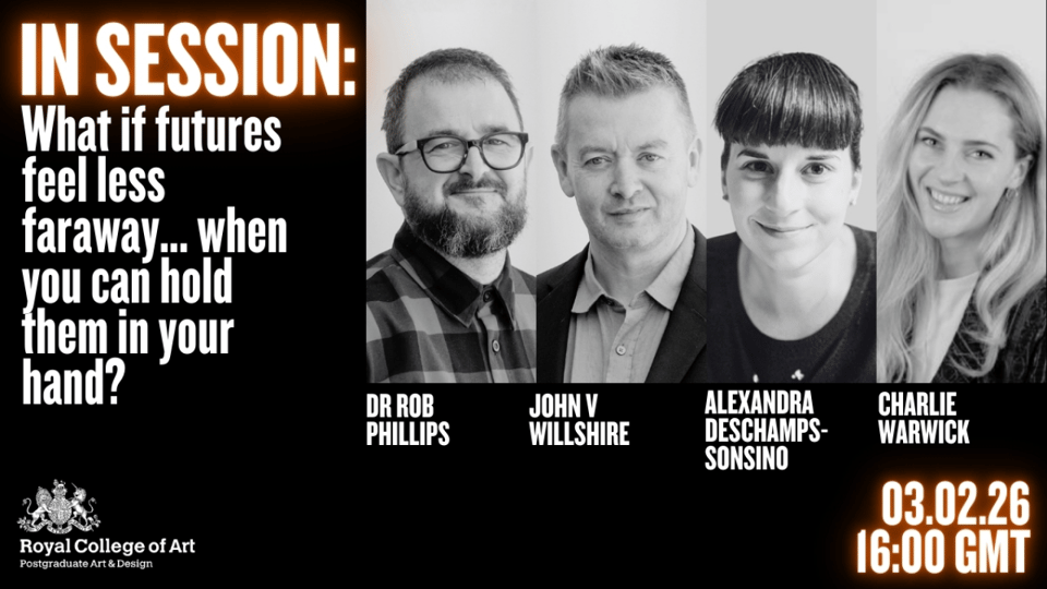
Amongst the things we’ll be talking about is what makes Foresight and Design increasingly inhabit the same spaces, and how in complex rather than complicated situations, foresight has the opportunity to use design as a probe to discover more about potential futures.
It’s a free online event, it starts at 4pm GMT online, and you can sign up here.
The Field Guide to Design Futures
Giovanni Caruso and Silvio Cioni had a little idea a while back - to create a fast, fun ‘Field Guide’ to design futures. And they asked me to do something for it, which I did.
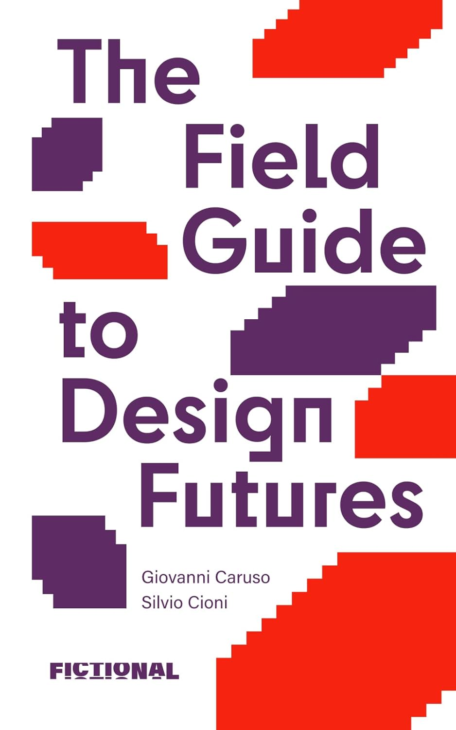
And it came out on Friday!
The PDF (open access) of the book is available at: https://designfutures.short.gy/pdf-guide.
Or, like me, if you like physical books, you can get that here.
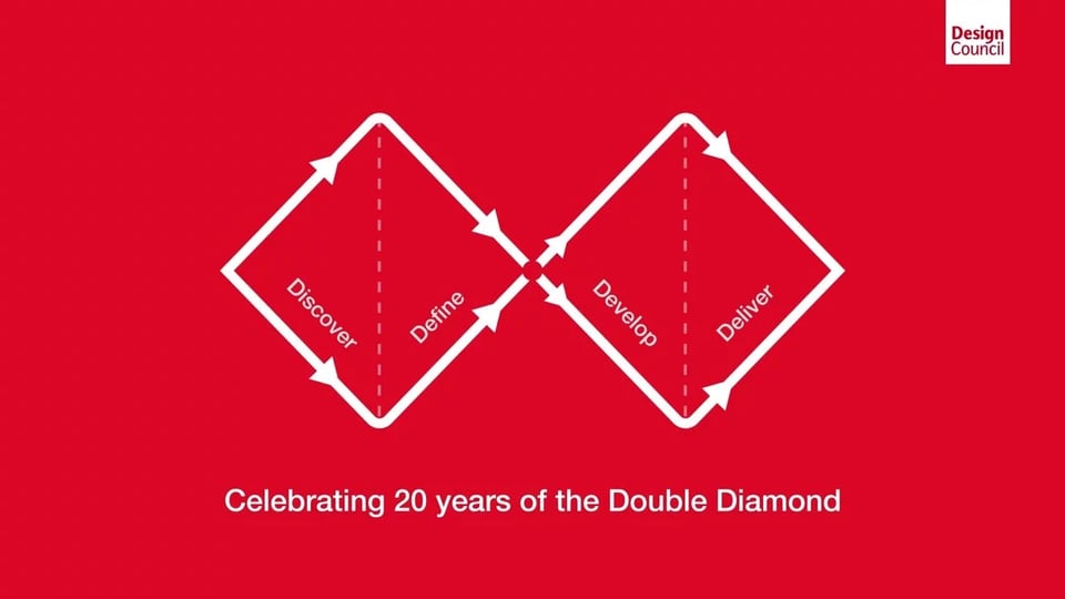
Finally, the Double Diamond thing
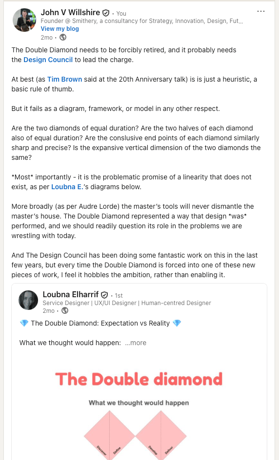
Short backstory: Loubna Elharrif wrote a post about the Double Diamond’s shortcomings that I liked. I wrote a few bits about it when forwarding, and then that generated over a hundred comments. People care about this, it seems.
So rather than pick up points individually, I promised to do it in a newsletter, and gather together some key themes.
Finally, then, some extended thoughts to all the comments (thanks, as always).
i. Where did this come from?
There’s a traditional Irish joke about a city boy from Dublin, who goes to the country for his cousin’s wedding. He has a great time, gets up the next day, but can’t remember the way home.
So he stops to ask a farmer for directions back to Dublin. The farmer looks at him, scratches his head, thinks for a moment, frowns and says: ‘You know, if I were you, I wouldn’t start from here.’
It is always a good idea to look at anything that’s causing problems, and work out where it came from.
I started coming across issues the Double Diamond was creating for others (I guess about a decade ago now). I’ve been gathering, thinking and writing about things since, and had another scout around over the last month or so.
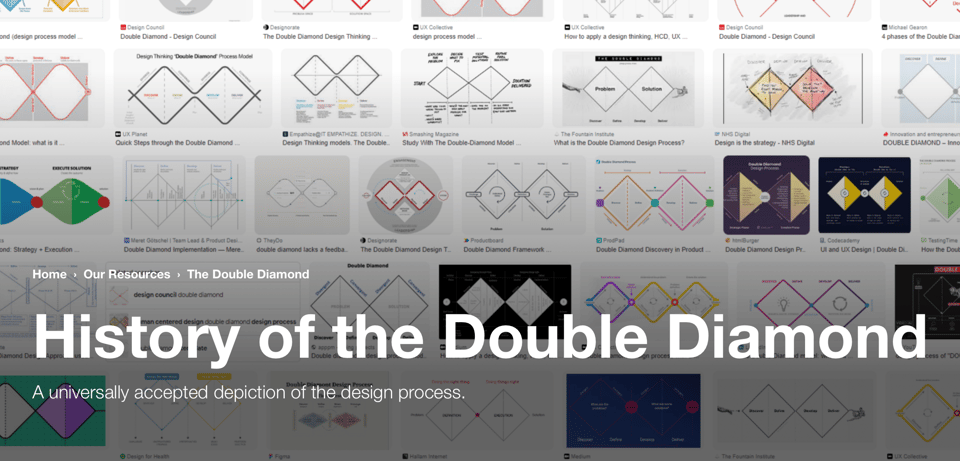
First off, there is a really fulsome history to get you started from the Design Council here.
Hmm. Citation Needed, maybe?
The broader aim was "promoting the positive impact of adopting a strategic approach to design and the value of ‘design management’ as a practice.”, with the specific question at the start of the project of “How do we describe design process?”.
If you haven’t read it before, this history is worth diving into. It gives you a sense of how the Design Council have chosen to remember the people, organisations, process and output that led to the Double Diamond.
For me, the real question it should ask is this; is ‘design process’ in 2026 the same as it was in 2003?
If you really wanted a modern model of the field of design today, I’m pretty sure you wouldn’t be relying on research gathered from practitioners up to 2003, before (*checks notes*) YouTube, iPhones, Facebook, Twitter, Nike FuelBand, Twitch, Tinder, Slack, Google Nest, TikTok, Nissan Leaf… I could go on, but you get my point.
It also predates a massive number of people doing jobs which are considered to be design today.
Additionally, even that research generated something that has been erased in this history (thanks Peter Murphy for the below) which was ‘this isn’t universal, there are lots of different divergent and convergent moments’.
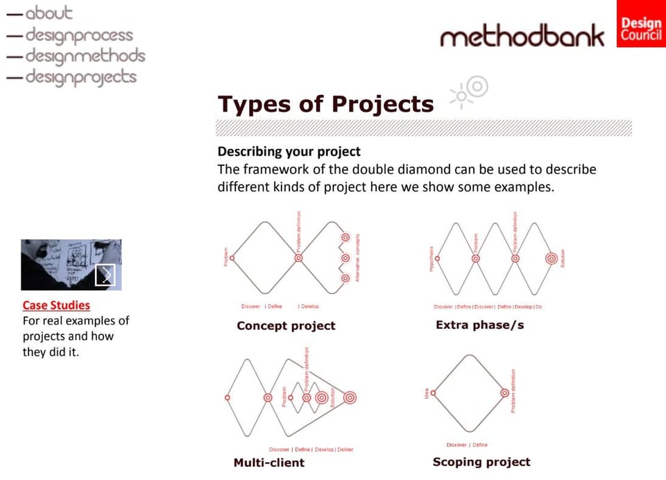
So my first issue is that in the ‘official history of the Double Diamond’, the inputs to the research are dated, and the subtleties in the outputs largely forgotten and erased.
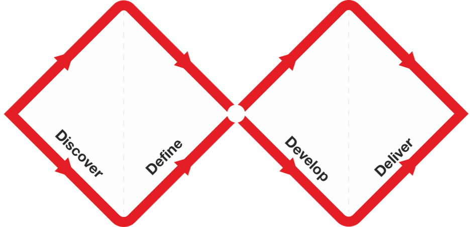
We are left with the hieroglyphic representation of the ‘double diamond’ that priests continue to repaint on the temple walls.
ii. The Double Diamond makes ‘the work’ disappear
Tim Kastelle and Cecilia Weckstrom pointed out it misses the crucial part in between ‘diverging’ and ‘converging’ - exploring the emergent space, working with the material you find.
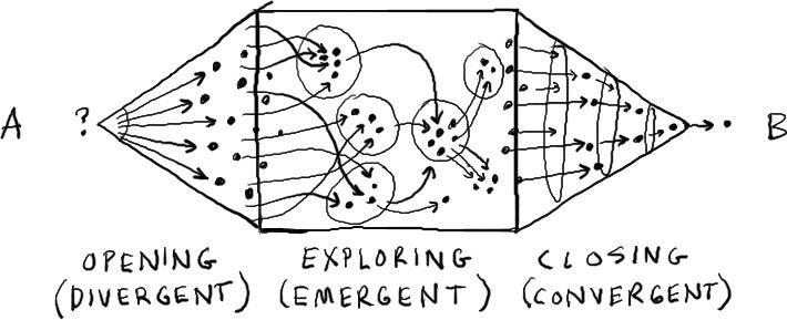
This is also part of the Design Methods diagram by John Chris Jones, which I would have thought is part of the research that went into the Double Diamond.
First published in 1970, with a second edition in 1992, Jones’ key insight for me is his description of the ‘transformation’ stage between divergence and convergence.
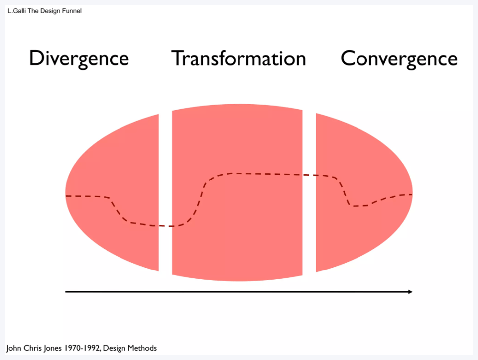
“[Transformation] is the stage of pattern-making, fun, high-level creativity, flashes of insight, changes of set, inspired guesswork; everything that makes designing a delight.
It is also the critical stage when big blunders can be made, when wishful thinking or narrow mindedness can prevail and when valid experience and sound judgement are necessary if the world is not to be saddled with the expensive, useless, or harmful, results of large but misguided investments of human effort.”
All of the things Jones describes as part of the ‘transformation’ phase don’t neatly pack into the ‘Develop’ triangle of the second diamond.
This is my second issue; the Double Diamond hides crucial parts of the process.
It is important to make space clear and visible for this part of the work. Instead, the Double Diamond tries to disguise it. It feels like a parsimonious accountant’s version of a process, hiding all the actual work from the client’s CFO to make something neat and certain.
The various newer versions of the Double Diamond which are produced with backwards arrows and loops perhaps speak to this too.
This endless scrawling on top and around the Double Diamond lead to the third point.
iii. It is not even a model
I have always fund this exploration by Dave Snowden, which lays out the difference between Models, Frameworks, Methods, Manifestos and Creeds, very useful.
Here’s a section from the model part:
A model seeks to represent reality, or more appropriately some aspect of the world. It allows for simulation and exploration without encountering the irreversibility of reality.
So, does the Double Diamond reflect reality? Or even enough of it to be useful?
[Side note: It might just be because I started in economics, and have a different kind of relationship to what a model should be.]
Firstly, the x axis is notionally meant to be ‘time’ - how the project will unfold. But then, all of a sudden, it isn’t.
Client: Are these four segments equal in duration?
Designer: Well, no. It depends.
Client: Are they linear though? Do we do break these down into four stages?
Designer: Well, no actually. We might go backwards again.
Client: So why do all the arrows point left to right?
Designer: …
The vertical dimension is even worse. It’s become the space in which you try and explain everything else.
If you search through the Design Council’s website and resources, you’ll also find a wide variety of what the Double Diamond is described as; variously, it is a model, a framework, a process with ‘four distinct phases’, a visual representation, and so on and so forth.
I actually think Tim Brown of IDEO was probably right with how he described the Double Diamond at on the panel at the 20th Anniversary Event in 2023 (the recording doesn’t seem to be online).
“I don't think of the Double Diamond as a method, but as a heuristic…”
The Double Diamond is a mental shortcut, a rule of thumb. “Maybe some of this, maybe that, maybe this way, maybe not”.
The more you pretend it’s a model, the more you get things like this:
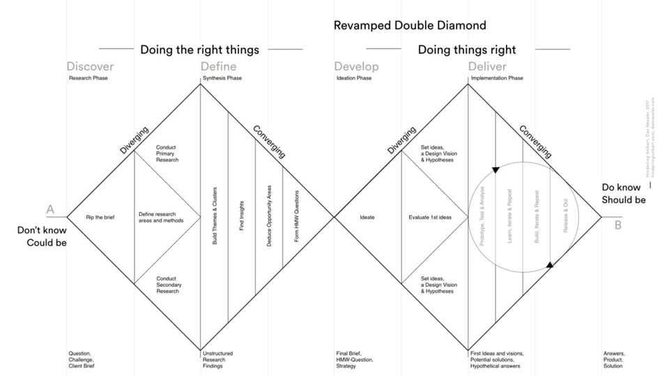
There are many examples of people taking on the assumption it is a model and over-specifying it as a result (Ramunas is not nearly along, I only picked his example as it ranks highly in Google images).
And it lots of cases, the more you specify inside the ‘framework’ of the Double Diamond, the worse things get.
iv. Well, that’s just because it’s badly applied / taught etc etc
Finally, I struggle a bit with this argument for two reasons. Firstly, the inherent assumption is that ‘this is a good teaching tool, and should be taught well’.
There’s never an acceptance that this could be a bad teaching tool. Or that all of the nuance and understanding of where it came from should be taught too.
Secondly, given the scale and breadth of how and where it is taught nowadays compared to 2003, if it is open to misuse or misunderstanding, then it only serves to diminish the thing it is trying to achieve; “How do we describe design process?”
If design is seen as having massive potential in many other areas of industry and teaching, but the central tool you use to spread the gospel is open to unfortunate interpretation, then maybe the problem is the tool, not the teachers or practitioners.
v. A hinderance, not a help
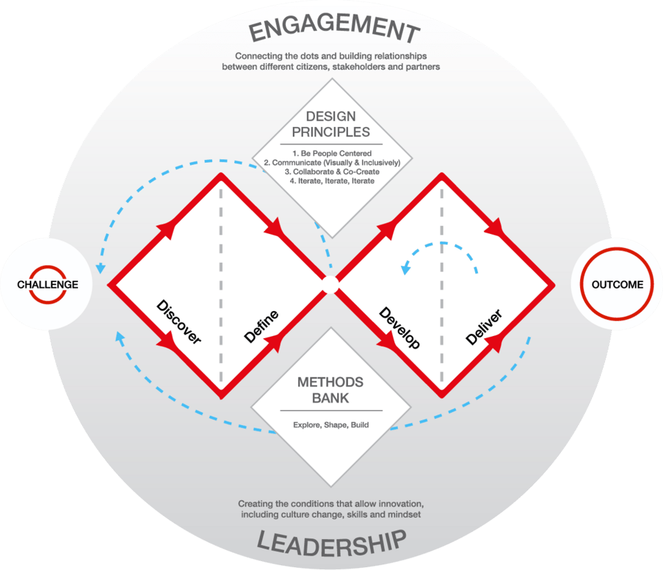
Now that it has become a piece of ‘intellectual property’ for the Design Council, it is used in pretty much everything as a ‘symbol’, a maker’s mark.
For instance, in the Systemic Design Framework (which contains brilliant work, that I loved), I am frustrated by the presence of the Double Diamond as an orientating mechanism here.
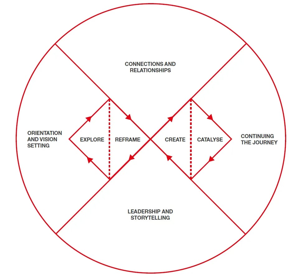
You dig in to the set-up, and you get to diagrams like this:
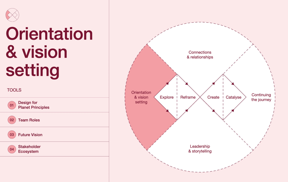
Is this inferring that I don’t need to think about ‘Connections and Relationships”’ in the ‘Explore’ section of the Double Diamond? Because it really feels like I should.
Likewise, the more recent ‘Skills For Planet’ map (again, a visual representation of some great, highly necessary work) has the Double Diamond right in the middle for reasons which are unclear.
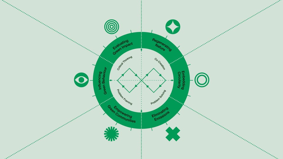
How is the Double Diamond in the middle of the map related to the six segments around it? Should I only be thinking about the first three sections during the first diamond?
I would love to have seen (and maybe still see?) the Design Council’s recent work and initiatives freed of the need to put the Double Diamond in the middle of everything.
—
And maybe more broadly, that’s what I’d like to see. Rather than endlessly repurposing a model which claims to be “A universally accepted depiction of the design process”, there should be a future project that asks:
What skills, professions, companies and projects do we consider ’design’ to be covering in 2026?
What are their processes and approaches that we can learn from and evaluate?
What was lost from the original Double Diamond work that’s worth resurfacing?
What universal principles and methods can we share that bring this all together in a way to share, teach, iterate upon?
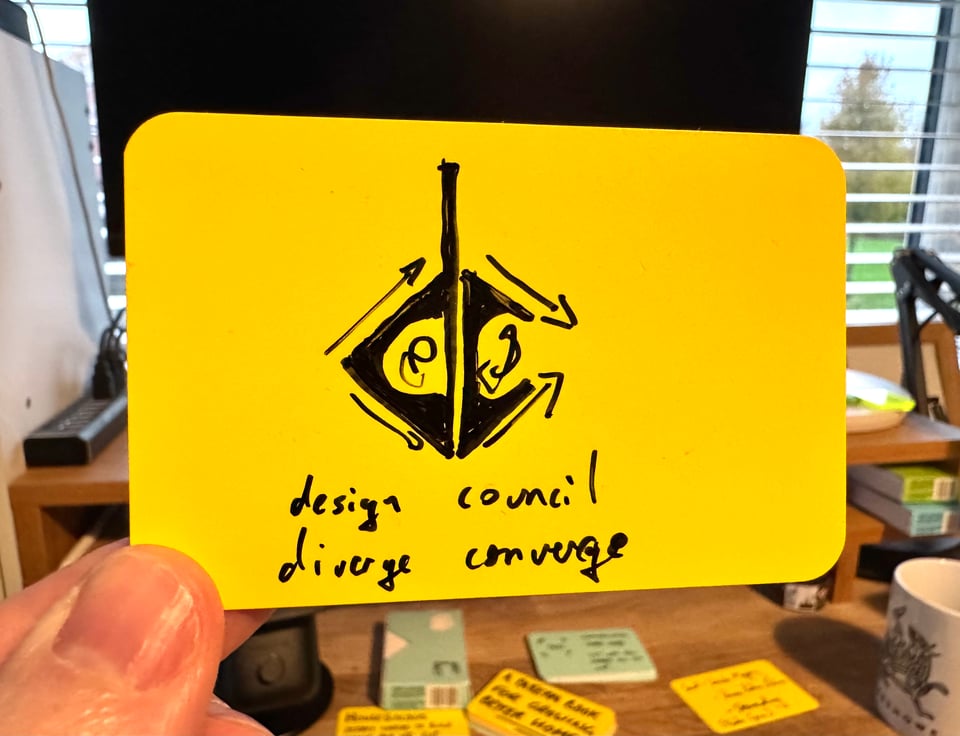
I’m fairly sure that ‘diverge’ and ‘converge’ will still be a big part of it. And it’s nice that 'Design Council’ has the same initials as ‘Diverge / Converge’.
But for me, we have to stop pretending the Double Diamond is the be all and end all of how to teach, apply and benefit from design.
John V Willshire
1st February 2026