Comrades!
This week two things caught my eye.
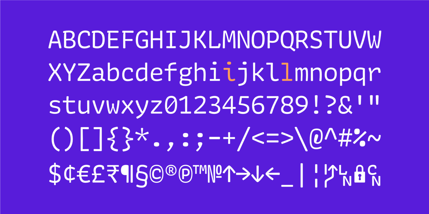
First up: Codelia by Toshi Omagari which is described as a “monospaced humanist sans” on MyFonts and more accurately described by me as a “heck yeah” font. Just look at this thing and all it’s extreme heck yeah-ness:

There’s a great deal of attention focused on designing, building, and selling monospaced coding fonts lately. I’ve noticed a seemingly endless barrage of them—a new variant appears to pop up every couple of days. Chris Coyier even made a website called Coding Fonts that acts as a gallery, letting you experiment with the most popular ones:

Each of these fonts have their own flavor, their own variation on a theme but Codelia stands out to me as being more playful. Check the oblong-shaped dots that can be found in ! and ? and . There’s something excitable in these letterforms, a kind of motion that feels playful without looking childish.

Not only that but I love staring at the Greek and Cyrillic characters...

Next up: I also stumbled upon Urlop by Mikołaj Grabowski, a dazzling display face that allows for a number of combinations by stacking and aligning other styles on top of them. This is just the sort of thing that makes me want to quit my job, drop everything, and design book covers all day long.

One question I had whilst staring at Codelia and Urlop was this though: what makes these typefaces good? In fact, what makes any typeface good for that matter?
I get this question often from folks when they discover my perversion for typefaces and I’m never sure how to answer. How do we know what constitutes good? You like this font, I like that font. It's like music, right? There’s nothing that can be quantified, nothing that can be pointed to—precisely—where you can say “ah! that is a mighty fine font indeed!”
Sure, yes. Most of this comes down to a matter of taste I suppose. But some letters are drawn better than others and the more you study letterforms the easier it is to spot them. In Urlop for example, it is obvious that great care and attention to detail has been taken to make these combination of letters snap together like a puzzle.
The O is elegant, the S is balanced even when a tiny chunk of it is missing.

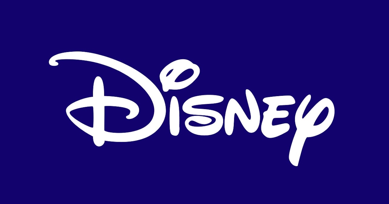
As I mentioned, once you learn enough about letterforms you can tell which letters have been poorly drawn and those which have been drawn with an expert hand. Take the Disney logo for example where, earlier this week, I noticed the lowercase s in the middle:

It’s unbalanced and clumsy, the bottom left part of it flopping over itself awkwardly. The weight of each of these characters don’t fit together either and any good type designer or calligrapher could improve these shapes without too much work I’m sure.
And although the earliest sketches of the Disney logo were in an entirely different style it is clearly drawn with more care and attention to detail: the letterforms are expertly balanced and whimsical.


Now, even though the first version is drawn with more skill you still might prefer the latest version of the logo. And that’s okay! Taste is important when it comes to typography because it means that we all prioritize different qualities in the letterforms that we see every day.
It’s difficult to describe what "better" is when it comes to typesetting though. There’s so much nuance and so many answers end with "it depends" that it can be infuriating for folks just getting started. For instance: you can pick a beautiful typeface and use it in the wrong place or you can use a boring typeface and use it expertly and suddenly a piece of design becomes beautiful.
I was reminded of this fact just the other day when I spotted a piece on Fonts In Use all about how the designers at Rolling Stone employed the Elmhurst type family. Now, I can’t say why, but I’m not a big fan of it—it just looks pretty naff to me at display sizes and there are ten million fonts I’d pick before I reach out for that one.
But! The design team at Rolling Stone constantly made it new over and over again:


This feels like competition: how can we make Elmhurst not look like Elmhurst? What about this and this and that!? There’s a joyful experimentation to be found with constraints like these and in the past I’ve tried to follow suit. For a few years I only used Ideal Sans in personal projects because I was overwhelmed with how restrained and elegant it was; it never failed to make my writing look so much smarter than it really is.

With that said, I made an odd website the other day.
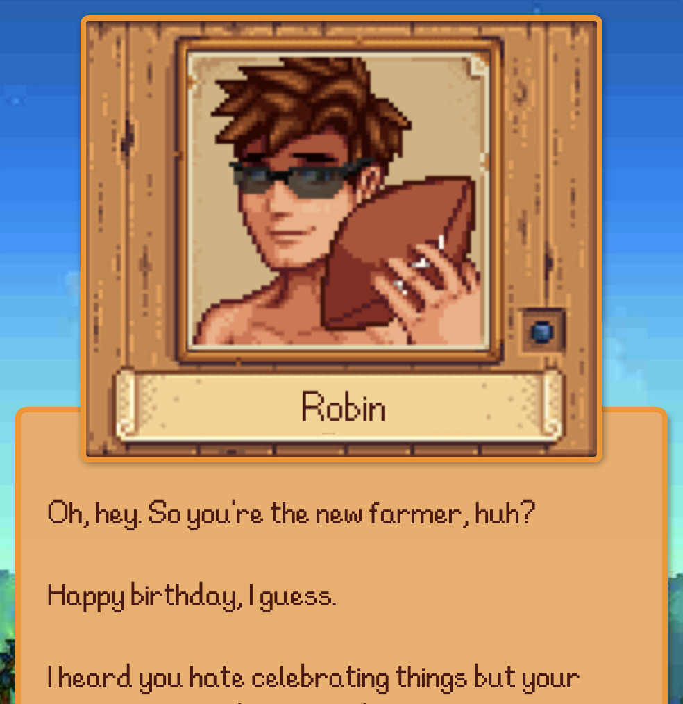
It’s a website for my girlfriend’s birthday that copies the style of her favorite game right now: Stardew Valley. To make the website I needed to track down the font and yet it was a bit of a struggle because I think the one found throughout the game is entirely custom. But after hunting around on some dodgy websites I downloaded a somewhat questionable version that looks like this:

Now is this a good font? Categorically, scientifically: no. It’s difficult to read, with some letterforms too thin and others too thick. You have to spend more energy than should be necessary to read the dang thing. And yet with a few quick hacks and some tinkering I made this website as a gift; in the fiction of this website I become a villager in her game, welcoming her to this new farm for her birthday:

(On an unrelated note I think we all tend to forget that websites can be gifts.) But once I had finished making this thing I had a newfound appreciation until I began to like and then love the half-busted font of Stardew Valley. It’s quirky and odd and feels as if it was made by someone who is not an expert. Someone who might just quit their life and go start up a farm in the middle of nowhere just because they could.
So! I have avoided my own question here I suppose. There are qualities that makes typefaces beautiful and qualities that make them out of place. Sometimes a typeface can perfectly hold a note at just the right pitch but sometimes the broken junk fonts are the very best of the lot. All of this makes things complicated and hard to describe without mountains of context.
There are no answers to be given, no rules to be found. And if you find yourself in front of anyone saying otherwise then might I offer the only good advice that I can preach here: run like hell.
Until next time,
✌️ Robin
You just read an issue of Adventures in Typography. You can also browse the full archives of this newsletter.