Comrades!
This is Adventures in Typography, a newsletter all about typefaces and fonts and what those words really mean, written by your friendly-neighborhood-lowercase-k-enthusiast Robin Rendle.
There are many evenings of mediocre Internet but one day last week, out of nowhere and rather suddenly, something changed. Every website and link that I stumbled across propelled me exponentially faster across the Typographic Superhighway and I frantically tried my best to capture all the wondrous type specimens, font shops, and PDFs that I saw barreling towards me. By the end of the evening, my computer was wheezing with hundreds of open tabs, gigabytes of beautifully disorganized nonsense on my desktop, and tab upon tab of Letterform Archive search results and type websites from every strand of the world wide web.
It all began when I saw the website for the 2019 graduates of Type Media, a type design course at the KABK in The Netherlands. If you want to study type design then there’s really only three options: Reading University in the UK (where I graduated, but didn’t study type design), The Cooper Union in NYC, and then there’s the KABK.
Anyway, the new website is really something else: giant colorful letters! condensed letterforms! cool navigation patterns!

The quality of the typefaces on display is what we’re really here for though. First up, Céline Odermatt’s Coat kicks things off with a variable display face that lets you jump between a refined sans-serif and a dashing condensed serif:


Then there’s Anya Danilova’s Rezak which is founded on an offset squarish skeleton that looks rather playful —I particularly like the lowercase a and the bizarro italic-ness of the lowercase u:

Prelude is Ricard Garcia’s almost-calligraphic child which also has a secret twin: the upright and towering letters found here…

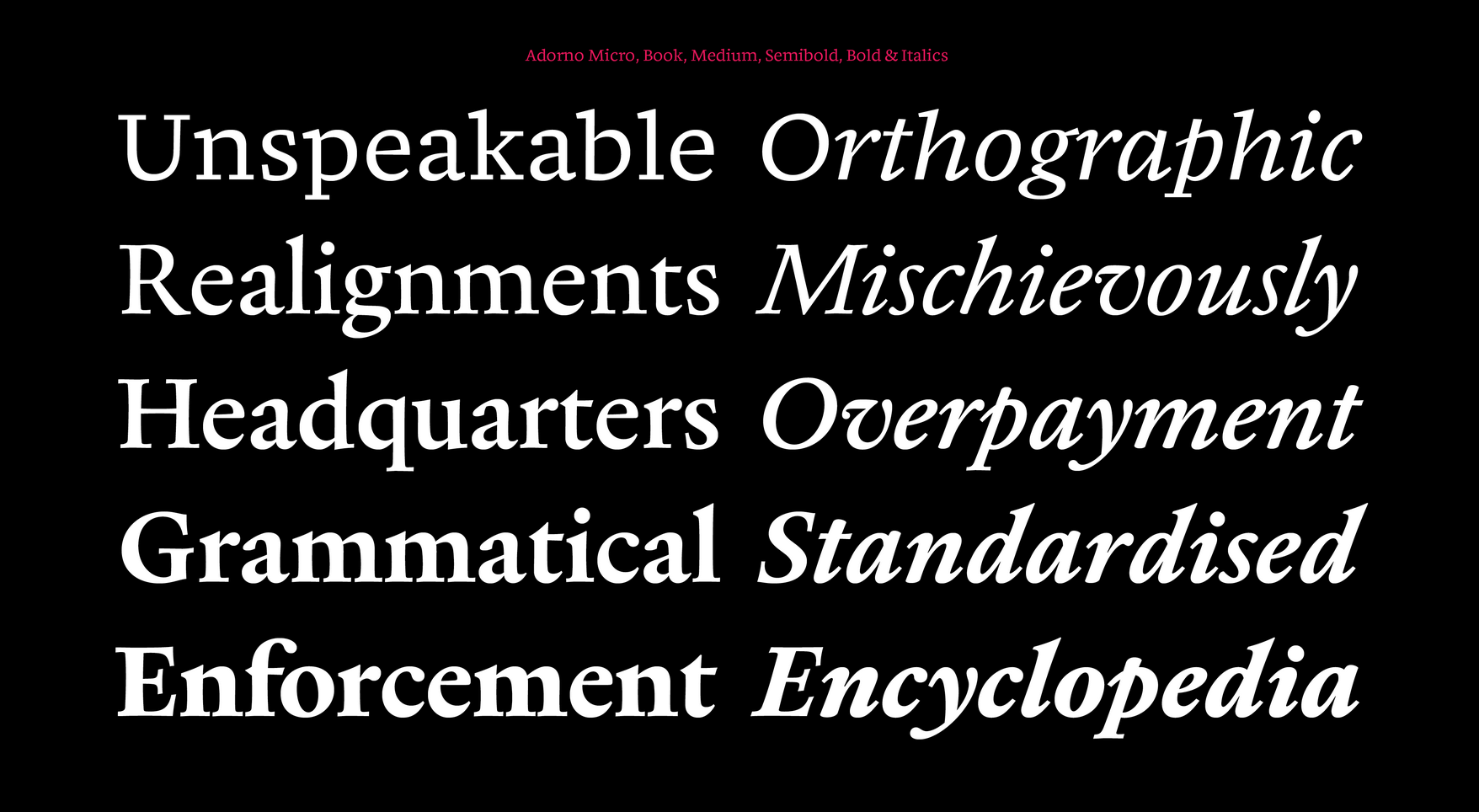
Next up, Luke Charsley has made a rather handsome Renaissance book serif in the form of Adorno which has a number of flourishes that can be used to make things a bit more exciting. The square-cut serifs in Adorno Micro is my favorite (the top line of this specimen below):

Joona Louhi’s Maneuver is uhhhhh ummmm entirely wild. I’m not entirely sure how to describe it. The italic (?) forms here are equally mad, brilliant, and punk rock through and through:

I’ve had one tab open in dedication to the 73 in the specimen screenshot below because the wonky double-stacked 8 is fun whilst infuriatingly novel at the same time:

The playful italics are also my favorite part of Fabiola Mejía’s Rodina: particularly the lowercase f and t. The italic is almost a stencil—with gaps between parts of the letterform—and I think this style could be played with in all sorts of ways.

Austra by Eva Abdulina looks—to my eye at least—absolutely perfect for a recreation of Paul Rand’s books. And that’s a compliment! The lowercase feels tiny and compact, with rectangular serifs that bolt out in each direction, all of which is perched on a round frame:

Greymarch led me down a rabbit hole of Rutherford Craze(!)’s work with his type foundry Mass Driver and his MD System typeface (of which the specimen alone occupied three whole hours of my evening). Greymarch though is an excellent bookish typeface that is begging me to redesign my website:


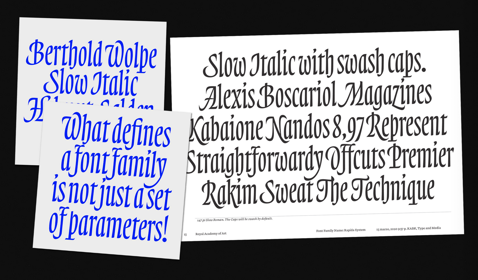
Michelangelo Nigra’s work with Rapida is a striking collection of styles: with the confidence of this stuff…

…combined with the high-pitched ooooooo of this:

…and the wait wtf-ness of this stuff:

Next! Ryan Bugden’s Spee is a really interesting concept where chunks of the letterforms are missing: the counters burst out of the lowercase a, o, and b to create this strange pattern in the text:

Decibel is a typeface made up of bold serifs and chunky strokes by Ethan Cohen. And I feel like this thing requires a designer that isn’t going to sit there and be quiet—Debicel demands design in the genre of EXTREME LOUD NOISES and with HEY LISTEN TO ME shapes and colors:

And last but not least, Alexis Boscariol’s Picardy—a variable font family with flare:

I think the star of the show is perhaps the Outline variant which happens to look something like this:

I think that all of these projects are remarkable and it all amounts to an embarrassment of riches. One neat thing I’d like to see with these type graduation websites though is a sort of high school reunion in the future: a website in twenty years time that showcases all the work these students have made since they graduated (all the work they’ve drafted and programmed, all the buck wild and beautifully conservative letters they’ve drawn, all the magic and wonder of sleepless nights and variable font madness.)
Because I cannot imagine the kind of adventure a website like that would lead me on.
Until next time,
✌️ Robin
You just read an issue of Adventures in Typography. You can also browse the full archives of this newsletter.