Friends! Comrades!
On display in photographs and archived notes, in design documents and type specimens, the great bulk of documentation about the field of type design makes the process look so mechanical and obvious. Straightforward, even. The designer is seen at their desk, dressed all in black, a finger raising their bespoke glasses and an arm is resting on an immaculately tidy desk. All is calm and easy going and they have likely used the word gestalt several times today. A grid of perfect letters in perfect symmetry are displayed before them and they are leaning forward, questioning the philosophical, ontological meaning of the letter ä.
But talk to any type designer and you’ll find that their work is a very messy business indeed.
There are busted, half-broken, and buggy apps that they depend upon to make a living. There are dozens of projects incomplete that linger for years on hard drives (some reach escape velocity whilst others are not quite so lucky). There are treasures in progress. There are rough sketches in coffee-stained notebooks. And there are sleepless nights over the business, over the money, over the state of the foundry. And so, although from a distance it appears that the act of type design is a beautiful and focused effort full of smiles and poetry, this could not be further from the truth; to make a beautiful thing you must be experimental and wild, weird and uncouth.
In short, you must be extraordinarily messy.
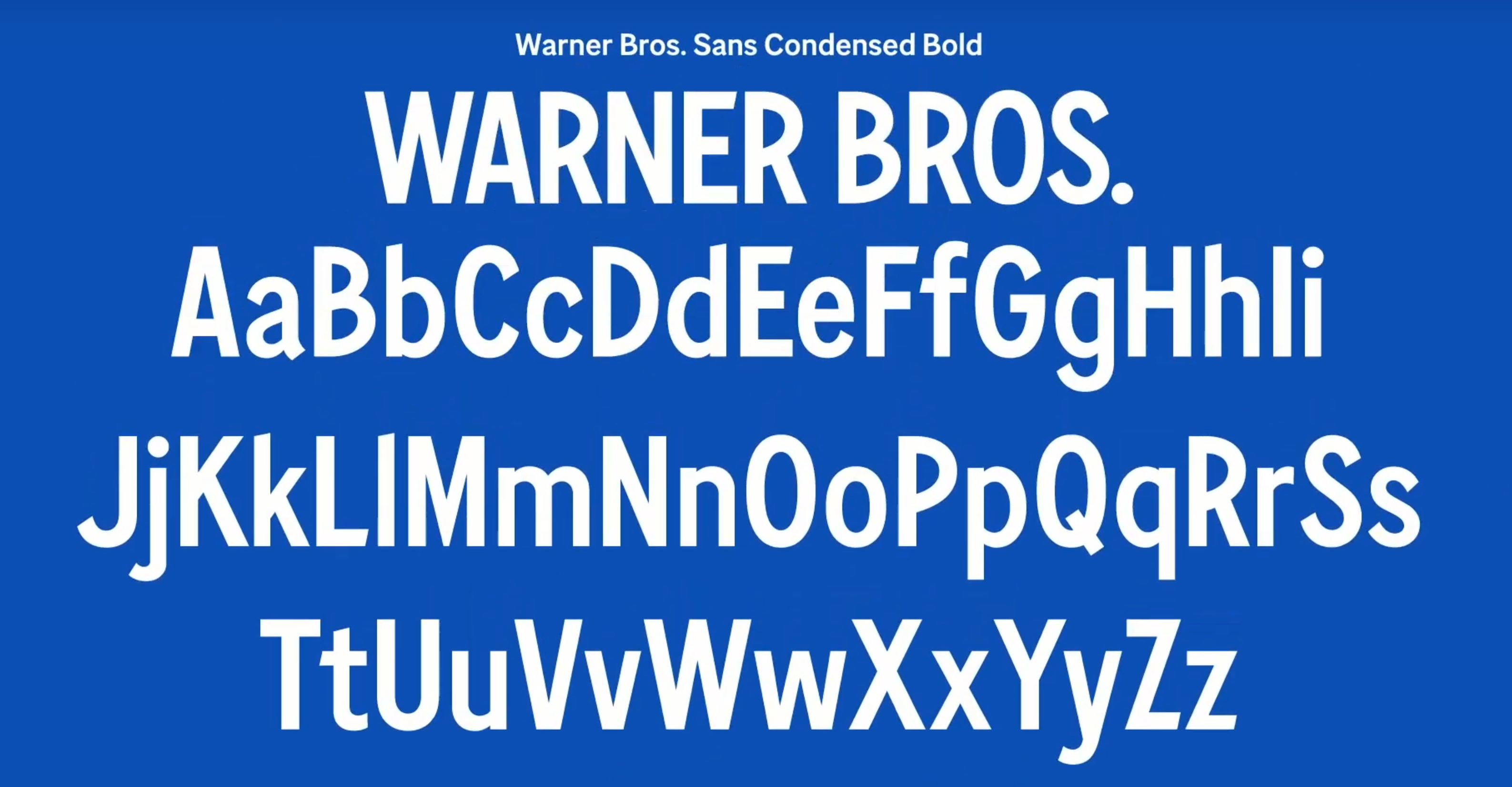
On this thread, I wonder how messy the process was for the design of the new Warner Bros. typeface by MCKL Type; this is one of those rare branding projects that I think is significantly better than the original design. Behold!

The condensed bold variant of this custom type family is especially lovely: check the funny and peculiar lower half of that B! Or the charming top half of the capital E! The little lowercase a! The confident capital S!

And on this note, the work of the MCKL type foundry seems to be everywhere these days: the Justice League design, the Uber redesign, The Atlantic rebranding I mentioned not so long ago. And that’s just their custom logo and branding work! Not even considering their rather lovely typefaces that are available for sale such as Fort Condensed:

I wholeheartedly love their work but I cannot begin to fathom the mess they must’ve made in the process.
Until next time!
✌️ Robin
You just read an issue of Adventures in Typography. You can also browse the full archives of this newsletter.