Friends!
I received this email the other day that brings up a thoroughly interesting question about typesetting and I reckon it would be neat to reply in public so that we can all talk about this stuff together:
Dear Adventurer:

What do I do when I'm stuck on a good typeface? I was recently freshening up my website for the new year, and as part of the process, I decided I ought to finally change the somewhat showy typeface that I use for all my <h1>'s and <h2>'s -- my page and article titles. I thought: "I'll swap it out for something else, just as showy, but a little different!" I had plenty of contenders: typefaces I've had bookmarked for ages, all beautiful and interesting and usable. But… they just didn't look as good. I would toggle from Showy Original to New Contender, look at the page, think "hmm… maybe!" -- then toggle back, and be so delighted with Showy Original again that I couldn't even contemplate changing it.

So here I am, with a website that's been using the same typeface for years. Will I ever change? Can I? How?

Yours,

Stuck on a Good Typeface (There Are Worse Fates, I Suppose)
Dear Stuck on a Good Typeface,
Whenever I start a new project I always try to focus on what I call the smallest possible bit. I’ll ignore all the layouts, avoid comparing typefaces right away, and hunt for the most important piece of information first.
Why is that though? Well, let’s say we’re designing a personal website. The most important piece of information is most likely going to be the humble paragraph as the reader needs to move through large quantities of text. I reckon those paragraphs ought to be the best dang paragraphs in the world—they should be little gang planks linking your website together, encouraging the reader to hop from one paragraph to the next with ease.
From there we can start to ask ourselves a series of questions: How do these paragraphs make you feel? When you read the text out loud, who does it sound like? Is it a swashbuckling hero or a grimy, despondent character instead? Perhaps the writing is jovial, upbeat, and playful though. Sentences might be punchy. Quick. Short and to the punch. Long paragraphs, rare. Maybe the writing is a bit wonky or silly even.
Something like Bilo by Bold Monday could make a good fit under these conditions:

If we look up close and examine Bilo used in paragraphs then we can get a sense of its somewhat elegant whackiness:

Once we’ve solved the problem of the smallest possible bit then we now have a bunch of helpful constraints to work by: in this instance we can start to pick display typefaces and layouts that support Bilo.
However! Perhaps the writing is not whimsical, instead your blog is focused on the economy or politics and so you want to take a more serious tone. You might then be better off with Brenta—an extensive type family that oozes charm and sophistication:

But make sure not to focus on the fanciness of the specimen when you’re looking for typefaces. Instead, take your text and dress it up in Brenta. Have it walk around a little bit to see if it fits. Does Brenta sound like you? Does it fit the tone and pacing of your sentences? Is it too sophisticated?

Notice how these two options, Brenta and Bilo, feel so very different from each other. Neither is better though, these are merely two separate answers to a question that you have to figure out first. And sure, you might have a preference for one over the other aesthetically but I would recommend that searching for typefaces you like isn’t a good idea.
At least, I’ve found it’s easy to get lost in a sea of beautiful and expensive typefaces that way.
Jason Santa Maria has written extensively on this subject and has a ton of great advice surrounding the act of choosing typefaces. He’s argued consistently that the best method is to ask what the text does, what it feels like, and jot that down as a list of feelings first. Tim Brown also made a great book a while ago called Combining Typefaces where he argued along similar lines.
Once you’ve setup that list you can then use it to compare typefaces against it. I used to do this a lot when I was learning how to set text, and it doesn’t matter if the list is a little silly. Here’s one I might make for this very newsletter:
- excitable
- charming to a fault
- unfocused
- unresearched
- light-hearted
- quick pace
- earnest
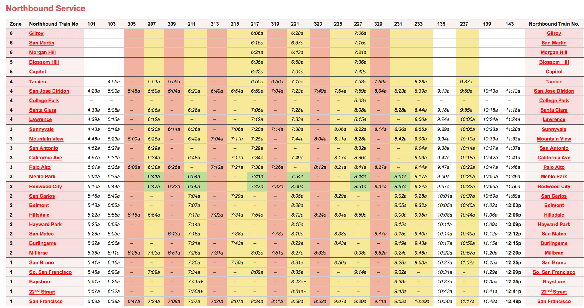
Let’s drive home the point by imagining an altogether different project. Imagine we have a new goal: to make a train timetable website for the local area. A quick search brought me to the Caltrain timetable that shows the Northbound service and, ignoring the scary colors for a second, the smallest possible bit in this instance would not be the paragraphs that can be found on the website or the display text or even the navigational elements.
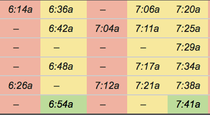
Instead, we must get up close and look at the numbers.

No matter how scary the design of this thing might be.

If we were making this kind of website then the goal isn’t to explain the history of trains or give a nice introduction to the service for the local area. A timetable website is about timetables—so numbers here must be the smallest possible bit.
How do these numbers work together? Do they need to be proportional or tabular? Do you have symbols next to the times? What OpenType features might we need? Do we need to design a website or are there complimentary print materials we need to take into consideration, too? Is all of this a part of an established brand or aesthetic?
Questions like this would guide my hand when I’m on the hunt for something but let’s pretend we don’t have any restrictions for now. In this instance I would be looking for something without much charm or character, but instead a type family that’s resilient and very legible. Say, something like Retina by Frere-Jones for example:

Not only does Retina have a beautiful set of numerals but—crucially for our example at least—it also has what the foundry calls a “MicroPlus” form. This is designed especially for small sizes and has these tiny notches in them that makes them more legible at smaller sizes. At large sizes though these notches are obvious:

For timetables we’d probably need our numbers to be squidged together and so the smaller we can make the text and still keep it all legible, the better.
But just like with our blog example, we now have something to build upon. Perhaps we want the first page of the website to be really explosive and eye-catching, or we’re designing a billboard that sends people to this website. We probably need another display face for that but instead of us heading to every type foundry website in the universe and scouring through a billion specimens we have a guide since we’ve tackled the smallest possible bit—this dang timetable.
We know we have to pick something that matches, compliments, or contrasts with the Retina typeface. And that reduces a million options down to a couple of dozen.
So I reckon this advice could be broken down into the following:
- Find the smallest possible bit.
- Read the text—obsess over it—at least until it drives you a little bonkers.
- Make note of what the text feels like and jot that down as a list.
- Compare typefaces you find to that list.
- Typeset your work with that typeface just to make sure it feels right. Fontstand is a great service you can use to test them quickly and for free.
- Once you’ve solved the smallest possible bit you can now address other typographic issues such as layout, display faces, and other interface elements like icons.
- Ignore what the loud jerks on Twitter say and just try to have a good time doing this stuff.
Once you’ve gone through this process enough times you won’t have to jot down the list at all—you’ll have a good sense of the foundries that exist out there and where quality typefaces can be found. You’ll begin to figure out how to quickly pair faces together, too. But even today I’ll sometimes find myself stuck on a particularly difficult typographic problem and it’s often because I ignored one of the steps above.
Side note: you can often tell when a design team picked a display typeface first and then worked their way down to the smaller, more important elements, too. Tables full of data will look wonky and might be difficult to read (the team probably picked a display typeface and then matched something to that instead). Or paragraphs will be too wide and the voice of the typeface won’t match with the style of the copy (the team probably looked at a ton of cool type specimens but didn’t stress test the design with actual content).
Ultimately though I think the reason why typography is hard and/or badly done is because we forget about the text. We forget what the text really sounds like and we try to force our aesthetics on a thing instead of trying to solve a problem. And so Stuck on a Good Typeface I would ask whether you’re just trying to have fun or whether you’re trying to solve a problem. If you’re having trouble picking a typeface it’s probably just because you don’t understand the problem that you want these tools to solve.
If you’re stuck then perhaps starting from scratch will help. But I promise that if you figure out the smallest possible bit first and work your way up from there then things will be much easier in the long run.
Until next time!
✌️ Robin
You just read an issue of Adventures in Typography. You can also browse the full archives of this newsletter.