Pals!
When it comes to typography, my tastes fluctuate and change over time. Sometimes I want loud interfaces, buck-wild swashes, and daring shapes that shove me about and challenge me. Other times I admire subtlety and caution; I want a typeface that looks like a professor all buttoned up, hands firmly in pockets.
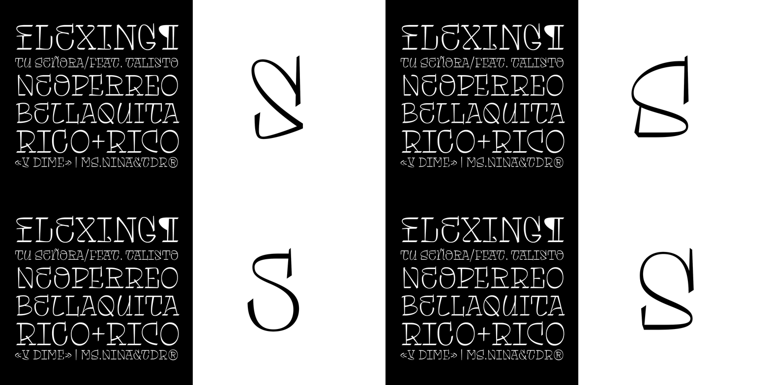
But for the past month or so I‘ve been looking at a series of utterly bonkers typefaces that are not the usual pristine, posh, and fancy things that catch my eye. I‘ve found myself drawn to typefaces such as Adams Regular and Italic.


Look at these piratey fonts! This is the sort of thing that an admiral would scrawl in a ledger or something that would be etched onto a broadsheet poster in the 1700s.
Fernanda Cozzi’s Tomasa is likewise dazzling; full of large capital letters and swirling, curious shapes. Each letter is trying to distract you, begging you to just take hold of it in your hand, and look at the tiny treasure you must now show everyone.


There’s so much here to admire, so much to examine closely. Turn on, tune in, and open the pdf specimen. There you’ll find an endless menagerie of lovely shapes:

Finally, this week I’ve been admiring the similarly whimsical and dancing shapes of Galadali by Diego Maldonado. What I love about this typeface is how it’s a bit more subtle than Tomasa, except there are curious additions within the letterforms.
Let me explain…

See the double crossbar of the capital H? Or the curl inside the capital A? What I like about Galadali is that you can change how flamboyant and dancing it is by choosing from a number of variant letters:

That makes this thing pretty versatile so it looks great for bookish (quiet) and magazine (HELLO!) style typesetting. And that’s why I am in complete love with this thing.
The problem with all of this is that my tastes in typography and design are changing whilst I’m updating the design of my website. In my local development version that I’ve been working on for a little while everything looks posh and royal:

For body text I’m using Columba and titles are set in Caponi. But now…I want something weirder, something wilder. And so the other night I stopped what I was doing and began to wonder…what if a website looked like a broadsheet poster from the 19th century?
What if a website looked like this?

With viewport units, SVG, CSS Grid, and perhaps subsetting a couple of fonts to make them smaller, I think this is an interesting idea for a website that I’ve never seen before. And with so many websites today looking very similar (think tiny snippets of text alongside BIG images that do all the work), I want to see something new.
Something punk rock.
So—what if—no images, no white space? What if there’s just tons of type squished together until you’re forced to look more closely, forced to pay more attention? What if we took all the lessons of centuries of poster design and applied them to the web? I think that’s a nifty idea and it’s something I’m going to start exploring a bit more with swashbuckling, pirate fonts like these.
Avast, ye matey!
✌️ Robin
You just read an issue of Adventures in Typography. You can also browse the full archives of this newsletter.