Pals! Comrades! Big Serif Friends!
Whenever I look at serifs of a certain kind I see them all as children of an era. Take, for example, the big chunky serifs that were popular for a flash in the 70s – a ton of popular letterforms back then chose big, chunky terminals and descenders to punctuate their style. And these letters were used so heavily in that period that now whenever I see anything even remotely like it I see a hint of nostalgia in them.
The rebranding of Mailchimp is one example that uses a typeface of this kind, the Cooper type family:

Although the funny thing is that Cooper wasn’t designed in the 70s. It was released back in the early 20th century and yet for some reason whenever I see this style and the many typefaces like this – letters with rounded or rather peculiar serifs – I can’t help but think of the era in which they dominated graphic design and advertising.
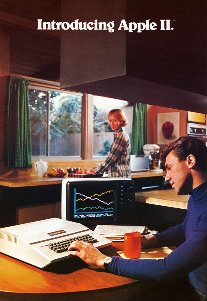
This style was everywhere, like in the advertising for the Apple II. A couple of years ago I even wrote about how much I love this style (although full credit should really be given to Stephen Coles for fixing my terrible first draft as he corrected so much of my poor writing here):

“Introducing Apple II” is set in Belwe Bold and even though I really don’t like it in almost any other context I love how it’s used above. Look at how weird that lowercase g is!
Whilst Apple prepared for the release of the Macintosh in 1984 they decided to move away from some of their use of Bauhaus inspired typography and began to develop a new typographic language for the company. Subsequently they asked Bitstream to work with them in the production. However, instead of making a new typeface from scratch, they simply looked at ITC Garamond condensed and decided to push the limits of these letterforms.
Apple Garamond was effectively a less condensed version of ITC Garamond Condensed but it oozes that same I-don’t-know-what that Belwe and Cooper has, too:

These typefaces had tons of contrast and lots of charm. And around this time in the late 70s Apple began to mix Apple Garamond along with Goudy Heavyface which happened to be used in display in these magazine ads:


Even though I get a strong fuzzy feeling whenever I look at serifs like this I can’t help but feel enormously sad looking at these advertisements. They show that computers are solely for men. And now I wonder that perhaps these typefaces weren’t chosen for their quirky serifs or for their charm, but instead because in a boardroom somewhere a man decided that these letters are for big, strong boys. Which, of course, is entirely mad.
Anyway, I find it super interesting that trends like these come in waves. I assume we’ll have a couple of years of these thick, high contrasted and weird serifs again until someone will have the bright idea to – gasp! – use a lightweight sans for a clean and more modern look. I guess it’s up to us this time though not to reinforce all those batshit insane stereotypes that typesetters and designers of the past did – and still do – today. It’s an important lesson that although typography is a wonderful art, it can be used in devious and awful ways. Typesetting can exclude people, split people up.
I guess my point is that it’s our responsibility to take these old letters and do something kind with them.
Until next time!
✌️ Robin
You just read an issue of Adventures in Typography. You can also browse the full archives of this newsletter.