Friends!
This week I’m writing from England where I’m attempting to navigate the American visa application process without collapsing into a giant puddle of anxiety. But after thirty minutes in the embassy and a small, respectful fist bump with one of the security guards last Thursday I now have my visa in hand.
Over the past week I’ve bopped all over the country though; from every square inch of London and up to Peterborough, across and up to Wales (through breathtaking valleys and mountain ranges), and then across to Liverpool (and its wonderful collection of mummies) before heading back to my hometown in the southwest of the country (where I have acquired both Jet Lag and a Big Flu).

Since then I’ve stumbled upon two typefaces that I’ve kept open in my tabs waiting for an opinion to emerge but I’m not sure I have thoughts besides “holy cow I love these two and I think that they’re beautiful.”
The first is the Triptych family by The Pyte Foundry – it’s a combination of a Roman, an Italick and a Grotesque – and it all happens to be such a strange and wonky mix of characters that I simply adore. Here’s an excerpt from the specimen:

I’m not aware of another serif type family where the bold variant is a grotesque but somehow this just works together very nicely. There’s an aloof charm to everything here.
Take a look at the upper and lowercase G for instance or the quirkiness of the lowercase m where it looks as if those characters have experienced some kind of distortion. Not to mention the peculiarity of that lowercase y, too. Or the lowercase a!

Dear heavens.
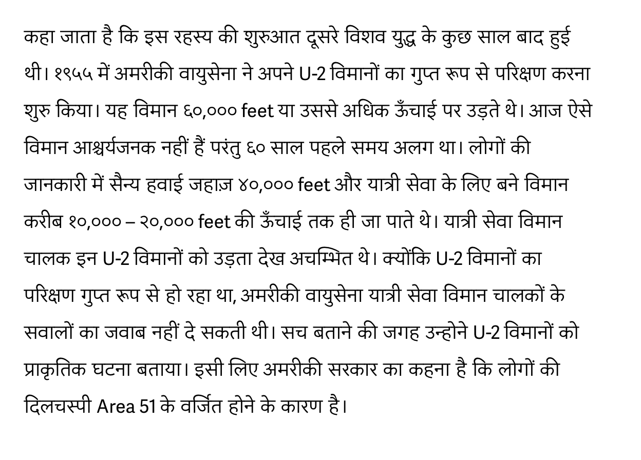
The other typeface that caught my eye whilst I was traveling all over the country was Type Together’s Adelle Sans but in the Devanagari script. It’s an astonishing work of art and is one of those typefaces that fuels me with jealousy and shame that I cannot read the language that happens to have such beautiful characters devoted to it:


I know I’ve mentioned Adelle Sans on the show before but perhaps it’s only now that I realize it’s an immense achievement of subtle character design. So many sans-serifs in this style appear boring to me now but you can tell that the team over at TypeTogether truly cared about their work in the process and it shows.
There’s no swagger here – only confidence made up by years of experience working towards a single goal. This confident energy pours out of every shape and curlicue in the design and when I look over these letters I imagine someone on a stage, someone with decades of experience that has struggled in obscurity until this very moment. But now they know that their words have energy and meaning and power.
And now they will speak.

Until next time!
✌️ Robin
You just read an issue of Adventures in Typography. You can also browse the full archives of this newsletter.