
Type pals! Friends!
I’m reading Gary Kamiya’s Cool Gray City of Love this week which is all about San Francisco and it’s history, architecture, culture, and people. I’ve been wanting to read it for quite some time and so the long weekend gave me a chance to finally sit down and drink it all in. I’d certainly recommend it too, as Gary writes thoroughly lovely stuff like this throughout the whole book:
San Francisco is famous for its natural beauty. But to call its beauty “natural” is slightly misleading. For aside from the cliffs at Lands End (which are actually covered with introduced trees), Glen Canyon, and a few other places, its beauty does not derive from nature in its pure state. The paradoxical truth is that before the city existed, its terrain was not particularly beautiful. Covered in sand dunes and with scant trees, it was a monotonous, even dreary landscape, largely devoid of color and contrast. Heretical as it is to say, much of San Francisco’s terrain became more attractive when the city was built. San Francisco is the urban equivalent of an English garden, an artful blend of wildness and cultivation.
This book has led me on a few too many midnight photo gathering sprees where I’ve dug through the archives of the Library of Congress searching for old maps of San Francisco. This one in particular caught my eye: “Graphic chart of the city and county of San Francisco respectfully dedicated to the leading interests of California and the Pacific coast.” And it looks something like this:

Upon closer inspection you can see just how beautiful all of these letters are (I reckon this is all hand lettering and not from a type family but I could be wrong here). Look at that headline though!

Also! Check out the wondrously wonky sans serif capital letters that make up the subheading beneath it. Now, I’m pretty sure this is hand lettering because no one in their right mind would make metal or wooden type with that C or R and be happy with their work:
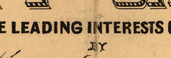
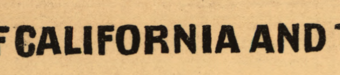
But! I love it all the same. I especially adore the bananas italic at the foot of this map and the bulky slab serif that has...experimental spacing between all of the characters:

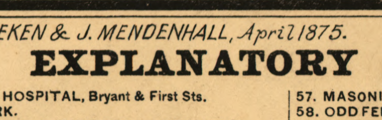
(On further inspection I reckon that slab serif above is a typeface because of the weird spacing between the N and A.)
ANYWAY, as delightful as Gary’s book might be, when I was reading it I couldn’t help but think of a book-ish project of my own.
This idea has been floating about in my head for about two years and it struck me the first moment I laid eyes on San Francisco on an overcast day in December. The city has a peculiar typographic history and a high concentration of people that care intensely about letterforms. It’s tough to see at first but once you do you begin to see wonderful letters everywhere.
So whilst Gary’s book traces the city of San Francisco through its geography, mine would trace the city through typography and lettering.
There’s the Letterform Archive and Silicon Valley's contribution to typesetting, there’s the Center for the Book, Type Thursday and, of course, New Bohemia Signs to talk about. There’s desktop publishing and neon lights, the fallow tech industry and it’s lazy branding efforts, there’s the indie type designers, and the video game industry.
The book would be a rambling, unfocused, and joyous little thing.
Speaking of which, last week I foolishly took a walk through all the smoke and headed over to the Mission where I stumbled upon this lovely garage door, designed by a fellow from New Bohemia Signs:

Glorious stuff, huh? Anyway – San Francisco is teeming with typographic artifacts, institutions, and people that make stuff like this. But I feel like the city isn’t well known for typography or lettering and so convincing folks to look at the city through that lens could make for a wonderful book.
The text would be a mix between the slow, patient waddling of The Futures of Typography with the upbeat childish whimsy that I hope for in this newsletter. It would be more researched and elaborate though and I’d pick an illustrator to help capture that sense of glamour and wonder that I see in the city. On that front, I think I would plead with Camellia Neri to help give this thing an extra pop and giggle to its step.
It would be a book would be filled with interviews and rambling trips across the Bay Area where I’d try to figure out what makes San Francisco special. I’d split the chapters into the separate regions of the city and look at the neon signs of the Tenderloin, the hand lettering of Chinatown, the house numbers of Noe Valley, and the hectic, bizarre and hand-painted signs of the Mission.
Anyway, I think that’s what Adventures and my blog has always been really; it’s an excuse to, in a rather roundabout sort of way, slowly write a bookish thing.
Until next time!
✌️ Robin
You just read an issue of Adventures in Typography. You can also browse the full archives of this newsletter.