Friends!
Did you know that you can buy type specimens? If you leave the Darkest Web behind and hop onto the Loveliest, Sweetest Web you’ll find a treasure trove of graphic design and typesetting—the likes of which you’ve never seen before.
Ah, but where are my manners? Let me re-introduce myself. I’m Robin Rendle and you’re receiving this newsletter because you subscribed to it some time ago. I took something of a hiatus recently but am now returning for Season 3 of Adventures in Typography.
Let’s make a big mess together and talk about fonts.
But where to begin? Well, we should probably start where all good stories do: with a cup of tea. Right now I’m sat drinking a cup in my kitchen whilst praising the heavens that thankfully, mercifully, the heat wave has broken long enough for me to concentrate and read and do literally anything other than turn into a puddle on the floor. Because I have important work to do.
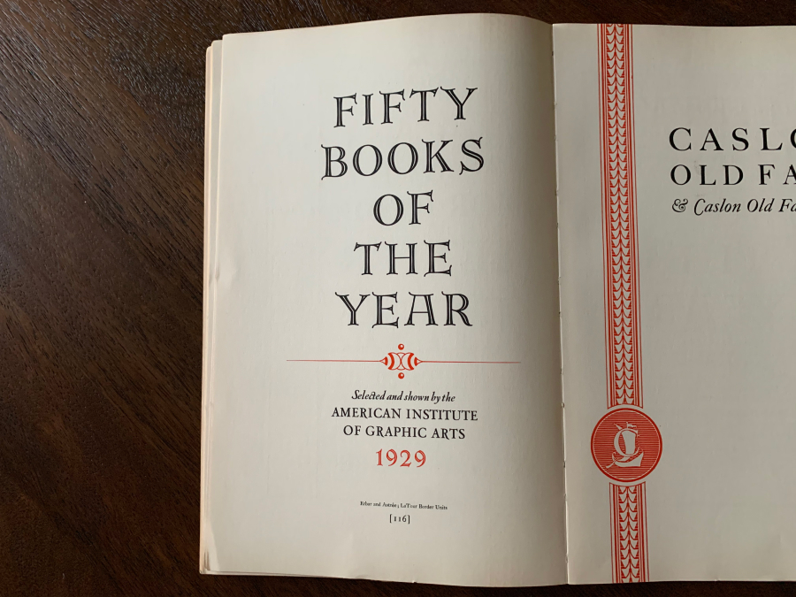
In the mail this week I received a beautiful thing that I want to tell you about: the Specimen Book of Continental Types. And oh boy oh golly gee whiz, etc. etc.

Printed in 1930, the book collects a ton of type families from European foundries at the time and, from what the introduction suggests, is trying to sell them to advertising companies. And yikes the intro is just the sort of something you’d triumphantly nail onto a large door on a cathedral to incite a revolution.
It is titled A Word to the Cautious:
No user of type today can afford the commonplace. […] That is why the types shown in this book are not ordinary types. For a truly great type design is a work of art, the product of genius, and cannot be produced at will. This is why no foundry can deliberately set about the fashioning of a great type. Out of twenty efforts one may be good; out of a hundred, perhaps not even one may be truly great.
Lutetia by J. van Krimpen is just one of those truly great types found here:

Or the magnificent Erbar:

And it’s not just the typefaces that are stunning, but the limited use of red and black ink with complimentary gallons of white space in between:

I feel like I’ve seen Neuland before, how could you possibly mistake that fantastic lowercase u:

And Sphinx! The M alone is worthy of our praise:

I know almost nothing about any of the typefaces shown here except the stately Kabel, which has a ton of lovely samples inside. In fact, when I picked up the book some pages fell out because the binding is coming to pieces and it became a micro-specimen for Kabel Black.


I do not say this lightly but: mamma mia!
This book was printed by the Continental Typefounders association and before you ask, no, it is not the name of a mysterious conglomerate hoping to murder handsome British spies but instead it’s the name of an organization formed in 1925 by Melbert Brinckerhoff Cary Jr. The group imported type from European foundries and likewise I know absolutely nothing about them.
I think this book shows that even if you’ve been studying the field for more than a decade there are all these loose ends in the history of typography that are out there. Beautiful typesetting with incredible, gasp-worthy designs and yet the majority of this outstanding work doesn’t make it to the front page. Heck, it barely makes it to the footnotes.
And so printed type specimens might not be important, they might even be almost entirely forgotten, but I still believe that they are some of the most beautifully designed things. And for that alone they are worthy of our praise.
Until next time,
Robin
You just read an issue of Adventures in Typography. You can also browse the full archives of this newsletter.