Friends!
I’m sat at my desk and it’s a cold morning here in Bernal Heights. But before you begin to worry too much about me—fear not!—it’s important to note that despite my nose being cold and my focus wondering all over the darn place, I have drunk at least a gallon of coffee and propped up in front of me is Keith Houston’s book about books called—somewhat mysteriously—THE BOOK.
It’s a truly lovely thing and it taunts me with its loveliness.
THE BOOK is a follow-up to Shady Characters, another book that Keith published way back in 2014 which happens to be all about the typographical marks like ? and ! and & that we tend to overlook. I remember fervently reading Shady Characters whilst I lived in Nottingham and oh! how envious I was that Keith could write about Big and Important things, historical things, whilst also being light-footed and charming. That’s a particularly difficult thing to do when it comes to writing about typography because there’s an incentive to preach, to belittle, to punch down (I hate Comic Sans! Ugh, look that em dash! Ugh look how much I am struggling with the ugliness of this mortal coil! Ugh!)
With these books, Keith politely sweeps all of it away.

Keith’s most impressive achievement isn’t the books, despite how lovely and charming they might be. Instead, it’s the absolutely perfect blog of his—it contains a collection of notes and rambles about typography with each post overflowing with footnotes, deviations, thoughts elsewhere.
I just love that feeling of stumbling onto a blog and watching a mind at work like this.

I had this experience with Christina Tran’s website not so long ago where I gasped at how she creates this completely beautiful mess of hyperlinks that point in ten thousand different directions. There is no order here, only pure chaos. And yet, I love it, it captures the messiness of things exquisitely.

Returning to Shady Characters though: take this blog post from Houston called Miscellany № 88: a tale of two signs. It begins by looking closely at a sign and then falling down a rabbit hole, being swept up by the peculiar punctuation at the end:

There are so many lovely and yet utterly useless facts in this one post, such as this extract from Rodney Sampson’s Nasal Vowel Evolution in Romance:
In the Latinate languages that preceded modern Spanish and Portuguese, a dash or ‘~’ placed above a vowel indicated the omission of a following n or m — a so-called nasal consonant — so that, for example, aurum, or gold, could be abbreviated to aurũ.
How wondrously useless that fact is!
Although, as well researched and as thoughtful as Houston might be there’s a messiness at work here that I love; it is the true great quality of a blog. That permission to roam, to let your curiosity grab you by the lapel and hoist you across fifteen different subjects over the course of a single paragraph; blogging is pointing at things and falling in love.
But all this reminds me of something else.

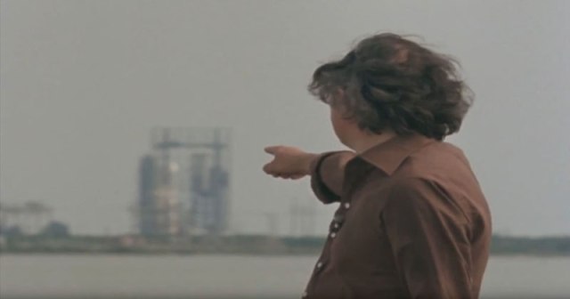
One of my all-time favorite TV shows is James Burke’s Connections—the entire show is effortlessly watchable—and James is the master of pointing at things, forcing us to look at the world upside-down-inside-out-the-wrong-way-round. James is the penultimate blogger, the King of the Blogosphere—of asking questions that a child might blurt out and then, without shame, letting all the answers tumble out of you and all around until you’re left gasping for air.
(If you only have a minute, James also made the greatest shot in television.)
I’d say the premise of Connections is this: there’s no such thing as a subject. We’ve taught ourselves that there are fields of expertise and that we must confine ourselves to one of them. For example: I’m a web designer so why on earth should I learn about ecology? But James argues: shut up. Mathematics is chemistry is literature is engineering is publishing. Learning about how an elevator works teaches us about the history of computing, of metal, of systems.
All of these subjects excitedly blur together when you look at them closely and really that’s what I hope to do with Adventures; point at the things until they blur together.
Until next time,
✌️ Robin
You just read an issue of Adventures in Typography. You can also browse the full archives of this newsletter.