Friends!
There’s a lot of different subgenres within sci-fi. You’ve got your steam punk sci-fi, your miserable dystopian sci-fi, and you have your big city Bladerunner/Transmetropolitan sci-fi. But my favorite category of all the varieties of science fiction that you can find is the much rarer sort:
Cardigan sci-fi.
The Black Mirror episode ‘Be Right Back’ is an example of this where – yes – there are technological wonders like screens that bend and robots implanted with the memories of your long lost loved ones. But there’s also a lot of cardigans and socks and there’s an open pack of cereal on the table. The world is not glossy or unrealistically clean and people’s homes don’t happen to look like polished glass reverberating inside a Jonathan Ive nightmare.

Cardigans are not entirely necessary for a show or a film to fit within the Cardigan sci-fi subgenre (although they certainly help). It’s the lack of polish in the world, it’s the absence of technological fetishism in the science fiction itself. The science or the tools or the spaceships do not sit at the heart of Cardigan sci-fi — it’s all about the people that wear the cardigans instead.
I thought about this subgenre again when I stumbled upon a blog post by the historian Dan Bouk last month. He made a few notes whilst hunting through the archives in search of stories from the 1940 census and the one that caught my interest is when he looks at the role that women played in that colossal bureaucratic adventure:
In the archives, one can readily see women working for the Census. In a very limited way…
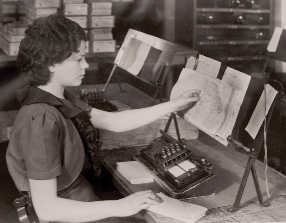
Consider this photograph from 1939 or 1940:

When I look at this picture, my eyes fly first to a person’s face, to a ruffled collar, to meticulously styled hair. Then I notice the papers she’s grasping—a thick stack, marked up all over. Finally, I notice a small mechanical device. In sum, I see a census clerk preparing paper punch cards—like the one she’s grabbing with her right hand. I see a working woman in a knowledge factory, one body in the human treadmill that transforms enumerators’ completed schedules into bound volumes of printed statistics.
This picture – and the way that Dan frames it – is peak Cardigan sci-fi because yes there is this new and wondrous technology that has this immense influence on this person’s life. And yet the photograph isn’t about the punch card machine – it’s about her.
I found myself thinking the same thing when I started watching Chernobyl. It’s a show that shortly becomes a frightening sci-fi horror film as radioactivity is shown to have unpredictable and alien-like effects on the area. And even though much of the dramatization of the show is a little...questionable, it’s a show that cares deeply for the people at the heart of it all.
Also? There are a number of very good cardigans.
The reason why I bring up Cardigan sci-fi is because there’s a trend in science fiction movies and shows to basically take the cross-bar out of the A and be done with it. Or space the letters out R E A L L Y F A R A P A R T and move on with it.
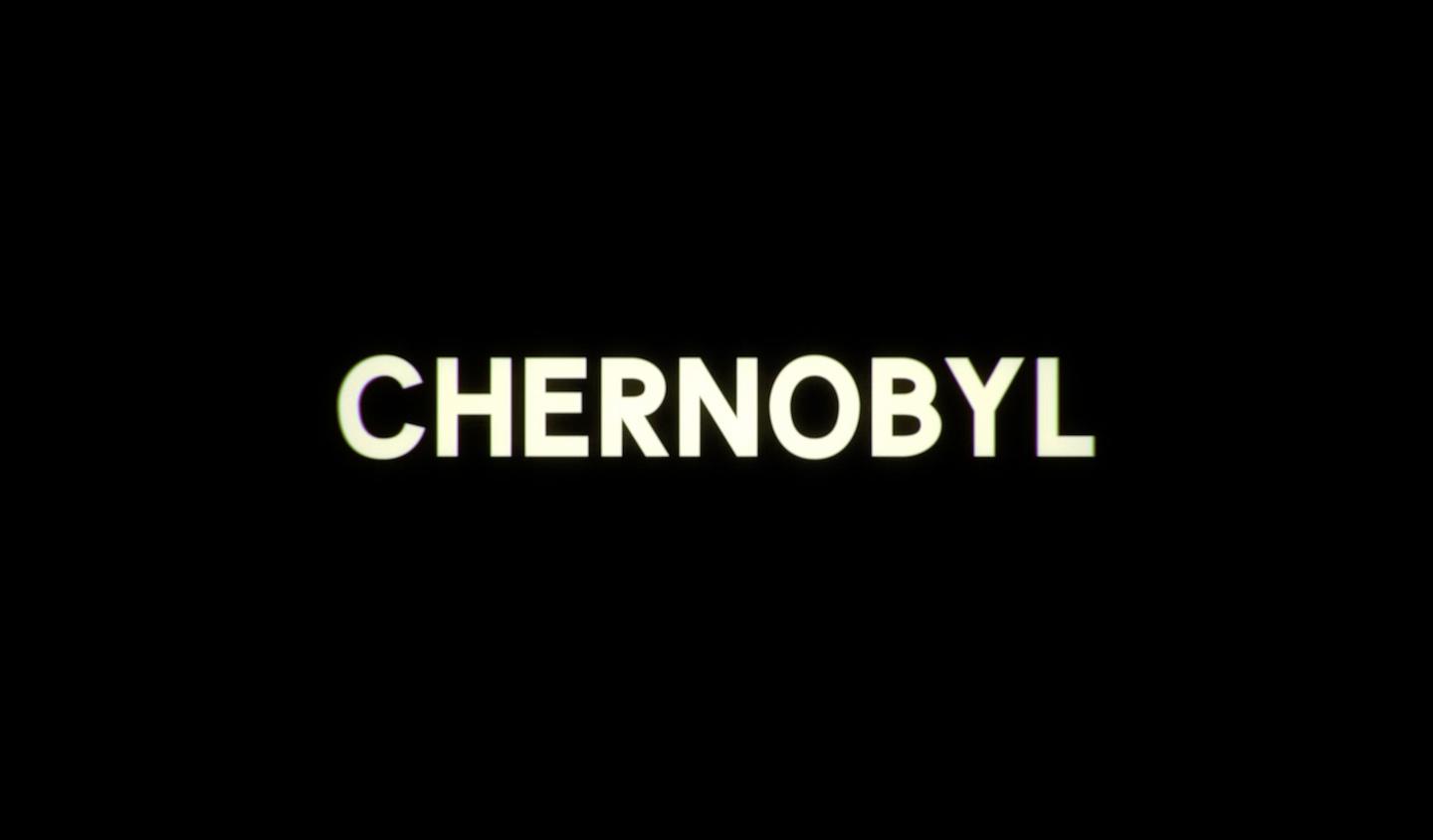
But Chernobyl, being an atypical cardigan sci-fi thriller, does something much more creative. And the shocking thing about the graphic design of the show is everything that they don’t do. You could easily do all the lettering in the show in the style of classical Soviet graphics – lots of red and a big poster. Or you could be particularly annoying and spell it like CHEЯNOBYL or something equally as awful. But the show runners chose not to do any of that.
They made something rather beautiful I think:

The show runner Craig Maizin describes how they made Renck – a custom typeface inspired by a number of Soviet sources. It appears that the face that they looked at very closely was a version of Zhurnalnaya roublennaya (and Fonts in Use has a wonderful story about that if you’re at all interested).
Anyway, I think the typesetting in Chernobyl is never a crude caricature as it sets the tone for the whole series; it looks bleak and inevitable. And the way in which they messed with the edges of the letters to make them look as if they’re being watched on an old television is just the neatest idea in this humble blogger’s opinion. In fact, I think it’s some of the best typesetting and graphic design I’ve seen in a television show for quite some time.
I even adore the wonky spacing between the numbers, as if there’s some issue with the machine that’s creating them. Look at that 6, too!

My point here is that the show isn’t really about the graphic design or the letters – Chernobyl doesn’t have a big flashy opening but instead cuts right to the tragedy and how these brave people died fighting a colossal science-fiction-like monster.
And so I think that Chernobyl has shown us not only how to do Cardigan sci-fi right, but also how to do typesetting proud, too.
Until next time!
✌️ Robin
You just read an issue of Adventures in Typography. You can also browse the full archives of this newsletter.