Friends! Compatriots! And blackletter fans!
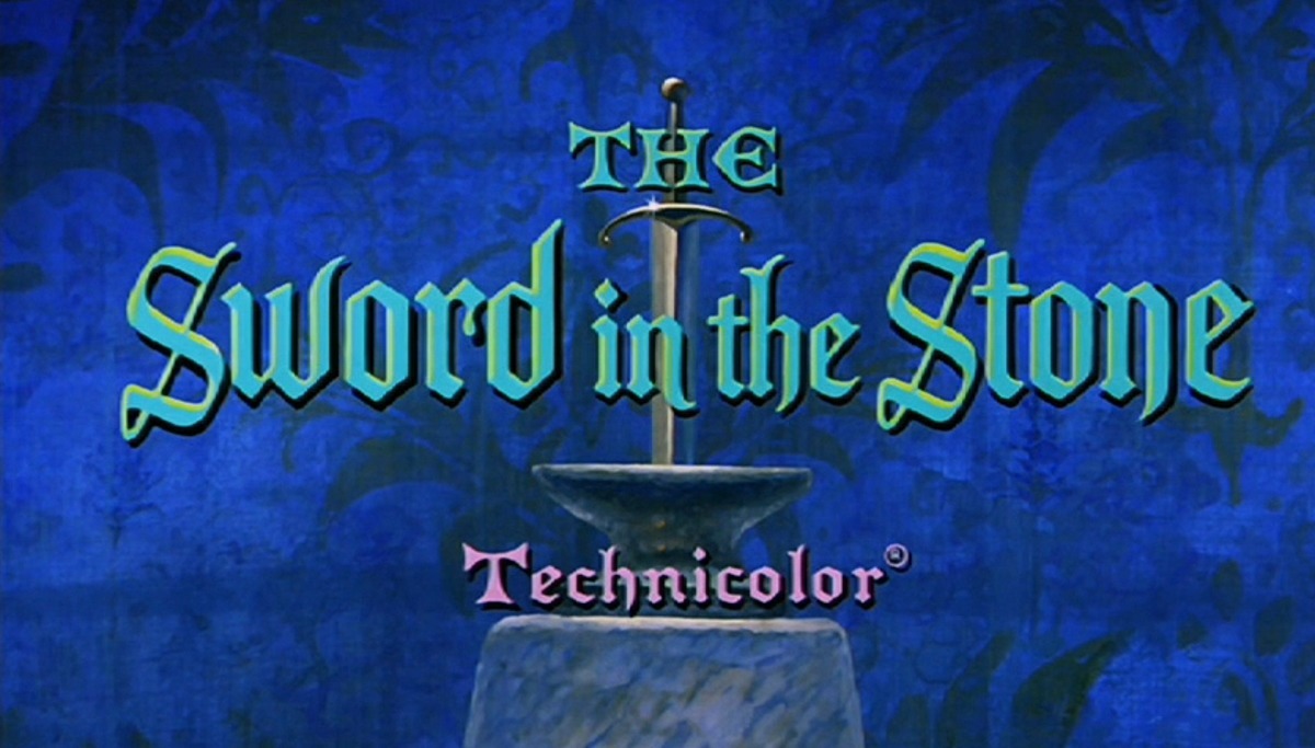
Earlier in the week I was watching The Sword in the Stone and surfing the net for fonts (as you do). But during that beautiful opening crawl I had somehow found myself struck dumb by a series of blackletter typefaces, and particularly by Elfreth. It’s a family designed by James Hultquist-Todd and published via his foundry JTD Type.
Here it is though, in all its wonder:

Whole books could be devoted to the loveliness of the capital M alone, or the tail of that lowercase y. Oh, and also the numbers are entirely wonderful too! Just take a gander at this 4:

In the excellent design notes, James writes about the goals of this project:
What if blackletter was for more than graduations and gravestones? Perhaps more than any other style of type, blackletter tends to carry a lot of baggage. It would probably be safe to assume that pretty much everyone in the latin-type-using world has an association with it; some of these are good and some are not so good. Is there a way to make a blackletter typeface that pushes against these associations?
What are those associations that James alludes to? Well, there was a recent episode of 99% Invisible all about the peculiar history of blackletter; how the German states of Luther’s time used them in defiance of Catholicism, how the Nazis rose to power with blackletter type and then turned their back on them, and how today their use in Germany is often seen as a reference to that extreme far-right past.
These associations are interesting because it shows how complex typography is. The letters in a font don’t just contain a series of glyphs from A to Z or 1 through 9. Instead, they contain all of our invisible, hidden, and undocumented cultural milestones, too. Picking a typeface is always somewhat political then.
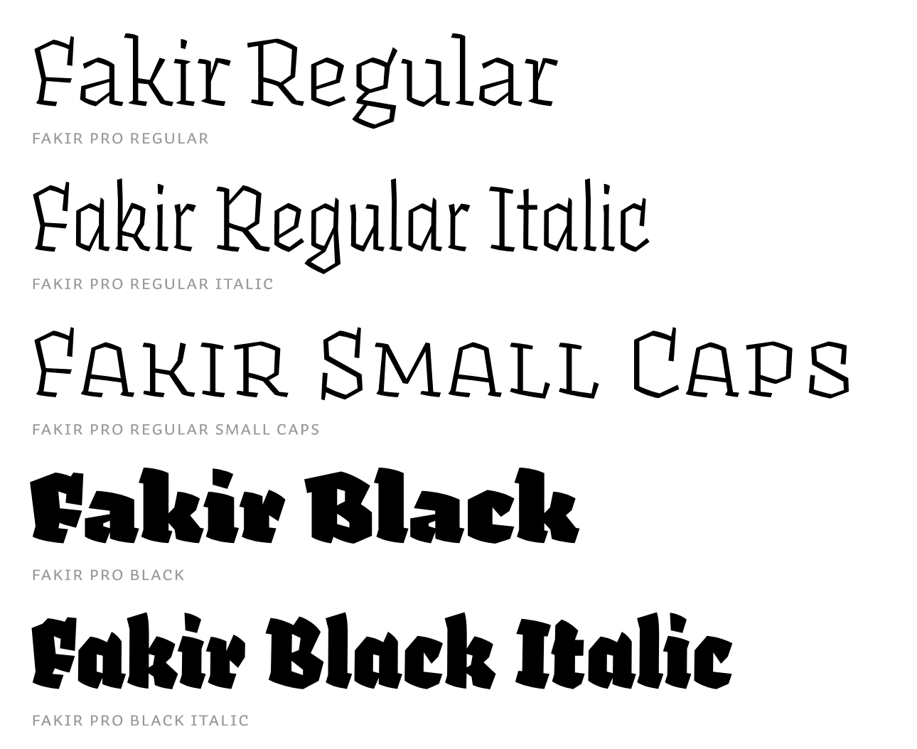
Anyway, all this talk about blackletter reminds me of one my favorite books of all time: Book of war, mortification and love by Ruud Linssen. This is a book all about how people suffer and why they do, whether that’s for art, love, or war but this thing is so interesting to me because it’s entirely printed in Fakir, a blackletter typeface by Underware. This little book pushes back against what we know about books, what the default rules of books are (such as use a boring text typeface so that the reader never notices it).
Well, in Book of war, mortification and love you notice everything.

I love how entirely bonkers Fakir is and how the rules that guide its design appear to be so consistent whilst also pushing the limits of what letters should legally be allowed to do. However! This book is also lovingly typeset and I can’t remember ever having read a book solely set in blackletter before.
Oh, also? The book is printed in the author’s blood (!) so that every page further compliments the theme of pain and suffering.

Anyway, my point here is that blackletter type is extremely cool and the only way we’re going to be able to break those cultural bonds is if we use it for wild and beautiful things again.
Until next time!
✌️ Robin
You just read an issue of Adventures in Typography. You can also browse the full archives of this newsletter.