Friends! Comrades! Letterpress lovers!
Whipping out a good typeface will not fix a bad design; a dashing sans can’t hide the sloppy, half-assed writing on a website and a beautiful, curling serif cannot possibly hope to conceal the performance issues either. Nor will a deft, calligraphic hand resolve the questionable business model that ties everything together.
Typography can only do so much, I’m afraid.
However, a great typeface used at just the right moment will make all things brighter. Like finding a partner, the days are sweeter, the evenings warmer, and, if you’re lucky enough, they will make each and every moment hum with potential.
Just look at Margo for instance, designed by Nick Sherman, who found inspiration in hand-lettered movie titles and book jackets from the ’40s and ’50s: Margo is a dashing and swash-buckling serif that’s here to pick you up off your feet and charm your parents silly.

The lowercase g and y! The capital W! Everything here makes me want to throw away whole afternoons designing fantasy book covers and making fake websites for fictional snooty authors. Vim and vigor ooze out of every pore of Margo’s frame, and the typeface demands to be set with next to no linespacing at all.
I particularly like the exclamation mark that leans to the side, as if in declaration of just how extra exclamatory this word must be:

The website for Margo is also a delight as well — I think Nick Sherman is quite possibly my favorite web designer working today — and it does away with the frilly descriptions, the pronouncements of it being a “workhorse” or not, and just dives straight into it all.
There are no animations. No big photos of the typefaces at weird angles. No shouting about revolutionizing the way we read (which some corporate type websites kinda start to read like) and instead the website remarkably just shows us the dang letters that can be found in this typeface:

In short; I love Margo and you should, too.
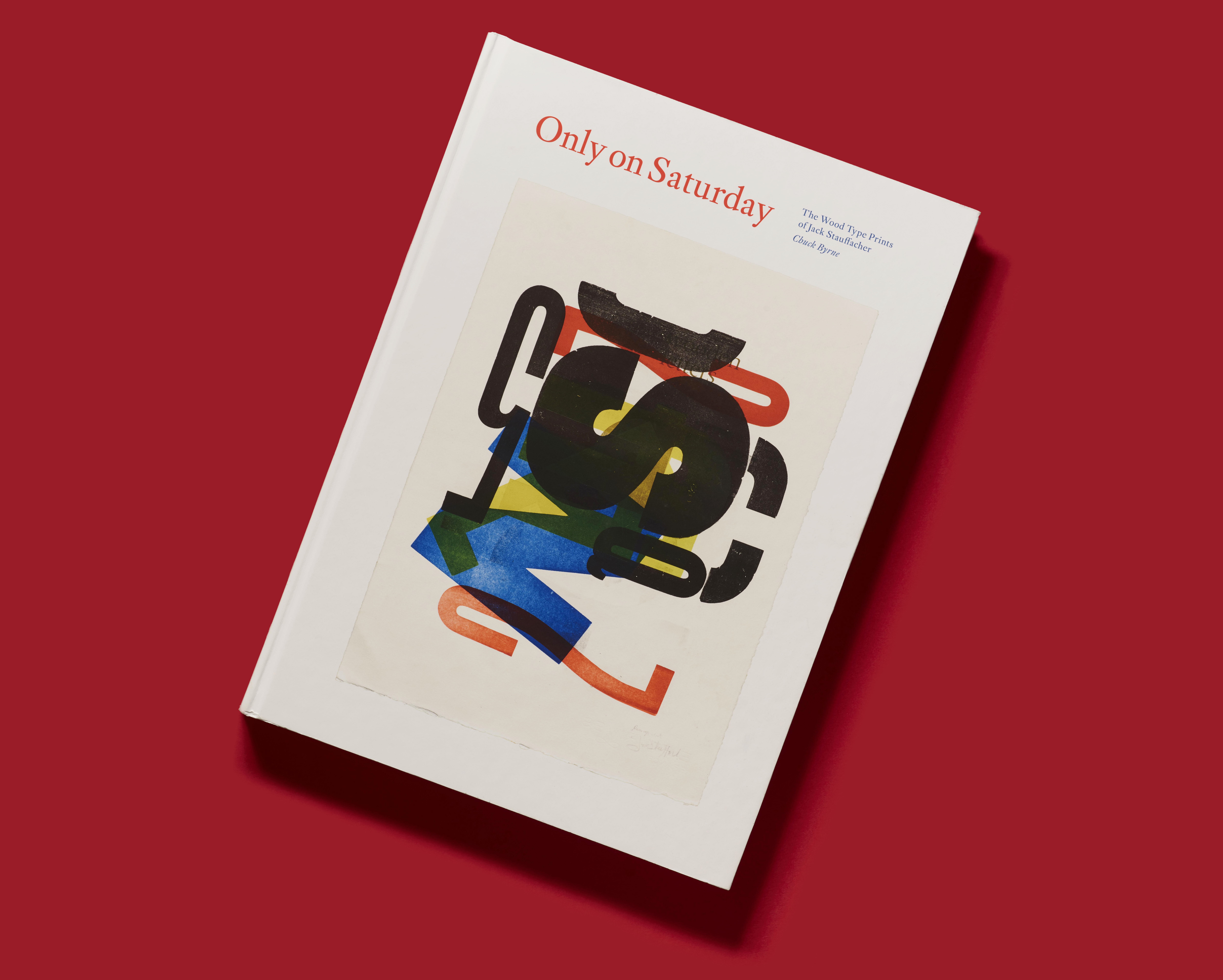
The Wood Type Prints of Jack Stauffacher
This is rather embarrassing, so please don’t tell anyone, but I had somehow forgotten all about The Letterform Archive’s Kickstarter campaign for a book that pays tribute to Jack Stauffacher, a San Francisco based printer and designer.

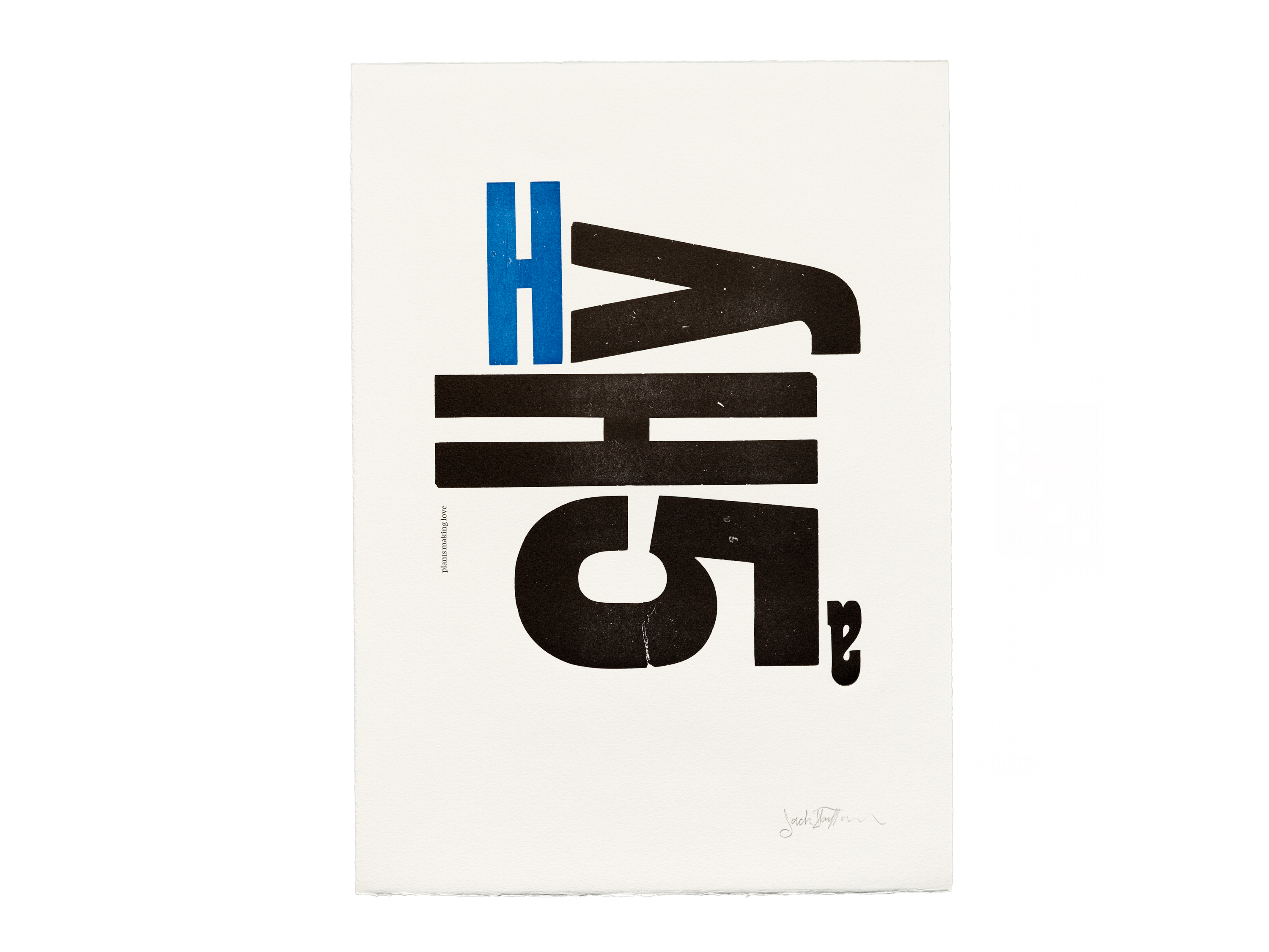
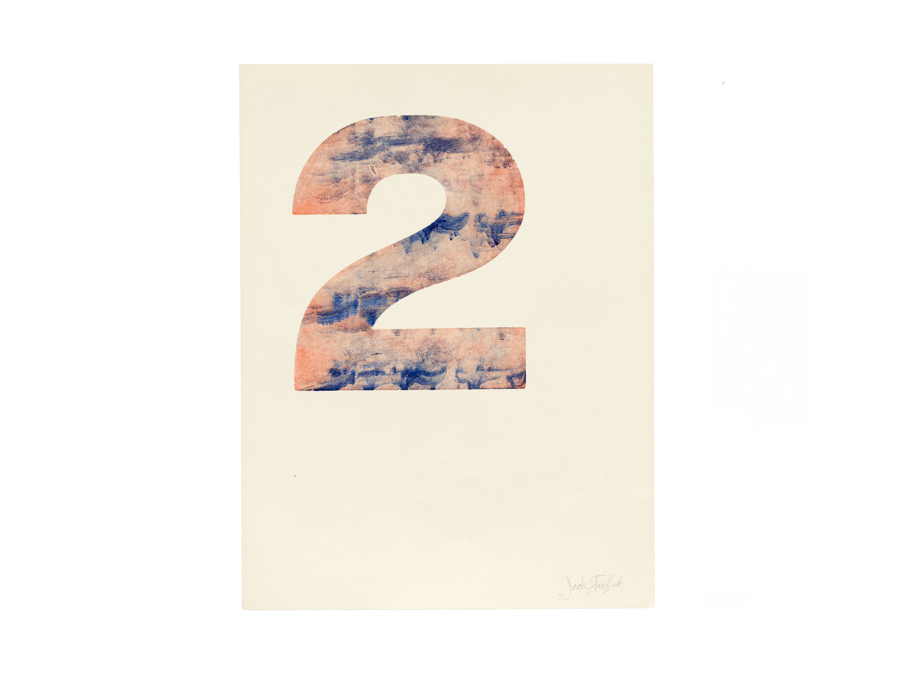
Every Saturday Jack would sneak off to his workshop and print experimental and rebellious letterpress prints where he would play with the color and the texture, the ink and the shape of each letter.
He splashed letters around like paint on a canvas:


These joyous and remarkable examples of Jack’s work is yet another reason why we need The Letterform Archive and why the work that they’re doing is so consistently outstanding.
A couple of months ago I tagged along with a pal to an event held at the archive and, despite my day being a thoroughly large trash fire, it was saved by this beautiful space and this interesting little talk about weird letters.

The whole way through the talk I couldn’t stop smiling.
Anyway, the upcoming Letterform Archive book looks like it will be a wonder, too. It contains essays about these beautiful artifacts and it happens to be lovingly designed by the their crack team of researchers, archivists, writers, and designers.
And so if you are of the typographic persuasion then I am not entirely sure why you’re still reading this email.

Go and support the project! Get out of here! Woof.
✌️ Robin
You just read an issue of Adventures in Typography. You can also browse the full archives of this newsletter.