Behind the Scenes - Part 2
Welcome back for another part of our Behind The Scenes series.
In Part 1, we learned how the scenes were written, prototyped, and sketched.
In Part 2 we’ll look at something much more visually pleasing: how Wednesdays’ (may I say gorgeous?) graphics came to be!
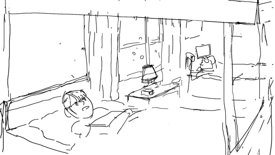
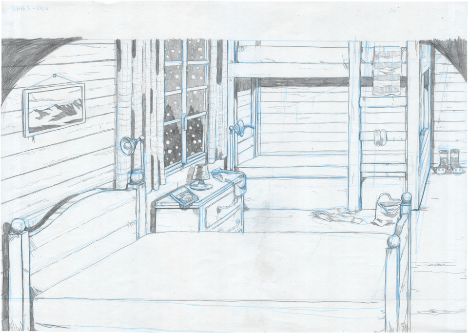
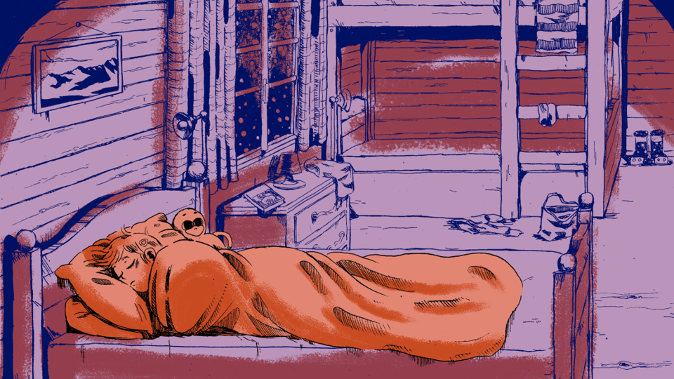
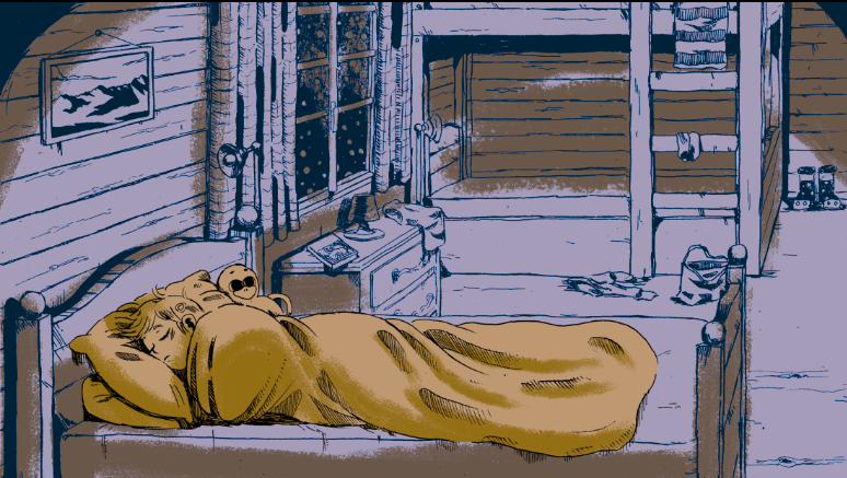
Last time, we left off with something like this :
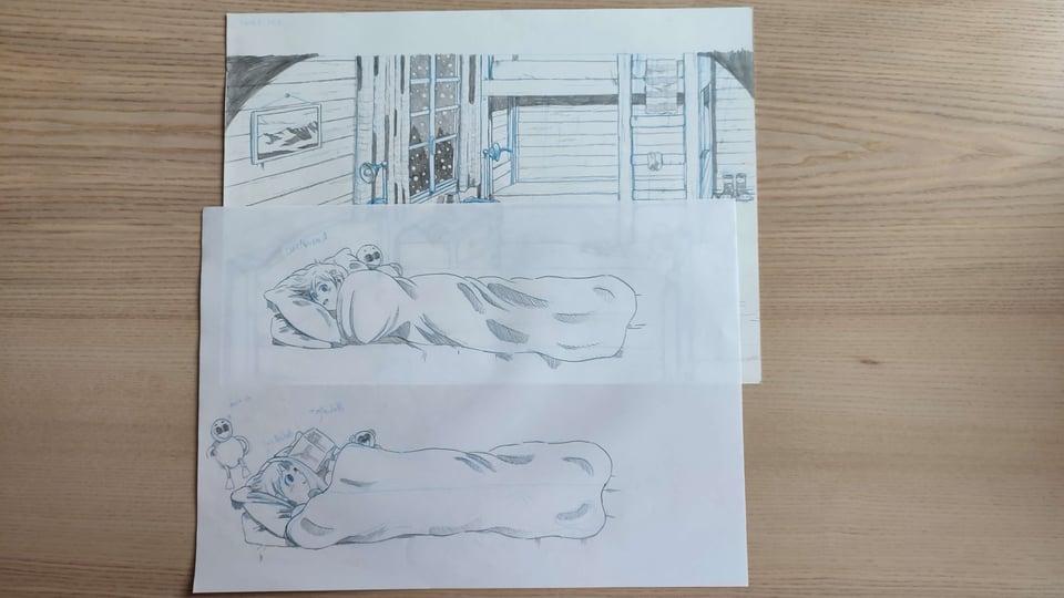
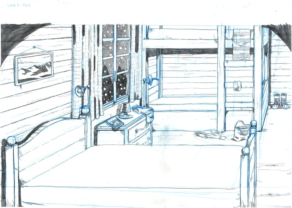
And today we will end up with something like this:

It’s a lot of work so let’s not waste any more time: to the drawing board!
Step 5: Drawing
First, the background is sketched using a blue pencil on regular A3 (11.7 x 16.5 inches) 120g white paper.
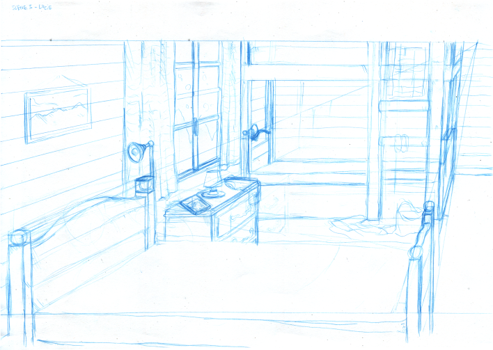
Why blue, you ask? Traditionally, in graphic design, documents were photographed on highly contrasted black and white films before being sent to print. On these films, the light blue color turned invisible, and thus a specific shade of blue called “non-photo blue” was used to leave notes to the printer directly on the documents.
Exaheva uses a similar technique, except her blue lines are erased in a few clicks using Photoshop. That way, she can draw the definitive lines directly on her sketches and scan the result without having to use an eraser. And Exaheva certainly doesn’t want to use an eraser, because contrary to what is usually done, she doesn't draw her definitive lines with permanent black ink. Instead, she uses a black pencil. It's nice because it gives the drawing a grainy graphite texture, but it wouldn't resist erasure!
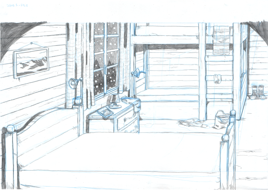
But the blue pencil isn’t the only thing that might surprise you, because while the backgrounds are drawn on regular paper, the characters are drawn using the same technique… on tracing paper!
Why tracing paper, you ask? The explanation is even simpler: While the backgrounds in Wednesdays are usually still, the characters aren’t. They move, talk, live! And thus each character pose (or “sprite”) has to be drawn separately.

By using several layers of tracing paper, just like one would use layers in a graphic editor, Exaheva can make sure each character fits perfectly on the background.
Writing aside (because the writing phase is only really over when someone puts a gun against my head), this phase is the one that takes the mosttime. About 10 days for a single scene! But it’s all worth it in the end and this will become clear in the next step:
Step 6: Scanning and editing
Once all the drawings are done on paper, it’s time for them to enter the digital world.
Exaheva scans her paper sheets one by one using an A3 scanner, resulting in something like this:
Pretty, but a bit dull.
No worries, we can edit this on photoshop and ramp up the contrasts and luminosity to get something like this:
Ah, that’s better! But aren’t we forgetting something?

Right! The blue lines! Now it looks almost perfect. There’s still one problem though. While the grainy texture of the pencil looks really pretty, it’s not as contrasted and thus not as readable as an inked drawing would be.
This is why we need one last edit: converting the image to "bitmap", i.e to pure black and white.
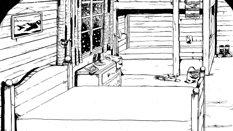
Using this pipeline, we can keep the messy aspect of the pencil while enjoying the readability of ink (actual black ink, not the scripting language from part 1. Try to follow!). And as a nice bonus: it makes coloring much easier.
Step 7: Coloring
The colors of the scene are added digitally on Photoshop using a paint brush effect. Easy, sure, but first, we need to find the right palette.
The palettes in Wednesdays follow a strict constraint that will be covered in a future newsletter. To sum it up: each palette is composed of two colors for the characters, and two colors for the background elements.
There might be a magic formula for color palettes, but I’m sad to announce that we never found it. The only way we know is to try stuff out and see what looks good, so that’s our next step, trying stuff out (and when I say “our”, I mean Exaheva).
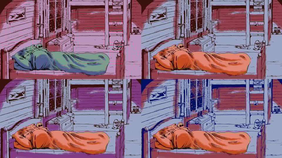
Sometimes, the right palette is found on the first try. Much more often, we have to try up to a dozen different palettes until we find one we’re fully satisfied with. And the more scenes we make, the harder it gets, because we certainly don’t want two of them to look alike. I know there’s supposed to be an infinite number of palettes we can use, but it certainly doesn’t feel that way!
Once we’re set on a palette, there still is one thing to check to make sure it will be enjoyable for everyone: colorblind accessibility.
There is no perfect way to do this, so we generally use two different techniques:
1) Playing around with color blindness simulation tools online. These tools aren’t especially accurate nor supported by actual “science”, but they allow you to quickly check what your palette looks like without red, green or blue, and see if the colors still “pop”.


2) Free labor from our colorblind friends.
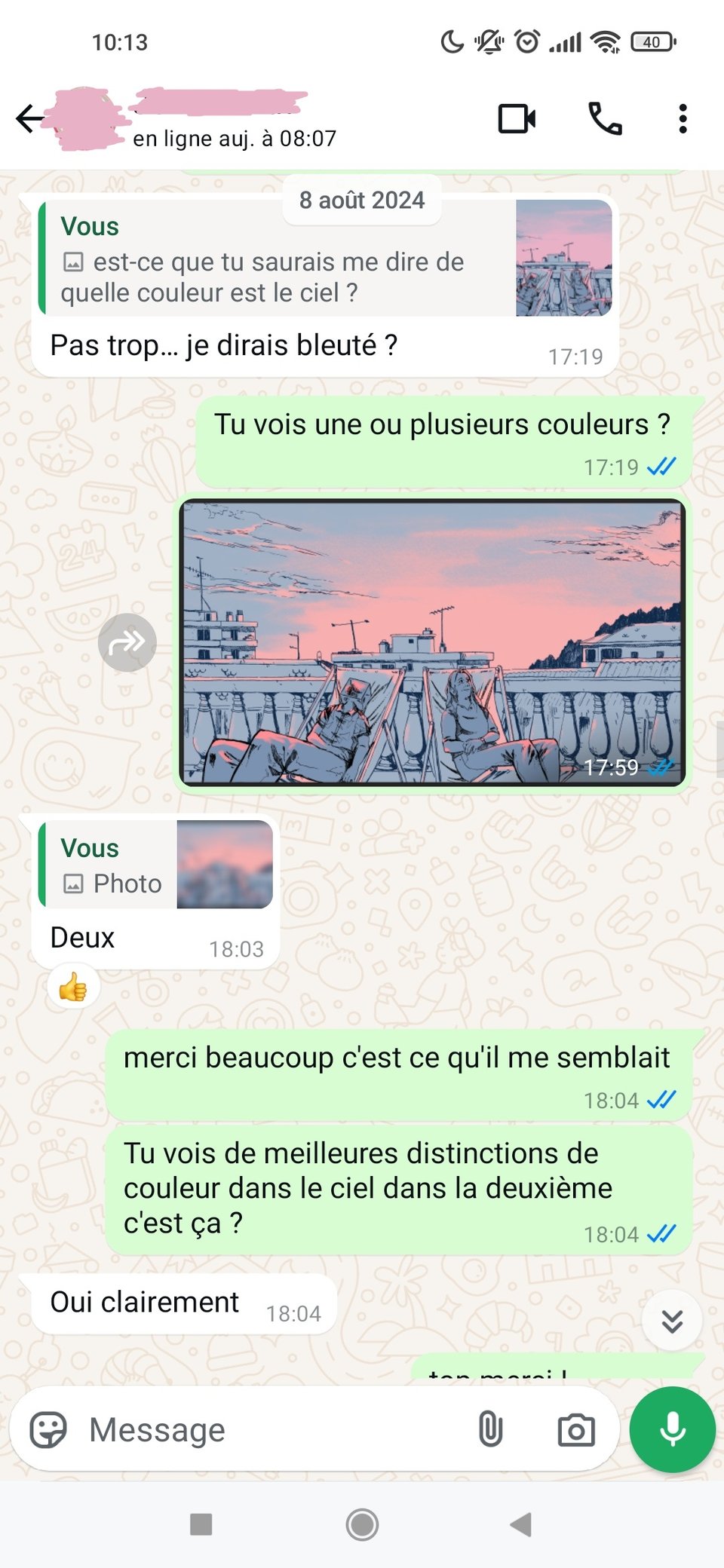
- Not really… Blueish maybe?
- Do you see one or several colors in the sky?
- Two (thumb up!)
-Thanks.That’s what I thought. Are the colors more distinct in the second picture?
- Clearly, yes.
The goal isn’t to make sure the palette looks “good” to everyone, that seems like an impossible task. The goal is to make sure everyone does see 4 distinct colors, and that the characters properly stand out from the backgrounds.
If that’s not the case, we tweak and try again. If it is, that means the art part is over and we’re ready for the next step…
…which will be revealed in the next and final part of Behind The Scenes!
Once again, make sure to subscribe to the newsletter if you haven’t already, and feel free to share it!
Wednesdays can still be found on Itch and Steam, tell your friends!