Frog Talk 3

Not a lot of business to get through. I’m embracing just sending this out when I am able, so you all have been warned. Discount code this month is MAYDAY and going forward that will apply sitewide. take a look as always there are lots of new books to draw your eye!
As always, links to buy are embedded in the first photo for each subject.
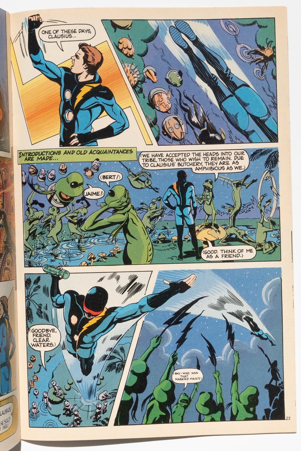
There’s a whole bunch of crap someone could say about Nexus. It’s been around for over 40 years at this point. The creators have changed as people. It’s a high water mark in the American indie scene. A cool superhero comic, exquisitely illustrated and smartly written. It’s all those things and more, but what I have here is only a small fraction of the comic.
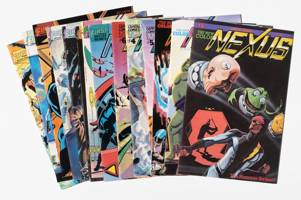
Nexus V2 1-14 by Steve Rude and Mike Baron
This is a snapshot of a moment in time, the period when nexus became Nexus, when Baron and Rude went from idealistic creators to artists able to make a living making comics. There is a real excitement in the letters column of every issue at what the artists are doing that is infectious.
This period of time also covers the demise of original publisher Capital Comics with issue 6. Luckily for (frankly) everyone, First stepped in and published issue 7 barely a year later. This provides a rather natural gauge of Rude’s quick evolution as a visual thinker. Because the thing about comics, is they love a good recap. Rude and Baron are pioneers in the recap page, as a quick and efficient tool to get new readers up to speed at a logical junction. Nexus V2 #7 features a recap page by Rude to introduce events from the previous issues to new readers. And Nexus V2 #1 features a recap to catch up readers who missed the first three issues of volume 1. Look at them side by side:
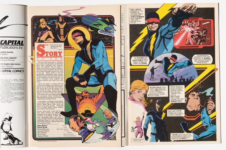
The first thing that jumps out to me is how much clearer, yet more complex the layout is in the later page. Rude’s understanding of visual flow was expanding with each issue as he experimented with different techniques, and with each successful experiment his confidence would grow in turn. One of the more interesting outcomes of this is Rude’s interest in more diagrammatic cartooning that he would sprinkle in whenever the plot called for it.
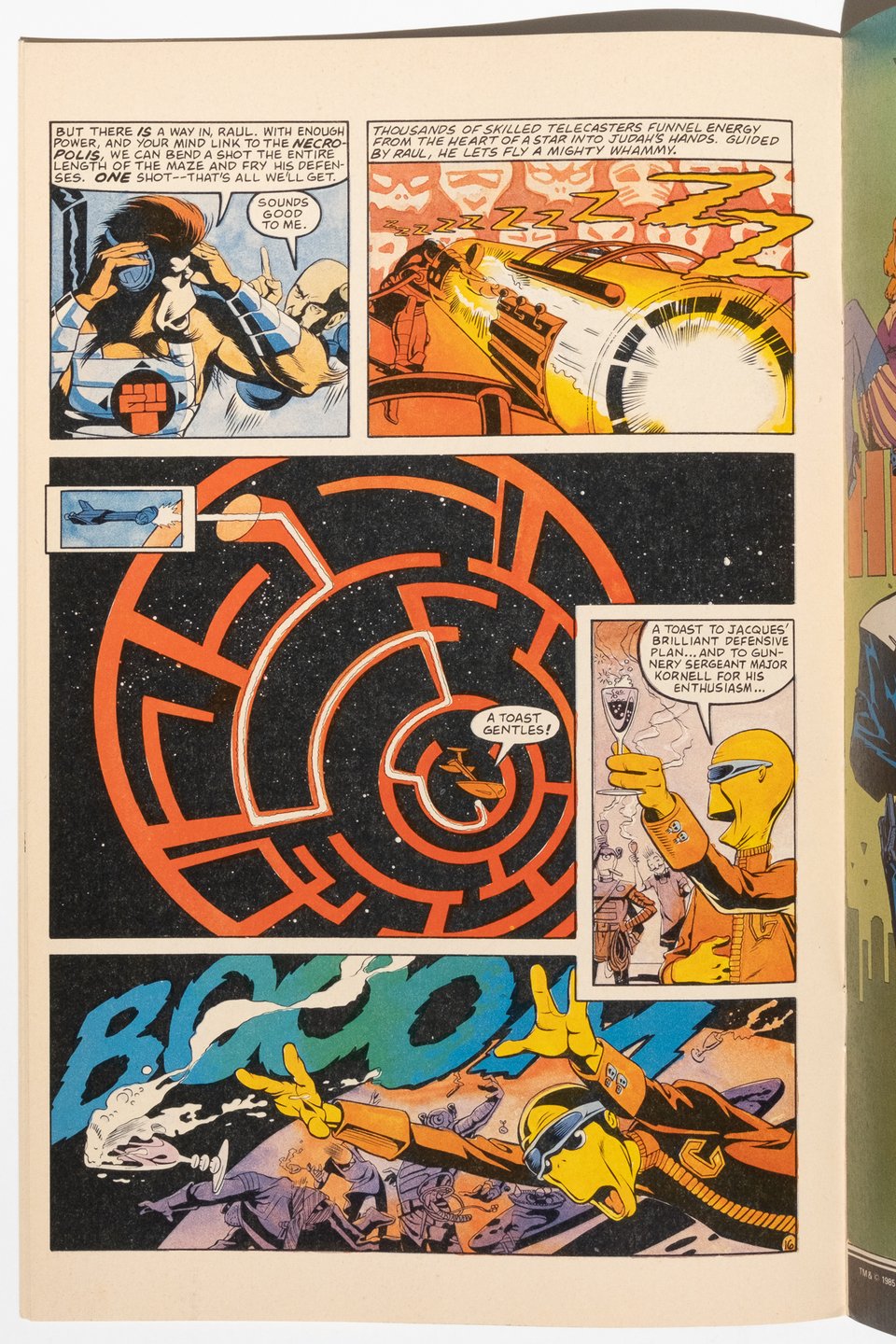
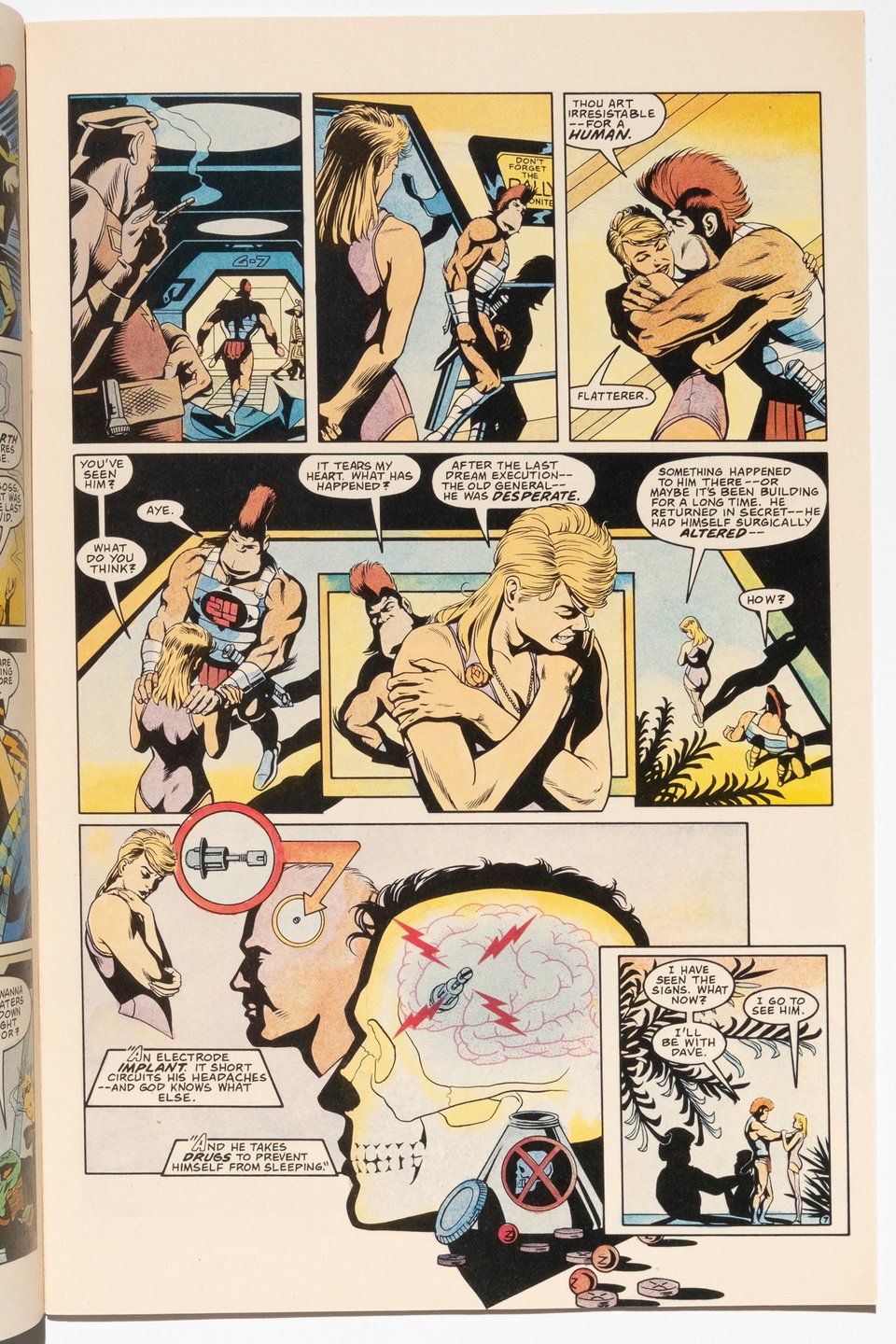
Above are two such examples that demonstrate clear linkages from Rude to someone like Kevin Huizenga which is frankly a connection I was not expecting to see.
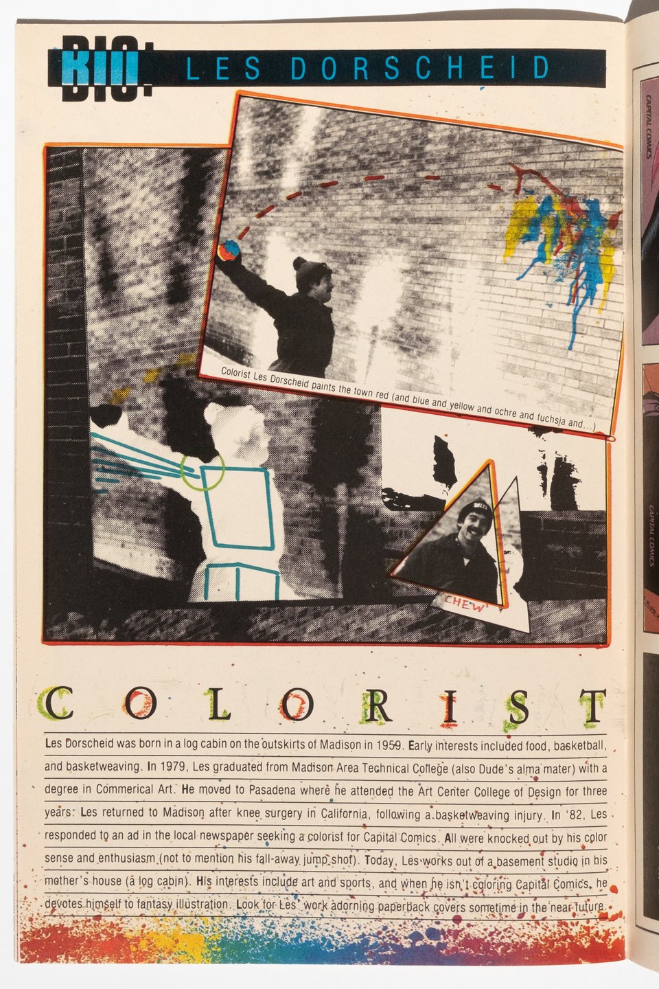
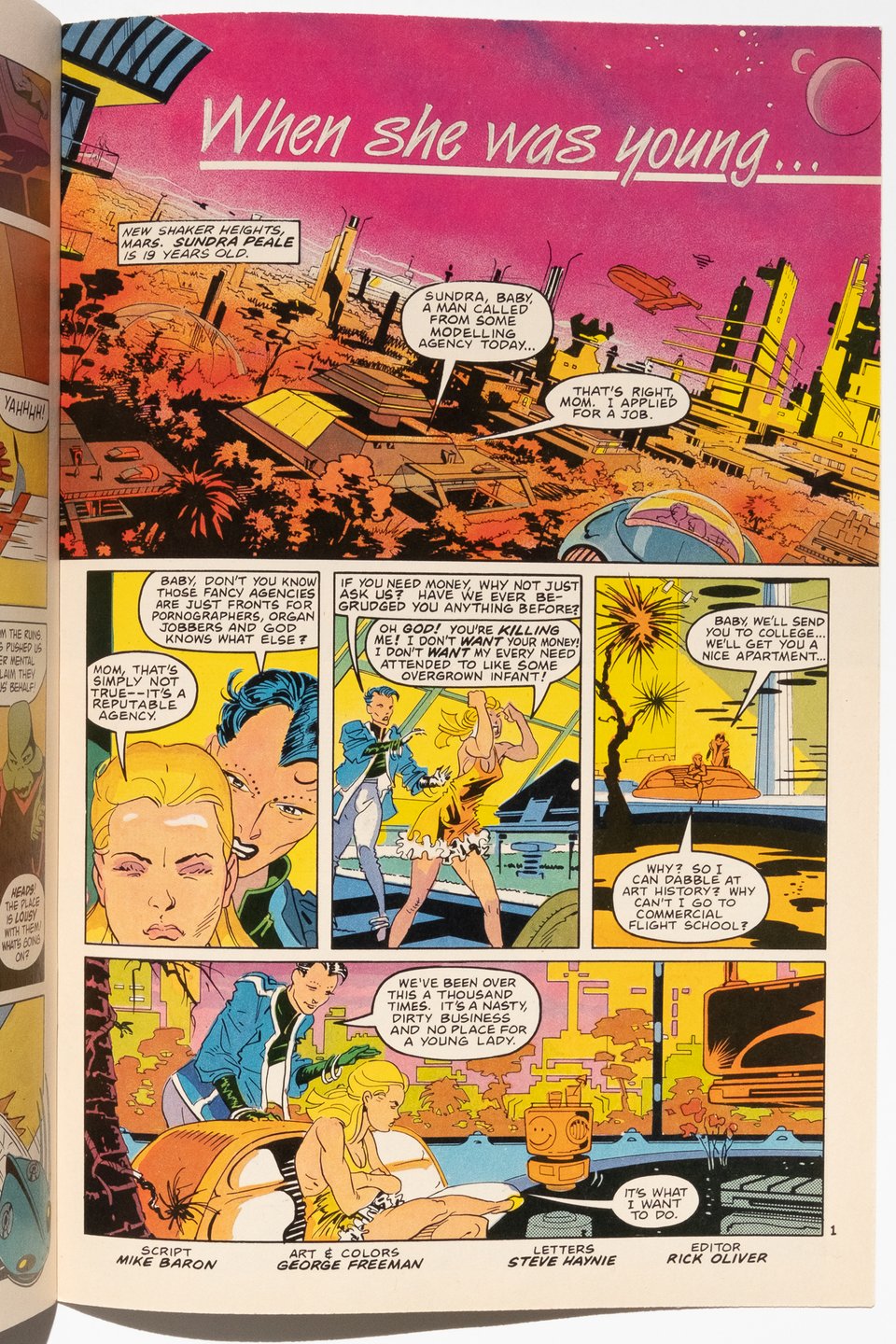
As the series progressed, Rude starting working with a young Eric Shanower as inker and they would run short stories in the back, all presumably to lighten the load on Rude to meet a monthly schedule. Shanower’s inks look great on Rude and many of the backup stories are terrific, and not as well collected (if at all?) as the regular storyline work. Shanower took the lead on several of the backups, but my favorite in this set has to be the piece illustrated by George Freeman.
Also available is the eighth issue of Comics Interview, which features a Nexus cover and accompanying interview between Baron and Steven Grant (his colleague in writing at both Capital and First comics). The interview came at an early stage in the success of the book, and is illuminating to show the thought processes of both Baron and Grant.
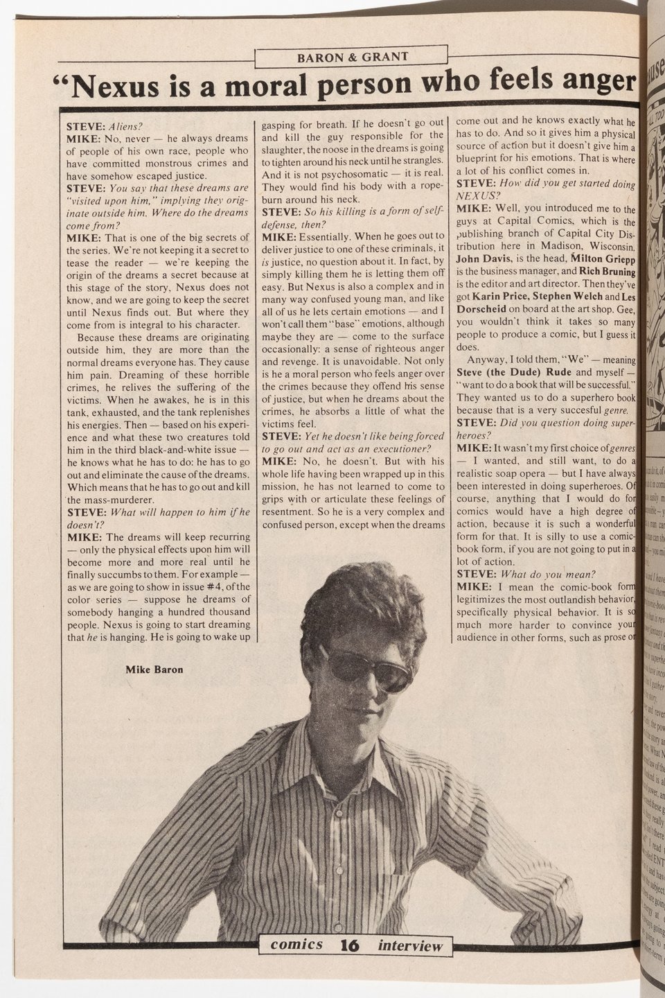
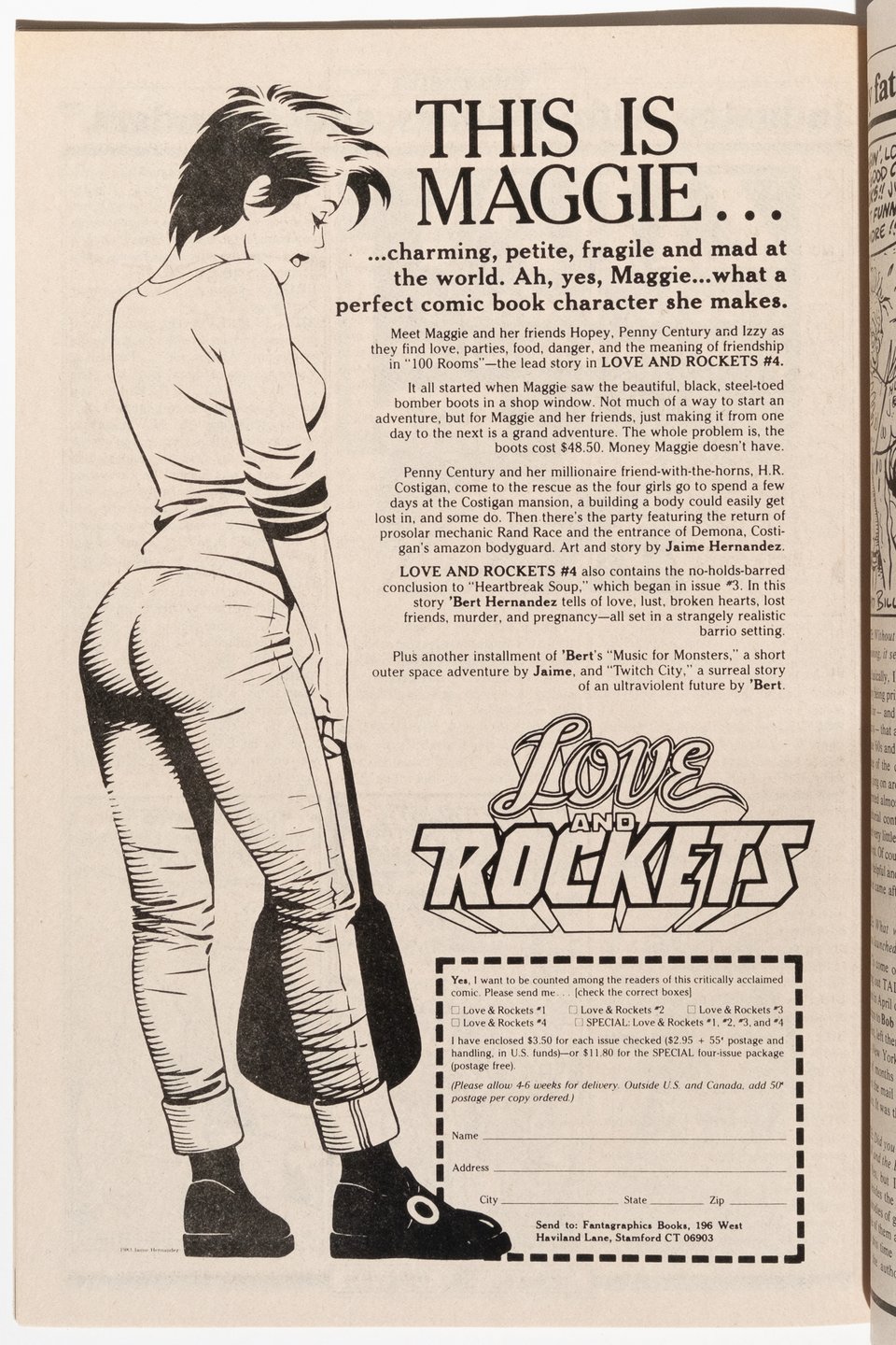
Perhaps most surprising is the discussion of latent ideology in comic books between Grant and Baron and how ill-equipped Baron is at matching wits with Grant. Also included in the issue are interviews with Bill Griffith, Tom Ziuko and 2000AD editor Richard Burton! Obligatory Love and Rockets ad documented below:

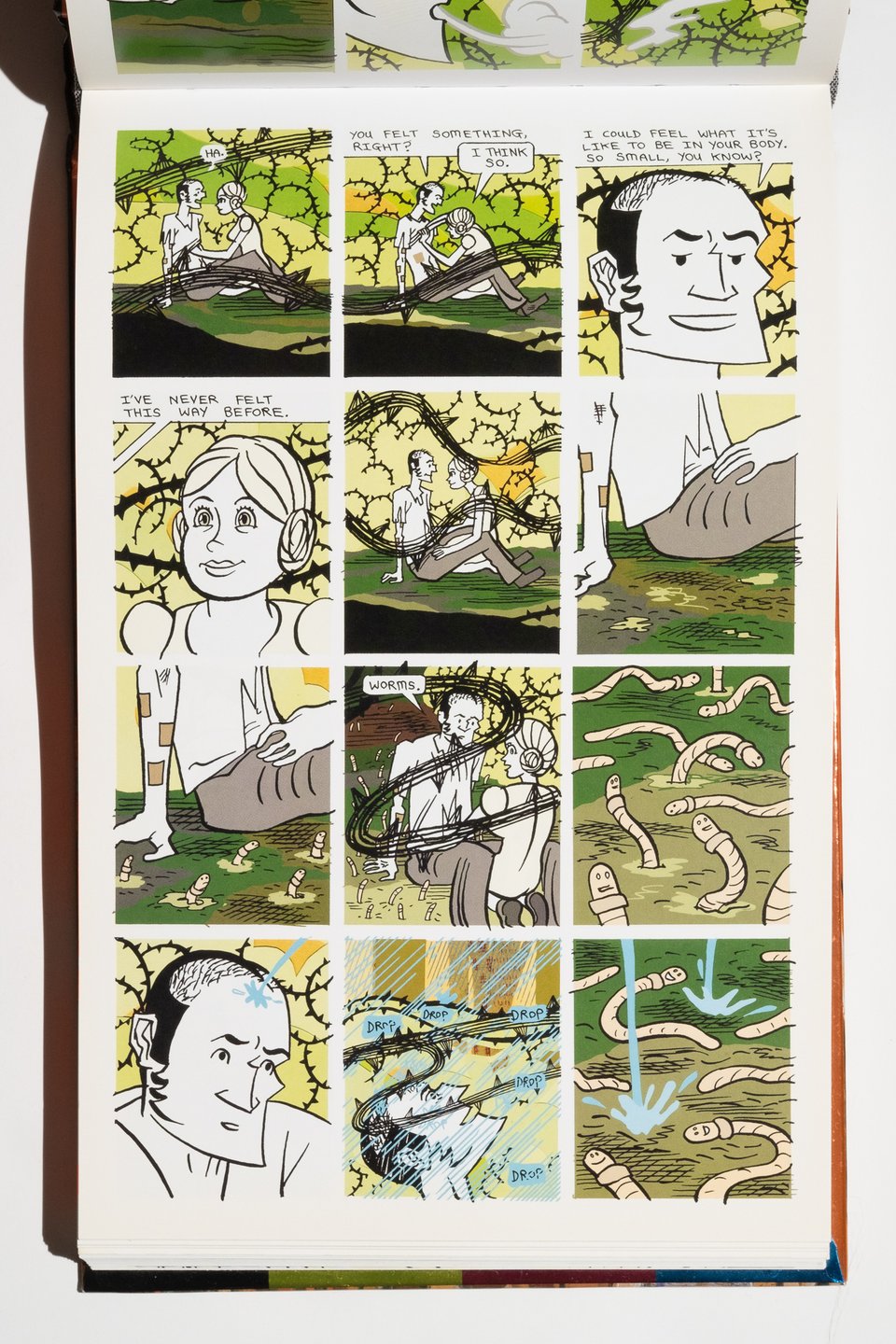
Bodyworld by Dash Shaw
Nobody does it like Dash Shaw does it. Bodyworld is the ambitious physical publication of Shaw’s webcomic original that was serialized on his website way back in 2008. The physical publication by Pantheon presents the work vertically—like reading it on the phone, which has become a bit more common in practice as popular webcomics have attempted to bridge the print divide. I certainly hope that some of the structural issues have been solved since this volume’s publication in 2010.
Set in the near future in an experimental utopian small town, the story follows an expert drug taker as he discovers a new powerful drug on the grounds of a high school. It allows users to merge personalities and physical traits with those around them. Cue psychedelic themes and questions around identity, and some of Shaw’s best experiments with digital layering. Really beautiful work that also bears heavy influence from Archie Comics; and more beautiful for being able to see Shaw work through and address methods of presenting work digitally that actually translate to print as well. This is an excellent synthesis of artistic vision and book design.
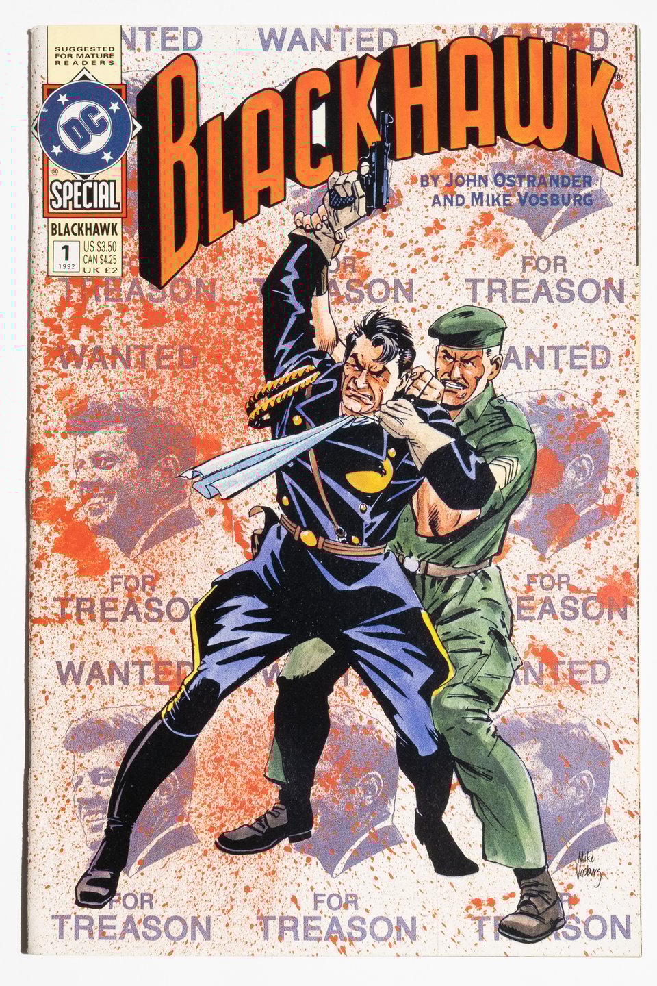
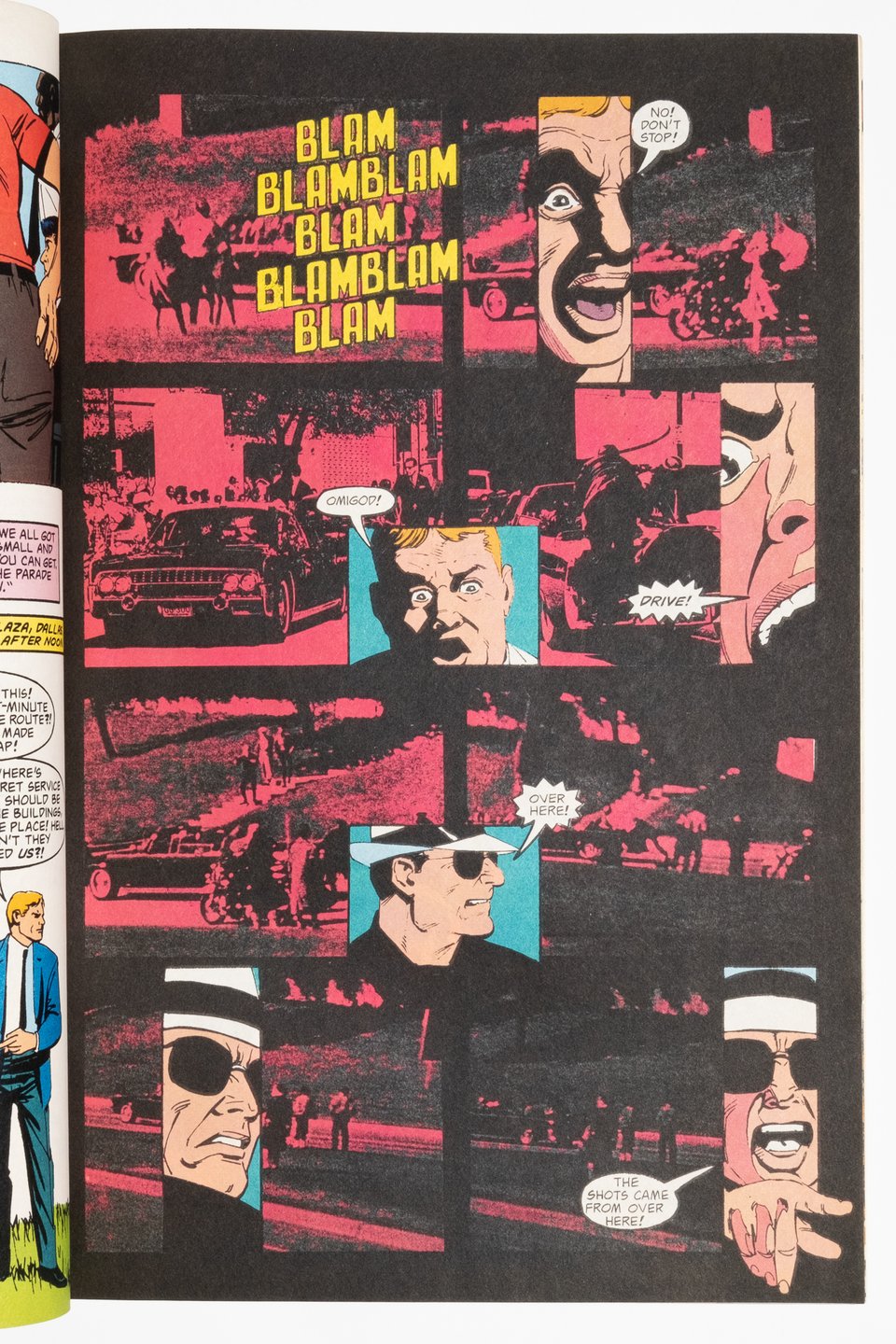
Blackhawk Special by John Ostrander and Mike Vosburg
An oversized done in one issue that weaves Kennedy assassination conspiracy theories into the fabric of the DCU and the history of the Blackhawks in particular. Because of Ostrander's involvement this strangely means that it is more of a Hawkworld tie-in than anything else, despite the very long shadow cast by Chaykin's reinvention of the characters in the 1980s. This is directly addressed by editor Mike Gold in his afterword, in which he basically says "we hired Vosburg because he looks like Chaykin."
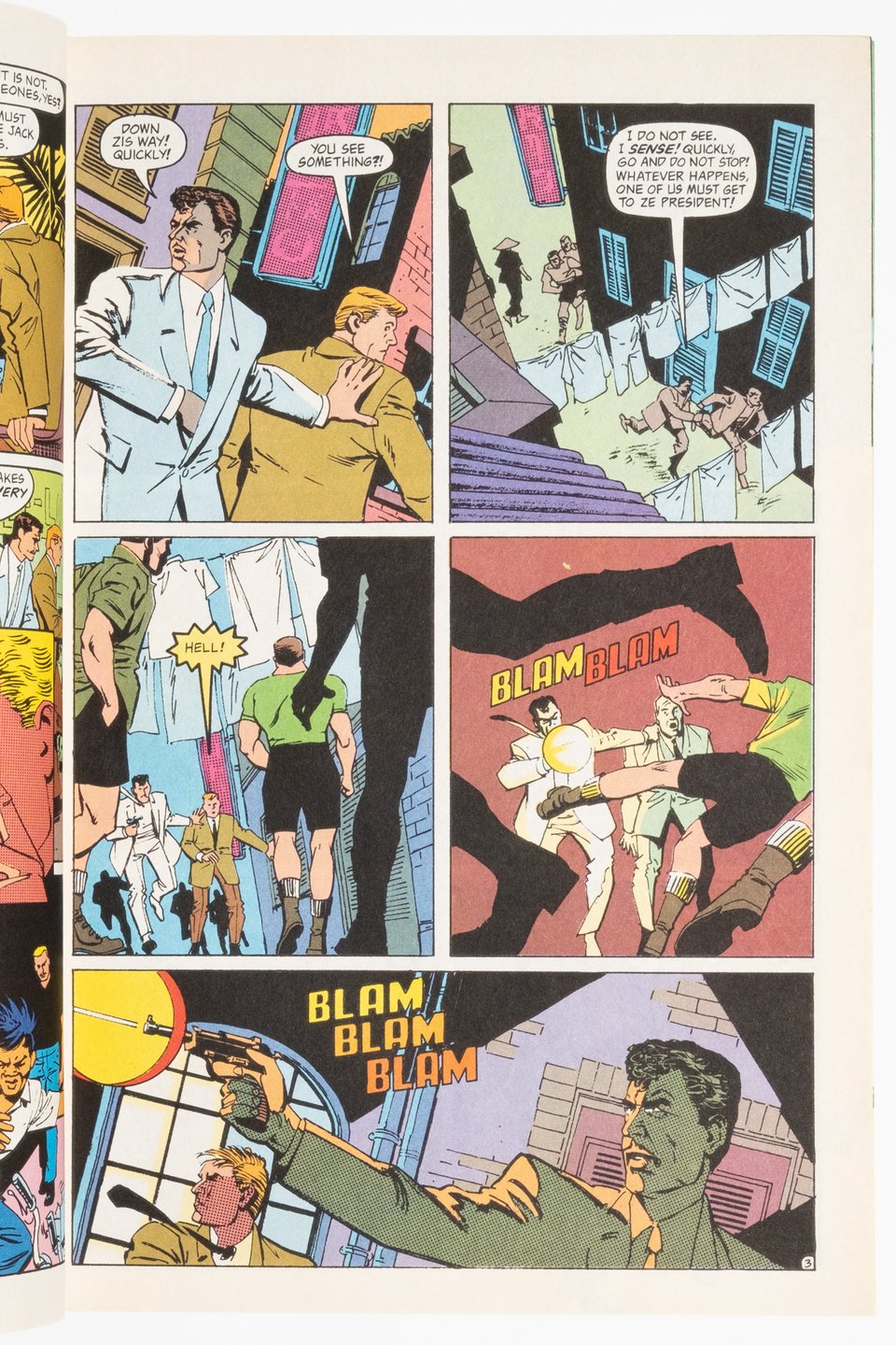
My first thought upon encountering the book was "Oh cool! Vosburg doing the same thing he did with American Flagg that's fun!" And that is because (as should be evident in the pictures here) Vosburg is a really talented artist in his own right. There is a reason he was chosen to replace Chaykin on Chaykin's signature book after all. The fact that he has his own style should be celebrated. Here for example you see some rather innovative panel placement that compresses the storytelling even as the page count remains languorous.
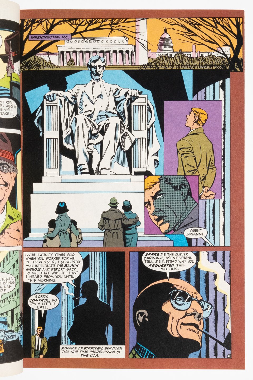
Ostrander makes use of that room to weave together a story about the missing decades in the fictional history of the Blackhawks. Ostrander sets the plot against several conspiracy theories about both Kennedy assassinations, a detail that is oddly relevant in 2025. But his focus remains on placing his characters within the framework of the DCU, to that end placing a nice Argent cameo into the plot, and reflecting on the breakdown of post-war New Deal idealism in the face of multiple assassinations and revelations about US policy around the world. An Ostrander comic in other words.
Pairs nicely with Chaykin's Blackhawk series, which is available elsewhere in the shop! buy both and message me for a discount!
A word to the wise: also listed in the shop is The Eternaut 1969, currently going for outlandish prices online, I have it listed at a nice discount compared to everyone else I see. I’ve also made a package out of Essential Thor volumes 1 and 3. Great comics, especially when Kirby was allowed to pursue his interest in myth to its zenith.