Frog Talk 1

What is Frog Talk? It’s when I don’t have a theme for the newsletter and I’m just vibing putting books up. Most of these I read in the last ~three months or so. All have my personal stamp of approval and they barely scratch the surface of what is available in the shop(KazSkellyWrightsonCampbellSchonefeldBrecciaCowan to name a few)!
I also figured out how to put two photos next to each other on the same line! wow! still not totally happy with the layout but this is a step in the right direction! Things will continue approving on the back end as I learn how to do stuff. Fun!
Finally, from sales in the month of February I was able to donate $75.00 to Critical Resistance! Thank you!

Without further ado, comics:
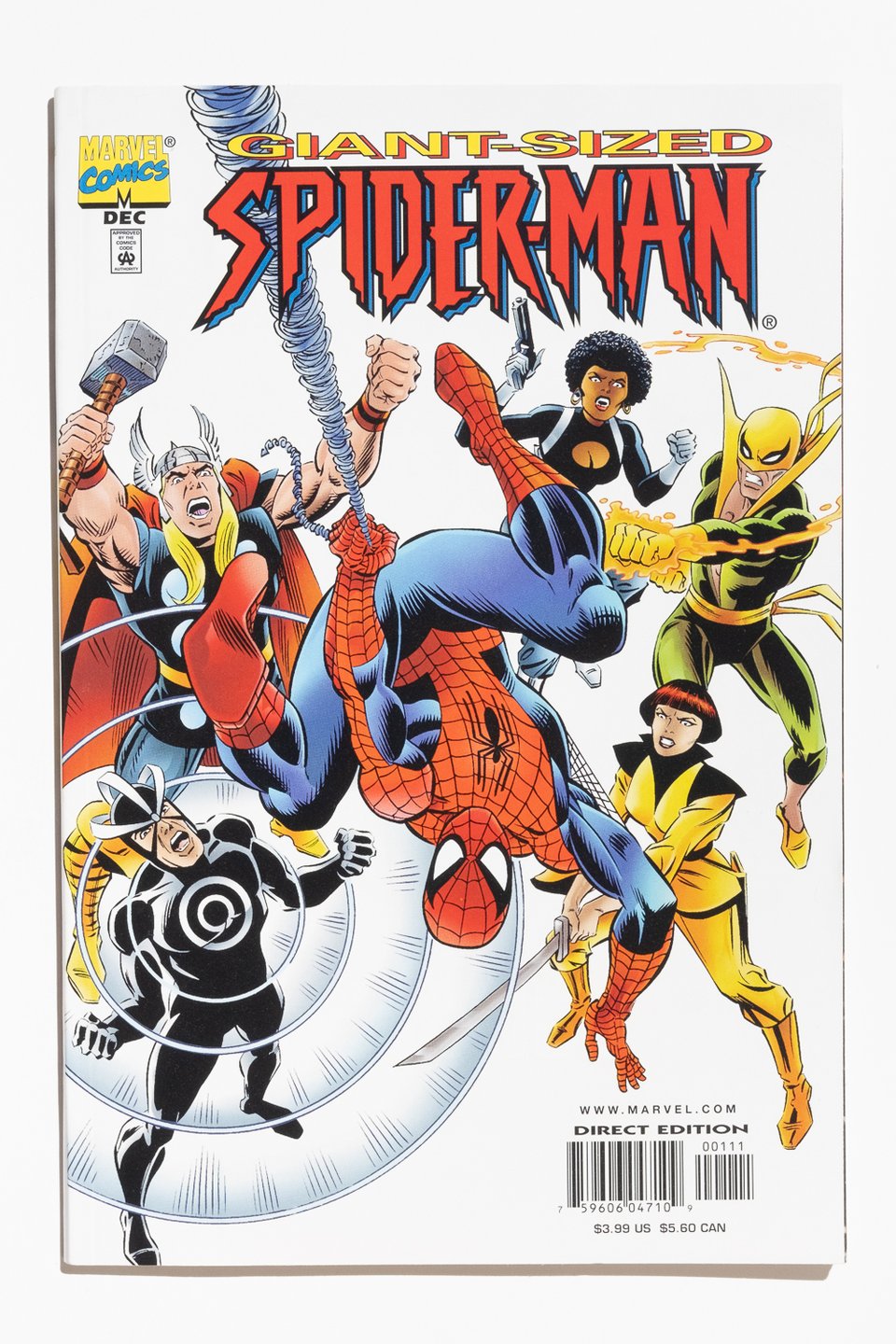 | 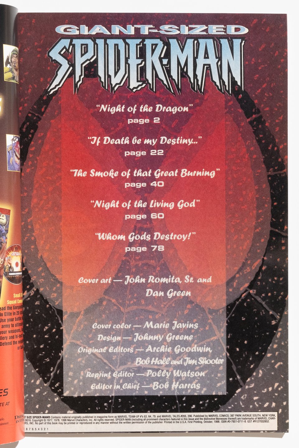 | |
Giant-Sized Spider-man by John Byrne and Chris Claremont
I have no idea why this book exists but I'm glad it does. Released in 1998, it’s an annual-sized reprint collection of Marvel Team-Up stories by Chris Claremont and John Byrne (to be even more accurate, I think these are the print files from the high numbered MT-U issues after it went into reprints!). The first half is with various Heroes for Hire, but that slim theme disappears with the final stories that feature Havok and Thor.
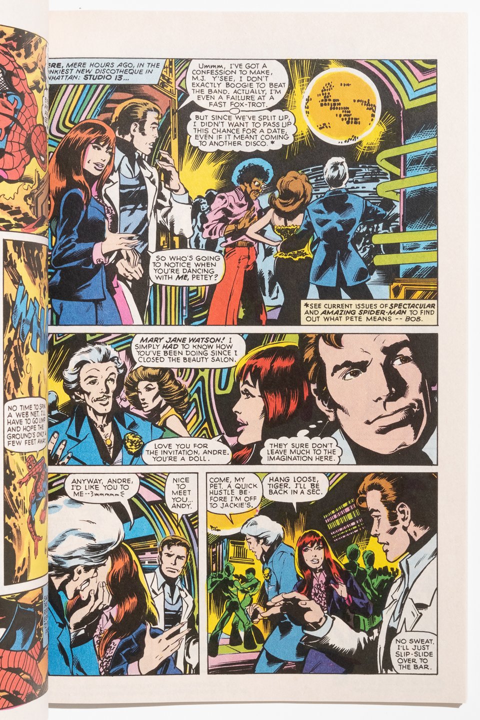
With no apparent textual theme, I suspect that this particular book was released to cash in on Byrne’s soft relaunch of Spider-Man that also began in 1998. Regardless of the reasons WHY, this issue is a sterling example of the kind of comic I like to keep my eyes open for: a bland cover that conceals better looking reprints than most of the official reprint packages put out by Marvel OR DC. This whole thing is on nice uncoated stock that holds the color nicely and feels good in the hand— especially nice on pages like the one below where you get to see Byrne’s version of a discotheque
Lastly for this one, I love that the title is in past tense for this collection— as if Spider-Man was formerly giant-sized, but now is simply regular sized.
 |  | |
|---|---|---|
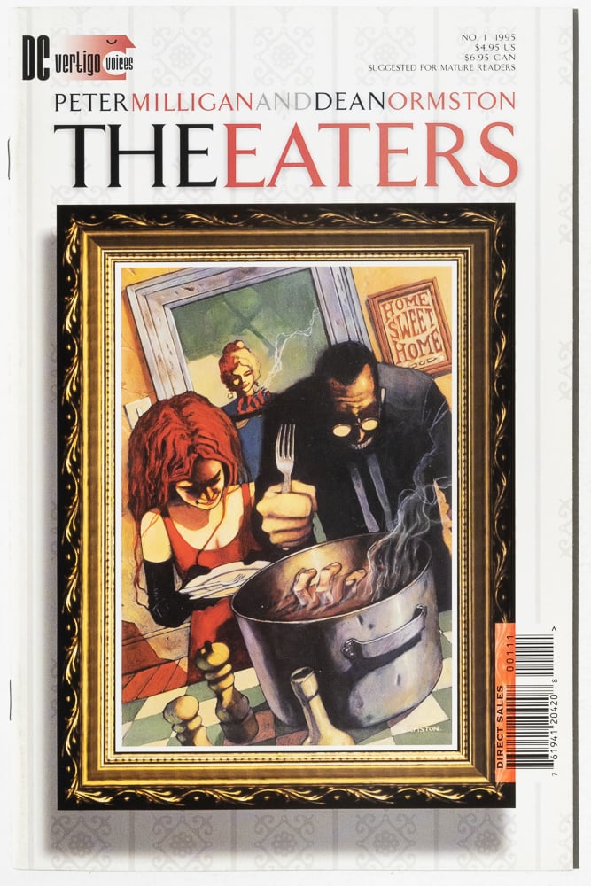
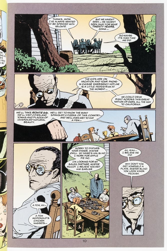
The Eaters by Peter Milligan and Dean Ormston
I think Milligan had some anger at the USA when he wrote this one. Twisted classic Vertigo one-shot that came out as part of the “Vertigo Voices” initiative. Lots of great work can be found there.
Dean Ormston is a favorite artist of mine from this era. His scratchy linework hits somewhere between Paul Grist and Mark Beyer. Here it is used for the most unsettling imagery.
 |  | |||
|---|---|---|---|---|
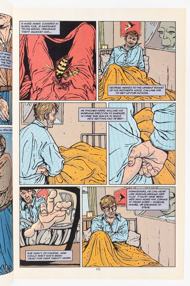 | 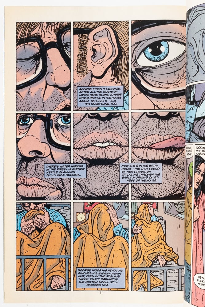 | |||
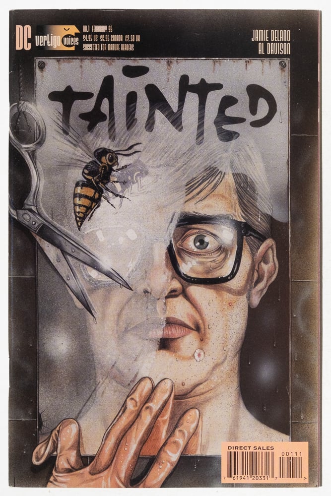
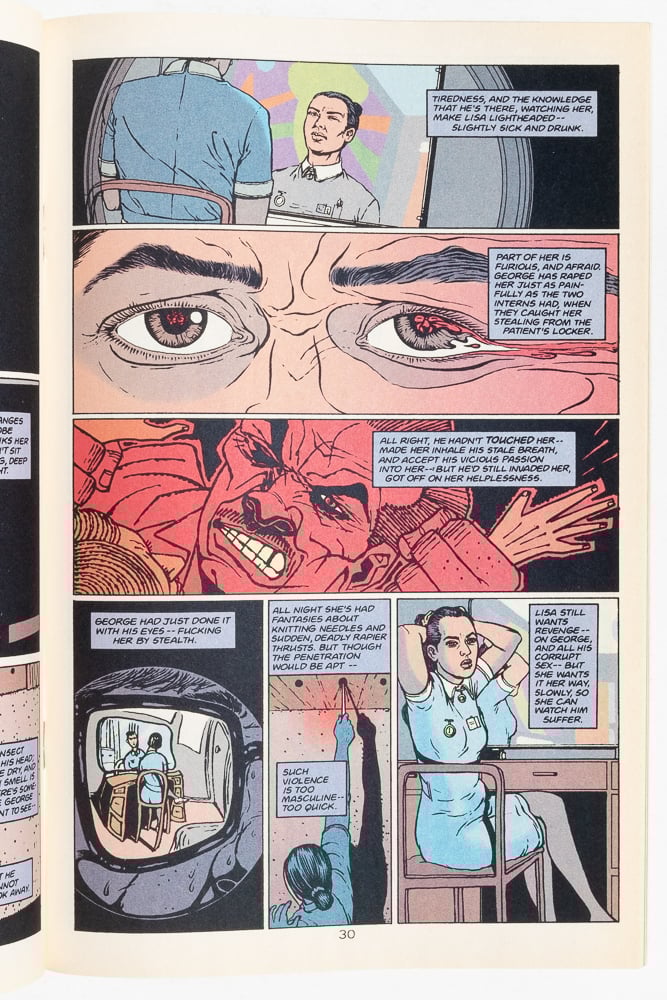
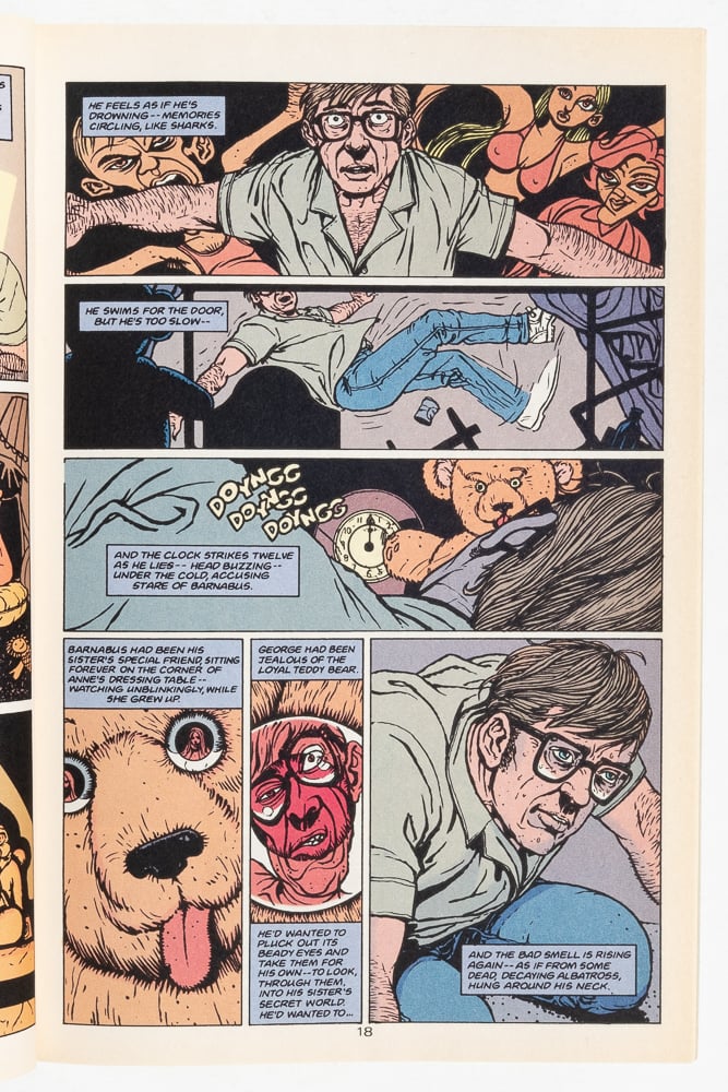
Tainted by Jamie Delano and Al Davison |
Speaking of Vertigo Voices, here’s another one of those books! Tainted is a great, neo-noir I suppose about a very kind man with a secret. Very much in the spirit of Peeping Tom if you’ve ever seen that, though Delano avoids and/or inverts most of the obvious pitfalls with that kind of story.
Al Davison really works the nine panel grid to great effect. Feels like the point of view of a wasp buzzing through a house, distorting the figure as needed. Very effective cartooning.
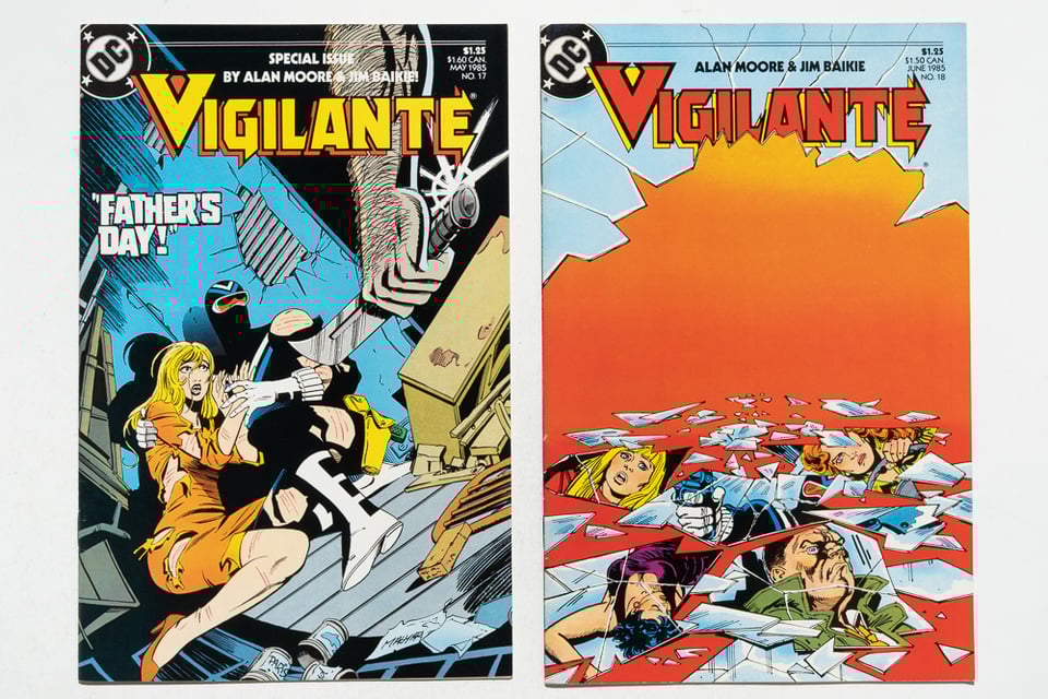
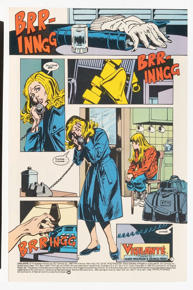
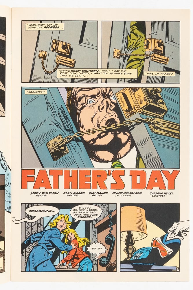
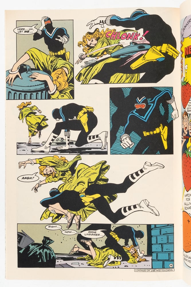
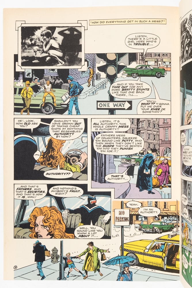
Impeccable comics from a young Alan Moore just about to explode. A miraculous homage/critique of grindhouse cinema stories like Dirty Harry and Death Wish. Very fun to see the different viewpoints pitted against one another and how confidently Moore takes apart the right wing ideology espoused by the Vigilante. Baikie is one of the great 2000AD artists. His career in the States was more limited, but the DC stuff is well worth tracking down. Good fight scenes.
 |  | |
|---|---|---|
 |  | |
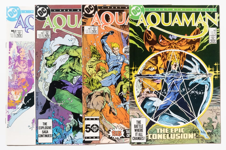
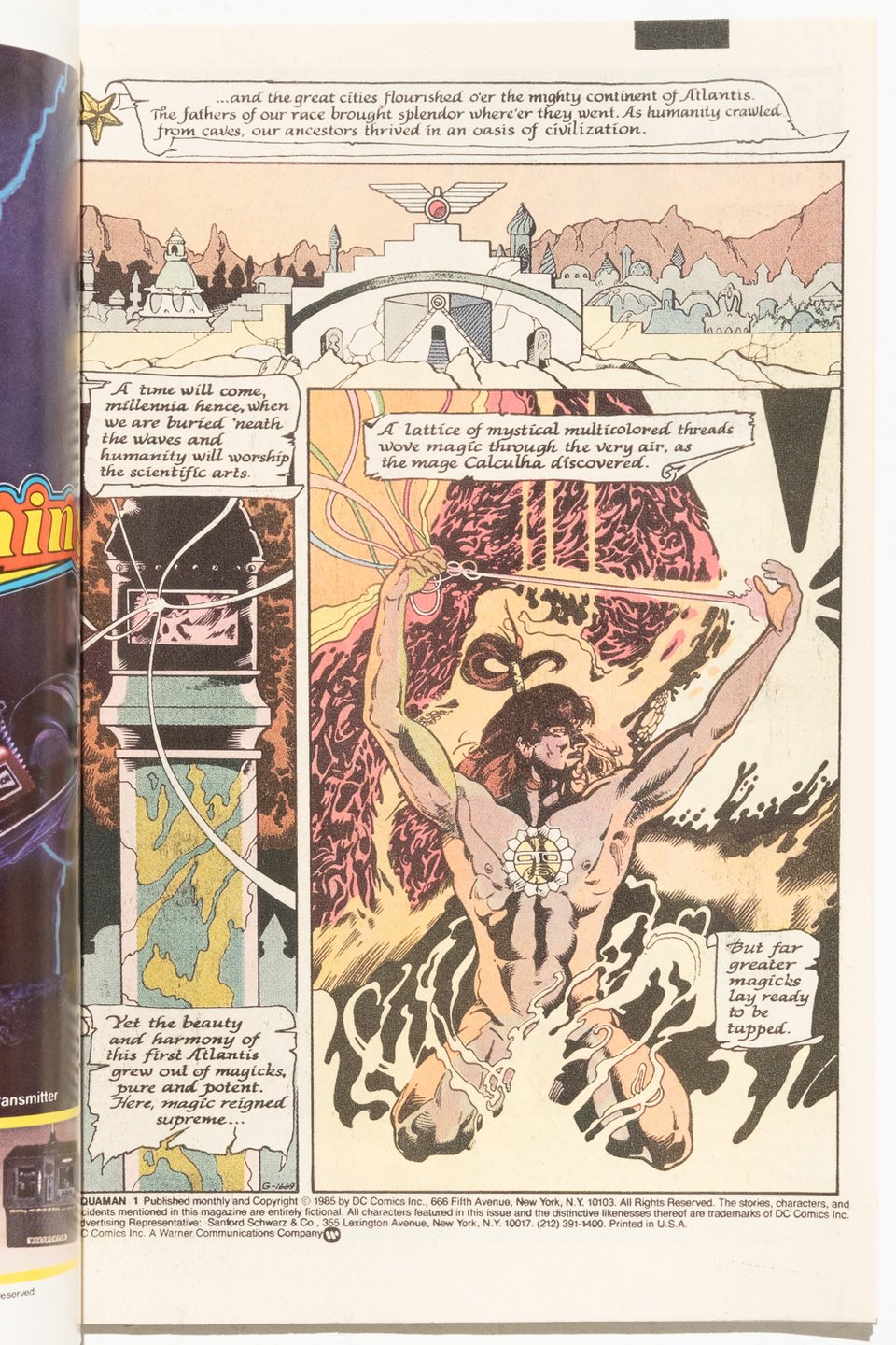
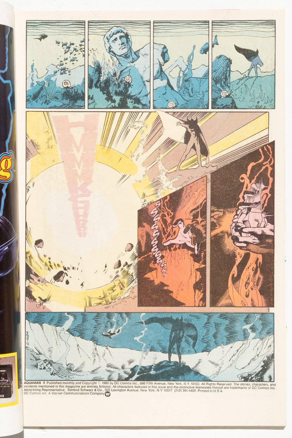
Another book in the long tradition of mid-eighties revamp mini-series of beloved DC characters! Maybe Aquaman doesn’t rate highly alongside DKR or Hawkworld, but this does feature the only long form sequential work from the artist Craig Hamilton! and it is genuinely LUSH artwork!
 |  | |
|---|---|---|
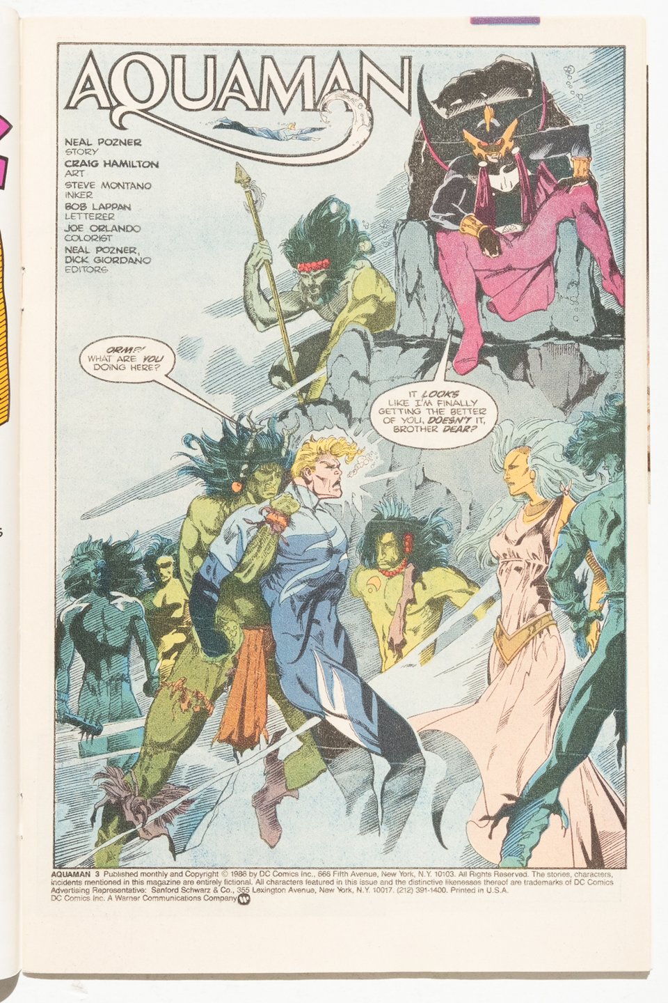 |  | |
Call me old fashioned, but I think Aquaman comics should have lots of underwater scenes and they should look really fucking cool, this comic checks both of those boxes beautifully. Surprisingly, the story isn’t half bad if you can look past the ill advised pursuit of perfect continuity. The letters page of the second or third issue reveals that this is basically everyone’s first ever comic, and they way they put it and the results I can’t help but pull for this one, the little comic that could.
Finally, and simply, one of the best books on art theory ever written. I love this book, it changed my life and the way I see the world. I consider it essential reading for anyone interested in any visual art. HIGHLY RECOMMENDED