Frog Talk 007

Hi friends,
It’s been a long couple of months as I’m sure you can relate.
Luckily, we still have comics. Maybe at the end of this you will have more comics than me.
Here are some of the good ones:
DISCLAIMER
I’m going to drop the link to the new arrivals section here. Every book I talk about is represented in new arrivals as well as a lot of other new books. This will save me a lot of time and you can skip past my blurbs once they become boring.

New Arrivals | Mostly Frogs
Browse all products in the New Arrivals category from Mostly Frogs.
AND SO
Here are some good comics I read since last time and they are available for you to have as well:
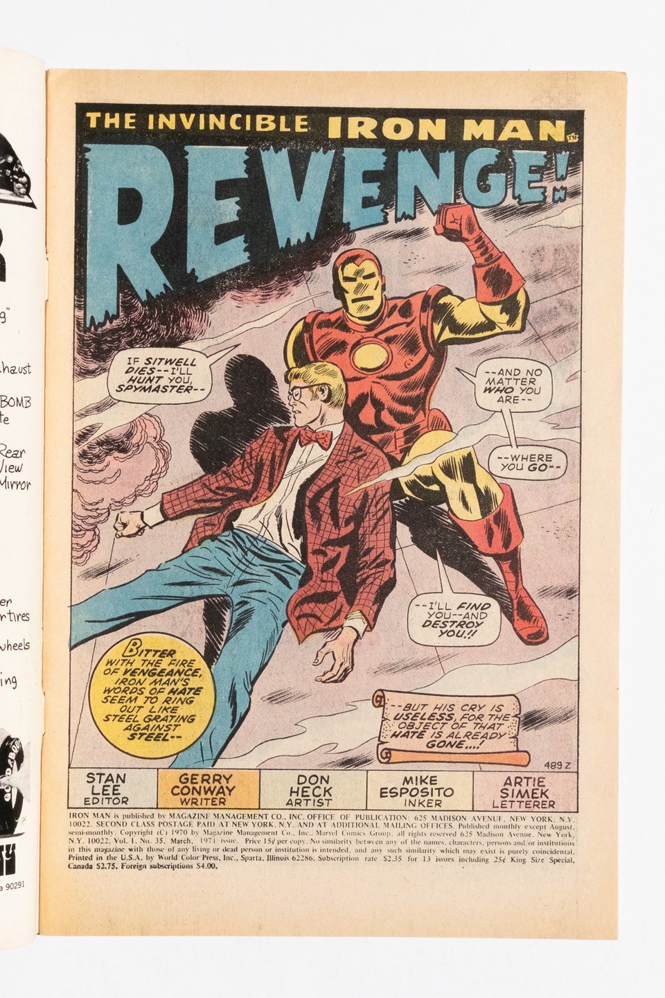
I’ve been making small grips of (mostly) Bronze Age books. This is from a little run of four Iron Man issues when the book was really in a sweet spot for high powered “spy-fi.” The Don Heck art certainly helps too.
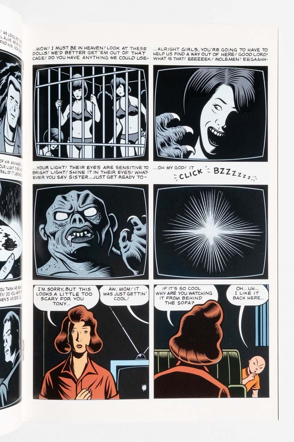
This is one of my favorite Burns comics. Released as a color, regular sized comic on glossy stock by Kitchen Sink in 1991 from a 1986 Raw Books black and white book. Of course, Burns pulls it off, with some downright excellent coloring. Here is an example of his interest in preexisting media and pop culture that would develop into the role of photography in the plots of Black Hole and the X’ed Out trilogy.
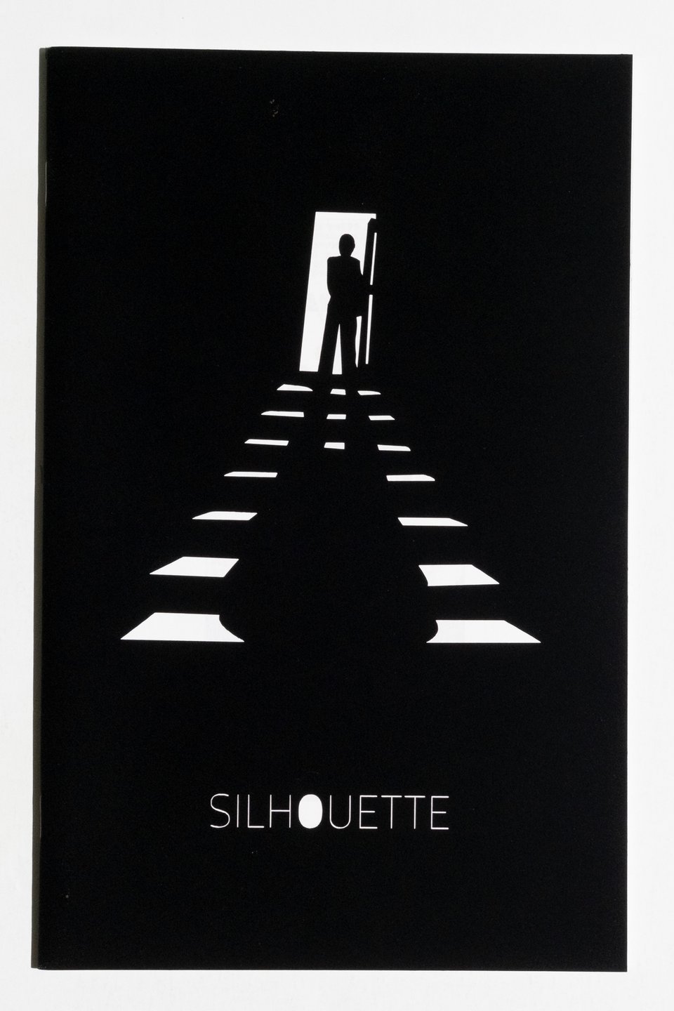
This is an incredibly niche book. Rugg released it in an edition of 50 (possibly 100, I have found conflicting information). it is an almost academic exploration of the usage of the silhouette in comics composition. The cover is lasercut, signed on the back. My copy came with an original Rugg sketch on the backing board of the Pink Panther (click through to view). This one’s expensive (sorry).
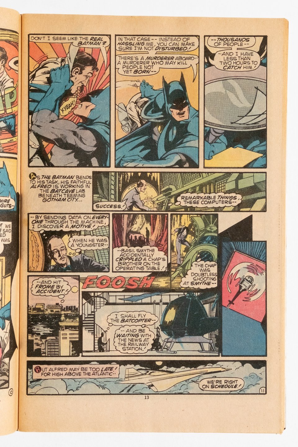
This is just an example of Rogers’ gift for inventive, yet legible panel composition. The bottom half of the page is built on turning left at the ‘FOOSH’ sound effect, which in turn totally breaks the standard reading order. Yet it works perfectly well. This isn’t even a particularly good Rogers page and he still does laps around most people!
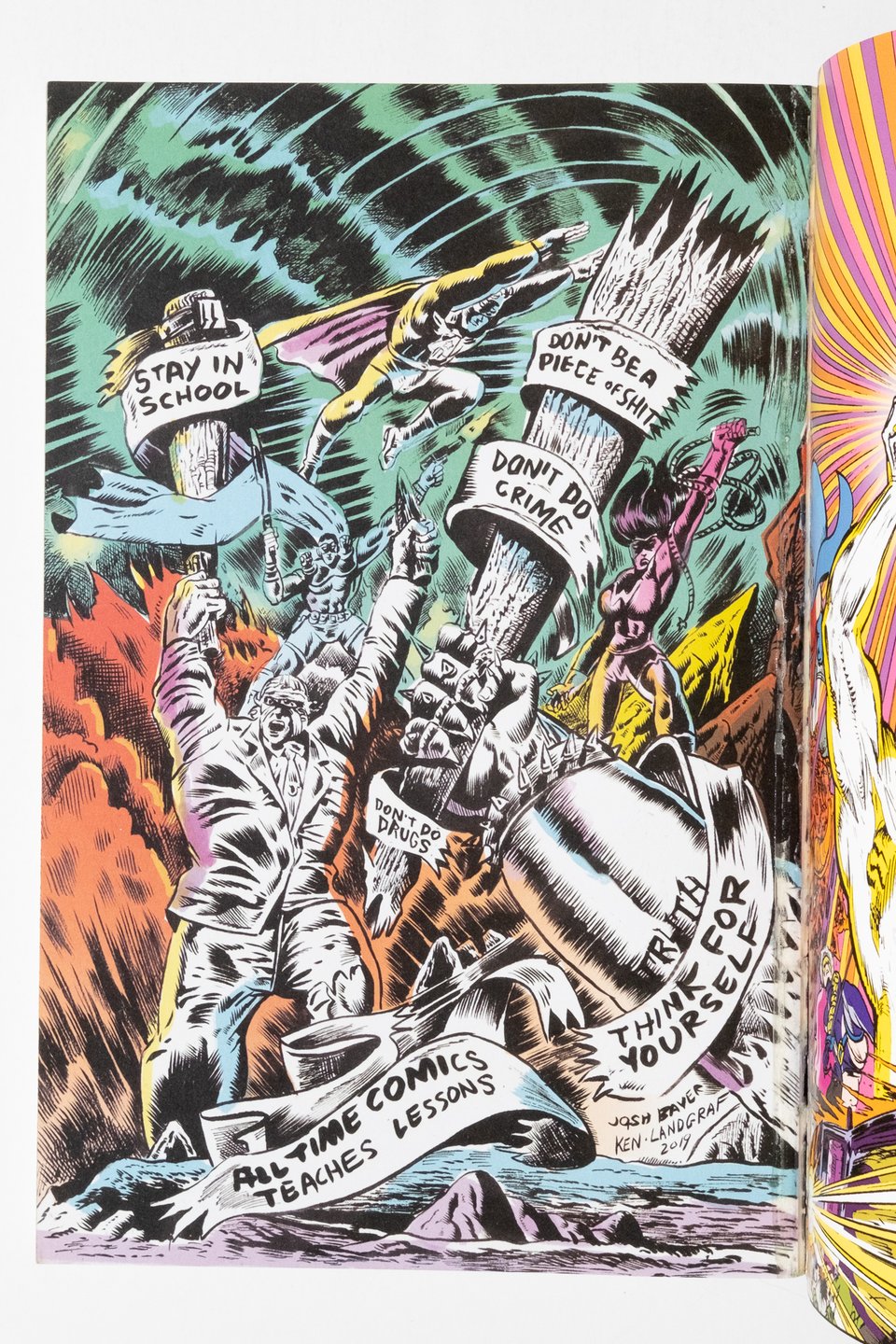
All Time Comics hit at a time when the wall between alternative comics and the mainstream was at its thinnest. This was also when traffic flowed both ways between the two camps. So you could have someone like Fiffe build a following for his self-published superhero comic, land a job writing for Marvel, and then release a slice of drama from Fantagraphics in the span of ~five years. All Time was a slightly different beast, built out of a profound reverence for the assembly line approach to comics production. Previous attempts may find one creator handling all production jobs on something like a regular schedule(the aforementioned Fiffe, Piskor, Forsman, etc) whereas here, that dynamic was reverted with creators fulfilling only one or two roles on the line. Spearheaded by brothers Josh and Sam Bayer, All Time pushed the bit further by hiring industry veterans into the production flow. Rick Parker lettered all of volume one. Herb Trimpe’s last published artwork is contained here. Trevor Von Eeden and Ken Landgraf are WELL represented. Al Milgrom turns in even more excellence. He even pens new Editori-Als (reborn as “Critic-Als”) with reviews of the younger work of his peers. The younger talent should be full of familiar friends to regular readers of the newsletter. Ben Marra, Noah Van Sciver, Gabrielle Bell, Julie Gfrörer all grace pages. When these combinations work, they really work, and this more frequently happens with artists comfortable at the edges of their scene. This makes a pairing like Von Eeden and Marra completely logical to the point that it may be boring, whereas more singular artists like Gfrörer stand out because their style is so precise. My favorite pairing is Stephen Bissette inking Noah Van Sciver. More than anything however, these books remind me of the Atlas/Seaboard books from the 1970s. Martin Goodman’s weird, indulgent, a little punky, notoriously late with payments Atlas that offered creator rights on godawaful paper stock to old school pros like Neal Adams, Steve Ditko and Wally Wood and to young innovative artists like Howard Chaykin and (yes) Al Milgrom.
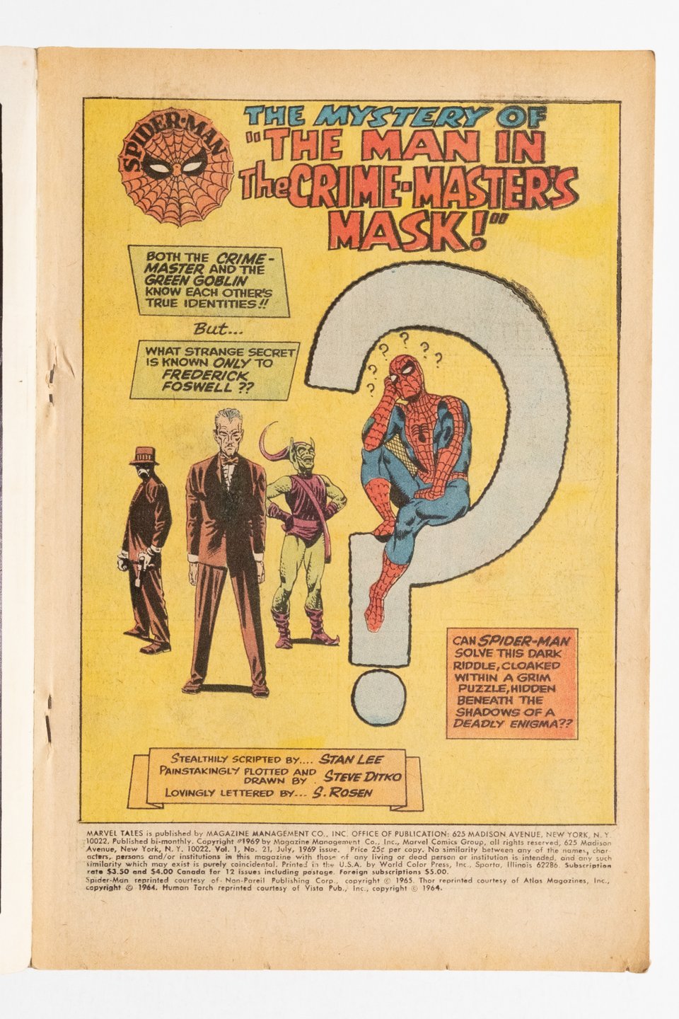
Another Bronze Age set I’ve put together. This pulls a bunch of early Marvel Tales issues from when it was a squarebound anthology title. This means that, Even though Spider-Man is the cover and lead story, you also get a bunch of backup tales of varying appeal. Most notably is that once ‘Tales’ reached the Spidey issue when Ditko left, Ditko’s Dr. Strange suddenly appears as one of the backup stories. Devious, if not downright mean y’all.
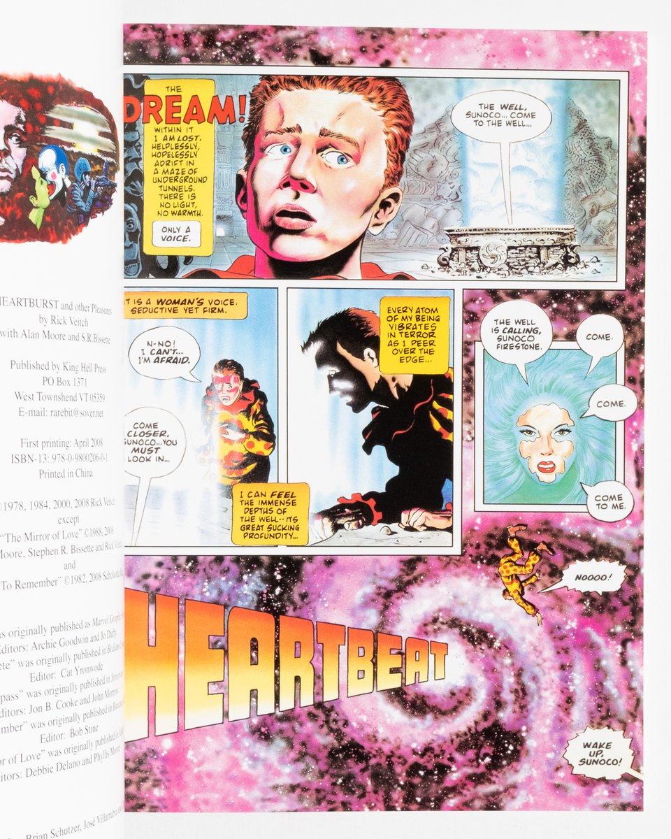
This TPB reprint is self-published by Veitch’s King Hell Press in 2008. Crucially, this means that it predates Veitch’s current infatuation with the Amazon Publishing print program that he uses to keep his catalog in print. By contrast, and even though this is a mass market paperback, it feels well made, even bound with signatures! In addition to the title story, Veitch included some hearty extra material in the form of early and experimental works as well as collaborations with Alan Moore, Bissette, etc.
This copy is signed!
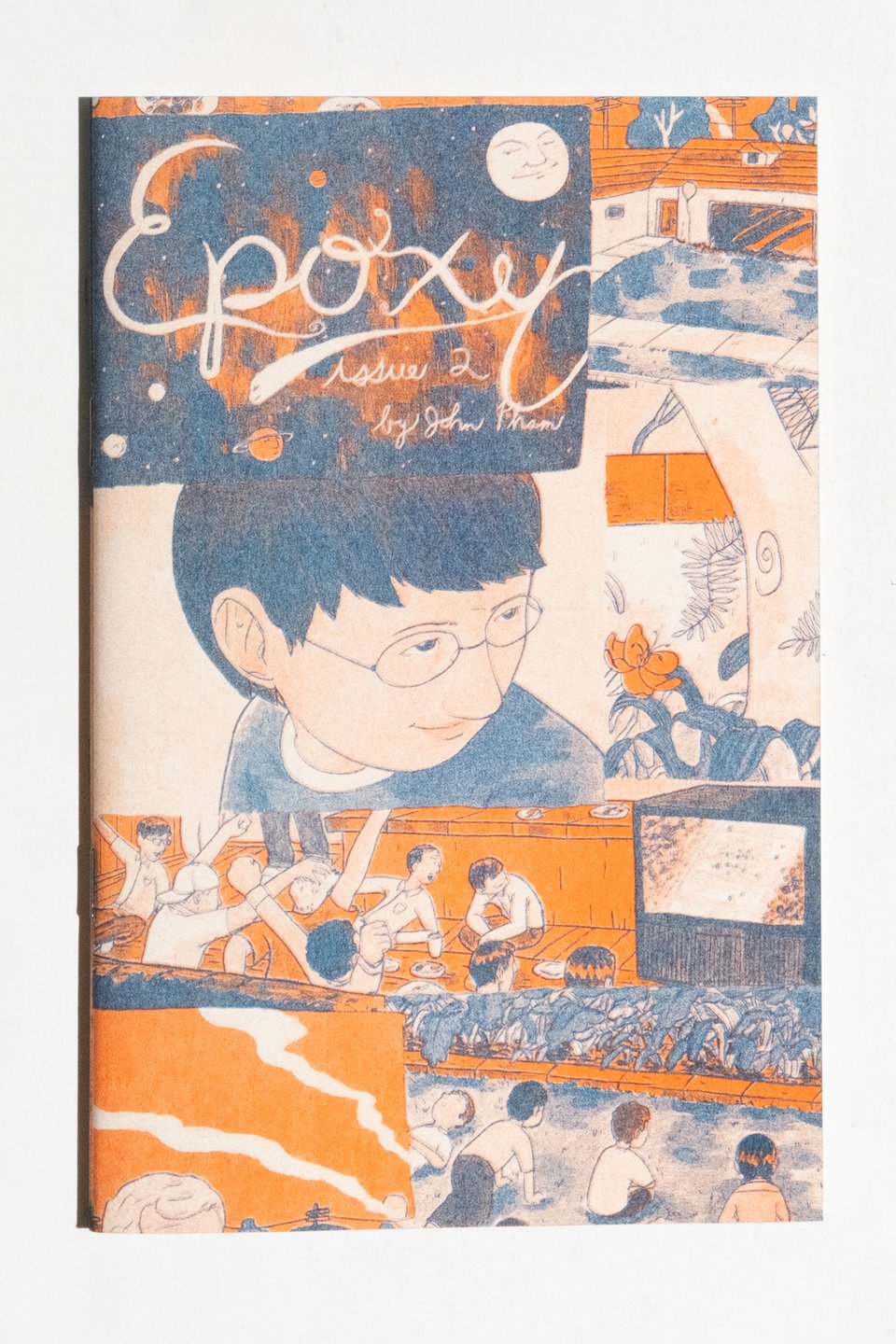
John Pham is one of those animators who quietly drops issues of the most gorgeously printed comics you’ve ever seen. Epoxy really hit its stride with the later issues when Pham’s riso palette expanded and his technical inventiveness was seemingly limitless. This earlier issue is smaller in scale (think printer paper folded in half) and the interiors are less ambitious print projects being single color. Still, Pham is a gifted artist without all the print trappings put on top, a fact that is readily apparent to anyone with this book in their possession. Oh and this one is a flipbook with a completely different story (also by Pham) on the opposite side!
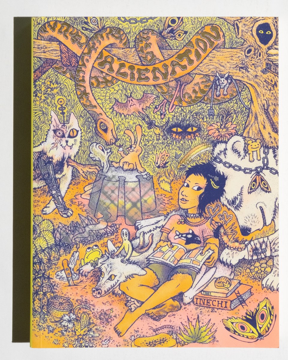
Alienation is an incredible comic. It’s effortless sci-fi. Estrada is a true talent. This TPB collects the original series from the self-published issues as Fantagraphics released it in 2019. As a sidebar if anyone is looking for some of those issues please reach out to me directly. It was recently reprinted in a revised edition that I have not looked through yet. Highly recommend seeking this out in one form or another.
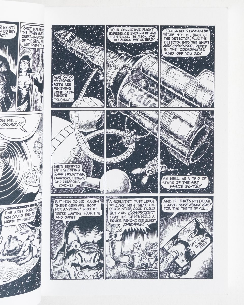
Twelve Gems is another Fanta book from 2014, when they were the pipeline for these great ~300 page books from indie artists. Milburn’s art here is a delight. I’m tempted to cite Six From Sirius as an influence–and that’s certainly part of it–though I see more of a relationship to the smaller end of the 80s scene. a bit of Matt Howarth texture, some of Strange Attractors and the bar scene in Teenage Mutant Ninja Turtles 5 and you are well on your way to what this comic is about.
“If Judith Butler's shitty nep-nibling ran a DND campaign it would look something like this. Highly recommended”
A line I like so much I used it in the product description too.
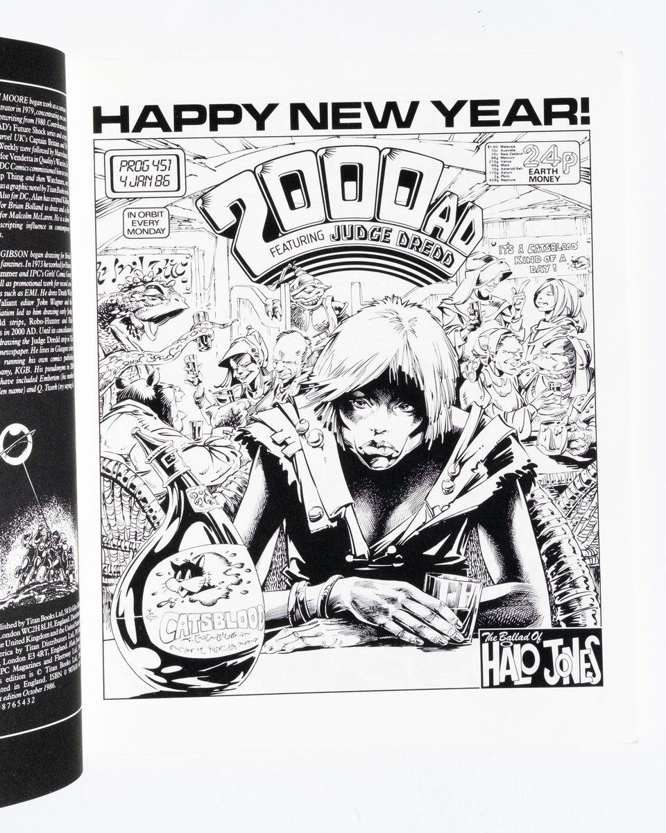
The affection for Halo Jones is well deserved. It is an early example of a softer side present in Moore’s work that wouldn’t be fully expressed until the 1990s and, I would argue, his departure from comics completely following that decade. It also delivers on his strengths at compact, episodic writing. There is a depth to the narrative arc that is made all the more bittersweet by the fact that the stories here are all we will get.
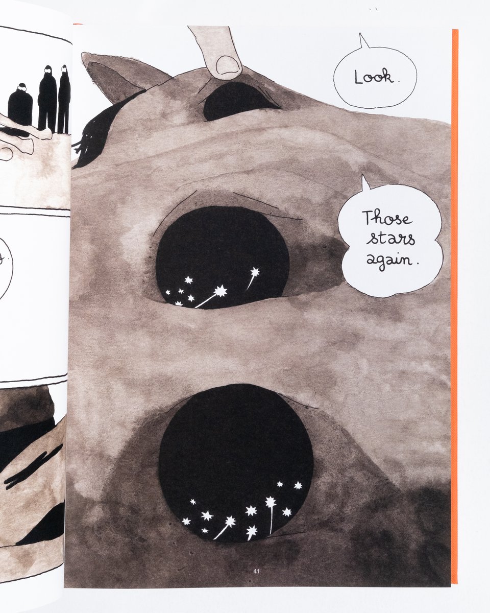
Continuing a theme, this is another large ~300 page graphic novel published by Fantagraphics of an accomplished indie artist. I strongly associate Cosse with the Breakdown Press boys across the way. He’s made numerous smaller books with them in the style seen above– Soft inkwashes, surrealist scale shifts and, later in the book, very thoughtful color application. One of the best presentations of new material Fanta has put out in quite a while.
I think I’m going to end this issue here with a plan (a hope? a prayer?) to follow up with another newsletter next week. Anyone who clicks through to the shop will note that there are A LOT of updates that I did not address here. I’ll feature those and more next time!