Bog Talk 001

Back again as promised and only a week past due.
let’s get this out of the way:https://mostlyfrogs.bigcartel.com/category/new-arrivals
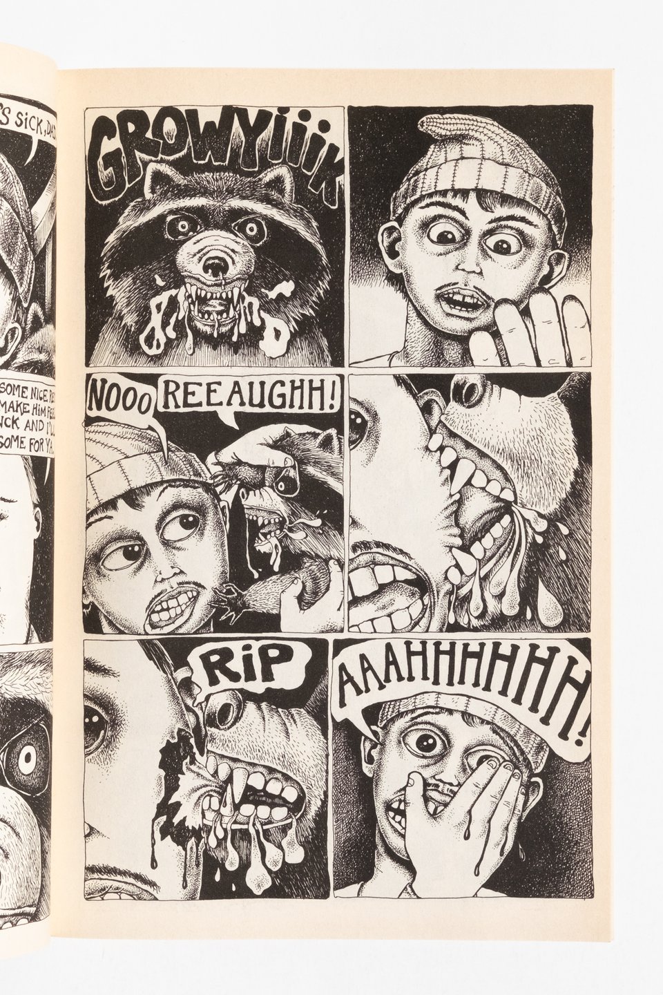
I’ve been reading a lot of comics lately. I know, I say that every time. But trust me, this time its serious. Whenever a lot is happening in the world I turn to comics. There’s a contradictory quality to comics any collector or reader will recognize that resides in the space between the satisfaction of finding that final issue of a run and the nagging feeling of incompleteness in the search. At least, I feel it that way. So, I’ve been reading a lot of comics and really soothing that part of my brain that wants to read every comic ever made. A couple weeks ago I resolved to only read stuff I already own for the next few months. I’m not sure how long it will last. But the point is, I’m forcing myself to read stuff that I have owned for years, the things I always say I will get around to but haven’t yet. In my reading and combing of my archives I stuck to one rule as guidance. Alternate more mainstream narrative with more experimental. It’s a pretty loose rule but leads to some interesting collisions of tone and overlapping synchronicities. Like swapping between seventies Colan Captain America comics and an issue of Mome. X-Force and Grit Bath. Grit Bath is a particularly nasty piece of early nineties Fantagraphics. Renee French has a talent for rendering the grotesque that would make Al Columbia blush mixed with the graphomania of Drew Friedman. Her work is deeply unsettling but then, so is Rob Liefeld’s X-Force. I’m trying to remember who said this in an interview, maybe Lale Westvind? that Liefeld’s drawing style is really scary in how he distorts the human form. I always think about that when I read Liefeld comics. This kid wholly raised on mainstream comics who learned how to reverse engineer the superhero drawing style to become a professional. Only everything is off in this weirdly compelling way. Of course whenever I spend too much time thinking this way about Liefeld I have to check myself with that gag from Pussey where the Spiegelman character loves Pussey’s art until he realizes it’s all sincere. Anyway, the X-Force comics would be a lot cooler with less dialogue. It sucks the momentum out of the page, but these comics aren’t about anything anyway. Just fun visual stuff to look at. I love Liefeld’s “scary” Toad update. ICONIC.
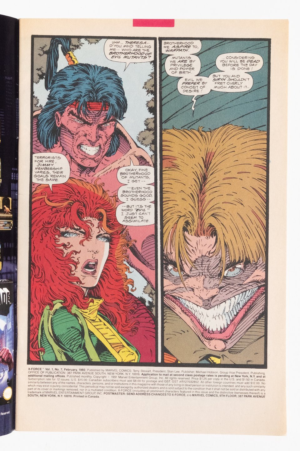
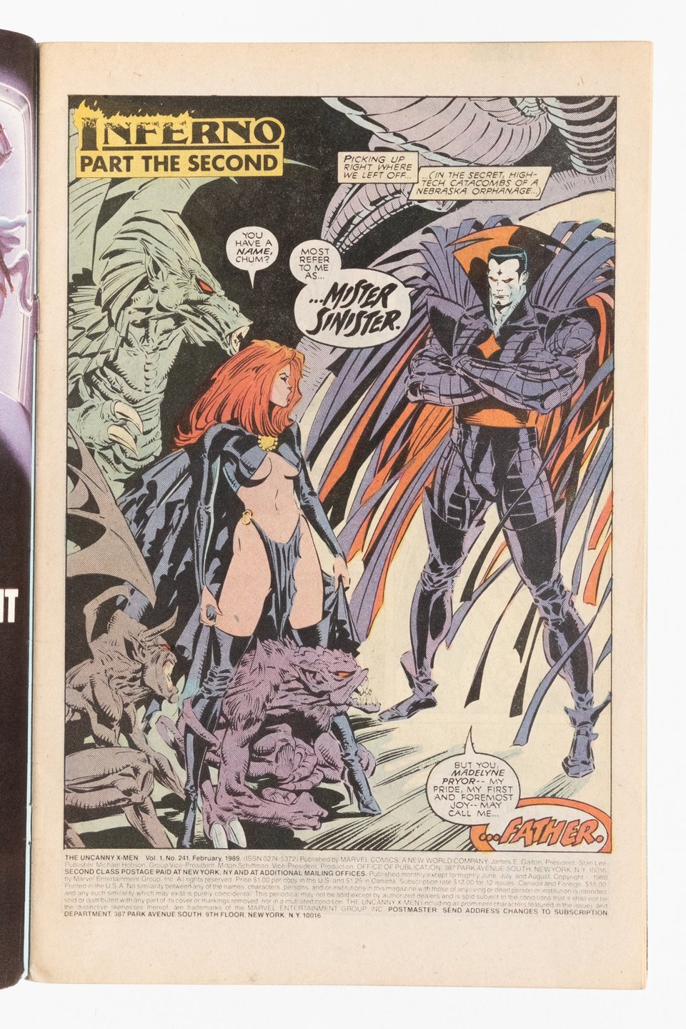
Yeah so this writing is going to be more rambly and less ABC Glengarry Glen Ross but hey, stuff I talk about is still for sale. Anyhoo The X-Force stuff is fun, #2 is the second appearance of Deadpool? Which I mention only to remark on how different the character is now. At the time he was just supposed to be another cool badass cracking one liners. The modern quip-y take was more a Joe Kelly invention if I’m not mistaken. All of this was lost on me as a child because I thought he was a cool badass. Also of note of course is the Mignola fill in issue. Still some of his best Marvel work. And then I threw in the crossover with Spider-Man by McFarlane and the preceding issue done by Erik Larsen. So that’s three of the founding fathers. Elsewhere in the shop are two issues of X-Men drawn by Silvestri, inked by Green. Four Image founding fathers ain’t bad. Those X-Men comics are near the end of Claremont’s time. The beginning of the end when the series started to buckle under its own weight. I wonder how much of this was Claremont and how much of it was editorial demands. Crossovers hurt the series in my opinion. And I am an avowed Claremont fan. I like to think he could have pulled it off perpetually had he been left to his own devices, but that doesn’t change the fact that these books were DENSE by the end of the 1980s.
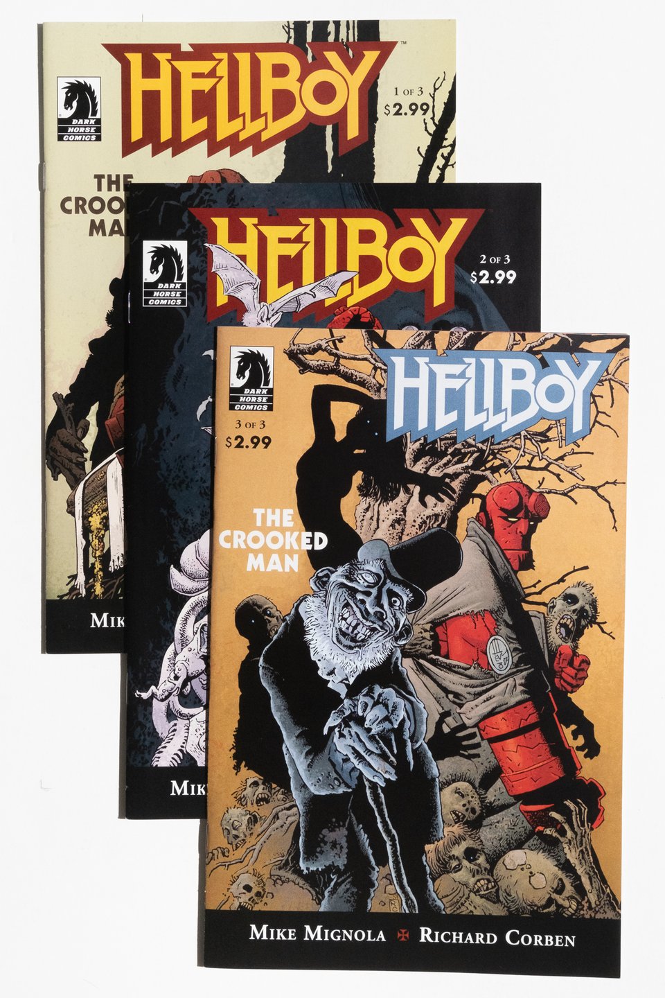
Hey speaking of Mignola, I was back home last month and brought back some Hellboy comics I got right when I started collecting. I just so happened to come in right when Corben was doing all these one shots and The Crooked Man. Pretty freaking good luck as a 13 year old kid to find these, but I think at the time I was confused by how un-Hellboy like they seemed. Ahh youth. Hey I’m also selling the complete Hellboy run they published a few years ago. It’s well loved but the perfect way to read the series. During lockdown I read everything Hellboy and BPRD I could get my hands on. Much as I like BPRD I think the ending of that series detracts from the ending of Hellboy, which I consider one of the all time great comics series. I don’t have a picture of it yet, the books have obvious wear—they’ve been read more than once and printing all that black ink is a nightmare for collectors to begin with. Shoot me a message if you’re interested. It’s going into a shop update in the next week or two.
Anyway I’ve been reading all these books and there’s something really comforting in just learning new information. Like that was a big part of the appeal of X-Force was all the mystery around Cable and Stryfe. Or the lore and mystery of Hellboy that kept things interesting. Its something that I admire about the big phonebooks of continuity the big two would produce. I read Essential Hulk Volume 1 recently. It can be too much to read that all at once, so that’s when I started mixing it issue by issue with something more alternative. Regardless, trends start to emerge. The book didn’t work as a regular length comics. The stories are plodding, dull, even though Ditko and Kirby are doing the art. Then after a cancellation and revival in Tales of Suspense or WHATEVER The title shares space with Giant Man and his stories get cut to ten pages. Suddenly the book moves, it actually gets somewhere. The hacky premise gets walked around the block just enough before going home. Is that a metaphor? Is it anything?
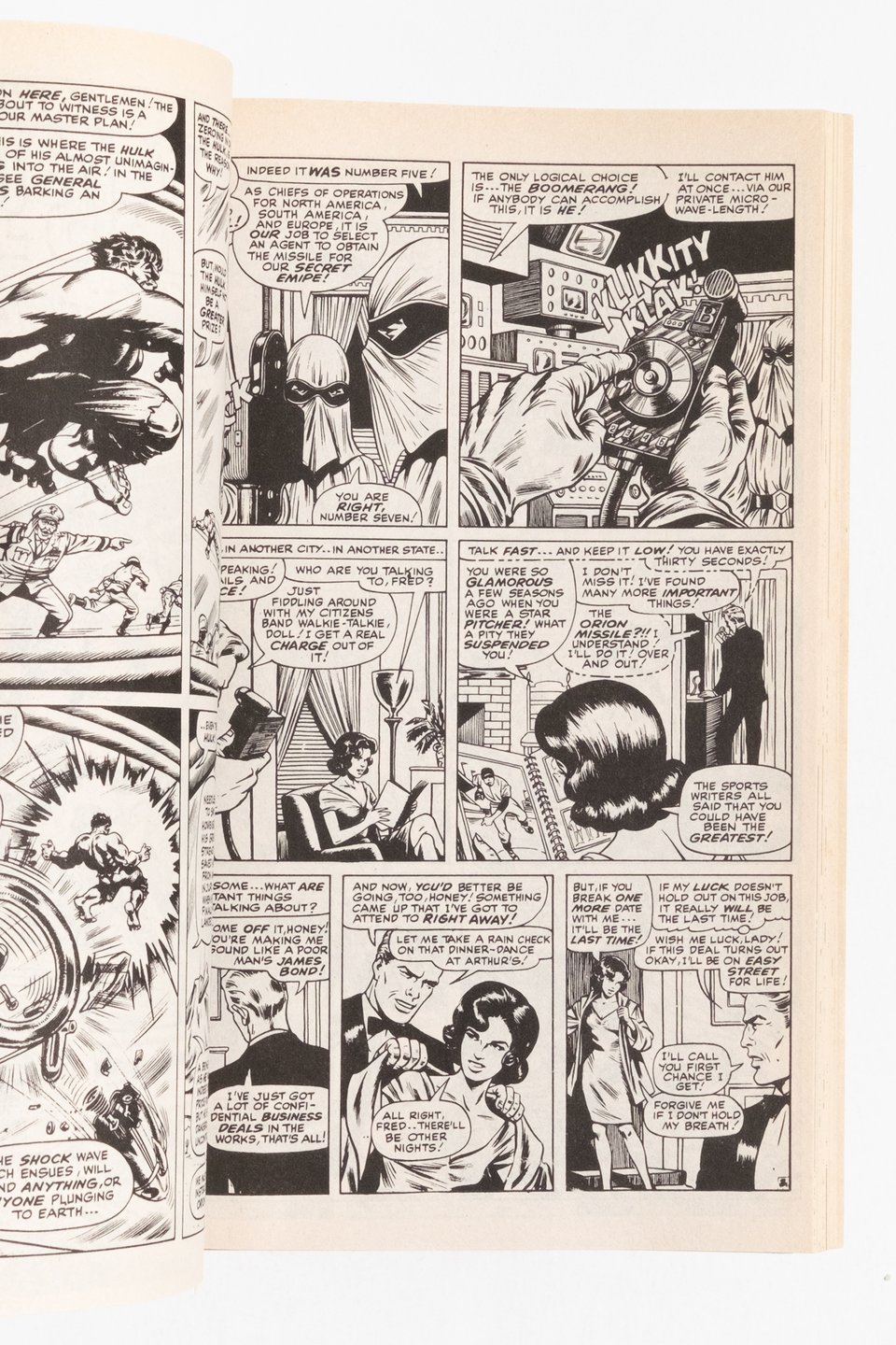
One final Essential Hulk thought. A couple of issues late in the book are drawn by Kirby and inked by Bill “Sub-Mariner” Everett. They are sublime comics. At least one of the issues is reprinted from the original art and words do not approach how gorgeous this looks (conversely, a couple issues suffer from being reproduced from copies that print horrible). It is an amazing blend of Kirby blocking with the lush golden age style of Everett. It’s very reminiscent of Charles Burns. Worth seeking out.
Some other books I alternated reading with Essential Hulk:
an issue of Drawn and Quarterly. Volume 2 Number 1 from 1994 to be exact. Nice Seth cover, a Jacques Tardi World War I story to begin. Excellent reproduction quality I have to point out. A gorgeous Carol Tyler story. Some work that was new to more. A perfect anthology in other words.
Now 10. Another perfect anthology. The spiritual sequel to MOME. This issue is from 2021 and features Richard Sala comic pages dating back to his graduate school years at Mills College. Dan Clowes found them in Sala’s archives after his passing in 2020.They’re amazing to look at, you can just barely see where his art would head in these pages. They remind me a lot of Eric Haven’s comics.
Palomar. It’s been a few years since I read these stories and never in this big hardcover format. Still incredible storytelling. I know everyone says this but it is just amazing the respect for their characters both brothers have. And sheesh don’t get me started on the art. We are so lucky to be able to see it reproduced at this scale on such nice paper. Anyway it is time to move on my copy.
I’m calling it here. There are a lot of updates in the shop, and I am making an effort to update it more regularly. Thanks for reading, talk soon.