On the Google Workspace rebranding
One of the biggest design news items in the past couple of days has been Google’s rebranding of the ‘G Suite’ to Google Workspace.
What do you think? Open disclosure, I am on the fence about this.
So, in this story, I am going to share my views on this very polarizing rebranding.
Déja Vú Moment
Before we delve deep into Google’s case, I want us to recollect the Facebook rebranding that happened at the end of last year. Facebook owns some of the (if not all) most popular social media and communications apps in the world. Let’s talk about its three most important assets - the Facebook app, Instagram, and Whatsapp.
All of these companies were founded by different people and teams but ended up becoming a part of Facebook eventually. (Snapchat, you could’ve been here too!) These apps, thus, came with their own design systems. Right from the logo to all the way into the UI, these apps were vastly different from each other in their design for the longest time. So, Facebook couldn’t really show off that it was part of the same social media giant. Well, not through the app at least.
People would riot if Facebook or Instagram looked like each other. Thus, they came up with an interesting strategy to envelope all the companies it owns under one single entity. Every app (IG, Whatsapp and a few others) have the ‘From Facebook’ branding in some corner of the app now.
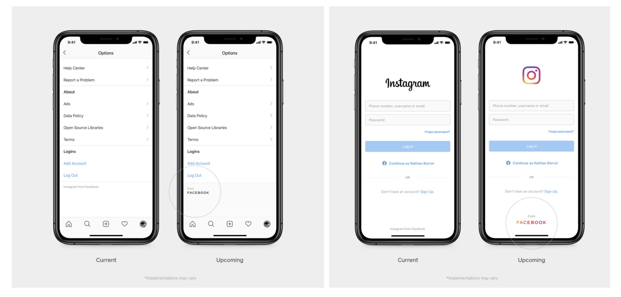
Changing the logos of all these apps didn’t seem like an option to them. They chose to preserve the brand identities of each of them while creating an overarching common element. In this case, it’s the ‘From Facebook’. This is a great example for a company that acquired assets and tried to envelope them under one common identity.
Another common example of enveloping different products under one brand is Apple adding the signature ‘i’ before its product lines during the early times. Lately, they’ve been dropping it though. Think they started dropping the ‘i’ from the Apple Watch. Until then it was all, iPhone, iPod, iPad, iTunes, iMac, iLife product suite etc.,

However this was easy to implement because Apple created every one of these and it was almost natural. Now, let’s talk about the protagonist of today’s story, Google.
Similar but different
Google story is similar to the ones above in some ways and different in some. The search giant created all these products in-house but treated them like separate individual companies (Similar to the IG, Whatsapp being developed in the silicon valley) and only keeping some common elements in between them like the name scheme such as the GSuite, GMail, Google Suite, Google Allo, Google Duo, Google Plus etc., (Similar to the Apple ‘i’ naming system) and some color palettes. But, for the large part, the company treated them like separate apps leaving them with their own brand identities (Like the Gmail App, only having the M in red on the logo and Hangouts having a green theme); and letting them have their own audiences. A Gmail User or a Google Docs user didn’t need to absolutely use Google Meet.
They let each of their apps grow individually. Now whether this was a right decision or not, I have nothing to comment. It just happened is all.
But, off-late Google is trying to pull off a Facebook-Stories type thing, did you see the Google Meet icon in the Gmail App that you almost never press? Yes. That. So, they’re mixing products now.

They’re doing this already and they’re now going to take this to a larger scale. The new Workspace suite is going to have a lot of apps integrated into each other. Like Google Docs having a Google Meet integrated into it.

Google hasn’t yet revealed what other cross-app integrations it plans on doing, but I assume that all of the main apps of Google - Gmail, Docs, Drive, Calendar, and Meet are going to be seen as one big product henceforth.
THUS, a common rebranding seemed logical.
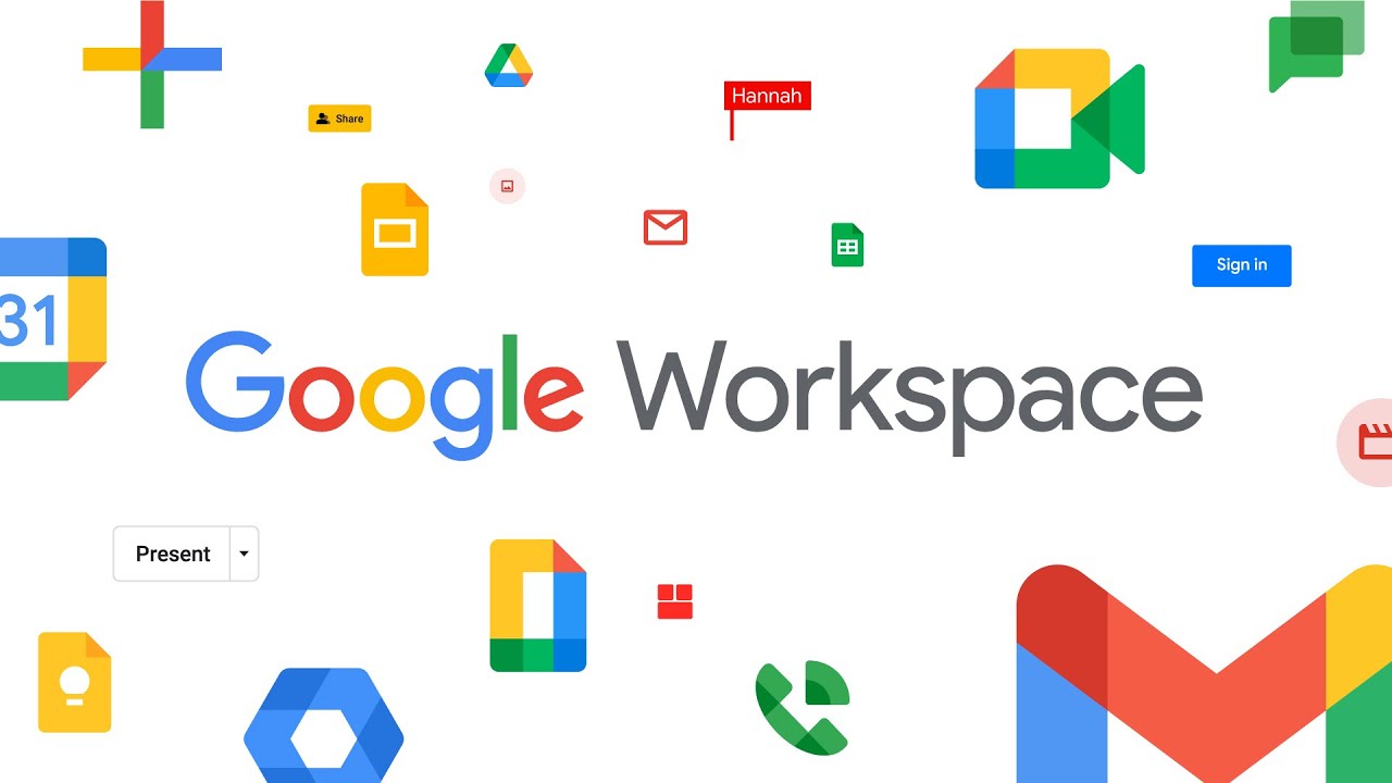
The Rebranding

From (L to R) : Gmail, Calendar, Drive, Docs, Meet
The top line is one we all know now and the bottom line is the new set of icons. Having read the story until here, I hope you can now see how Google is trying to unify its product lines with a different rebranding (Like Facebook adding “From Facebook” everywhere).
Let’s talk about the old icons for a bit. They were pretty. They pioneered the whole flat design culture (called Material Design by Google) and had a story to each of them. The Gmail App with that beautiful M on an envelope. A card flipping calendar, A document with lines on it. A communications app that shows chat and video calling. I know the Google Drive doesn’t make too much sense but they did have a story for that too.

Each color on the lines of the icon represented the three main products - Docs, Sheets and Slides.
And, now all we have are shapes. While the logic behind this common language makes sense, I am not a fan of the implementation.

Besides screaming Goooooooooogle, they don’t do a whole lot. Even some other smaller products have been affected with this rebranding change, such as the Google Chat.

Honestly, Google Chat’s change is more digestible to me than the others. The reasoning is sound. Execution not.
Digging Deeper

Google had different logos at different points but from 2015 it has pretty much stuck with the 4-color palette of the Red, Green, Blue and Yellow. So, the new color concept falls inline to that color palette to create a common identity.
The problem with the new updated logo set is two fold for me - shapes and colors. Let’s break them down.

- The shapes are too common between the products. All of them are made of similar looking rectangles with similar shapes, save for color.
- It is hard to differentiate the shapes if they’re viewed in a very small size.
- It’s hard to differentiate them at the first glance.
- The colors don’t say a story. I am not saying the previous ones did, but at least, the reduced number of colors highlighted some elements distinctly.
- Since these new icons don't look like anything that’s in the physical world, it’s hard to make sense out of them at first sight. Like, the previous Docs icon had a folded page with some lines of content, but the current one a similar looking shape to the old logo but with no meaning.
These are just some of the obvious ones I could think of. Can you think of anything else?
Concluding Thoughts
Instagram rebranding was received in a very similar way when it released but the new identity grew on people over time. So, we have to just wait and see what happens here.
This kind of a rebranding is surely necessary for a company that’s the size of Google. It’s a valid effort in trying to unite its products under one umbrella but I feel the execution could’ve been much better.
What are your feelings about this? You like it?
--
Also, many apologies for this delayed newsletter. I am aware that this should’ve arrived on Tuesday. I had to take some necessary personal time off for some work. Your Friday newsletter will arrive as per schedule.