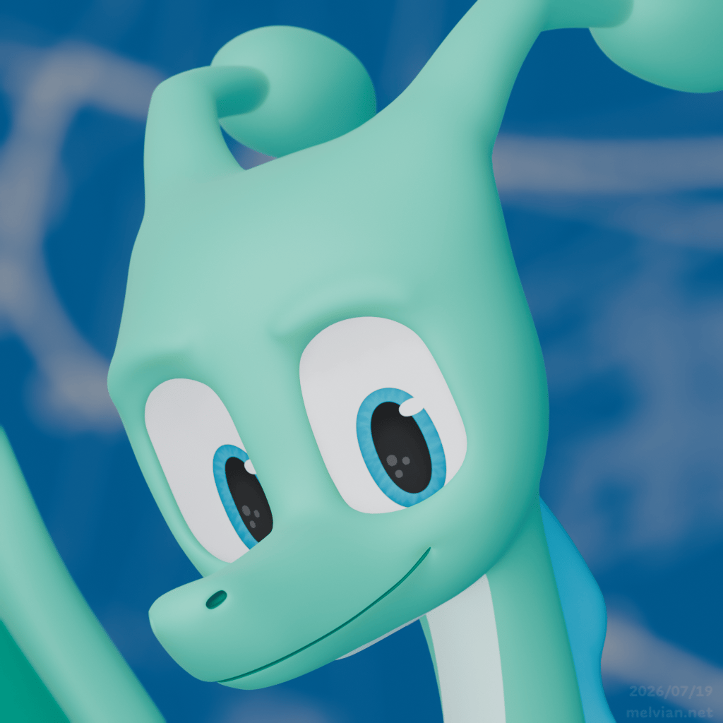
Being the typeface dragon
Some thoughts on my amusing but satisfying journey to be a slightly different type designer.
Rerrurr!!
Uh, before I continue with today’s topic, I’ve got a confession to make.
I follow Alchetype, the newsletter of the wonderful type designer Anne-Dauphine Borione1. (Oh also, go look at Dargon please!) I’ve been impressed with her commitment to the newsletter and it’s been making me motivated to write this next issue. Thank you Ando!
To be totally honest, I’ve been mega-distracted by the Catic project (announced two issues ago) and another top secret-ish project that I can’t wait to share more details about. If it weren’t for these things I probably would have written this sooner, but better late than never right?
For this issue I wanted to dump my thoughts on my personal journey to typeface design. And becoming a very silly creature in the process. In front of other typeface designers too. It’s been an amusing and satisfying journey and I want to tell you what it's been like.
The spark
I suppose we should start at the beginning shall we?
I’ve always had an interest in fonts since I was a wee little hatchling. It was right about the time that I discovered and played with Microsoft Word and PowerPoint, when I figured out I could use them to make my own little “movies” and other stupid things. Since my approach was basically clicking every menu and button and seeing what it did, naturally I went crazy with the system fonts. Then things really took off when I discovered the wonderful world of free font sites!!!2
I’m convinced that everyone who displays an interest in typography3 inevitably goes through the “wow these fonts are so cool!” phase, where they’ll use a font because they like how it looks and not because it’s suited for the context in which it’s being used. Most of those people go through that phase at a much older age than I did. I was personally fortunate to have mostly gone through it before I turned 10. Remarkably, I had realized back then that different fonts carried different voices, and that this could be used to my advantage. Though it’d still be well over a decade before my tastes in font choice refined to the point where it is now.
Being the intensely creative critter I was, even back then at that single-digit age, it was inevitable that I’d be dreaming of making my own font someday.
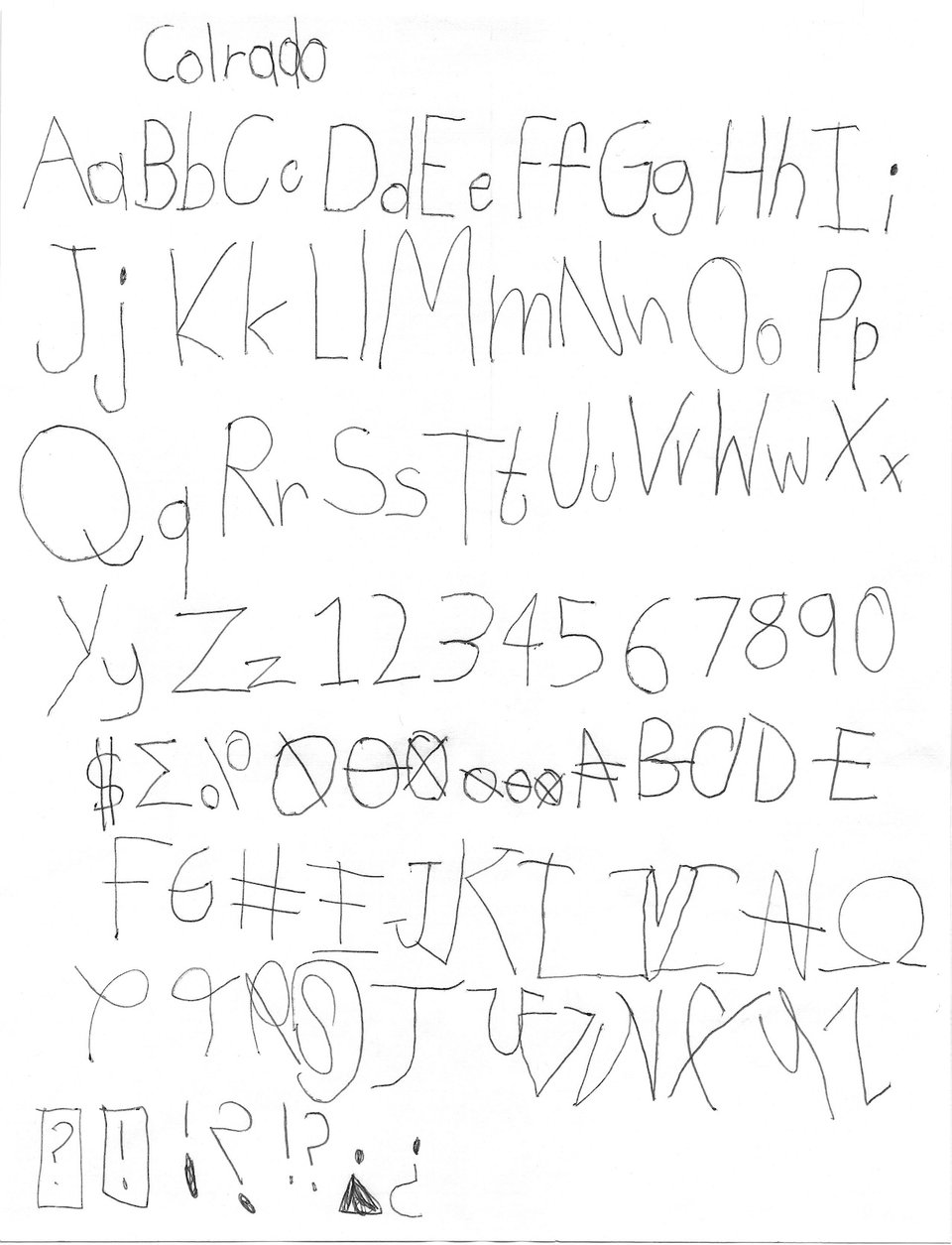
This is the single earliest artifact of my creativity that you will ever see. I somehow had the foresight to scan this back then, because who knows where the original paper has gone now.
It was also around this time that I got introduced to Gary Hustwit’s 2007 documentary Helvetica. I vividly remember the part where Matthew Carter opens up the raw Bezier outlines of Helvetica’s lowercase a, and I was totally amazed. I was seeing the inside of a font!! I wanted to know more about this!!4
Back then though, I didn’t know the term “type design” and I didn’t know how to find the kind of editors that were actually used. If I recall correctly, I might’ve found FontLab or something similar on the Mac App Store, which cost a huge amount of money. There would’ve been no way I could use a professional font editor. I did not have the mental capacity to understand working with Bezier curves and complex creation tools of that nature.
Fast forward
It’s 2015.
I’ve already been moving away from generic free font sites, mostly depending on Google Fonts instead by this point.
I doodle alphabets on my school notebooks, but only to get the ideas out and to keep myself from being bored. The idea of actually making fonts hasn’t occurred to me yet.
That year Google gives itself a fresh brand identity with a custom typeface, Product Sans. Not long after, I’m ranting to a friend about how every company on the planet is getting its own font and I cannot, for the life of me, understand what the point of having your own font even is when they all look the same.
And then a couple years later I’m doing some small logo designs for various projects, both my own and those of my friends. It’s at this moment when I come to realize the power of being able to draw your own letters. At this time I was using Inkscape, and somehow putting up with its terrible Bézier outline editing. Regardless, it wasn’t long before I tried drawing full alphabets in Inkscape. Then it briefly turned into drawing letters in Inkscape and transferring them to FontForge. Then I switched to FontForge completely.
It begins
2020 became the true beginning of my journey into type design. It was also when I began to understand why custom typefaces were a thing even if they seemed to look all the same. It began when I wanted to make a whole font for a project, and I knew I wanted a basic geometric sans with some specific characteristics. I swore there just had to be a font out there that had just what I needed. After constant searching through MyFonts and other marketplaces5 I couldn’t find what I wanted, and figured “Well, I should at least try modifing Montserrat or something”. What happened was I changed every single letter in that font to set out a single word. It was then that I realized it made far more sense to build a font completely from scratch.
And so that’s what happened. Trying to teach type design completely on my own, with the Internet and only a couple of books, has been no easy task. By 2021 it became extremely clear that I was pushing the limitations of FontForge and that I wasn’t going to get out of this rabbit hole any time soon, so I splurged some money on a new Mac and the industry-standard font editor Glyphs 3. This decision paid off immensely. I’m still using Glyphs to this day.
2022 was the beginning of my personal typeface, Melvian Sans. This was around the time I realized that I didn’t want to be a generic programmer anymore, but instead I wanted to be a silly dragon on the Internet. Though the dragon part of the identity wouldn’t materialize until nearly a year later as I was busy learning character illustration. Knowing by now how long fonts took to make, I intentionally started a year in advance.6 Despite this, Melvian Sans still went through a major overhaul in 2024, and the italics are also still due for an overhaul thanks to some feedback from Domi Federowicz.
First connections
Up to this point I’ve got a few drafts going and I’m slowly refining my skills, but I've been completely isolated. No mentors, no connections to literally anyone connected with type design. I’m on my own.
Late 2023 hits. An interesting foundry called XYZ Type is looking for a junior type designer. At that time, it was run solely by Ben Kiel and Jesse Ragan. I had already been familiar with them as I had found Jesse’s Aglet family, which I strongly admired (and still do). I, of course, apply, since I hit their minimum requirements. I was genuinely curious how my work was going to be received, as I have never had my work be seen by professional type designers.
I’m (rightfully) rejected, but they noted they were impressed by my portfolio and wanted to be updated about my journey. This began my first real connection with a professional type designer, mainly talking with Jesse, though I did have Ben critique one of my other typefaces.
Mind you, this did not mean I was a great type designer. Even now, I still have a long way to go. The fact that I have professionals complimenting my work says something though. Maybe they were just impressed by the quality of my outlines and my ability to draw nice looking sans-serif letters, though the spacing was definitely not that great.
The font dragon
January 2024 was the moment I became Melvian. It’s also when I started calling myself a type designer. I intentionally make my presence on the more queer furry side of the fediverse rather than the typographically oriented typo.social, sensing it would have more of the vibe I’d want to be in.
At this point, I figured I’d be too silly for professional type designers.7 Being a silly dragon and a type designer are not things you’d find in the same person. You’re usually one or the other, or neither. All the working type designers use their human names and their human likenesses. I’m the weird one for getting into type design and not presenting myself that way.
As a brief experiment, I created an account on typo.social that aimed to focus a little more on type, with a more “professional” profile pic instead of the headshot of my dragon self. But what happened was that the few type designers that followed me (and who I admire strongly) followed both my typo.social and my main account! Okay, interesting. I can’t be that cringe to these people.
So I ultimately closed my typo.social account and stuck with my main account for everything.
Rawrtype
My personal font foundry eventually launches as “Rawrtype” in late 2024, with the announcement of my first release, Melvian Mono, to be released as early access in mid 2025. I originally had a different font lined up to be my first release, as the Melvian font family is my personal type family and isn’t meant to be available for use by the public. But I liked Melvian Mono, and unlike the other Melvian fonts, it saw little public use, mainly being confined outside of my terminal and code editor. It was also much more ready for release than anything else I had.
May 9, 2025 marked the early access release of Melvian Mono. Despite the slightly embarrassing release, the typeface is well-received. Surprisingly, I get a few compliments from professional type designers far more experienced than I am. And I also get compliments from silly dragons.
On the exact same Mastodon thread.
I will never not find it hilarious. I consider it to be one of my personal greatest achievements on Mastodon. I’ve somehow gotten these two totally different groups of people to talk on the same thread. I’m entirely convinced that I’m the only person on the planet who could pull that off with those groups.
Regardless, it’s been satisfying to put out a release of some sort. It’s funny because people really enjoyed it, though I felt somewhat embarrassed about it. To be fair, I hoped I could match my expectations of being able to open up a complete independent web store, with an online type tester and all. The kind of thing that took independent foundries years to reach. But, ultimately, I said “Screw it, this is good enough for me”, and that was really the right decision.
I’ll be forgiven for starting so minimal and “slapped together”. I mean, type designers don’t typically start out with a full polished web store anyway. It’s interesting reading about how the well-established Grilli Type got started, straight up putting payment links on a WordPress site and emailing the customers the files when they had time. (Thierry Blancpain talked out it on TypeDrawers.) Compared to that, my launch is somehow slightly fancier, but I’ve also had the benefit of things like Itch.io coming into existence.
Current feelings
And I guess this lands us at the present day.
I recently joined a type design Discord server that’s got quite a few people I respect, and some new faces I’ve met and come to like. It’s been nice to finally interact with type designers a little more than I have in the past, and especially to expand my connections beyond just one or two.
I can’t really say that I’m “friends” with any of them, and frankly I doubt that I truly will, but that’s okay. I’m just grateful to have the opportunity to talk with other type designers at all.
Generally speaking, it’s been an interesting journey in many ways.
Some people get into a hobby with the hopes of “breaking out” and becoming established, or with the hopes of aiming to get some big dream project of theirs done, or even just to get a job doing that thing.
None of that was the case for me.
What happened was that years ago I got intrigued by the question of “What if I made a font?” and then just followed it. And then fell into the rabbit hole. And I couldn’t stop. Suddenly I had a dozen drafts on my computer, and a few professionals expressing interest in my work. Oopsies! How the hell did that happen??
I never intended to make fonts with the idea of impressing the pros. I didn’t think it'd even be possible. And frankly I probably would’ve continued with Rawrtype and releasing and using my fonts out in the public even if they didn’t care.
I make fonts because I can’t help myself. I get a stupid idea in my brain and I can’t help but spill it out. There is something extremely satisfying about paying attention to the smallest details and type design is all about that. There is something that feels so good about a well-made typeface, seeing it set in small paragraphs of text, communicating its message in a distinct but pleasant voice. When I started at the very beginning I thought I’d be mostly making display fonts, but it evolved quickly into focusing on text typefaces as I realized just how interesting it could get.
The fact that I’ve gotten some interest from people in the professional type design scene does mean quite a bit, and it gives me some assurance that I don’t suck at the craft even if I have room for improvement. A number of those designers are those I greatly admired when I began my journey, and it’s cool to see them admire my work too.
I’ve been framing this whole thing as if I’m an “outsider”, and the “pros” are this other group of people that I’m not part of and have this distance from me. And to an extent I am, in fact, an outsider. It feels cliché to say this and I’ve seen it said elsewhere, but in many regards professional typeface designers are just normal people. Some of their fonts might be used by the largest corporations on the planet, but they’re not famous. In many ways they’re like you and me. This has been the biggest thing I’ve taken away in the past year regarding my relationship to the type design scene.
Given where I’ve ended up, I think it’s fair to say that I’ve ventured well beyond merely “dabbling” in typeface design.
Rawrtype is something of a social experiment. I’ve come to the conclusion that the type design scene, as a whole, doesn’t have enough silliness. In general, I’ve wanted to see what happens if I mixed silly dragons and type design together, and for me the results have been positively surprising. You really never know how others will feel when you express yourself in a way that isn’t common. It can feel like quite a risk, and it certainly did when I interacted with other type designers as my dragon appearance.
But it has paid off immensely. It is satisfying to take two totally different worlds and see them collide on occasion. In addition to my expression of myself being unique, it’s also just very personal. I have honestly never felt like I fit neatly into any one scene. The only way I can truly express myself is to put multiple worlds on a collision course. This inherently makes me a unique character, but it comes with its own challenges.
On the queer furry side of the fediverse, I’ve gotten a reputation for being the “typeface dragon”. I find this extremely satisfying. It’s also fascinating to me, because I post very little about fonts, and my stupid little animations get far more engagement. Yet what sticks out to these creatures is the fact that I make fonts.
I wouldn’t be the least bit surprised if other furries have dabbled a little in type design. But I think it’s fair to say that I am the only non-human creature at a level high enough to be well received by the professional scene.
Future
This, of course, is only the beginning of my font journey. At some point, Rawrtype will be given a fresh coat of paint, and I have a typeface lined up for my next release. Also a few other things I’d like to do too.
What about Melvian Mono? I haven’t put out any updates for it, partly because I’ve been distracted with other projects, and also because I’m not currently satisfied with the existing tools for finishing up fonts, and I’m going to make my own. I’m taking my time with my releases. Expect Melvian Mono to be in early access for a few years. Once it exits early access I want it to be the highest quality font I can possibly make, not just in terms of the outlines and spacing, but also in the production of the font files themselves.
Anyway...
I could probably elaborate a lot on any one of those paragraphs, but I think I’ve said enough on the topic. You know, I wasn’t sure that I wanted to commit to this topic. After all, do I really have that many interesting things to say about myself? Is it even worth saying this much stuff about myself? I get very conscious of how much I talk about myself, because I feel better when I put the spotlight on the other wonderful people that are out there and are doing much cooler work than me. Life isn’t about me.
But you know what? You probably knew this was going to be about me and you read it anyway. I’m honored that I am worth your attention. I also did enjoy writing this issue once I had momentum. It feels good to dump a lot of these thoughts into a single place.
I hope you at least get something out of the stuff I write, and I still have plenty of things to talk about!
I’ll see ya in the next issue!
I’ve got another confession to make: It took me way too long to realize her name is actually Anne-Dauphine Borione and not Anne Dauphine-Borione. In realizing this I was subsequently reminded of the sweet ass-car. ↩
Related note: I remember there being one particular free font site I went to a ton, which shut down by the time I moved away from PowerPoint into actual animation tools. It had a distinctive orange and black palette, and the kind of minimal design one would associate with 2000s websites. I was chatting with a fellow dragon about it recently, and after I brought an old Mac mini from the dead and searching the raw Safari cache files I finally found it: typenow.net (Wayback Machine link of course) ↩
Typography is not type design. Type design is making fonts. Typography is using fonts. They are very different, though they overlap a little since fonts are ideally made to be used in specific contexts. ↩
I rewatched Helvetica a couple years ago, and it was really interesting to see it at a much older age, and well into my type design journey. It’s funny to realize that 1) the documentary uses an inconsistent mix of Neue Helvetica and digital Helvetica, given this was prior to the more historically faithful Neue Haas Grotesk, and 2) Matthew Carter had no involvement in Helvetica (besides the barely related Helvetica Compressed), and is clearly randomly clicking the mouse in the name of “getting footage for the documentary”. ↩
I hadn’t discovered the independent type design scene yet, but even now, I still wouldn’t have found what I wanted. ↩
When I started Melvian Sans I didn’t even know I’d be named Melvian. Early in its development the font was called “NewID Sans”. ↩
Jesse only knew me by my human name at this point, which he’d only known because of my job application. I would later admit to him about my Internet presence as Melvian, which felt a little bit scary for me, but fortunately it paid off. ↩
