A few personal updates
Time to play a little catch-up!
Rawrarr!!
I'm going to start off this newsletter by getting a few personal updates out of the way. Let's face it: it's been a while since I gave any updates like this. Heck, my last update post on my website was back in February! Which I'm gonna directly address later in this issue.
I am hoping that future issues will not be crammed with so many personal updates. Instead, I'll throw in one or two short personal updates, followed by a deep dive into some aspect of my creative journey, and focus on highlighting other people's stuff that I think are really cool.
The impromptu hibernation
Those of you following me on Mastodon may have noticed that I said I was going to start drawing again in June and post my drawing exercises there.
Well, June came, and I was definitely planning to do some drawing sometime in the middle of the month. But then before that time came, some unexpected things happened that made me feel the need to disconnect from Mastodon for a while (nothing bad happened, it's just difficult to explain).
And honestly I'm glad I took that break. I've been getting some really important stuff done, and I've even been making progress on things I had been putting off for a while. Some of that I'm gonna talk about here!
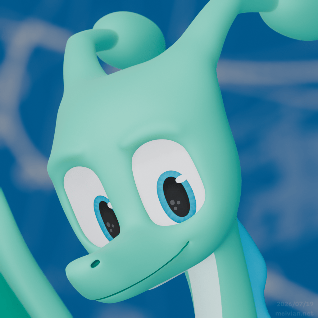
The main reason I was going to start drawing again in June is to get better at it, but also to start warming up for ArtFight. I'd also be putting together a new reference sheet for myself1 (the one on ArtFight is still the old model! Ewwwww!!!). But then all that got thrown out the window as soon as I decided to hibernate for a little.2 I won't lie, I felt a little FOMO from not participating in ArtFight this year, but that's fine. The stuff I'm doing now is far more important in the long term, and I can always participate in ArtFight next year.3
I briefly returned to Mastodon to repost one more animation from 2024 (since I said I would repost exactly three animations), and announce my newsletter. That's all. I've hopped off for a little while longer, and I'll probably return when version 2.2 of my site is all ready to go.
I accidentally influenced a professionally made font
So there's this typeface designer named David Jonathan Ross. He makes some real kickass stuff. Some of you might be familiar with his Input fonts. Maybe you've used his open-source font Bungee before (or if not you've definitely seen it, I see it all over the place, though not as common as, say, Helvetica).
I would consider him to be one of the few typeface designers I admire the most. I'm particularly very impressed by the wide variety of styles he's explored and doing it all incredibly well. Usually you'll get some type designers that specialize mostly in expressive display fonts, and other type designers who do almost exclusively text typefaces. And then you have DJR who somehow excels at both.
I should also point out that one of his fonts recently became the corporate typeface used globally by HP. Yeah, that HP. I'm not kidding, go to hp.com and you'll see that it's set entirely in Forma DJR. Did I mention that HP even commissioned him to lead the expansion of the typeface to different writing systems?
So he's kind of a big deal. Which is funny because compared to the amount of people who have absolutely seen his typefaces, almost nobody knows him. Pro tip: if you want to become rich and famous, being a type designer is not the way to go!!
Okay yeah, I mention all this because I think you should check out his work. But there's another reason I'm bringing him up in particular.
You see, one of the things he does that makes him stands out from all the others is that you know how buying fonts usually works? You pay lots of money to use a single font forever? Well he does that, but he also does another thing called Font of the Month Club where he takes a monthly fee from you and in exchange you get a new font delivered to your inbox each month.
It's genius because it's a win-win scenario for both DJR and the graphic designers paying him for this. DJR wins because he can mess around and explore all sorts of wacky genres of type and get paid to do it4. And it's a win for the graphic designers because each month they get a shiny new toy that they can make use of for their next big design project or what have you.
At the very end of May, he dropped that month's Font of the Month, a little sci-fi display font called Megawarp. Okay, pretty cool, nice to see a very good type designer take on this kind of genre. Cool story, design philosophy, I'm scrolling through the pictures, mhm, real nice thing going on here.
Then I got very surprised that among the large words he set in the typeface, one of them was the word...

...fuckery????

Oh wait a minute that word was actually flickery!
Still, I had a sense that I wouldn't be the first one to misread something like that, and I felt like I should at least say something about it.
With that, I commented on his Mastodon post about the typeface. And he actually went and added alternate letterforms, taking my feedback into account! Which I was not expecting at all.
But then it didn't even stop there.
June's Font of the Month was a counterpart to Megawarp, called Gigawarp. He not only added the alternate letterforms to that font, but then even explicitly credited me and linked to my font foundry Rawrtype!
Anyway, that was awfully generous of him to take it that step, so I'd like to give a huge thanks to him for giving my silly foundry a little more exposure! I don't expect that anything will come out of it given that DJR's audience is much more demanding than what I can provide, but it is wonderful for me to be treated by professional type designers like a real type designer, and for them to treat my silly little type foundry as a real type foundry. It is frankly the best thing that could happen to me during my type design journey, even if I still have a long way to go as far as competence goes. (I've got a lot more to say about that in a future issue.)
Announcing my first long-term project!
I'm mostly known for my silly animations and memes, and also for being into fonts. But for the past two and a half years, I've been aiming to someday present my idea of a path to a more sustainable digital ecosystem. Not doing it via blog posts, or even in words, but with actual, real, tangible software that would embody that vision.
I have spoken very sparingly about it so that I can commit to truly practicing what I preach. If I'm gonna talk about how software should be made, I should make it and present it to people first, because then my ideas might actually mean something.
Today I'm finally pleased to reveal my first long term project, Catic.
Catic is my brand new programming language, designed to be very simple and reasonably performant, yet expressive and highly adaptable. When I first started working on it, I initially planned for it to be a small project that might eventually get replaced by something else. But as I started developing it I realized this was the language I always wanted to build. So Catic will have a long future ahead of it, and I'm hoping someday it can evolve enough to become the language I use to write all my future programs.
Catic is currently being built for the purposes of building and maintaining my websites. I'm getting really close to giving it all the features I need for that purpose. Once I get there, both Melvian.net and the Safonts webring will be rewritten in Catic (from Hugo), and Rawrtype's website will be completely refreshed for an upcoming font release. Perhaps some new websites will be made too.
The primary goal is to make version 1 of Catic, with that focus solely on website building. Version 2 will be the next major iteration of the language, which will transform it into a general purpose language for writing any sort of applications. I'm splitting it into these two major versions because I've figured out that expanding Catic in this way requires me to significantly restructure the way Catic code gets processed and run. It will be totally worth it though, and it'll beat using C or any other systems language in many ways (although C will always continue to play a role in my software).
You might be curious as to how Catic syntax looks, and how you use it. The very short answer is that if you're at all familiar with any programming language, Catic probably won't look like anything you've ever seen. But those design decisions are also what make Catic such a simple and expressive language. I'd love to expand on the details, but this issue is getting a bit long already, and I also haven't come sufficiently prepared to describe the language in a way that might be more understandable.
Rest assured, Catic will have a minisite, complete with visual illustrations on how it works and the ability for you to try out the language for yourself. I don't expect most people to use Catic, but that's okay, I want to share my journey to creating more sustainable tools for building and using software. And for those who are curious about Catic, they have the option to explore it.
Anyway, Catic has been the reason I haven't updated my site in a while (though I did make one tiny adjustment), and I'm waiting to make any further updates to it until Catic is ready to go. It'll pay off hugely though.
One last really tiny thing
You know those old 88x31 badges that used to be prevalent on the early web? And that a lot of smol independent websites tend to revive those?
Yeah, I've had a badge of my own site ever since I began, and my current one isn't too bad. But I figured there was some room for improvement, and I've decided to a make a totally fresh version of it.
So here's my brand new 88x31 badge, in both still and animated form!


This new badge will officially debut with version 2.2 of my site, but I'm unveiling this one early since I like it a lot :)
Wrapping up
Oh geez, that was a lot, wasn't it? If you've come this far, thanks for reading! It means a lot to me.
I'm hoping the next issue won't be quite as long, but enough interesting things have happened since I gave out any substantial update that I wanted to play catch-up. Now I've done that, I can focus on smaller updates and info dumps. Which is funny because I didn't even spill out all my updates, they'll make more sense in the context of the next few issues.
The theme of the next issue is "Typeface design and colliding worlds", which touches on the "Fontdragon" part of "The Fontdragon Log". It'll touch on typeface design and its process, but also touch on my journey as someone a bit weirder than most type designers (or even dragons for that matter, it seems). I'll explain how and why I express myself in this way, and the ups and downs that I feel as a result of this.
Anyway, I hope you have a fantastic rest of your week!
Let's close with some news in the wonderful world of fonts:
- A few months back, Typotheque6 released a new set of fonts for the Tibetan writing system. When it comes to global scripts, Typotheque has largely focused on expanding their sans-serif family November, their rounded sans October, and their wonderful serif typeface Lava. Along with that release, they've also put out an article about the evolution of Tibetan typography. Notably, I find it fascinating that Toshi Omagari led the project (along with two consultants). Toshi is a pretty unique type designer, having touched quite a few scripts throughout his type design journey and apparently being competent at them too. It's not his first try at Tibetan either, he worked on Noto Sans Tibetan a decade back and talked about it at the 2015 Granshan conference.
- On the subject of global scripts, DJR's Fit received an Arabic companion designed by Sahar Afshar, and even a Kannada adaptation by Taresh Vohra. Usually the kinds of typefaces that gets multiscript extensions are for long form text. Which is great, but there hasn't been enough exploration of scripts beyond Latin in the realm of display type. It's so cool seeing top-notch designers push the boundaries of their native scripts under the extreme constraints of Fit.
- Alphabettes, a loose network about promoting women and non-binary type designers, released a new book called Alphabettes Soup: Feminist Approaches to Type. I just bought a copy as I'm typing this. I still gotta finish Baseline Shift though...
- Speaking of feminism! Robin Mientjes's Gagneur is a very nice serif typeface that recently came out. It only supports Latin, but its design process is grounded in questioning established notions of type history and avoids paying tribute to any specific "archetype", most of which were established by (and credited to) men. Go check it out and also read the design notes.
-
Or in other words, my "fursona", as some people call it. I'll also call it "3D Melvian" or "3D me". If you're not used to me making reference to how I'm really a cartoon dragon, you will get used to it by reading this newsletter! This won't be the last time either!!!! >:3 ↩
-
Not updating my ref sheet turned out to be a good thing because 3D Melvian received more significant changes. But that's a topic for a future issue. ↩
-
I'm also not too disappointed because it takes quite a bit of mental energy to draw characters other than my own.
Besides, I'm not cool enough to be drawn anyway.↩ -
The alternative, generally speaking, is spending several years of your life on a single design, crossing your fingers that it'll be appealing enough that you can make enough money to compensate for all that time you spent making the damn thing. And for that typeface to be appealing, it needs to be versatile so that graphic designers can make good use out of their lost money. Which is why type foundries sell more text typefaces than display typefaces. James Edmondson has first-hand experience confronting this reality. Though now there's Future Fonts, and similar models of releasing typefaces in "early access". Oh wait a minute, I know someone else who's doing that too! ↩
-
In case you're trying to find that image, DJR went back and edited the article to replace that word with "midnight". Which I don't blame him for at all. ↩
-
It's pronounced "tee-poh-tech". ↩
