
Step by Step
Hello, everyone!
Did you miss me? Sorry I didn’t send you a letter last month. An absolutely massive old oak owned by the landlord next door crushed my house a while back. We’re all fine, but the roof, attic, and a whole bunch of the second floor interior walls got smashed up. Then we had to move out of our house for repairs, and as soon as we did- literately as my wife was bringing in the final load from our house, the temporary apartment flooded because the landlords didn’t hook up the washer’s drainage pipe correctly.
So, we’ve been having a super fun autumn.
Now would be a lovely time to recommend my books to others, or request it from your local library, if you happened to be inclined in that direction.
But, I am sick to death of coordinating all of that, so let’s talk about something else.
I got a long overdue haircut today, and I’m waiting on a new pair of glasses, and these edits to my daily appearance happen to coincide with working on more anime-inspired character designs for my next animation project—an anime opening credits inspired trailer for Shattered Idols, the book I’m currently editing.
Combined, it has me thinking about character design, and how it impacts how I think of my own appearance, and how much I hate how character design is usually taught, at least online.
Because normally, when you look up information on designing character what you get is “here is a heroic shape: it’s a thin tall man with a triangular torso, and you can add diversity by changing how wide the triangle is!” or “Women are made of rounded angles and men are made of sharp ones.” They equate body shape and personality, and generally reinforce every stereotype you can think of, when and if they acknowledge diversity at all.
Which is both aesthetically and morally bankrupt. It’s also—and this is not a word I use often or lightly—lazy. Someone’s appearance obviously does not determine someone’s capacity for heroics. Or even for physical capability. (Have you seen that fantastic series of photographs on Olympic athletes? Fantastic reality check for this line of thinking).
I thought we covered not judging people based on appearances in like kindergarten, but I guess some people didn’t retain that lesson past grade school.
So, setting aside bog standard cut and paste character design, and getting back to the real world, how do real people, who are starting from a body made of flesh and blood instead of ink or pixels, show others who they are? The obvious things are clothes, accessories, jewelry, hair style, tattoos, makeup.
Those are the sort of things I focus on in developing my own appearance. I can get a haircut, or buy a cool new set of wood-framed glasses. I can get another tattoo or piercing or even make a set of loose linen pants and dye them black. I can’t decide that my character design would be better if I was 6 inches taller and just edit my design.
The choices a character makes about their appearance, combined with the less obvious— posture, movement, and facial expressions—are all part of what a person puts into the world, without even making a sound. Those are the things I focused on when doing the character designs for my first animated project. But, while I remain very proud of my animated trailer, and have a general idea of what all my own characters look like, I kept finding myself dissatisfied with them as character designs themselves.
So, what else is there, that makes for an appealing character design—not even necessarily cute or attractive but nice to have in my eyeballs? Just about everyone has their own opinions about what makes someone cute or attractive (I actually did an undergraduate thesis on cultural models of infant cuteness) but artistic appeal is harder to pin down.
So, this time, I started off with the designs I did for the first project, then looked at a lot of anime I enjoyed the look of, and converted my characters to those general looks. That gave me terrible results, but a decent starting place. Then I had to un-anime them a little bit because anime typically features very simplified and limited noses, and next to no lips. And that’s an issue if you’re trying to depict a racially and ethnically diverse cast without being weird about it, since a lot of characteristics that carry that information are in the nose and lips. So I had to sort of reverse engineer all of that.
Then I switched those up because this next story takes place in the dead of a northern Midwest January, and the characters have made some changes to their appearances since the first book in the series.
Next, I considered color design, and how to create a harmonious design that still had contrast and excitement. This step actually took me ages, and I tried a lot of different approaches. I tried reading up on color theory (moderately helpful as a refresher). I tried straight up stealing colorways off of My Little Pony characters (fun but did not work out because the results always looked like they were for grade-schoolers, which is not the vibe for a book with this level of violence).
I finally ended up focusing on the hair color of each of the characters, and searching for “palette” with the hair color, focusing on those with a bit of contrast. That could be light/dark contrast, or it could be warm/cool, or opposite colors, but it needs a bit of contrast. I don’t know why people on the internet are making these, but there’s loads of them. I think a lot of people use them for picking wedding color schemes? I also tried to keep in mind what kinds of settings I needed them to sit well in, color-wise.
Part two of this step is that, after I had a bunch of them for different characters in the cast, I started adding a level of repetition to them. If there’s gonna be green on multiple of them, I want them to be the same green, so they look harmonious and uncluttered together on the screen.
The next editing round was for looking at shape. One of the best bits of design advice I got from the cartoonists’ side of things (most of it was not applicable for me) was that each character in your cast should be identifiable by their silhouette. So, even though everybody is wearing their winter coats, they all have to be a different essential shape—while remembering each character’s background and making sure the type of coat and clothes they pick works with their style and what they’re doing in the book.
Then, I looked at each character, and thought about what shape they had prevalent in their design that I could turn into a motif. So, Jamie for example, had a bunch of angles, so I pushed the triangles. Triangular eyebrows, bangs, coat shape, shirt collar, boot tops, pant bottoms etc. Having lots of visually exciting angles works for her, especially when softened with pastels. It’s subtle—again I’m not doing a Tex Avery cartoon here so things have to be subtle—but it worked.
Issac has his curly hair, so I added puffs to his coat, rounded his collar, looped his scarf, and so on. This worked because he’s got skinny little legs and a narrow face and thin hands, so the curves are a visually appealing contrast to the straight lines which makes that appeal.
So the process looks something like this (only a lot less linear):
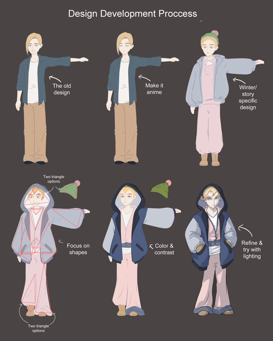
And I’m more or less happy with the end result! It feels more polished, more fully designed.
Now I just have to do that for every single character who appears on screen, in every outfit they appear in. So far, that’s a cast of about 16, with about 1/3rd of them appearing in multiple outfit variations? So, wish me luck!
Before I vanish for another month (unless you’re following me on Tumblr), I have my monthly free action item ask. It will not surprise you, my fellow Americans: vote. I did it early voting today. If you’re dithering, I will add; not voting isn’t a boycott. Not paying taxes is a boycott. You have already sent money into this system. It is on you to do what you can to steer it.
Happy Halloween!
Lee Brontide
Add a comment: