326: that mean green bird rolling its eyes
Hullo
Rebel With a menopause
Capsule
Exquisite
Links
Bye
****
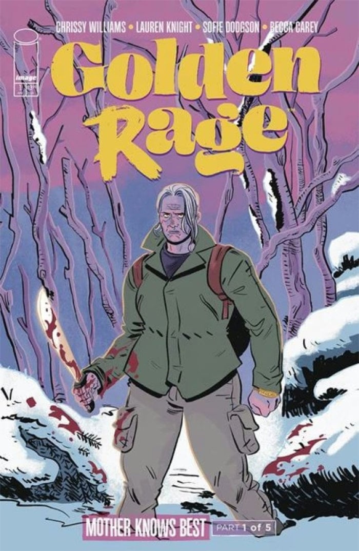
Rejoice! Golden Rage has returned with its second series, Mother Knows Best. Want to know more about Golden Rage? Here’s a bindings site for your elucidation, as well as links on how to get the first series. Can’t be bothered to click on a link? The shorthand is “Battle Royale meets the Golden Girls” but with less interest in the high concept and more interest in the high art. I interviewed Chrissy about it last month for more details.
Also, as per usual with an image launch from a sleep-deprived parent, it’s led her to do things like this.
I’ve made an important video to mark GOLDEN RAGE: MOTHER KNOWS BEST going on sale today. Enjoy! (Preview links to the comic below too) (Uh and please buy our comic! Made by me @laurenknight.bsky.social and @sofiedodgson.bsky.social) [contains quote post or other embedded content]
— Chrissy Williams (@chrissywilliams.bsky.social) 2025-04-09T10:13:12.581Z
Golden Rage!
****
Appearing in the next issue of The Power Fantasy, I’m starting to include capsule overviews of some books out from Image in any given month. Due to our book coming out in the back end of the month, I’ve realised it’s likely best to get it out there early. So here you go.
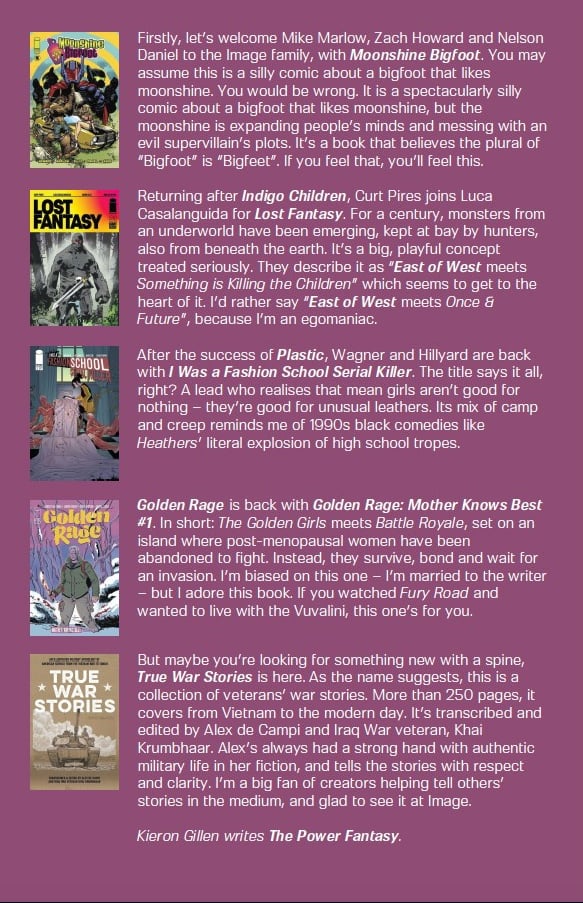
More next month. It’s not the full design, but I realised that Rian’s lovely layout isn’t exactly conducive to be read online, so I’m cropping it.
Do share.
****
After all these years, I’ve only now worked out how to stick in a subscribe form in my newsletter. Man!
****
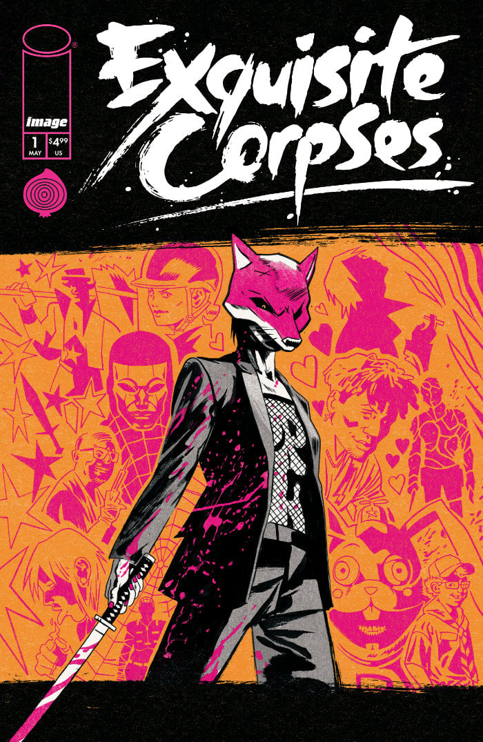
DOUBLE IMAGE: James Tynion IV on Exquisite Corpses
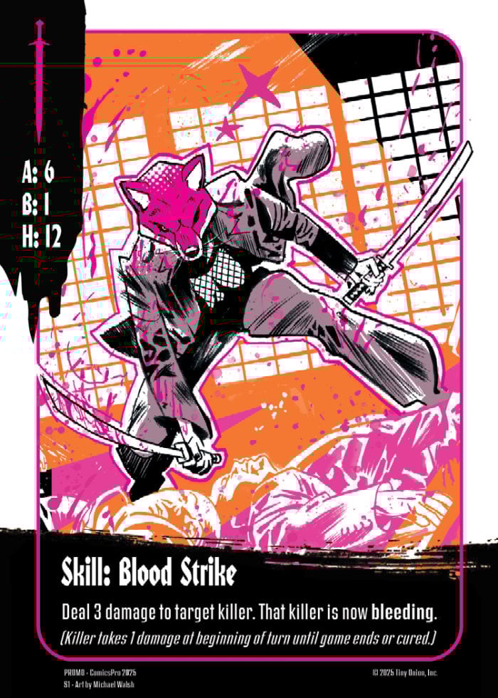
The more I look at Exquisite Corpses, the more I’m fascinated at the gleeful audaciousness of it. I had to speak to James about to it, and after that, I’m going to speak to Michael Walsh about it. It’s got so many ideas thrown into it, you’ll see in these questions the moment where it’s revealed I forgot there’s a bloody card game involved with it too. It’s got the level of swagger which I love to see in Indie Comics, a book which laughs at the word “indie” and decides why not just take over pop culture. I think this is going to be huge.
Is it possible to have too many high concepts? I would say on the evidence of Exquisite Corpse, you would say no. The monstrous families who secretly control america drop 12 weapon-themed killers into a (deliberately) small town and whoever wins, controls America for five years (and probably kill other people too.) Battle Royale meets the purge meets... well, if you make a list of the elements and influences it sounds like the world's most exciting (and brutal) shopping list. But it's also a high concept in its production - you and Michael, and a team of people, working in a writer room fashion, in a way distinctly unlike Indie comics are usually done. The multi-level pun title, of having rotating creative, in the manner of anExquisite Corpse in a story about making corpses, exquisitely? The fact it's 12 issues, when 12 is so key to the book? It's a lot, and deliberately a lot. Some say less is more. I think this is a more is more kind of book. Am I off the mark?
I think you're hitting it right on the head. This is loud book. It's loud in its construction. It's loud in its imagery. It's loud in its design. In its marketing. The creative question from go was how can you take a fun high concept like this and get the comics market to treat it like a superhero event comic from the release of issue one, and do that without the bag of tricks you have in licensed comics or at the big two. We can't drop a Transformer or a Ninja Turtle or Doctor Manhattan in here, but there is a kind of blockbuster storytelling we're trying to tap into here. It wears its King influences on its sleeves, but I was also trying to tap into a Spielbergian scale from go. We want people swept up in this, and asking questions about the universe. We're starting with a sixty page issue that we're selling for the price of a book one third that size, and the goal is by the end of that issue we want people excited to pick up the next one and the next and the next. There's been a lot of conversation in media spaces about this being the attention economy, and there are ways you can make people pay attention. We wanted people to pay attention. It's definitely not a shy book. The energy expresses the spirit of the thing, and the scale.
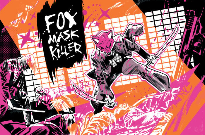
Previously you've talked about how comics (and especially indie comics) don't go big enough with the looks of their characters. Popular Manga, even the grounded ones, have these big bold iconic looks. I can see that thinking in play here You can imagine all 12 of the weirdos being the big deal or lead character, but you know that (just from the concept of the book) some are going down, quickly.
For me it all goes back to Erica Slaughter. There is a lot that we could have accomplished with Something Is Killing the Children without her iconic mask, but that image cemented the book for me and for readers and it changed me as a writer. We're operating in a visual medium, and it's important to lean into that. And even knowing that some characters would die very quickly, we knew that each of them needed to have enough of a visual hook for people to feel like they COULD live longer. There's also a card game component to what we're building here, and we want people to want to use the cards of the killers who don't make it far through the comic. Each had to stand alone, but look exciting and dynamic all together. Walsh and I spent a long time thinking about the sort of aesthetics that you can see in games like Fortnite, in superhero comics, in slasher movies. We wanted to lean in without trying to make any of the characters just a nostalgic throwback. We kept leaning in to the killers whose core concepts were the most visually exciting, and we felt would lead to the best story. It was an exceptionally fun process.
The production method - the team of people, working on the book. You've referenced what you missed from WFH comics, and trying to bring it over. How does that work? How much freedom do folks have? How much is the master plan? How were folks brought aboard?
Before the rest of the team were brought in, I had written the bible for the world and its characters. And Walsh had designed every killer, and every civilian. There were only a couple of dynamics that Walsh and I laid down that we hoped people pick up -- an affinity between two of the killers, and a rivalry between another two -- but everything other than that we left to the room. We laid out how the story started, and the rules of how we would tell that story. Those pieces were locked. There was only one line of dialogue in the first issue that changed in a fundamental way after our creative summit. But from that point, the rules laid down, we let all of these phenomenal creators play with this world, and suggest what might happen next, and who might die in what order. We set the rules of the game, and the team had the freedom to play within those rules, and then we tightened the whole story as a unit. It was honestly one of my favorite collaborative experiences of my life.
I've talked a lot of the sturm und drang here, but the normal side needs to be stressed. It's not just the flamboyant killers. It's also their handlers, from the family, sipping drinks while the blood spills. But more so, it's also the people in the small town. Yes, it's a triple sized debut issue, but to delineate all these people so we care about them and their survival (or root for their death) is a lot. Care to talk about the structuring and planning for that?
It was one of the rules in the room. For this story to work, it had to be from the perspective of the ordinary people caught in the crossfire. Otherwise this would just be a callous action comic book. We need to feel the horror of what it would be like to be caught in the crossfire of this brutal, inhuman game designed by people who could not care less about the ordinary humans on the ground. Horror doesn't function as horror if the Slasher is the protagonist. Here we have a civilian ensemble who are alltrying desperately to stay alive, and to understand what is happening to their small town. That was always crucial to me. The killers are the noise, and the spectacle, but the human characters are what make this a compelling story issue to issue. I honestly can't imagine doing it another way.
Neil Tennent from the Pet Shop Boys coined the phrase Imperial Phase to describe a certain point in a creator's career. It's not just being enormously successful - it's also being successful in a way which means people will take a leap of faith with you, and you get to push the boundaries of the field you're in. Do you recognise that in yourself right now? Because this feels like an Imperial Phase project.
Look, I hope so. I hope people take the leap of faith, on Exquisite Corpses. There's a lot more stuff I want to see if I can get away with.
Exquisite Corpses is available to pre-order now from Image Comics.
****
I spent the weekend in Italy, at Play Bologna, my first ever Italian Gaming con. It was quite the scene, but to capture a bit of its vibe, here’s Grant opening the zine that was for sale, embedded in a concrete block that you had to smash with a hammer to get at It’s this sort of thing which I think of when trying to explain the indie TTRPG space is one of the most hilarious and vital art forms right now.
The GNS Big Model is a bit of games theory dating from the days of the Forge – Gamist, Narrativist and Simulatiounist. Now, what that means has shifted significantly over the years (and been superseded in lots of ways) but still (for me) is a useful enough lens that I made it the three schools of magic in DIE RPG. Anyway – here’s Vincent Baker looking back at the theory after twenty years and picking it over. It’s good stuff.
Zach over at Goonhammer digs into accessibly and in detail at what Tariffs will do. It is mainly a game centric article, but the broad lessons apply to a lot of things – if you’re wondering how it may effect comics, this is a good place to nose too.
The Cartoonist Rebecca Burke interviewed about her experience being detained in the US.
I don’t speak Spanish but was interested to see this attempt at doing a Krakoan Primer, including big ol’ graphs. That’s the way Saint Jon would have wanted it.
****
Today is a quick one – C was off visiting a friend, so I had Iris for the morning, and we need to go out at 6. So I need to cram in a lot inbetween and my brain isn’t exactly 100%. After this I’m meant to go onto the lettering draft for The Power Fantasy #9 and I likely will just do a first pass, and then get over tomorrow after I’ve had a night’s sleep.
The other thing on the plate is wrapping the details for The Wicked + the Divine Compendium, which is going to press this week. We’re still tweaking the cover, and making sure it all ties together. It really is huge – over 1500 pages, for sixty dollars. We’ve used the word “masterpiece” on the back, and I’m not even slightly ashamed at that.
As said above, I was in Bologna for Play at the weekend, which was an interesting look at the scene. It seems slightly more indie-friendly than the average UK (and certainly US) con, but that’s hard to ascertain. The big difference is actually that gamebooks are still a big thing there. In the awards ceremony we RPG Magnifico at, there was a category for gamebooks. This prompted me to go and grab some – specifically, the one called Gandalf Girl, which is a hell of a title, though I’m not sure the Tolkien estate would approve.
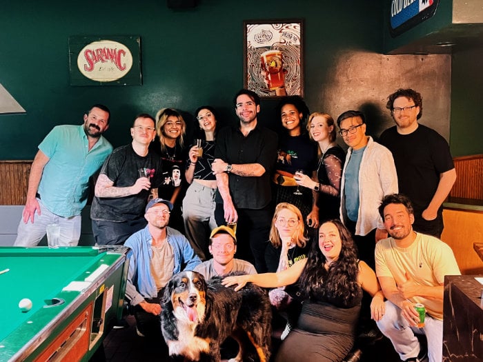
Yes, you may have spotted the casual namedrop in there. We were absolutely honored to win the RPG Magnifico award for DIE RPG. Here I am, with Stephanie, Grant, Chant and my new friends at Isola Illyon Edizioni, experimenting at smiling.
I made a quick acceptance speech, where my Duolingo was vaguely functional enough to butter everyone up with “I Giochi di Italliano sono magnifici!” except I probably said magnifico, which would have that mean green bird rolling its eyes at me.
The other new creative thing worth mentioning was I did another quick one-off playtest of the new game I’m noodling on, which now looks like this…
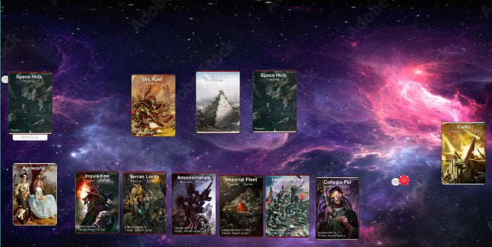
...which is significantly prettier, as I had some time with Affinity Publisher and more time to (er) borrow art for the early prototype. I’m especially delighted how the dramatic starfield says “Adobe Stock”. God is in the details.
In terms of new comics work, I’ve nearly finished issue 10 of The Power Fantasy. It exists in a draft, but I’ve decided to sit on it a little bit (as Caspar doesn’t need it yet) and see if I can work out a way to edit it to do something fancy. You know me. I like the fancy.
Right, onto the lettering draft.
Speak soon.
Kieron Gillen
Bath
9.4.2025