F1 2025 livery launching thoughts
Ads. Ads everywhere.
The much vaunted F1 75 show was essentially two hours of advertising. But, as with any advertising, it is informative in ways the producer usually doesn’t realise.
When the F1 75 show was announced late last year, some people were saying (complaining) about how little time the teams would get, and by extension, how little time in view the team’s sponsors would have.
From having watched it, it seems simply to have been a seven minute advert to a captive audience the teams didn’t have to pay for. But it was kind of interesting to see what the different teams valued and where they put their focus.
The host, Jack Whitehall, started off with acknowledging the enormous amount of money sloshing about in the sport, a cardinal sin in Formula 1 where everyone wants to pretend they’re all very rich but don’t want to brag about it. An appeal to the “everyday fans” perhaps? I had no idea who Jack Whitehall was before this. I still don’t. Allegedly he’s a comedian. He had some funny bits, but there was loads of cringe, too.
I ducked in and out of some watchalongs throughout the livestream, which helped confirm that it wasn’t just me, and that the show was just “very British” in vibe. To prove this, the production apparently opted to include the British value of casual sexual harassment, indicated by the host making awkward jokes about having sex with Charles Leclerc.
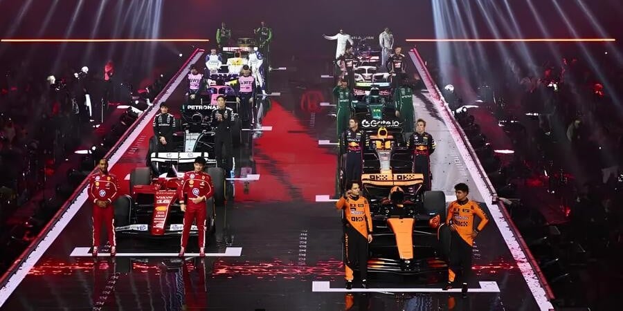
The range of adverts shown ranged from the low key chat with Williams, complete with dad selfie, to Aston Martin doing a funny with riffing off the James Bond theme, to the art installation production of Alpine.
I don’t want to go through all the teams individually because I can’t stand the advertising cringe. But I would like to mention some moments in particular.
After what felt like the forever of watching an art installation I didn’t understand, Alpine had maybe the best physical car reveal of the night. There was a quick cut to the car where it was parked at one end of the stage, the end furthest from the people. A white shroud had been draped over the car that was immediately and rapidly lifted off with a pulley from overhead and it looked like it was haunted. My note was “poltergeist.” It didn’t help that so little time, and lighting, was allocated to this particular moment so I don’t actually remember what the car looked like, but I do remember it was haunted.
There was a weirdly dystopian moment with Sauber/Audi, or SaubAudi. Their advert featured eerie green light, echoey voice overs of positive messages, paired with large, smiley images of their drivers with intentional image distortion. Making it worse was that it was shown from the arena view, without a neat full screen version. So we got flashing green lights, echoey voices and a large, silent audience seen mostly in silhouette watching on. It’s hard to convey the effect of the imagery, but it actually left me speechless and not in a good way. But at least I remember the car…?
Red Bull Racing started their relaunch of last year’s livery with Christian Horner being booed. I wasn’t expecting it, and apparently neither was he. He looked at the booing crowd and possibly stumbled a little with his intro speech: “is that..? … uh … well, it’s great to be here[…]”
Also, of all the teams, only the Red Bull Racing drivers did not talk. I can’t decide if I believe more that it’s because Max simply refused to hold a microphone, or because Red Bull thought Max would get booed if he did speak. And the car? I’ve since looked at comparisons of last year’s and this year’s livery; I can’t tell them apart.
The Haas launch didn’t have any bald eagles flying around with US flags in their talons, but they were close. It was good to see a response to all the “nice to have a US team on the grid” chat that’s been going on the last year with Team not-Andretti Cadillac. But, I have a bone to pick with some of the wording of the advert part: “Gene Haas did the unthinkable. He brought an American team to F1.” I would argue he didn’t, actually. Guenther Steiner did the work and brought an American team into F1; Gene just paid for stuff (begrudgingly).
VCARB spent their time just telling us about their team name. Granted, it does include a title sponsor, but also, given they started their press emails with “We are Visa Cash App Racing Bulls” for most of last year, I imagine it’s something that still bugs them. Their time was mostly spent on a fake vox pop where, according to the VCARB press release, “Munya [Chawawa] cemented Visa Cash App Racing Bulls into the audience’s minds once and for all.” The show’s host followed this moment by saying, “I can’t wait for them to change their name again next year.” And I remember the livery! (It’s a great look for Alpha Tauri.)
Meanwhile, in the Red Bull press release they said of VCARB: “Boasting a new name and look…” Full marks for paying attention there; this is the team’s second year with that name.
Also from Red Bull, were a series of images I found striking for the wrong reasons.
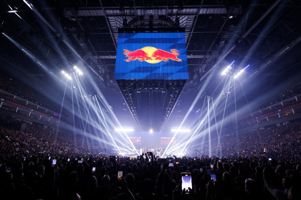
The arena has a rectangular footprint and for the show a main stage was extended from the usual stage down the centre of the venue. I kept thinking of it as a penis extension, but that’s just me. The usual stage at one end was all screen. There was another series of screens set in a rectangle around the stage extension that could be raised or lowered as required to hide things on stage. All these screens were utilised for montages, key words, logos, etc. While the whole shebang was being live streamed around the world, there didn’t seem to be any big screen in the arena for the fans actually there to see anything of the cars being revealed or the drivers they came to see. But, I mean, even watching from home I didn’t get a good look at many of the cars.
The image above stood out to me because this is the “fan zone” at the end of the stage. And it’s a sea of other fans’ cameras. Much light, very wow, no car. As though the show wasn’t at all for those present, who’d paid for a ticket, but for those watching through the cameras. I can see why the teams went along with it, even though with only seven minutes of advert space it’s way less than with a usual car launch. It guaranteed them all the glitz and glamour of a big stage with big lights. To have all the eyes on them — and their sponsors — for seven whole minutes instead of just reading a press release. Car launches are fun for nerds, but not for most fans. The big show was likely an attempt to change that. And, to top it off, Liberty Media got the fans to pay for it all.
Many liveries were similar to last year, or at least looked similar enough in the few seconds we got a look at the liveries. At least McLaren said they did it on purpose. “Don’t mess with success” so they say. They also brought along the Constructor’s trophy and four historic championship winning cars. Let’s see if they have a point this year.
I think I liked the VCARB one best? It struck me as taking itself the least serious with tessellating bull icons, and also reminded me of the leaves on Yuki Tsunoda’s helmet. And, as Fred Vasseur said during the Ferrari moment, “Formula 1 is fantastic and magic,” it seems fitting to at least let your car livery enjoy a little whimsy. Is it because VCARB has the least amount of pressure on them with their stated purpose being to be an also-ran? Maybe.
It might be the law of primacy, as they were first up, but I think SaubAudi were the most improved, once they stopped being dystopian. Last year’s livery looked like it was designed by someone for whom “graphic design was their passion.” By which I mean, they had no idea what they were doing. This year’s livery had more intent about it. Maybe they aspire to bring those two factors into their 2025 season.
And I’ve not even mentioned the offensive to some white stripe on the Ferrari. Did any of you watch it? Does the white stripe on the Ferrari offend you? I’m more offended by the HP logo than the white stripe.
And there I’ll end this wee hype train of consumption. But hey, speaking of consumption, Drive to Survive is up in a couple of weeks.
The White Stripe(d Ferrari)
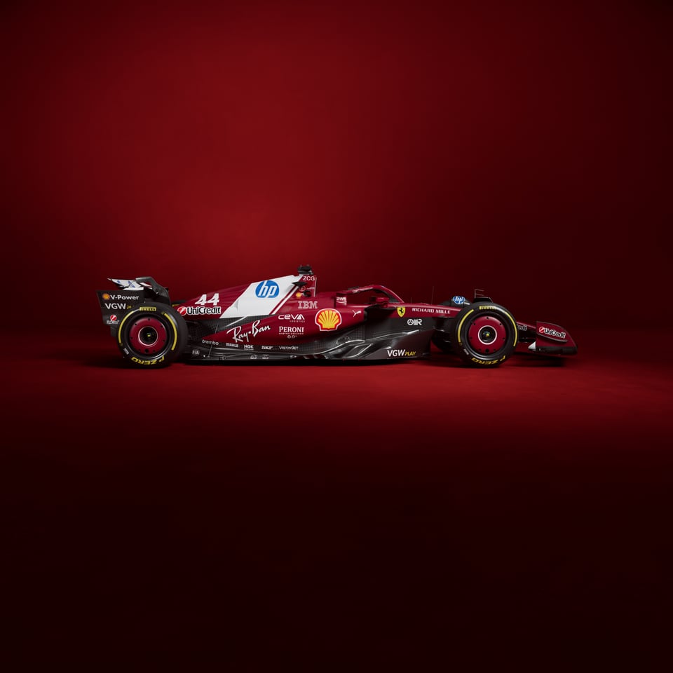
What makes the stripe worse is that HP won’t allow a non-standard version of their logo, in that it must be blue and white.