Improving CausalImpact with a BSTS custom forecast
CausalImpact is an R package that helps analyse the causal effect of an event on a metric of interest.
It is often used by media analysts trying to pinpoint the uplift caused by campaigns or by SEOs wanting to prove their impact to clients.
Mark Edmonson has made a tool called GA Effect where you can try it online with your Google Analytics data.
The output of the analysis can be visualised like this:
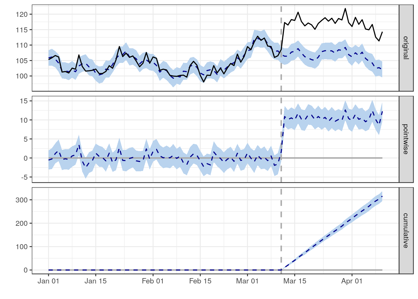
- The first plot shows the actual data (black line) and a forecasted estimate for what would have happened based on the historical data prior to the vertical dotted line.
- The key assumption is that any difference between the forecast and the actuals is because of the change that happened on the day marked by the dotted line.
- The following two charts show the size of the daily effect and the cumulative overall effect.
- The pale blue ribbon is a predictive interval. If this is entirely above or below zero then people will reject the hypothesis that there was no change and conclude that there was a positive/negative impact.
However, in real life, the results don't always look like this. Sometimes you end up with something like this:
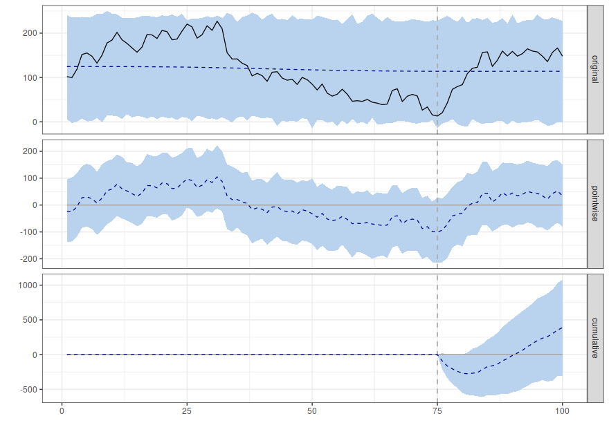
- The dotted blue line in the first plot doesn't track the black line at all; this shows that the CausalImpact forecast is poor at predicting what happened in the past.
- Eyeballing the data shows there was a strong negative trend starting on day 30 and continuing until the intervention on day 75.
- It looks as if the intervention had a positive effect
- But the model looks like it is comparing the post intervention period against the average for the whole of the pre-intervention period rather than realising that there was a negative trend up until the intervention.
- This means that the cumulative difference with the model is not good enough to consider that the intervention caused a positive change.
To me, this looks like a false negative; the intervention has had a positive effect and the CausalImpact test is wrong to say there is no effect.
It is particularly concerning that there seems to be a very poor match between the forecast and the actual values during the pre-intervention period.

You can get better results by using a custom forecast.
The default forecast in CausalImpact is a Local Level forecast. You can
see this in the code on
Github.
Local Level forecasts are very simple. It says the next value in the series is equal to the previous value plus some (small) random amount.
This is also known as a "random walk plus noise" model.
The good thing about this model is that there are very few assumptions and, at least for short range predictions, it can give good results for a very wide range of timeseries.
But, the downside is that the simplicity and lack of structure in the model means that is misses things like trends in the data and this can "fool" it into false negative results as seen above.
One solution is to make a custom BSTS model that better fits your data in the
pre-intervention period. The CausalImpact docs have a section on how to do
this.
Which model to use? I like to start with an AutoAr component because this is
less flexible with how much it allows the trend to vary; this gives a narrower
credible interval for longer term forecasts.
ss <- AddAutoAr(list(),
            pre.period.response
            )
You can also add a static intercept with this kind of forecast:
ss <- AddStaticIntercept(ss,pre.period.response)
Then fit and plot the results like the documentation says.
bsts.model <- bsts(pre.period.response, ss, niter = 1000)
impact <- CausalImpact(bsts.model = bsts.model,
                       post.period.response = post.period.response)
plot(impact)
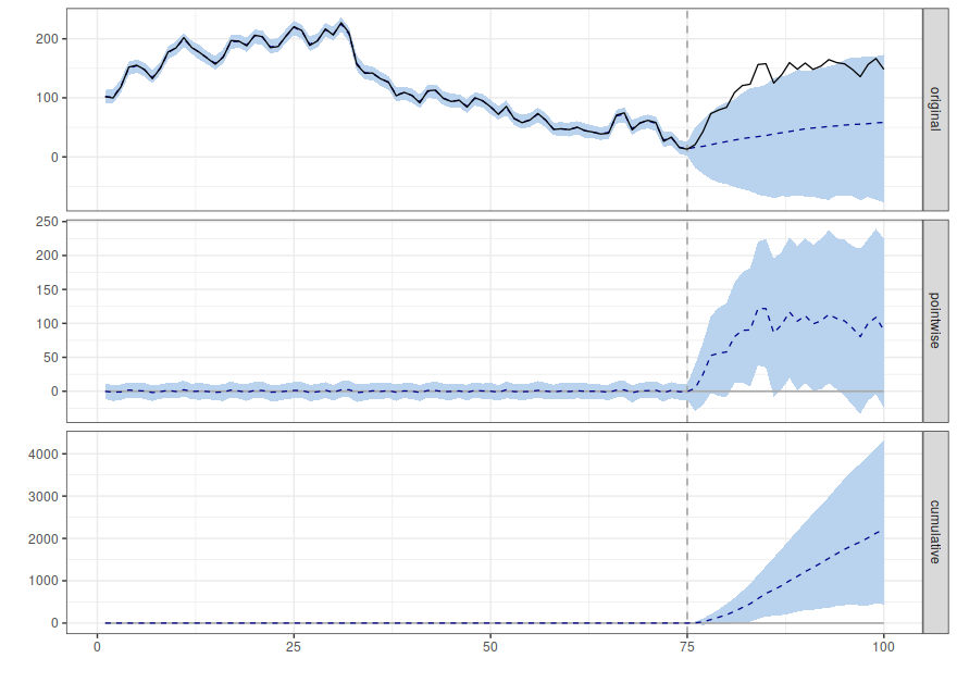
Much better!
AutoAr isn't necessarily the best forecast you can use in all circumstances;
it just works with this example. For serious analysis you should aim to build
the best forecast you can on the pre-intervention data and only then run it
through CausalImpact to see the results for the post-intervention period.
Another way to solve this problem is through the skillful use of regression columns. These add extra data to help the model make predictions. If you have some other metric that is closely correlated with the thing you are interested in and it should be unaffected by the intervention then you can use it to do a better analysis.
This is how some SEO split test tools work; half the pages get the intervention and the traffic to the other half is used as a regressor. If the pages are split randomly between the two groups then there should be a very good correlation between traffic to the test and control groups in the pre-intervention period. This makes it easier for the algorithm to find real changes in performance.