UI/UX Design - Don't be like Xiaomi
After Huawei was victim to US export bans, numerous companies picked up the pieces from them. One of those companies is Xiaomi, a Chinese manufacturer which is best known for their budget phones in the Redmi and POCO lines.
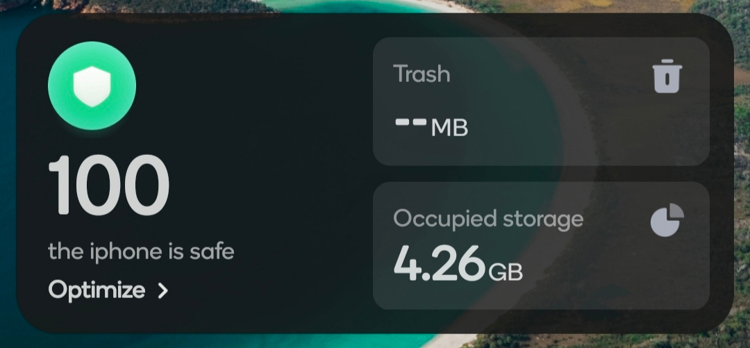
Today, I want to go through and just look at some inconsistent UI, and bad user experience. I'm not a professional, but I think I should be able to point out the mess that this is to you clearly enough. Before I start, is your Xiaomi iPhone safe? There's no point to this, I just found it funny.
You should at least try to make it less obvious that you try to copy Apple at times!
Let's start with looking at the mess that is the notification center. I have it set to more of an Apple-style notifications and control center approach, but let's just look at the positioning of elements here and inconsistent sizing.
If you can see, the notifications get much closer to the edges than items in the control center does. You can also see that status symbols such as my carrier etc are lower down in the notifications part. I also find it annoying how there is wasted space on the control center section, since smart devices is now a button. Xiaomi could have easily showed some more quick settings on the control center page to make use of the space.
One of Xiaomi's big claims to MIUI 14 was the fact that they reworked the settings page, but the user experience definitely has taken a step backwards. It's probably more of an actual programming bug, and not UX related, but it's pretty annoying. In the developer options menu, one of the options is to change the size of elements on your screen with the smallest width setting. However, when you put something in, it changes the amount. Also, animations decided to turn themselves to off when I left the settings app.
https://youtube.com/shorts/hvAl7mIcBhM
Going back to the notifications menu, it seems like Xiaomi can't even round corners properly. Take a look at this screenshot of two notifications, one from my music player, and one counting my steps. The corners are completely different. Yes, I am using a third party music application, but that shouldn't make a difference here.
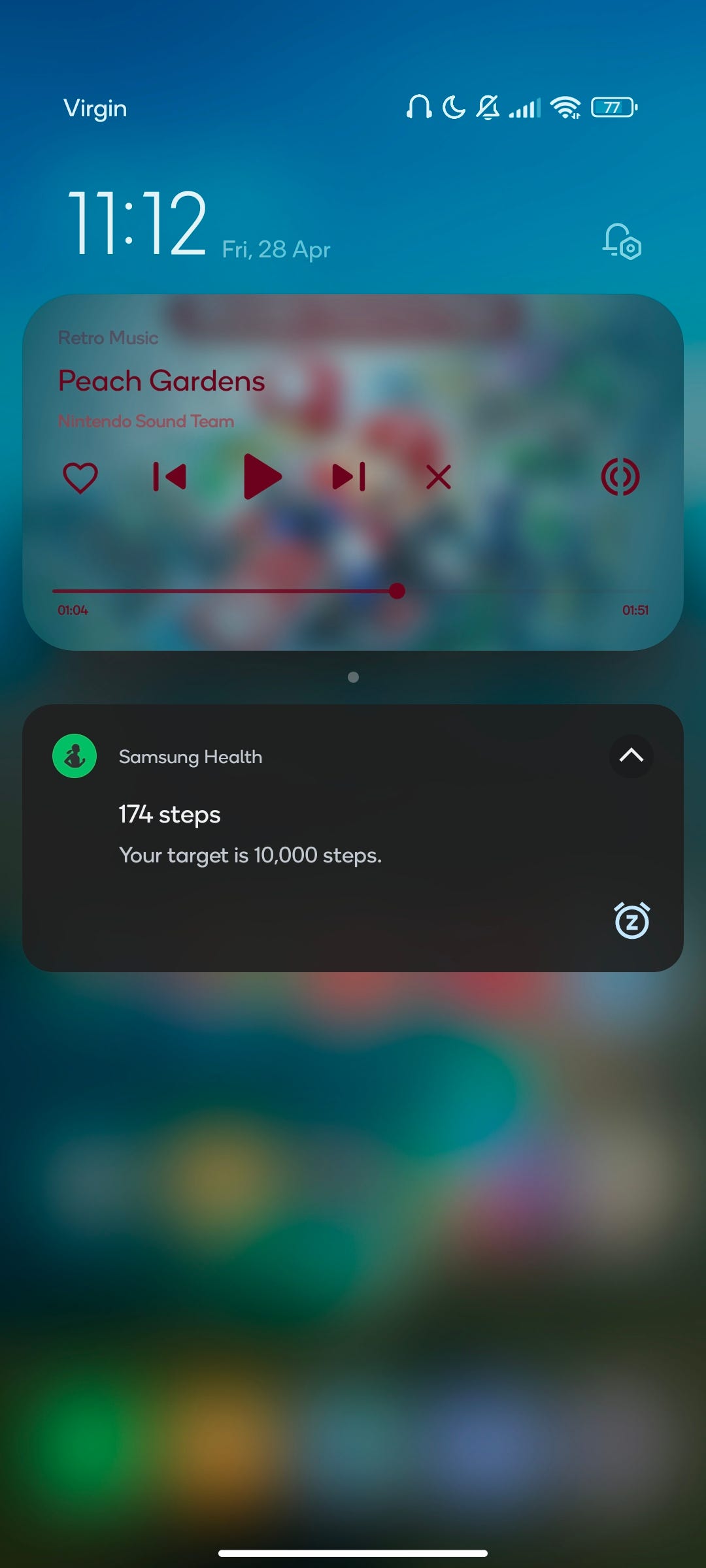
I have to assume the corners on the music player was taken from AOSP, and for other notifications, it's Xiaomi's mess of a design language.
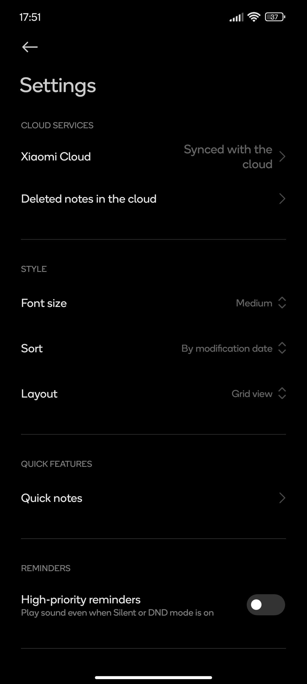
Looking around some more, and it's time to bully the Notes application. In the Settings section, for Xiaomi Cloud, the 'synced with the cloud' text should not be bigger than the actual Xiaomi Cloud text. The font weight also looks a tiny bit thicker compared to other stuff, but I could be wrong.
I think I'll stop complaining for now, but maybe I'll make a part 2 eventually. I'm hoping that outlining some of these things might help you with your own user interface and user experience design work.
Subscribe and share if you liked this post!
Add a comment: