Mini-Newsletter: Cover Design Drama and the Evolution of Sci-fi Art
Hi all, I’m in the middle of coursework hell so this is really just a silly little email <3. It is, however, something I’ve been joking about writing for…quite a while.
Because, as someone who draws1 (a drawer, if you will), I have opinions on book cover trends.
So, I spend a lot of time on booktube, and I also spend a lot of time reading sci-fi (gasp! shocker! who could have guessed!) and there was this one teensy tiny trend that had me feeling like I was going slightly insane.
That being, upon the release of The Strength of the Few, by James Islington, a new set of covers were released for the series. In every single video I watched, the youtubers would repeat the same sentiment:
“Ugh, it really sucks that the new covers are SO UGLY. I’m glad they’re reversible because the old ones were so much better and not icky and gross.”
(This is a bit of an exaggeration, and I know people like their matching covers but there was an air of genuine despair and borderline disgust at the change)
For those of you that haven’t been following this, here are the two covers of the first book, The Will of the Many. I invite you to guess which is the new (and much reviled) cover.
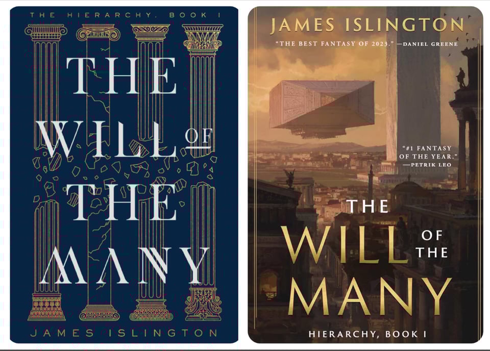
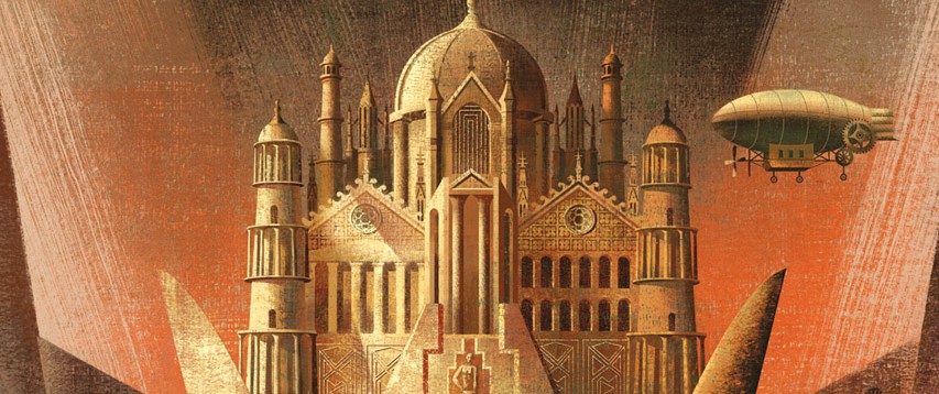
Do you see why I’m feeling so insane about this? (It’s the one on the right, for the record. The gorgeously painted fantastic illustration that sci-fi fans would kill for. This is the horrible awful ugly cover).
Ok, in all fairness, I think that this is partially a genre thing. I understand that, from what I’ve seen, the people reading TWotM are the kinds of people who prefer this kind of sleeker, more…well, it looks a bit like a fancy old hardcover doesn’t it? It’s very this is a literary-leaning alternate history. I take no issue with having a preference, but considering this is a science fantasy novel, I think it’s unfair to judge the new cover as inappropriate2. Also again, that illustration is GORGEOUS.
Book covers and cover illustrations (because I do think there’s a distinction to be made between the graphic cover design element and the underlying illustration) go through periods accepted styles and evolve. I am by no means an expert (and most of this list is pulled from the Locus awards because frankly I will never read 99.99% of the sci-fi out there) but here are the general trends I’ve noticed by dint of being a reader and avid trawler of used bookstores.
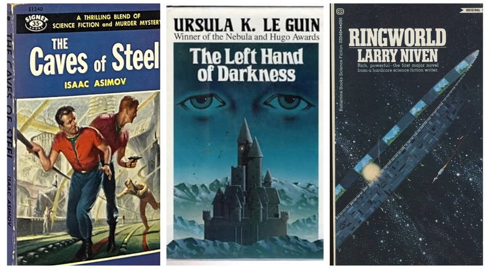
We had the early mass market sci-fi paperbacks, taking inspiration from the classic pulp magazines that had birthed the sci-fi magazines of the golden age, the slightly more literary, abstract leaning covers of Le Guin in the 60s and 70s, and Ringworld coming in with the familiar old pulp sci-fi novels with wonderful massive structure paintings.
The 70s scifi art blog is a wonderful resource for all things sci-fi covers, and there are some incredible paintings of spaceships that make me a little feral. Also some…rainbow dolphins. Don’t worry about it.
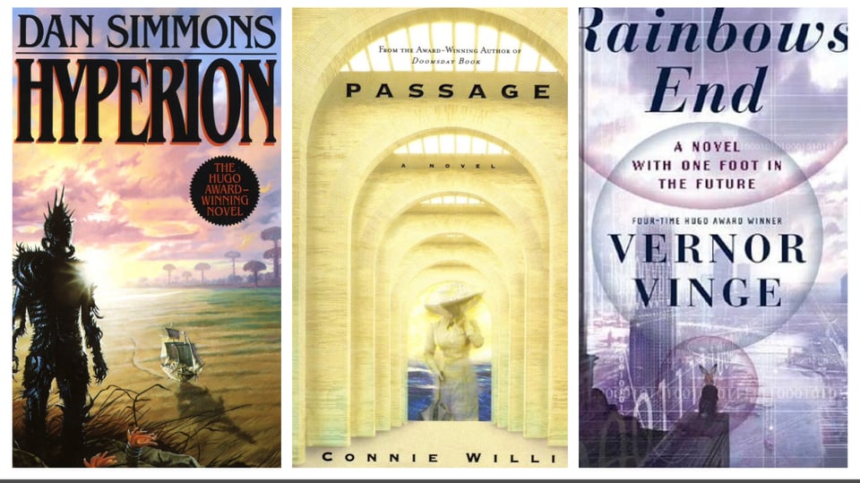
From the 90s to the early 2000s, the painting style evolved to more complete scenes, to a period of…almost abstraction in the late 90s which was the beginning of what I would consider ‘modern’, ie. the rise of digital illustration and painting getting rid of the particular ‘hand painted’ look of earlier sci-fi. Badly edited computer images and strange layouts proliferated in the early 2000s, part of which is, again, the popularization of digital art, but the other truly being the shift away from mass market paperbacks. Covers had a lot more space and tended to be glossy, which both change the style of art that looks best on them.
Though, honestly, I’d expect that one of the big drivers of these changes is cost. It’s far more expensive to commission a traditional, well established painter of sci-fi covers than to get someone to imagebash a cover together for you. Which brings us to the thing that actually got me to write this newsletter:
Again, I had been joking about this following the Strength of the Few discussions, but I saw this post at the perfect time for it to lodge in my brain as ‘hey. hey. you know that niche thing you love complaining about? let’s complain about it.’
As I pointed out, it’s not the first time that sci-fi covers have transitioned away from painted illustrations to more ‘graphic design is my passion’ (ok, this is rude to the 2000s covers. I think they served their purpose and their time period very well, but boy do some of them look goofy today). It is, however, the real reason that I was annoyed at the Strength of the Few discussion.
My personal favourite era of sci-fi covers were the 2010s ‘LET’S PAINT SPACESHIPS!!!’
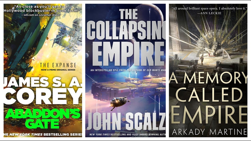
I just think they’re wonderful. Like truly, for genre fiction, they’re wonderful little pieces of art that accurately communicate the subgenre, style, and even some loose themes. And I want to hang them on my wall. Then, recently, the Imperial Radch trilogy got new covers.
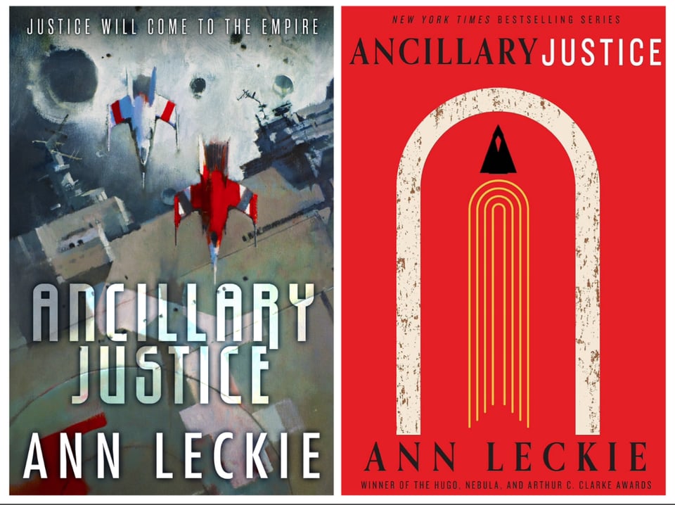
What. Why? Look, there’s absolutely nothing wrong with graphic design or simple covers. They can be lovely. But…why???
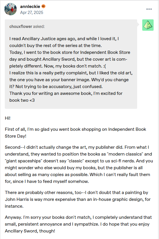
Well, why not let Ann Leckie herself explain it:
Let’s take those two points in reverse order: 2) cost. I’ve already touched on this. Let’s not pretend that this style of graphic design is not far less expensive than these fully painted pieces of art. This is evident in the various striations of publishing, with these kinds of full painting covers only really available from major publishers like Tor. On top of being sad for consumers, this seriously sucks for the people who previously made a living illustrating these types of book covers. In a time when human art is valued less and less, it feels like a bit of a punch to the gut to see the lack of appreciation for these really wonderfully human covers.
1) I think is perhaps more interesting, and it was something I tried to gesture at when discussing The Strength of the Few/The Will of the Many, the different ways that covers are perceived. Read enough, and you’ll be able to tell the genre of a book by cover alone. It’s truly not hard.
(Also, five thousand people have talked about the ‘cartoon romance covers are going to make kids read these spicy and explicit books!!!’ Even if it’s not my preferred art style, gang, are you not reading the backs of the books you buy??? Yeah, a romance about adult characters is likely to have sex in it. Thankfully this is something you can glean by the blurb. Anyway. That’s not a conversation I care about. We’re here to talk about silly sci-fi art.)
Literary and contemporary fiction has always tended away from illustrated covers, leaning instead on graphic design, traditional art, or straight up photography. As much as I adore the painted spaceships of Ancillary Justice and The Collapsing Empire, they do rather scream genre fiction, and if you want to—as Leckie points out—market to people outside of genre readers, well…
Why not dress up your book like contemporary fiction?
Anyway, that’s my admission: the real reason I was annoyed by the discussion surrounding the new Will of the Many covers is because I come from a genre that is edging farther and farther away from unique covers from skilled, human artists.
Rather than my usual sections, let me show you some of my favourite recent(ish) cover designs:
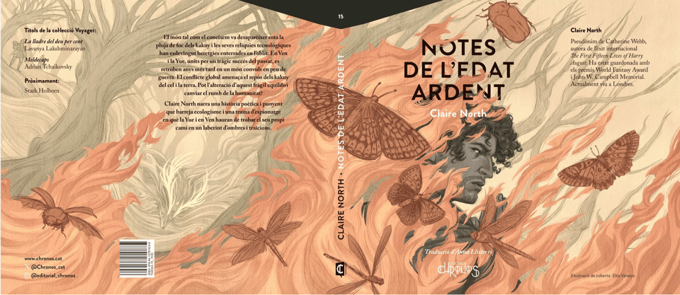
The cover for the Catalan edition of Notes from the Burning Age, illustration by Elsa Velasco
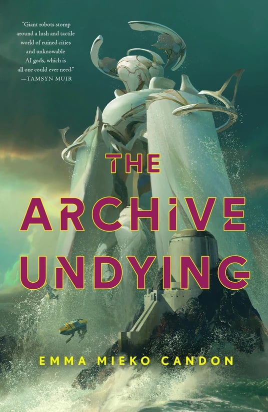
The Archive Undying, of course, illustration by Sung Choi
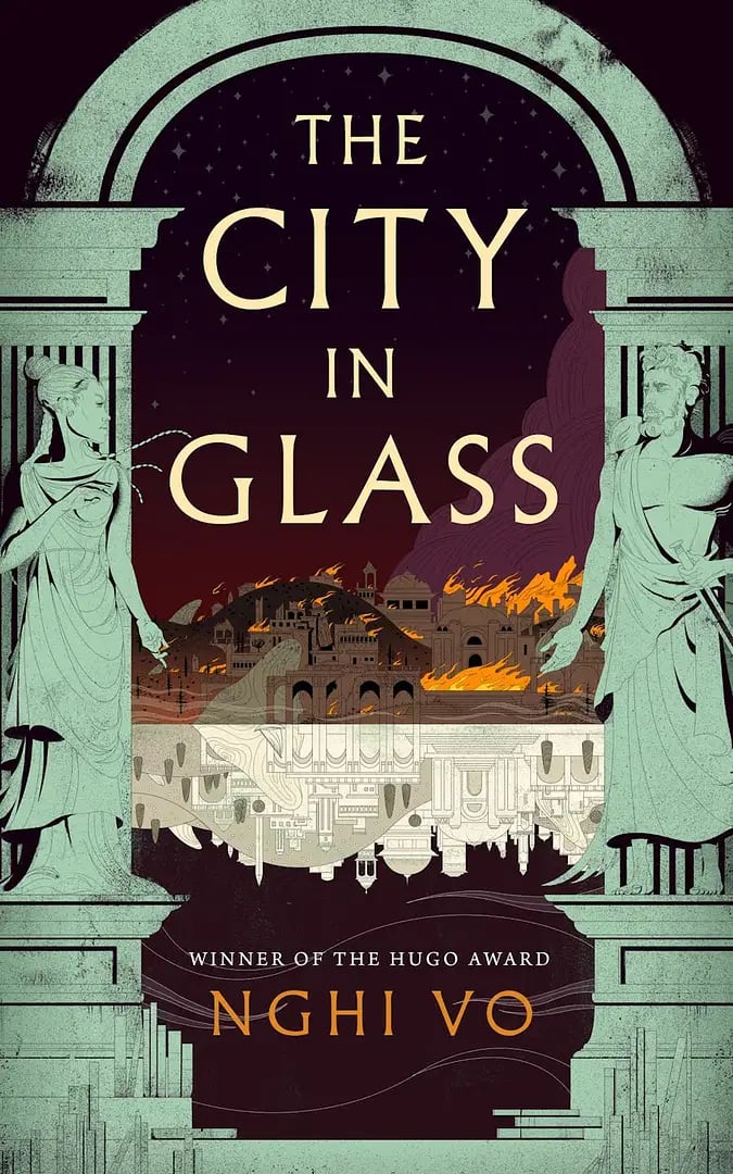
The City in Glass, illustration by Christina Bencina
EDIT how could I forget the cover of The Works of Vermin, illustrated by Deb JJ Lee
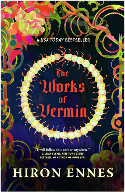
This is not quite as illustrative as my other picks but I think it’s gorgeous and I adore all the elements of it. Also I just realized, like a fool, that the reason I love this cover so much is that the artist is one of my favourite illustrators. The way they work with colour is a massive inspiration to me.
Support human artists!
Add a comment: