& Spring Arrives
How’s that weather going? Here it’s crazy windy all darn week. As well as some rain, but nothing worrying so far, thankfully.
Anyway, let’s get started!
Sadly, I don’t have much progress to report this time. March is always a busy time of year where I work, a lot of tourists visit here for Falles! You mix that with my phonophobia during a time period where everyone can use fireworks… well, it’s stressful. I’ve been catching up on my missed sleep. So I hope you’ll excuse my lack of energy this time, I’m slightly tired.
Yet I have something to talk about! Let’s discuss colors. Well, mostly colors.
Choosing colors is as important as working in any other assets in a project. It conveys the atmosphere, the vibes if you will. Any developer will tell you this.
That said, my little project is text on a static background. There’s a lot of hassle I don’t have to deal with (e.g. drawing or composing music). But that means that I have to make sure the elementes there ARE look alright.
I’m sure you’ve heard of color contrast. It matters a lot when you are working on something meant to be interactive. Now this is where limits appear: you want something to look good! Eye-catching! But it has to be accessible. Contrast can’t be too high or too low. I’m lucky that I don’t any problems with my eyes (not yet, anyway).
In my case, I want people to check my thing! Make sure they stay and read it!! But I need their eyes to not get tired during it. And I say this as someone that prefers light themes: black text on white background cannot work (nor white on black, I know what you are. It’s hurting your eyesight).
In fact, writing this letter is hell because the background is white and the font is so thin (fonts are important too). A side of me understands customization and having fun with your personal spaces online. But if you want people to peruse your site, you’re gonna have to make it comfy to do so. Which means approaching customization from a different perspective.
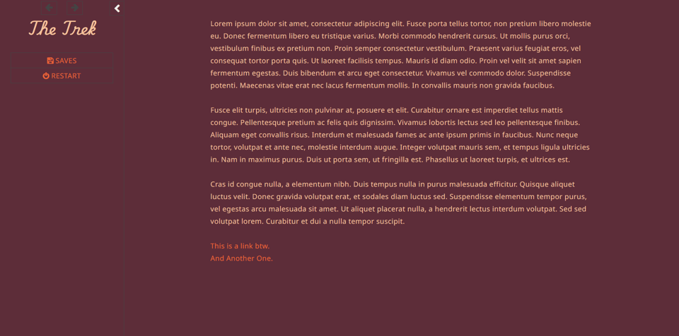
So my job is… well, to make it comfy, as I said. And since you’re subscribed (I assume), you get a glimple of what I have so far when it comes to the color palette.

I’m a fan of having more unconventional colors on my sites. I think color contrast can be fun! Limitation breeds creativity, as they say. You can also just say Fuck Everything Ever and use white text on a pastel pink background with a 10px font (average tumblr blog on the early 2010s).
Personally, I don’t like a minimalist approach towards my projects. ‘That screenshot there look pretty minimalist, though’ you might think. Perhaps? But I think there’s a difference between minimalism and simplicity. The latter is for the sake of making one’s work lighter. Believe me when I say, if I had the resources, I’d have turned this project into a more typical kinetic VN. Perhaps in the future I’ll toy with the idea. Though I’m sure I’d need help. Alas, I’m not exactly wealthy enough to afford getting that help at this point in time. I’ll make do, as always.
For now, I wish to keep things simple. And see where it takes me ✨